
Most people start building a brand identity backwards. They open Canva, type their business name into a logo generator, pick a font that looks “clean,” and call it done. Then six months later they’re redesigning everything because none of it actually fits the business.
This guide walks through brand identity the way it should actually be built. Not the fast way. The way that holds up once the business grows past the first fifty customers.
What Is Brand Identity? (And Why Most Beginners Get It Wrong)
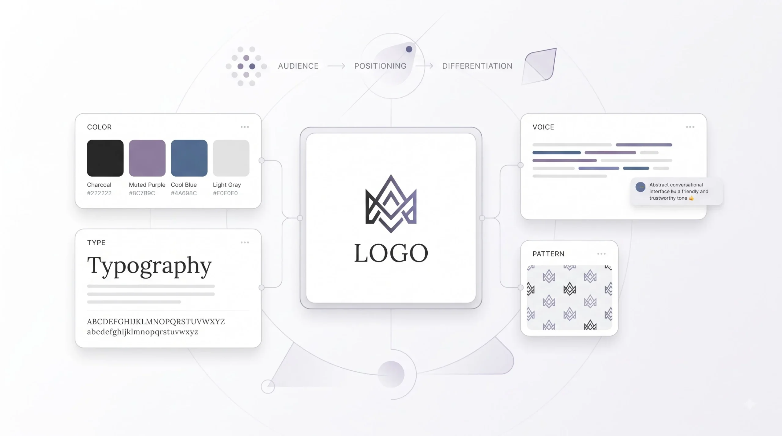
Brand identity is the visual and verbal language a business uses to show up in the world. Logo, colours, typography, tone of voice, imagery style. All of it together.
But here’s where most beginners trip up. They think brand identity, branding, brand image, and brand strategy are the same thing. They’re not, and mixing them up is exactly why so many DIY identities feel random instead of intentional.
Brand strategy is the thinking behind everything. Who the business serves, what it stands for, why it’s different from the next guy doing the same thing. Brand identity is what strategy looks like once it’s been translated into visuals and words. Branding is the ongoing act of building and reinforcing that identity, day after day, campaign after campaign. And brand image is the part nobody fully controls. It’s what’s actually sitting in the customer’s head after all of it.
| Term | What It Means | Who Controls It | How Often It Changes |
|---|---|---|---|
| Brand Strategy | The reasoning behind positioning, audience, and differentiation | The business, internally | Rarely, unless the business model shifts |
| Brand Identity | The visual and verbal system (logo, colours, fonts, voice) | Designers and founders, based on strategy | Occasionally, during a refresh or rebrand |
| Branding | The consistent application of identity across every touchpoint | Marketing and design teams | Continuously, in small ways |
| Brand Image | The perception that exists in the customer’s mind | The customer, shaped indirectly by the business | Slowly, based on experience over time |
Here’s the mistake worth flagging early, because it comes up again later in this guide. A logo is not a brand identity. It’s one piece of it. Businesses that jump straight to designing a logo without doing the strategy work first almost always end up with something generic. It might look fine sitting alone on a screen. It just won’t say anything specific about the business behind it.
Why Brand Identity Actually Matters (Beyond “Looking Professional”)
Look, nobody buys a product because the logo was well designed. That’s not the point. The point is what a strong identity does underneath the surface.
Humans recognise patterns before they process information consciously. That’s just how the brain works. A consistent colour, a consistent shape, a consistent tone shown repeatedly builds recognition faster than most people realise. That recognition is what turns into trust over time, and trust is what turns into someone actually choosing to buy.
For businesses trying to grow in competitive spaces, especially in crowded categories like education, D2C, or local services, a distinct identity is often the only thing separating one option from ten others that sound and look almost identical. When two businesses offer roughly the same thing at roughly the same price, the one that feels more put together, more consistent, more “real,” usually wins the customer’s attention first.
There’s also a cost to getting this wrong, and it’s not always obvious. Inconsistent branding, different fonts on the website versus the Instagram page, a logo that looks different in every ad creative, colours that shift from post to post, creates friction. It makes a business feel less trustworthy even if the product itself is solid. Customers might not consciously notice the inconsistency, but they feel something is off. That feeling costs conversions.
A brand doesn’t need to be the most creative one in the room. It needs to be the most consistent one.
Brand Identity vs Brand Strategy: Why Strategy Comes First
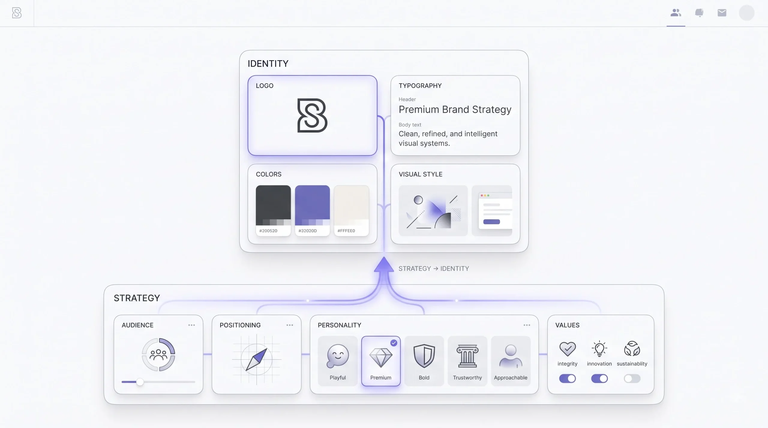
Here’s the part almost every beginner guide skips or rushes through, and it’s honestly the most important section in this entire piece.
Skipping strategy and going straight to design is the number one reason DIY brand identities fail. Not because the person designing it lacks taste. Because they’re designing without direction. It’s like being asked to build a house without knowing who’s going to live in it or what climate it’s built for.
Before any logo sketch, colour palette, or font decision, a business needs to have answered a few core questions.
- Target audience. Who is this actually for? Not “everyone.” A specific person, with specific problems, specific taste, specific expectations.
- Brand positioning. What makes this business different from the five other options a customer could pick instead?
- Brand personality. Is the business bold and loud, or quiet and premium? Playful, or serious? This isn’t fluff. It directly shapes every visual decision that follows.
- Mission and values, but only the parts that actually influence how the brand looks and sounds. Not a paragraph written for an About page that nobody reads.
Personality is where strategy starts turning into something visual. Once a business defines its personality honestly, the design choices practically suggest themselves.
| Brand Personality | Visual Direction It Suggests |
|---|---|
| Playful | Rounded shapes, brighter colours, informal or rounded typefaces |
| Premium | Refined serif or minimal sans-serif, muted or monochrome palette, generous white space |
| Bold | High contrast colours, heavier font weights, strong geometric shapes |
| Trustworthy / Corporate | Blues and neutrals, structured layouts, classic serif or clean sans fonts |
| Approachable | Soft colour palettes, hand-drawn or humanist fonts, casual imagery |
This is also where identifying the target audience properly matters most. A brand personality that feels right for one audience can feel completely wrong for another, even if the product is identical. Getting audience clarity right before this stage changes almost every decision that comes after it.
Step 1: Defining Your Brand Foundation (Before You Touch a Logo Tool)
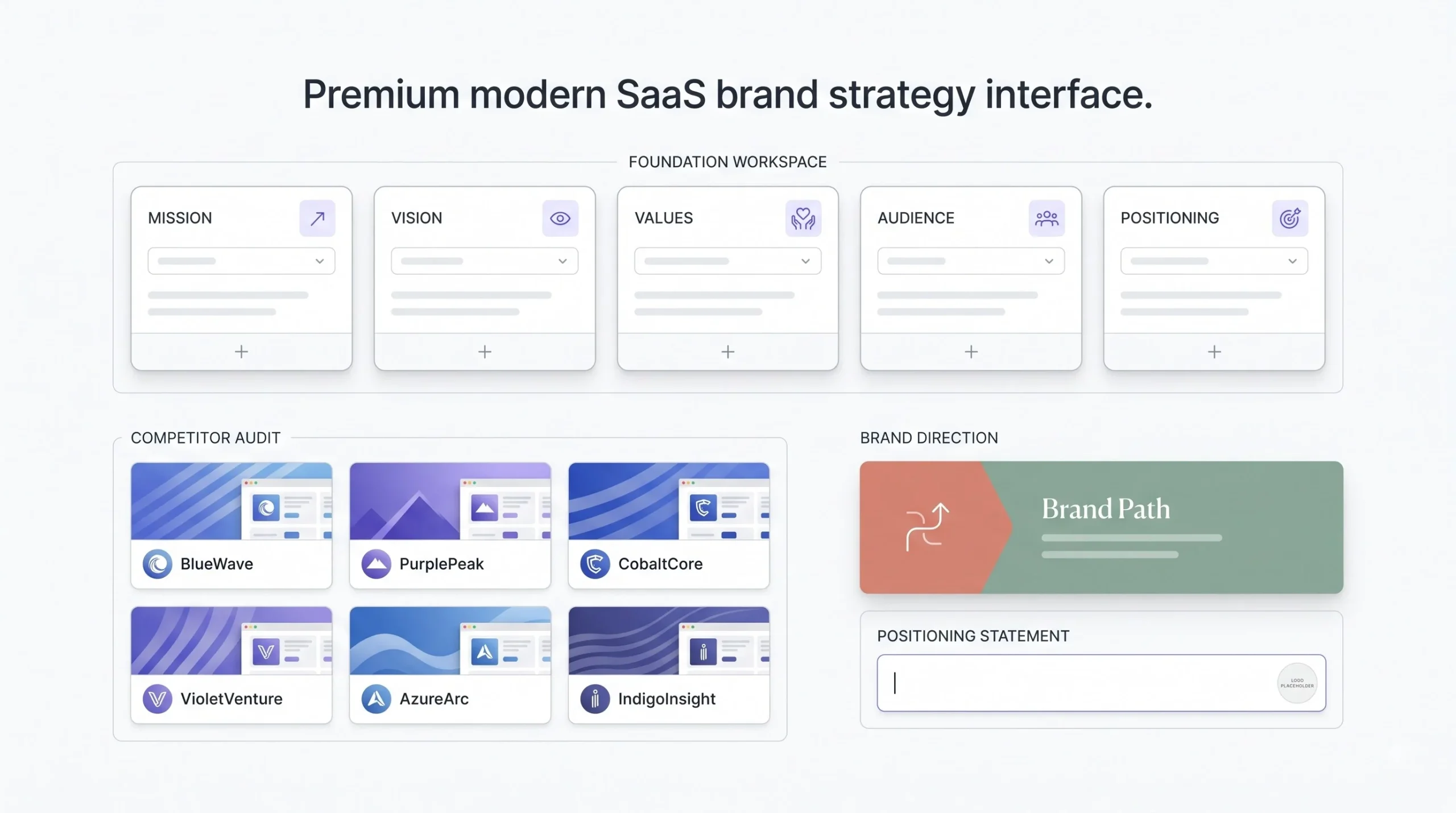
So before opening any design tool, there’s groundwork to do. Mission, vision, values, unique selling proposition, audience, competitors. Sounds like a lot, but it doesn’t need to be a fifty-page document. It needs to be clear.
One thing that gets skipped constantly, and shouldn’t, is a competitor visual audit. Before designing anything, actually go look at five to ten competitors in the same space. What colours do they all default to? What fonts show up again and again? What feels tired and overused in that category?
This matters because most categories fall into visual ruliness without anyone planning it that way. Fintech apps lean blue and purple. Organic food brands lean green and earthy. Ed-tech leans bright and rounded. None of that is a rule written anywhere. It’s just what happened when everyone copied whoever came before them. Doing this audit isn’t about copying the pattern too. It’s about deciding, on purpose, whether to fit into that pattern or break away from it.
A basic positioning statement helps pull all of this together into one usable sentence. Something like: “For [target audience], [business name] is the [category] that [key differentiator], unlike [main alternative].” It’s not meant to be publish-ready copy. It’s a working tool to keep design decisions aligned with strategy.
Before sketching a single logo concept, answer this honestly: if a customer saw this brand’s visuals with the name covered up, would they still be able to guess what kind of business it is?
Step 2: Designing Your Logo (The Core Visual Anchor)
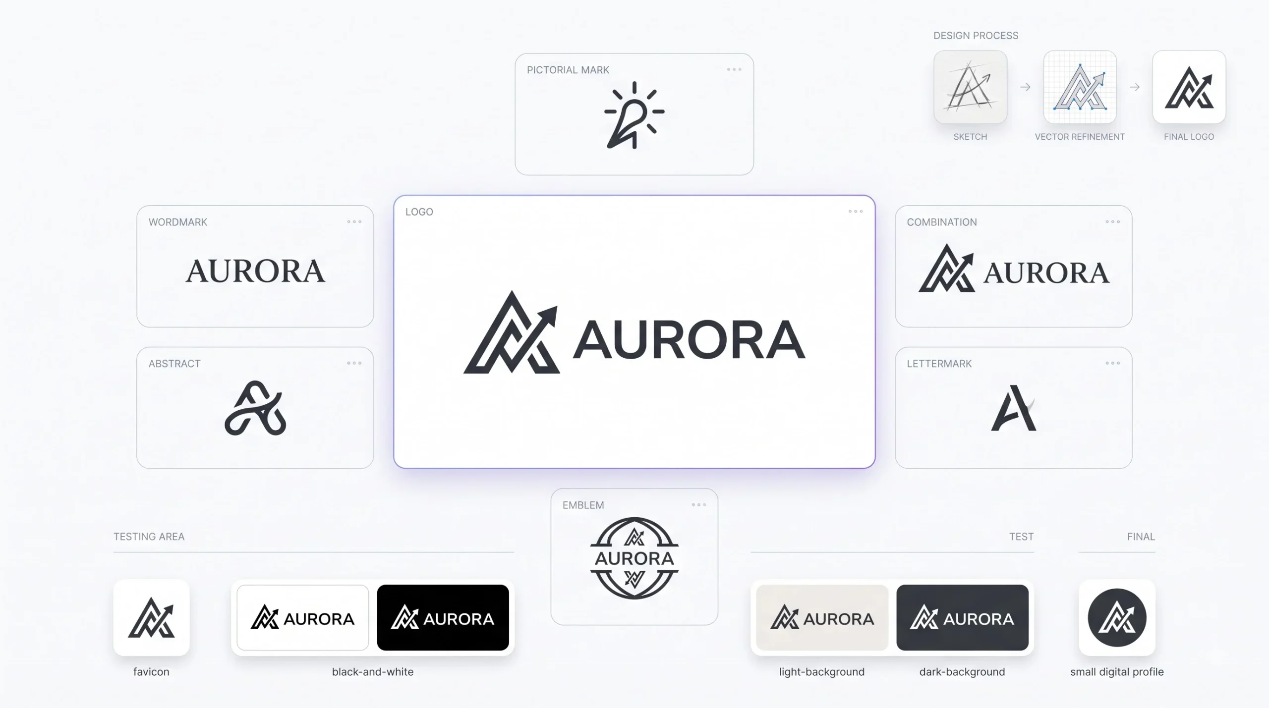
The logo gets treated like the whole identity, when really it’s just the anchor point. Still, it’s the piece most people obsess over, so it deserves real depth here.
Types of Logos (With When to Use Each)
Not every logo type suits every business. Picking the wrong type early is a common reason logos end up needing a redesign within a year or two.
| Logo Type | Best For | Example Style | Risk / Limitation |
|---|---|---|---|
| Wordmark | Businesses with a distinctive, short name | Full business name styled in custom or bold typography | Doesn’t scale well as a tiny icon (app icons, favicons) |
| Lettermark | Businesses with long names or acronyms | Initials styled distinctly | Can feel generic if not paired with strong typography |
| Pictorial Mark | Established brands with strong name recognition | A single recognisable icon representing the brand | Risky for new businesses, since the icon alone won’t communicate the brand yet |
| Abstract Mark | Businesses wanting a unique, non-literal symbol | A custom geometric or abstract shape | Can require more marketing effort to build association |
| Combination Mark | Most new and growing businesses | Icon plus wordmark together | Needs a flexible layout for use in tight or small spaces |
| Emblem | Institutions, schools, heritage brands | Text enclosed within a badge or crest shape | Loses detail badly at small sizes |
For most new businesses, a combination mark makes the most sense early on. It gives flexibility. The icon can be used alone once the brand is established, and the wordmark keeps things clear while that recognition is still being built.
Core Principles of Good Logo Design
- Simplicity. A logo that’s simple reproduces cleanly at every size, from a billboard down to a WhatsApp profile picture. Complicated logos fall apart the moment they get small.
- Versatility. The logo needs to work in colour, in black and white, on light backgrounds, on dark backgrounds, and as a tiny favicon. If it only works one way, it’s not finished yet.
- Memorability. Distinct shapes and clean forms stick in memory better than detailed, busy ones. Think about how few strokes it takes to recognise brands like Nike or Apple. That’s not an accident.
- Relevance. The logo doesn’t need to literally depict the industry, but it needs to feel aligned with the brand’s personality and audience.
- Timelessness. Trend-driven logos age fast. A logo built around whatever gradient or style is popular this year usually looks dated within two or three years.
Simplicity matters more mechanically than most people give it credit for. Every additional detail in a logo is one more thing that can break when it’s shrunk down, printed badly, or embroidered on a shirt. The fewer elements, the more forgiving the logo is across every real-world use case it’ll actually face.
The Logo Design Process, Step by Step
- Research. Competitor audit, audience research, personality definition. All the strategy work from the previous section feeds directly into this stage.
- Sketching and concepting. Rough ideas on paper before anything digital. This stage is about exploring shapes and directions, not perfecting anything yet.
- Digital drafting. Turning the strongest sketch concepts into clean vector versions.
- Refinement. Adjusting spacing, proportions, and details until the mark feels balanced.
- Testing across formats. This step gets skipped constantly, and it shouldn’t. Test the logo at favicon size, in black and white, on a dark background, and on a light one. A logo that only looks good large and in full colour isn’t actually finished.
- Finalising files. Vector formats (SVG, EPS, AI) alongside PNG versions in different sizes and colour variations, ready for whatever platform needs them.
Common Logo Design Mistakes
- Overcomplicating the mark with too many details or elements
- Chasing a visual trend instead of building something that lasts
- Ignoring how the logo performs at small sizes until it’s too late
- Using too many colours or fonts within the logo itself
- Designing something that looks a little too close to a competitor’s mark
DIY vs Hiring a Designer
DIY logo tools genuinely make sense in specific situations. Early-stage businesses testing an idea, extremely limited budgets, or situations where the brand identity is likely to change soon anyway once the business direction becomes clearer. There’s no point spending heavily on a logo for a business model that might pivot in six months.
Hiring a designer or agency makes more sense once the business has traction, funding, or a long-term identity that needs to hold up across serious marketing spend. At that point, a logo isn’t just a graphic. It’s showing up on paid ads, packaging, signage, and every customer touchpoint, and the cost of getting it wrong compounds the longer it’s in use.
Step 3: Choosing Your Brand Colours (Colour Psychology & Practical Application)
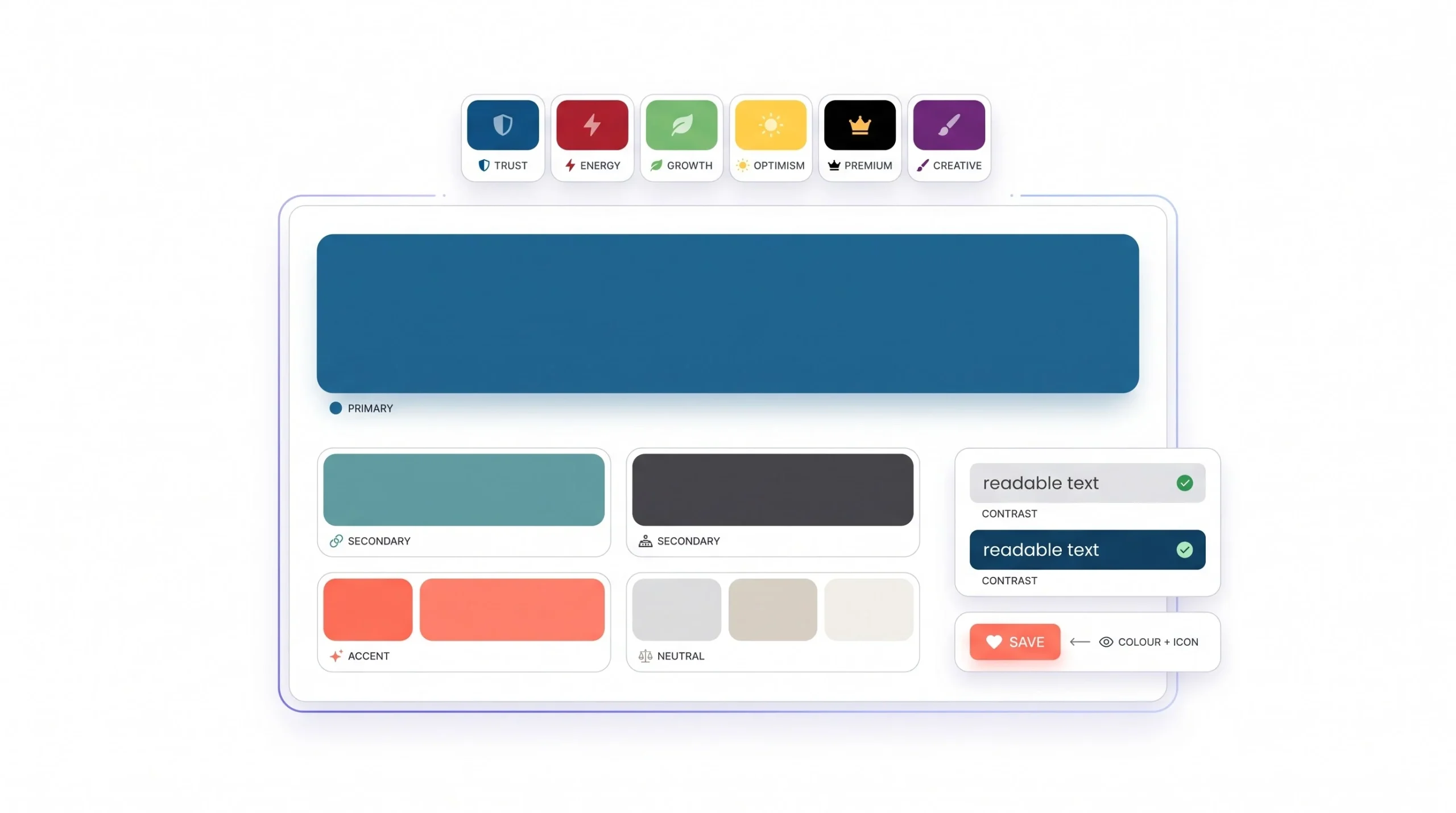
The Psychology of Colour in Branding
Colour psychology gets thrown around a lot, usually in an oversimplified way. Blue means trust, red means energy, that kind of thing. There’s some truth in those broad associations, but they’re not universal rules, and treating them like they are leads to generic palettes.
Context and culture change what a colour communicates. In parts of India, red carries associations with celebration and auspiciousness, not danger or urgency the way it often does in Western marketing material. White, which reads as clean and minimal in a lot of global branding, carries different, sometimes more solemn associations in certain Indian contexts. None of this means colour choices need to be overthought into paralysis. It means the association a colour has in one market doesn’t automatically transfer to another, and it’s worth actually thinking about the audience rather than defaulting to whatever a generic colour psychology chart says.
| Colour | Common Psychological Association | Common Use Case | Caveat |
|---|---|---|---|
| Blue | Trust, stability, calm | Finance, healthcare, tech | Overused in corporate and fintech, can feel generic without a distinct shade |
| Red | Energy, urgency, celebration | Food, retail, sales-driven brands | Meaning shifts significantly across cultural context |
| Green | Growth, health, nature | Organic, wellness, sustainability | Can feel expected or cliché in eco-focused categories |
| Yellow | Optimism, warmth, attention | Food, youth brands, budget-friendly positioning | Hard to use as a dominant colour due to low contrast with white |
| Black | Premium, authority, sophistication | Luxury, fashion, high-end services | Can feel cold or distant without warmer accent colours |
| Purple | Creativity, luxury, uniqueness | Beauty, creative industries, premium tech | Association weakens with overuse across a saturated category |
Building a Cohesive Colour Palette
A brand palette usually breaks down into a few functional roles, not just “a bunch of colours that look nice together.”
- Primary colour. The dominant colour, used most often and most closely tied to brand recognition.
- Secondary colour. Supports the primary, used for balance and variety without competing with it.
- Accent colour. Used sparingly, for calls to action, highlights, or moments that need attention.
- Neutral colours. Blacks, whites, greys used for text, backgrounds, and structure.
A helpful rough guideline here is the 60-30-10 split. Sixty percent of a design leans on the dominant colour, thirty percent on the secondary, and ten percent on the accent. It’s not a strict rule, but it keeps palettes from feeling chaotic or evenly weighted in a way that looks flat.
Colour harmony also plays a role in how “put together” a palette feels.
- Complementary pairs colours from opposite sides of the colour wheel, creating high contrast and energy.
- Analogous uses colours sitting next to each other on the wheel, creating a calmer, more cohesive feel.
- Triadic uses three evenly spaced colours, balancing vibrancy with structure.
None of these require deep design theory knowledge to apply. Most free colour tools build these relationships in automatically once a base colour is selected.
Tools for Choosing Brand Colours
- Coolors — fast palette generation, good for exploring options quickly based on a starting colour
- Adobe Color — useful for building palettes based on colour harmony rules directly
- Canva’s colour palette generator — good for extracting palettes from an existing image or reference
Colour Accessibility: A Section Most Beginner Guides Skip
This part gets ignored constantly, and it shouldn’t be, because it affects real usability, not just aesthetics.
Contrast matters. Light grey text on a white background might look “clean and minimal,” but it’s genuinely hard to read for a lot of people, not just those with visual impairments. Checking contrast between text and background colours before finalising a palette avoids this problem before it becomes a usability complaint later.
Colour blindness is also worth a real thought, not just a footnote. Roughly a meaningful portion of any audience experiences some form of colour vision deficiency, most commonly difficulty distinguishing red from green. Relying on colour alone to communicate something important, like a “success” versus “error” state on a website, can create confusion for those users. Pairing colour with shape, icon, or text label solves this without requiring a redesign.
Pick one dominant colour before building out the rest of the palette. Everything else should support that colour, not compete with it for attention.
Step 4: Selecting Brand Fonts (Typography Fundamentals for Beginners)
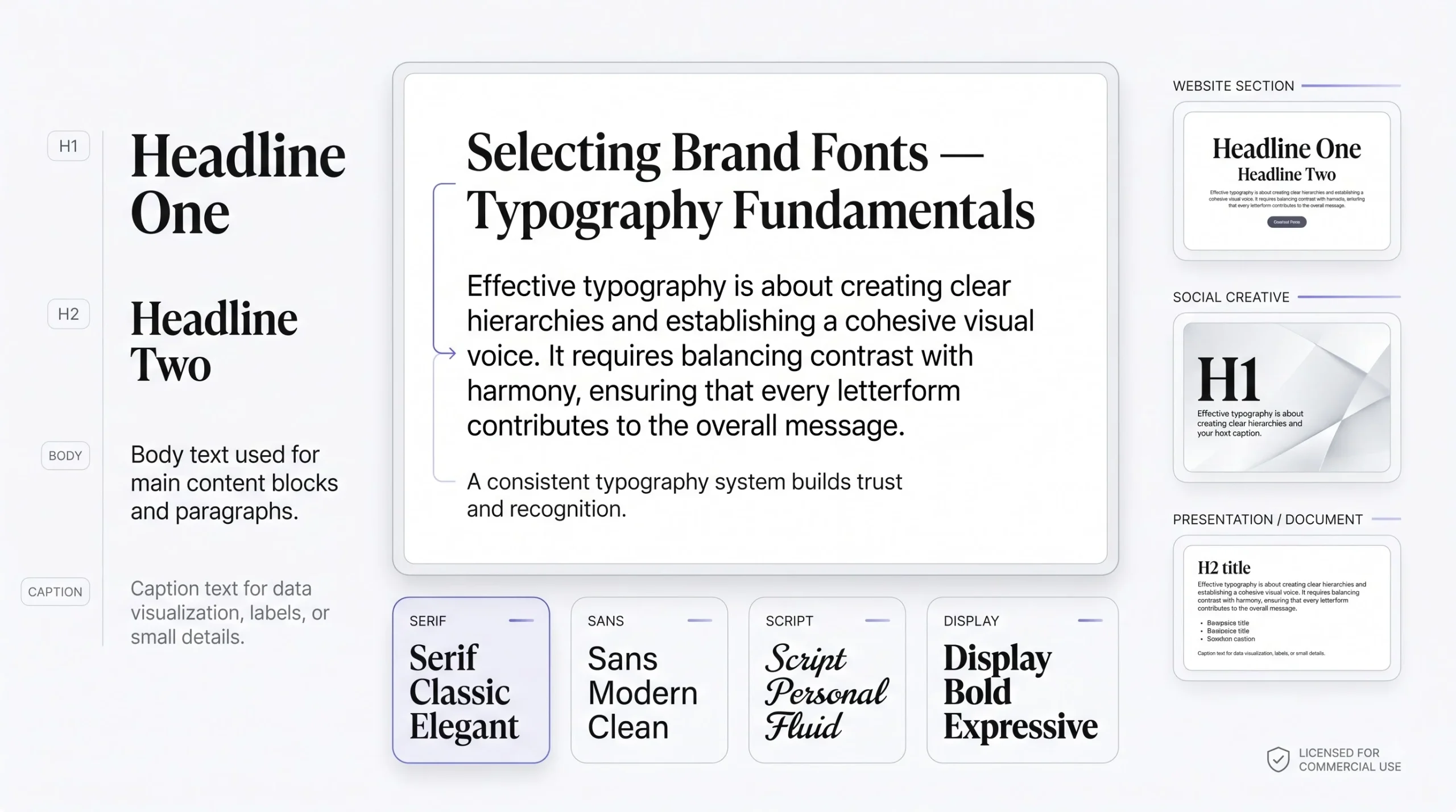
Font Categories and What They Communicate
| Font Category | Personality Signal | Best Use Case | Common Mistake |
|---|---|---|---|
| Serif | Classic, trustworthy, established | Legal, finance, editorial, premium brands | Using an overly ornate serif that hurts readability |
| Sans-serif | Modern, clean, direct | Tech, startups, minimal brands | Picking a sans-serif so plain it lacks any personality |
| Script | Personal, elegant, creative | Beauty, events, handmade or artisanal products | Using script for body text, which is hard to read at length |
| Display | Bold, expressive, attention-grabbing | Headlines, logos, short bursts of text | Using display fonts for anything beyond short headlines |
Font Pairing Principles
Pairing fonts well comes down to contrast. Not contrast for its own sake, but enough difference in weight or style between fonts that each one has a clear job. A bold display font for headings paired with a clean, readable sans-serif for body text is a combination that works because the two fonts aren’t competing. One is built to grab attention, the other is built to be read comfortably in longer stretches.
Most brands need two fonts. Occasionally three, if there’s a clear reason, like a separate font for a specific accent use, such as pull quotes or a logo’s custom lettering. Beyond that, things start looking inconsistent fast. More fonts mean more decisions every time something gets designed, and more room for something to feel slightly off.
Typography Hierarchy for Brand Consistency
A usable typography system needs a defined hierarchy, not just “pick two fonts and hope for the best.”
- Heading (H1) — largest, boldest, used sparingly for page titles or major section breaks
- Subheading (H2/H3) — smaller than the main heading, still distinct from body text
- Body text — the font used for the bulk of reading, chosen primarily for comfort and legibility
- Caption or small text — used for secondary information, credits, or fine print
Defining this hierarchy once means it can be reused consistently across the website, social graphics, presentation decks, and printed material, instead of making font-size decisions from scratch every single time.
Where to Find and License Fonts Properly
Free font sources like Google Fonts are a genuinely solid starting point and cover most needs for a growing brand. Paid font foundries offer more distinct, less commonly used options when a brand wants something that doesn’t show up on every second website.
The part that trips people up is licensing. A font downloaded for personal use isn’t automatically cleared for commercial use, and using an unlicensed font in a business’s core branding, especially on printed material, packaging, or paid campaigns, carries real legal risk that most beginners don’t think about until it’s already a problem. Checking the license terms before locking in a brand font is a small step that avoids a much bigger headache later.
Bringing It Together: Building a Cohesive Brand Identity System
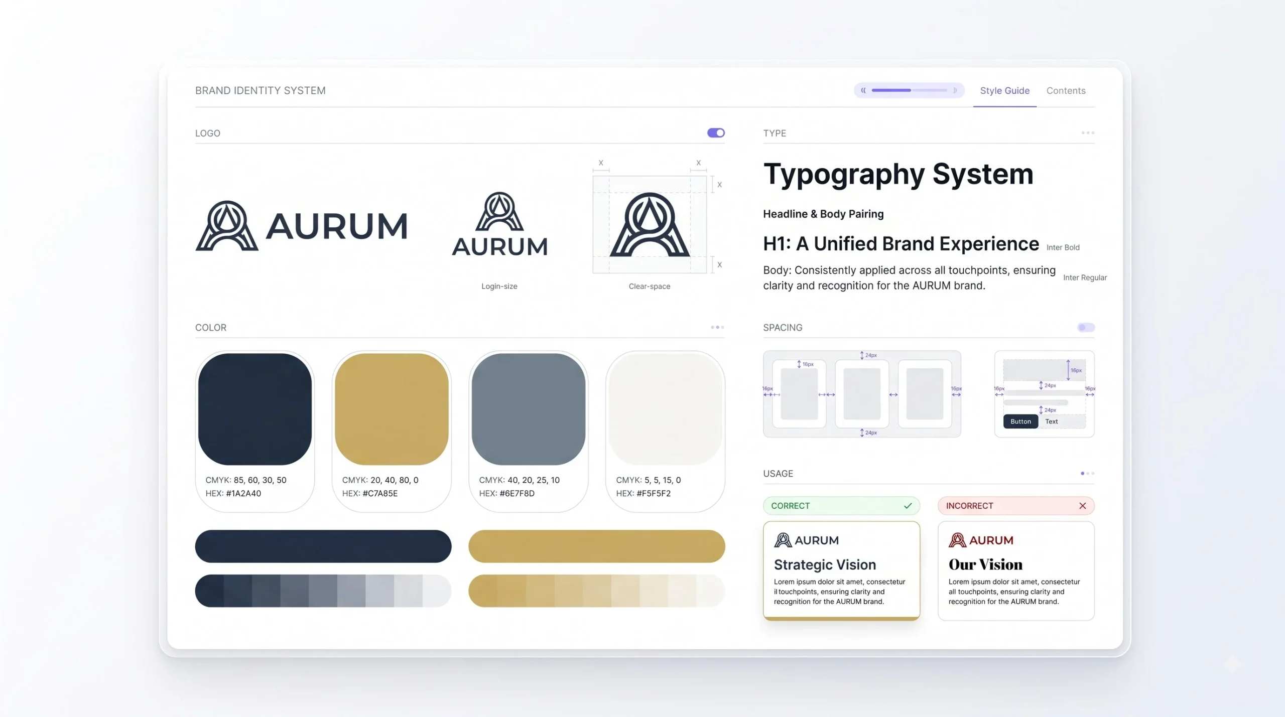
None of the pieces covered so far work well in isolation. A great logo paired with the wrong colour palette looks off. A well-chosen colour palette paired with a mismatched font feels disconnected. The interaction between elements matters as much as each individual choice.
Take a bold, geometric logo paired with a delicate, thin script font elsewhere in the brand’s materials. Individually, both might look fine. Together, they send mixed signals. One says confident and direct, the other says soft and personal. That mismatch is subtle, but it’s exactly the kind of thing that makes a brand feel inconsistent without anyone being able to immediately point out why.
This is where a brand style guide becomes necessary, and not just for large companies. Even a solo founder running a one-person business benefits from having this documented somewhere, because it keeps decisions consistent months later, long after the original reasoning behind a colour or font choice has been forgotten.
| Style Guide Element | What It Should Include |
|---|---|
| Logo usage rules | Minimum size, clear space requirements, acceptable and unacceptable variations |
| Colour codes | Hex, RGB, and CMYK values for every colour in the palette |
| Typography | Font names, weights, and hierarchy for headings, subheadings, and body text |
| Spacing and clear space | Minimum padding around the logo and consistent spacing rules across layouts |
| Do’s and don’ts | Visual examples of correct and incorrect use of the brand’s identity elements |
A style guide doesn’t need to be a fifty-page brand book from a global agency. A single, well-organised page covering these basics is enough to keep a growing brand consistent across everyone who touches it, from an in-house designer to a freelancer to a marketing agency.
Applying Brand Identity Across Touchpoints
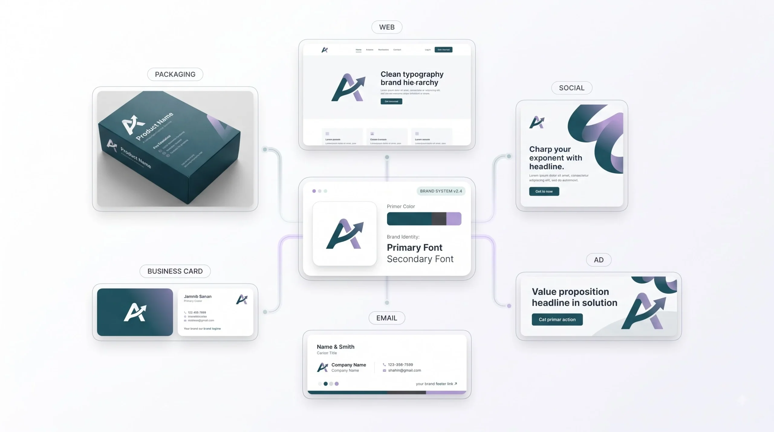
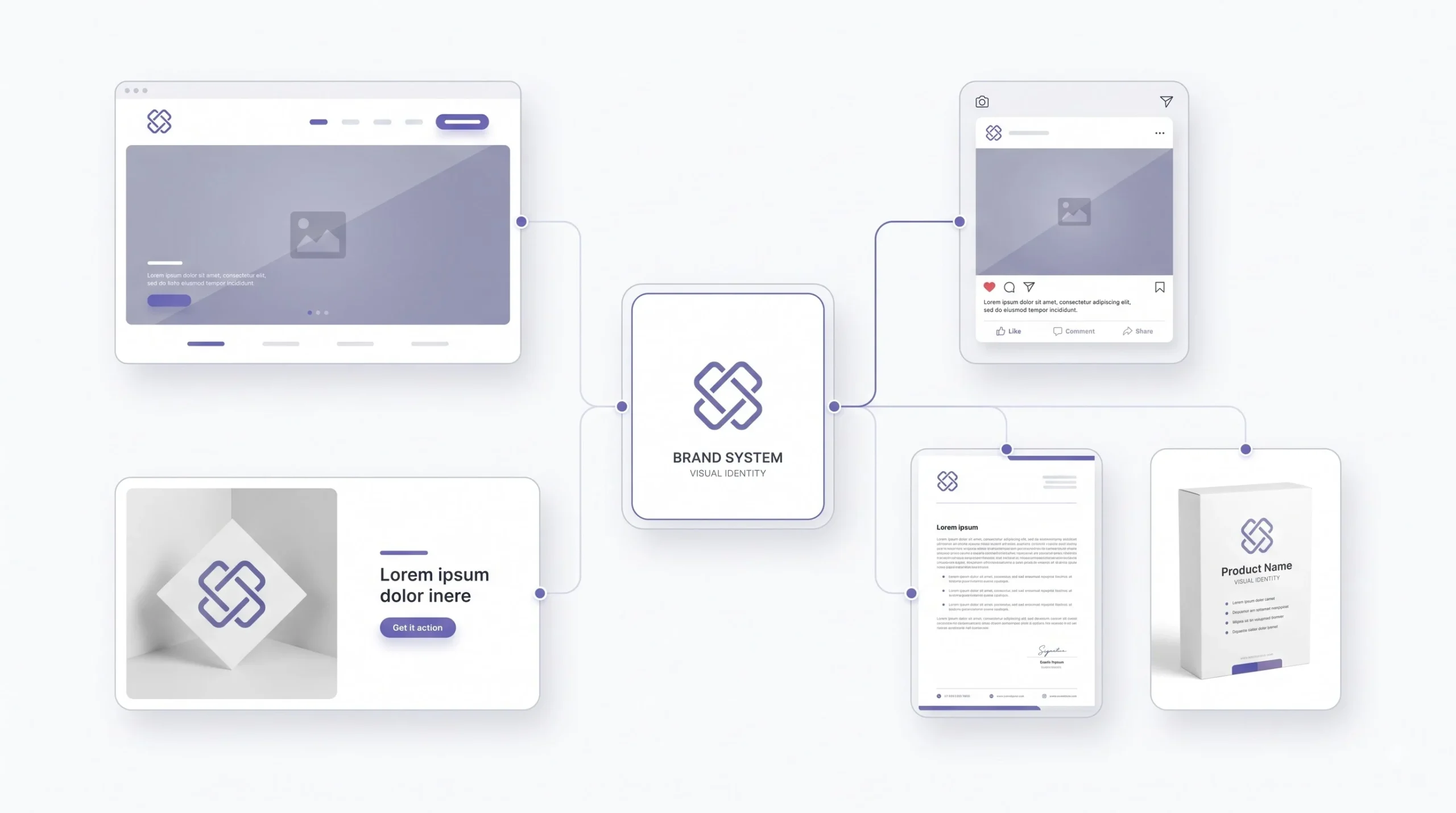
A brand identity only proves itself once it’s actually applied across every place a customer might encounter the business. Website, social media, packaging, business cards, paid ads, email signatures. All of it.
Consistency doesn’t mean rigid uniformity everywhere. There’s room for flexibility in places like social media content, where a slightly playful post might bend the tone a bit without breaking the brand. But the core elements, the logo, the primary colours, the typography, need to stay recognisable no matter where they show up. A customer scrolling past a paid ad and later landing on the website should immediately feel like it’s the same brand, without needing to double check the business name to confirm it.
This consistency matters just as much in paid media creative as it does anywhere else. Ad creatives that drift from the core brand palette or typography tend to perform less consistently over time, partly because they fail to build the same recognition that consistent creative builds across repeated impressions.
Tools and Resources for Building a Brand Identity (Beginner-Friendly)
- Logo design tools — Canva and Adobe Express for simple DIY logos, Adobe Illustrator for more custom, professional-grade work
- Colour palette tools — Coolors for quick generation, Adobe Color for harmony-based palettes
- Font pairing tools — Google Fonts for a free, reliable library, Fontpair for pre-tested pairing combinations
- Mockup tools — Placeit and Smartmockups for previewing how a logo and identity look across real-world applications like packaging, signage, and merchandise
- Style guide templates — Canva offers free, editable brand guideline templates that work well for smaller businesses just getting started
How Much Does Brand Identity Design Cost in India?
Cost here depends heavily on scope, so there isn’t a single number that applies across the board. A few factors consistently shape the final cost of a brand identity project.
- DIY approach. Using free or low-cost tools keeps spend minimal, but takes more personal time and design effort, and the result depends entirely on the founder’s own design sense.
- Freelance designers. Pricing varies widely based on the freelancer’s experience level, portfolio, and the number of deliverables included, such as logo variations, colour palette, typography selection, and a basic style guide.
- Design agencies. Typically involve a more structured process, deeper strategy work, and a full brand identity system, which reflects in a higher overall cost compared to a freelancer or DIY approach.
What actually affects the cost in any of these routes comes down to scope. How many logo concepts are included, how many rounds of revisions, whether a full style guide is part of the deliverable, and whether the identity needs to extend across packaging, merchandise, or physical signage in addition to digital use. A narrow scope, just a logo and basic colour palette, costs far less than a full identity system built for a business scaling across multiple channels.
For a business just starting out, it’s worth matching the investment to the current stage. Spending heavily on a highly polished identity before the business model is even validated often means redoing that work later anyway, once the brand’s direction becomes clearer.
Conclusion
None of this needs to happen perfectly on the first attempt. Most brands that look effortless today went through a few rough versions before landing on something that actually fit. What matters more than getting it right immediately is getting the order right. Strategy before logo. Personality before colour. Purpose before font choice. Skip that order and the identity ends up looking fine on its own but saying nothing specific about the business behind it.
A logo isn’t the brand. Neither is a colour palette or a font pairing on its own. The identity is what happens when all three get built on the same foundation and show up the same way everywhere a customer runs into the business, from a website to a packaging label to a five-second glance at an Instagram ad. That consistency is what turns a good-looking design into something people actually remember.
Start with the audience. Get honest about the personality. Then let the logo, colours, and fonts follow from that, instead of the other way around. That’s really the whole difference between a brand identity that holds up for years and one that needs a redesign before the business even finds its footing.
Frequently Asked Questions
1. What is the difference between a logo and a brand identity?
A logo is a single visual mark. Brand identity is the entire system around it, including colours, typography, tone of voice, and how all of it applies consistently across every touchpoint. The logo is one piece of the identity, not the whole thing.
2. Do I need a brand strategy before designing a logo?
Yes, honestly. Designing a logo without knowing the target audience, positioning, and brand personality usually results in something generic that could belong to almost any business in the category. Strategy gives the design direction something to actually respond to.
3. How many colours should a brand identity have?
Most cohesive palettes work with four to six colours total: one primary, one or two secondary, an accent, and a couple of neutrals. Going much beyond that tends to make the palette harder to apply consistently.
4. How many fonts should a brand use?
Two is usually enough. One for headings, one for body text. A third font can work if there’s a clear, specific reason for it, like a distinct accent use, but beyond that things start looking inconsistent fast.
5. What is a combination mark logo, and is it right for a new business?
A combination mark pairs an icon with a wordmark. It works well for most new businesses because it gives flexibility. The full lockup builds initial recognition, and the icon alone can be used independently once the brand becomes more established.
6. Why does a logo need to be tested in black and white?
Because a logo won’t always be reproduced in full colour. It might get printed on a single-colour receipt, embroidered on merchandise, or stamped somewhere with limited print options. If the logo only works in colour, it’s not actually finished.
7. What is the 60-30-10 rule in brand colour palettes?
It’s a rough guideline for balancing a palette: sixty percent dominant colour, thirty percent secondary colour, ten percent accent colour. It keeps a palette from feeling flat or evenly weighted in a way that looks chaotic.
8. Does colour psychology actually work the same way across every audience?
No, and this is a common assumption that causes problems. Cultural context changes what a colour communicates. A colour that reads as calming or premium in one market can carry a completely different association in another. Audience context matters more than a generic colour psychology chart.
9. Can a small business build a brand identity without hiring a designer?
Yes, especially in the early stages. DIY tools work fine for testing an idea or working with a limited budget. Hiring a designer becomes more worthwhile once the business has traction and the identity needs to hold up across serious, ongoing marketing spend.
10. What should a basic brand style guide include?
At minimum, logo usage rules, colour codes in hex and RGB, font names with their hierarchy, spacing guidelines, and a few do’s and don’ts. It doesn’t need to be long. It just needs to be documented somewhere consistent.
11. How often should a brand identity be updated?
There’s no fixed timeline, but frequent, drastic changes reset the recognition a brand has spent time building. Small, gradual refinements tend to work better than a full overhaul every year or two, unless something fundamental about the business itself has changed.
12. Is it okay to use a free font for a commercial brand?
Sometimes, but it depends entirely on the license. Not every free font is cleared for commercial use, and using an unlicensed font on business material carries real legal risk. Always check the license terms before locking in a brand font.