


Most marketers still build their weekly report by copying numbers out of four different tabs into a spreadsheet, and by the time it’s ready, half the numbers are already outdated. That’s the actual problem Looker Studio solves, and it’s exactly why so many people search for Looker Studio for beginners the moment they get handed reporting duties for the first time.
Looker Studio is Google’s free dashboard and reporting tool. Connect it to Google Analytics, Google Ads, or even a plain spreadsheet, and it pulls live numbers straight into charts that update on their own. No more manual copy-paste at 11 pm before a Monday meeting. No more three people arguing over which file called “final_report_v3” has the correct numbers. Just one link, and whoever opens it sees the real, current figures.
This guide walks through Looker Studio for beginners from the very first login screen all the way to a working marketing dashboard with traffic, ad spend, and conversions sitting side by side on one screen. It covers how the tool actually works, which data sources matter for a marketing dashboard, how to build charts people actually read instead of scroll past, and the mistakes that make most first dashboards look cluttered and confusing rather than useful.
None of this needs a coding background or a “data analyst” job title. Looker Studio was built for exactly this kind of person: someone who understands marketing numbers but has never opened a BI tool before. By the end of this guide, there will be a dashboard that’s live, shareable, and updating itself every single day without anyone touching it.
There’s a reason this particular tool has become the default answer whenever someone asks how to report on marketing performance without paying for expensive software. It’s free, it’s genuinely capable enough for real client and business use, and it doesn’t demand a technical background before it becomes useful. That combination is rare. Plenty of reporting tools are either free but limited, or powerful but locked behind a price tag and a learning curve that takes months. Looker Studio sits in a sweet spot that fits a beginner on day one and still holds up for someone managing a portfolio of client accounts years later.
What You Will Learn in This Guide
- What Looker Studio actually is, how it’s different from Google Data Studio, and why marketing teams rely on it for reporting
- How to set up a Looker Studio account and get comfortable with the interface without feeling lost on day one
- How to connect Google Analytics 4, Google Ads, Search Console, and Google Sheets as live data sources
- How to blend multiple data sources into a single marketing dashboard view
- How to build scorecards, charts, filters, and calculated fields step by step
- How to design a dashboard people actually open and use, instead of one they ignore after week two
- How to share, schedule, and turn a dashboard into a reusable template for future campaigns or clients
What Is Looker Studio for Beginners?
Looker Studio is a free reporting and data visualization tool from Google that turns raw numbers from platforms like Google Analytics, Google Ads, and spreadsheets into live charts, graphs, and dashboards. It sits between your data sources and the people who need to see performance, and it removes the manual work of pulling numbers by hand every week.
Here’s the thing that trips up most beginners at first: Looker Studio doesn’t store your data. It connects to it. When you build a chart showing website sessions, that chart is pulling numbers directly from Google Analytics in real time (or close to it, depending on the connector). Change something in Analytics, and the chart in Looker Studio reflects it the next time it refreshes. That’s the entire point. A dashboard isn’t a snapshot you build once, it’s a window into data that keeps moving.
For a marketing team, this matters more than it sounds like it should. A typical marketer juggles traffic numbers from Analytics, spend and click data from Google Ads, ranking and impression data from Search Console, and maybe email metrics sitting in a totally separate tool. Without something like Looker Studio, someone has to manually stitch all of that together every single reporting cycle. With it, all four sources sit on one canvas, refreshing on a schedule, and nobody has to touch a spreadsheet formula again.
Think about what a typical Friday looked like before tools like this became standard: pulling a CSV export from Analytics, another from Ads, opening both in separate spreadsheet tabs, manually calculating a few ratios, then formatting everything into something presentable enough to email a manager or client. That process, repeated weekly across even a small handful of accounts, eats hours that could go toward actual strategy work. Looker Studio doesn’t just save time on any single report, it removes an entire category of repetitive manual labor from a marketer’s week, which is really the bigger shift underneath the tool itself.
Looker Studio vs Google Data Studio: What Actually Changed
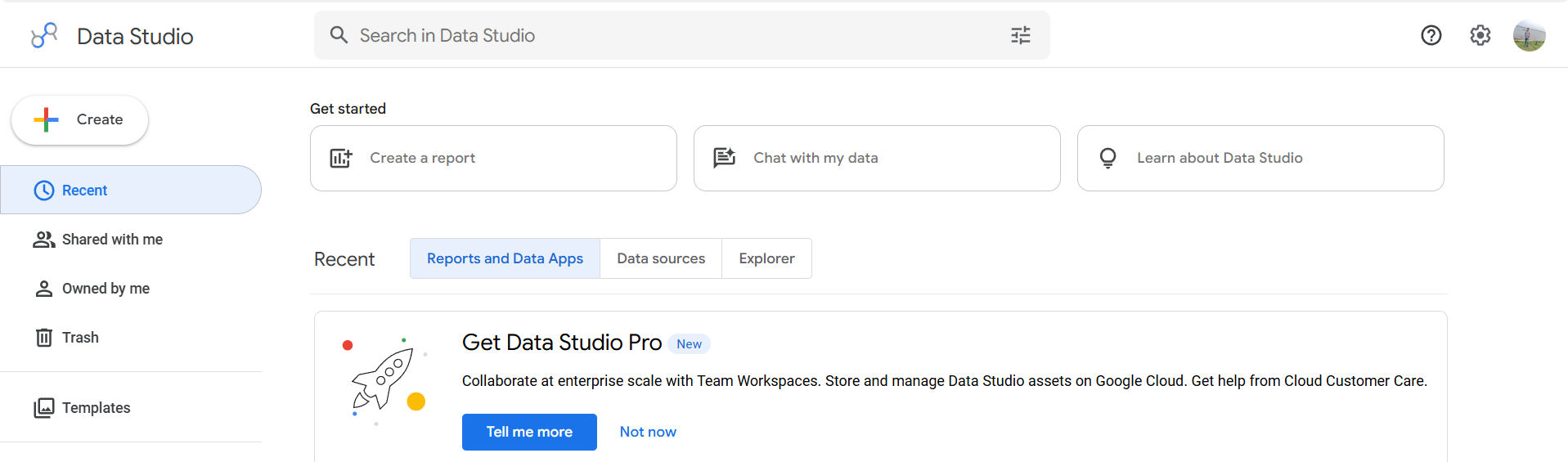
Looker Studio used to be called Google Data Studio, and if you’re reading older tutorials or watching YouTube videos from a few years back, that’s the name you’ll see. Google rebranded it in 2022 after folding it into the broader “Looker” family of business intelligence products, but the free version most marketers use didn’t fundamentally change in that switch. Same interface, same connectors, same free price tag.
What did change is the direction Google’s been pushing the product. There’s now a paid tier called Looker Studio Pro, aimed at larger teams that need admin controls, version history, and support for enterprise-scale reporting. For a beginner building a marketing dashboard, none of that matters yet. The free version does everything covered in this guide, and it’s the same tool used by freelancers, small agencies, and in-house marketing teams handling accounts worth real ad budgets.
One more thing worth knowing early: because of the rebrand, some connectors, community visualizations, and even file names on Google’s own help pages still reference “Data Studio.” Don’t let that confuse the search. It’s the same tool, just wearing a new name.
Who This Tool Is For (And Who It Isn’t)
Looker Studio fits anyone who needs to report on numbers regularly and is tired of doing it manually: in-house marketers reporting to a manager, freelancers sending monthly updates to clients, small agencies managing five or six accounts, and students learning how digital marketing reporting actually works in the real world. If you can read a spreadsheet and understand what a bounce rate or a conversion rate means, you have enough background to start.
It’s a weaker fit for two specific situations. First, if your reporting needs are genuinely simple, like checking one number once a month, a plain spreadsheet is faster to set up. Second, if you’re working with extremely large, complex datasets that need heavy data modeling before they’re report-ready, you’ll eventually bump into limits that push you toward proper data warehouse tools. For 95% of marketing dashboards, though, Looker Studio is more than capable, and it’s the tool most beginners should learn first before anything more advanced.
There’s also a practical career reason to learn it early rather than later. Reporting shows up in nearly every marketing job posting in some form, whether it’s phrased as “comfortable with data visualization tools” or spelled out directly as Looker Studio or Power BI experience. Having a working, shareable dashboard to point to during an interview, built on real or sample data, does more to demonstrate actual skill than listing the tool name on a resume ever could. It’s a fairly quick skill to pick up relative to how often it gets asked for.
Looker Studio for Beginners: Setting Up Your First Report
Getting started takes less time than most people expect, and that’s honestly one of the reasons Looker Studio has become the default reporting tool for so many marketing teams. There’s no installation, no license key, nothing to configure on a server somewhere. You open a browser, sign in, and you’re building.
That said, the first few minutes inside the editor can feel a little overwhelming if nobody walks you through what you’re looking at. The interface has panels within panels, and if you start clicking around without a plan, it’s easy to end up with a blank canvas and a chart that shows nothing but errors. The three sections below cover exactly what to do in order.
Creating a Looker Studio Account and Opening the Editor
Looker Studio runs entirely inside a Google account, so if you already use Gmail, Google Analytics, or Google Ads, there’s nothing new to sign up for. Head to the Looker Studio homepage, sign in with the same Google account connected to your marketing accounts, and click the blank “Create” button in the corner to start a new report.
The first thing Looker Studio asks for is a data source. This is where a lot of beginners pause and aren’t sure what to pick, and that’s fine, because it’s covered in detail in the next section. For now, the important thing to know is that every report needs at least one connected data source before any chart will render. Skipping this step and trying to build charts first is the single most common reason a brand-new report shows nothing but blank boxes.
Once a data source is attached, Looker Studio drops you straight into the report editor with a blank canvas and a starter title text box. That’s the workspace for the rest of this guide.
Understanding the Looker Studio Interface: Canvas, Data Panel, and Style Panel
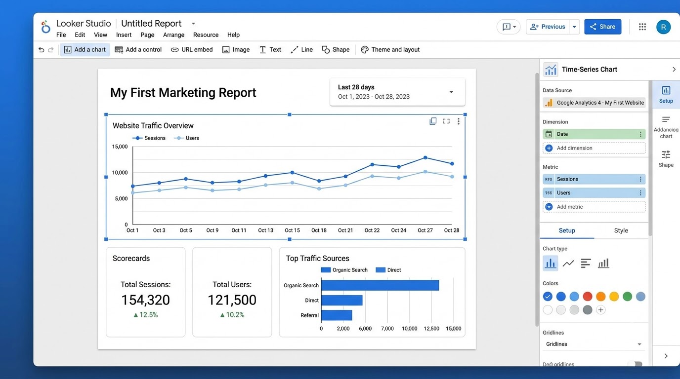
The Looker Studio editor has three areas that matter, and getting comfortable with each one before building anything saves a lot of frustration later. The canvas sits in the middle and it’s the actual page of your report, the space where charts, text, and images get placed and resized like objects on a slide.
On the right side, when you click any chart, two tabs appear: Setup and Style. The Setup tab is where you choose the data source, the metrics (numbers like sessions or clicks), and the dimensions (categories like date or campaign name) that the chart displays. The Style tab controls how it looks: colors, fonts, borders, and chart-specific settings like whether a bar chart shows data labels.
Along the top toolbar sits the “Add a chart” menu, which is exactly where most of the building happens. Click it, and a dropdown shows every chart type available, from simple scorecards to time series graphs to geo maps. Next to it sits “Add a control,” used for date range pickers and filters, which get covered in detail further down. Learning to move between these three areas, canvas, Setup tab, Style tab, without hunting around is really the whole skill of using this tool efficiently.
Choosing a Template vs Starting from a Blank Report
Looker Studio ships with a template gallery full of pre-built reports for Google Ads, Analytics, YouTube, and more, and it’s tempting to grab one and just swap in your own account. For a genuinely fast first dashboard, that’s not a bad shortcut. Templates come with charts already laid out, colors already chosen, and a logical structure already in place.
The downside is that templates are built for generic use cases, and a marketing dashboard built around your specific KPIs almost always ends up needing heavy editing anyway. For learning purposes, starting from a blank report is worth the extra effort, because it forces an understanding of how every single chart gets built, connected, and styled. Once that skill is solid, templates become genuinely useful time-savers instead of a crutch that hides how the tool actually works.
A practical middle ground many marketers land on: build the first dashboard from scratch to learn the mechanics, then once it’s done, save a copy of it as a personal template for every future client or campaign. That’s covered later in the sharing and automation section.
Connecting Data Sources: The Core Skill in Looker Studio for Beginners
If there’s one skill that separates someone who’s comfortable with Looker Studio from someone still fumbling through it, it’s understanding data sources. This is the part most tutorials rush through, and it’s exactly why so many beginners end up with a dashboard full of “No data available” errors they can’t explain.
A data source in Looker Studio is a connection to a specific dataset, like your Google Analytics property or a single Google Sheet. Every chart on your report pulls from one or more of these connections. Getting this part right at the start saves hours of confusion later, especially once a dashboard grows past three or four charts.
Connecting Google Analytics 4 to Looker Studio
Google Analytics 4, usually shortened to GA4, is the backbone of almost every marketing dashboard because it tracks website behavior: sessions, users, page views, conversions, and traffic sources. To connect it, click “Add data” inside the editor, search for “Google Analytics” in the connector list, sign in if prompted, and select the specific GA4 property you want to report on.
Here’s where beginners often get stuck: Looker Studio will show every GA4 property connected to your Google account, and if you manage multiple websites or client accounts, it’s easy to pick the wrong one. Always double-check the property name and the property ID against what’s shown in the actual GA4 admin panel before building a single chart on top of it.
Once connected, GA4 exposes hundreds of metrics and dimensions, everything from basic session counts to granular event-level data like scroll depth or video plays. For a first marketing dashboard, stick to the fundamentals: sessions, users, engagement rate, conversions, and traffic source or medium. Trying to report on everything GA4 offers on day one is how dashboards end up cluttered and unreadable.
Connecting Google Ads and Search Console
Traffic numbers alone don’t tell the full marketing story, which is why most real dashboards pull in Google Ads and Search Console alongside Analytics. The Google Ads connector shows spend, clicks, impressions, cost per click, and conversions, broken down by campaign, ad group, or keyword. Connecting it works the same way as Analytics: search the connector, sign in, and select the specific ads account.
Search Console connects a little differently because it offers two connection types, “Site Impression” and “URL Impression.” Site Impression gives overall performance for the whole domain, while URL Impression breaks numbers down page by page, which is heavier but far more useful for SEO-focused reporting. For a general marketing dashboard, Site Impression is usually enough; for a dedicated SEO report, URL Impression is worth the extra load time.
The real value here comes from putting Ads spend next to Analytics conversions on the same page. That single combination, spend on one side, actual results on the other, is what turns a “traffic report” into an actual marketing dashboard that shows whether the money spent is doing anything. Anyone building out reporting for organic search specifically will want a firmer grip on SEO fundamentals before leaning too heavily on Search Console data, since ranking and impression numbers only mean something once the underlying strategy behind them makes sense.
Using Google Sheets as a Manual Data Source
Not every metric marketing teams care about lives inside a Google product. Email open rates from Mailchimp, social media follower counts, or sales figures from a CRM often need to be entered manually, and that’s exactly what the Google Sheets connector handles. Any spreadsheet in a connected Google Drive can become a live data source in Looker Studio, updating every time the sheet changes.
Setting this up well requires a bit of discipline in how the sheet is structured. Looker Studio reads spreadsheet data the same way a database would: consistent column headers, one row per data point, and no merged cells or stray formatting. A messy sheet with subtotals mixed into the data rows will confuse Looker Studio’s field detection and produce broken charts.
A common beginner mistake here is treating the Sheet as a one-time import rather than a live connection. If the sheet gets updated weekly with new numbers, the connected chart in Looker Studio updates with it, no re-import needed. That’s the whole advantage over building a report in the spreadsheet itself: the dashboard becomes the single place everyone looks, instead of forwarding a new spreadsheet file every week.
Blending Data Sources Into One View
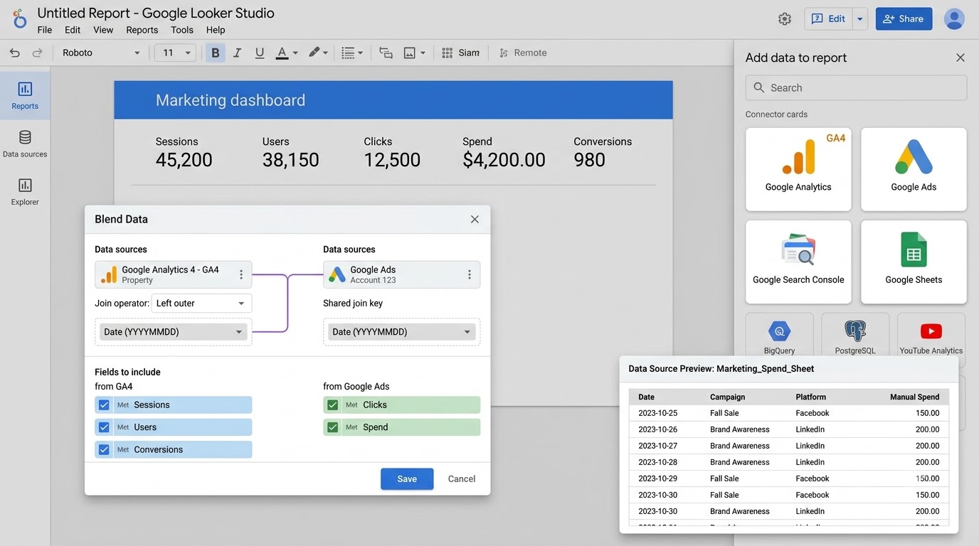
Individual connected sources are useful, but the real power of a marketing dashboard shows up when data from different platforms combines into a single chart. Looker Studio calls this “blending,” and it’s how you’d build something like a chart comparing organic sessions from GA4 against paid clicks from Google Ads on the same timeline.
To blend data, select two or more charts (or start fresh with the “Blend Data” option under Resource), and match them on a shared dimension, almost always the date field. Looker Studio then joins the datasets behind the scenes and lets a single chart pull metrics from both sources at once. It works similarly to a join in a spreadsheet VLOOKUP, just handled automatically.
Blending is also where beginners hit the most confusing errors, usually because the join key doesn’t match cleanly. If one source uses “Date” and another uses “Day,” Looker Studio won’t automatically know they’re the same field, and the blend either breaks or returns incomplete data. Renaming fields consistently across sources before blending, or manually mapping them during setup, avoids most of these headaches.
Worth knowing too: Looker Studio blends use a left outer join by default, meaning the first data source added defines which rows show up, and anything in the second source without a matching date simply won’t appear. This trips people up when a blended chart seems to be “missing” data that’s clearly visible when the source is checked on its own. Nine times out of ten, the fix is checking which source got added first and making sure it’s the one with the fuller date range.
Building Your Marketing Dashboard in Looker Studio for Beginners
This is the part that actually feels like building something. Data sources are connected, the interface makes sense, and now it’s time to turn raw numbers into a dashboard someone can actually glance at and understand in under ten seconds. That last part, the ten-second test, is the real goal of everything in this section.
Here’s what most guides skip: building charts isn’t just a technical exercise, it’s a planning exercise. The order matters. Jumping straight into “Add a chart” without a plan is how dashboards end up with fifteen scattered visuals that don’t tell a coherent story.
Planning the Dashboard Layout Before You Touch a Single Chart
Before adding a single chart, it helps to sketch, even on paper, what questions this dashboard needs to answer. A marketing dashboard usually needs to answer three things at a glance: how much traffic came in, how much was spent to get it, and how many of those visitors actually converted. Everything else is supporting detail.
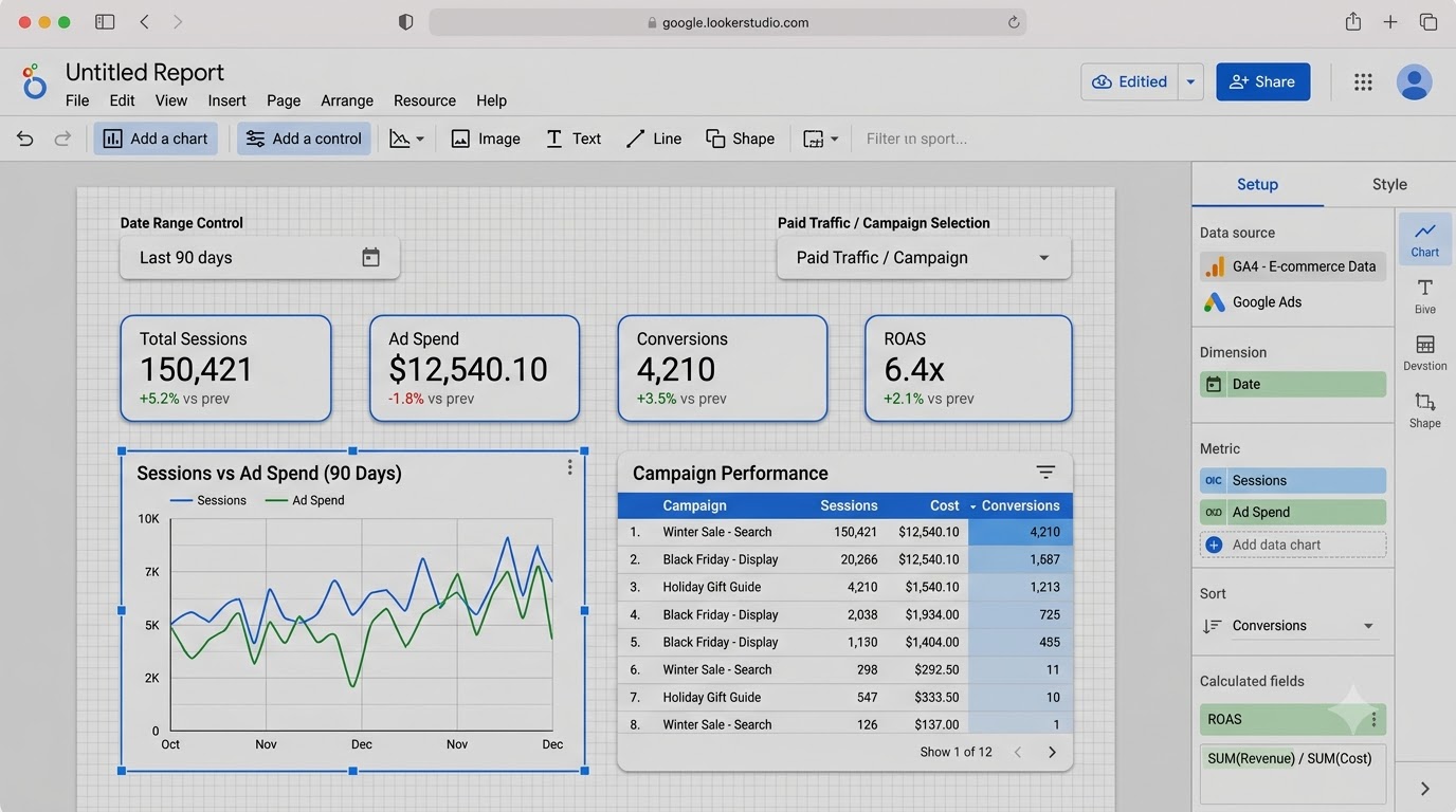
A layout that works well for most marketing dashboards places big-number scorecards (total sessions, total spend, total conversions) across the top row, a trend chart showing performance over time in the middle, and a breakdown table or bar chart at the bottom showing which channel or campaign drove the results. This top-to-bottom flow, summary first, trend second, detail last, matches how people actually read a page: broad numbers first, then digging deeper only if something looks off.
Skipping this planning step is the single biggest reason first dashboards look like a wall of disconnected charts instead of a clean report. Ten minutes with a notepad before opening Looker Studio saves an hour of rearranging charts later.
Adding Scorecards, Time Series, and Bar Charts
Scorecards are the big single-number tiles at the top of most dashboards, and they’re built by clicking “Add a chart,” selecting Scorecard, then choosing a single metric like Sessions or Conversions in the Setup tab. Add a comparison date range in the same panel, and Looker Studio automatically shows the percentage change versus the previous period, which instantly gives context that a bare number can’t.
Time series charts are the workhorse for showing trends, like daily website sessions over the past 90 days. Select the chart type, set the date dimension on the X-axis, and add one or more metrics as lines. This is also where blended data from the previous section really shines: overlaying paid traffic against organic traffic on the same line chart shows the relationship between spend and results at a glance.
Bar charts and tables handle the breakdown work, showing performance by category: sessions by traffic source, spend by campaign, conversions by landing page. Choose a bar chart when the comparison is visual and there are fewer than ten categories, and a table when there are more categories or when exact numbers matter more than the shape of the comparison. Mixing the two randomly across a dashboard usually just adds visual noise without adding clarity.
Adding Date Range Controls and Filters
A static dashboard showing only “last 30 days” is far less useful than one where anyone viewing it can pick their own date range. Adding a Date Range Control from the “Add a control” menu places a small calendar picker on the report that every chart on the page automatically responds to, as long as those charts are set to use the default date range rather than a fixed one.
Filter Controls work similarly but let viewers narrow down by dimension instead of date, like filtering the whole dashboard down to just one campaign or one traffic source. This turns a single report into dozens of possible views without building a separate page for each one.
The mistake beginners make most often here is locking a date range directly inside individual charts instead of relying on the global control. When that happens, some charts respond to the date picker and others stubbornly don’t, and it looks broken even though nothing technically is. Keeping every chart set to inherit the report-level date range, rather than a custom one, keeps the whole dashboard behaving consistently.
Creating Calculated Fields for Metrics That Don’t Exist Yet
Sometimes the exact metric needed for a dashboard doesn’t exist natively in the connected data. Return on ad spend, for example, isn’t a built-in GA4 or Ads metric by default in every setup, it’s calculated by dividing revenue by cost. Looker Studio handles this through Calculated Fields, accessed by clicking “Add a field” inside a chart’s Setup tab or through the data source editor.
Building one is closer to writing a simple spreadsheet formula than actual code. Typing something like SUM(Revenue) / SUM(Cost) creates a new field called ROAS that behaves exactly like any other metric, and it can be dropped into scorecards, tables, or charts anywhere in the report. Common calculated fields for marketing dashboards include conversion rate, cost per click, cost per conversion, and click-through rate, all built the same simple way.
The part that trips people up is field naming and data types. A calculated field built on a text field where Looker Studio expects a number will throw an error, and matching aggregation types (SUM versus AVG) matters more than it seems. Starting with simple two-field formulas before attempting anything more complex avoids most of the frustration here.
A Real Example: Building a Dashboard for a Small E-Commerce Brand
It helps to walk through what all of this looks like put together, so picture a small e-commerce brand running Google Ads alongside organic content, wanting one dashboard that shows whether the marketing spend is actually paying off. The starting point is the same as always: connect GA4 for the website, connect Google Ads for the campaigns, and connect a Google Sheet where the team manually logs monthly revenue targets.
The Overview page opens with four scorecards across the top: total sessions, total ad spend, total conversions, and a calculated ROAS field built from blended revenue and cost data. Underneath, a time series chart lines up sessions against ad spend over the trailing 90 days, making it visually obvious within a second whether traffic spikes are tied to ad pushes or organic momentum. At the bottom, a table breaks conversions down by campaign, sorted highest to lowest, so the best and worst performers sit at opposite ends without anyone needing to scroll or filter.
A second page, filtered specifically to paid traffic using a page-level filter control, gives the marketing lead a dedicated view for reviewing Ads performance without organic numbers muddying the picture. A date range control sits at the top of both pages, letting the same report answer “how did last week go” and “how did last quarter go” without building separate files for each.
What makes this dashboard actually get used, instead of ignored after the second week, comes down to restraint. There’s no attempt to show every metric GA4 and Ads offer. It answers three questions, spend, traffic, and results, clearly and quickly, and anything beyond that lives one click deeper on a dedicated page rather than crammed onto the main view. That’s the pattern worth copying for almost any marketing dashboard, regardless of industry or account size.
Looker Studio for Beginners: Designing a Dashboard People Actually Use
A dashboard that’s technically correct but visually exhausting doesn’t get opened twice. This section covers the design side, which honestly matters just as much as the technical setup, because a report nobody looks at isn’t actually doing its job no matter how accurate the numbers are.
Design here doesn’t mean anything fancy. It means removing friction between someone opening the report and understanding what it’s telling them.
Choosing Colors, Fonts, and Branding That Match Your Client or Company
Looker Studio applies a default theme automatically, and while it’s clean, it doesn’t say anything about who built the report. Under the Theme and Layout panel (found by clicking anywhere on the blank canvas), a range of built-in themes are available, or a fully custom one can be built by setting specific hex codes for background, text, and accent colors.
For a client-facing dashboard, matching the client’s actual brand colors makes a noticeable difference in how professional the whole thing feels. Pulling the exact hex codes from their logo or website and applying them consistently across every chart takes maybe ten minutes and changes the entire impression of the report. For an internal company dashboard, matching the company’s brand deck works the same way.
The mistake worth avoiding is using too many colors across too many charts. A dashboard with one accent color used consistently for “good” trends and a second for “bad” or “spend” reads far more clearly than one where every chart has its own random palette. Consistency does more visual work than variety ever will on a data dashboard.
Font choice matters more than it gets credit for too. Looker Studio defaults to a standard sans-serif, and for most dashboards there’s no reason to change it beyond adjusting size. Scorecards work best with large, bold numbers, usually 28 to 36 point, since the whole point of a scorecard is that the number registers before anyone reads a label. Body text and chart labels sitting at 10 to 12 point keeps supporting details readable without competing for attention against the headline figures.
Organizing Multiple Pages and Navigation
Once a dashboard grows past one screen’s worth of charts, it’s time to split it into pages rather than scrolling endlessly. Looker Studio supports multiple pages through the “Page” menu at the top, each with its own layout, and a navigation menu that appears automatically on the left side of the report when viewed.
A typical marketing dashboard splits nicely into an Overview page (the top-level scorecards and trend), a Traffic page (source and channel breakdowns), and a Campaigns page (Ads-specific performance). Structuring it this way keeps each individual page focused on one type of question instead of trying to answer everything at once on a single overloaded screen.
Page-level filters are worth knowing about too: a filter control can be set to apply only to the page it’s placed on rather than the entire report, which is useful when different pages need different default views, like a Campaigns page defaulting to “Paid” traffic only while the Overview page shows everything.
The Most Common Mistakes Beginners Make on Their First Dashboard
The single biggest mistake is cramming too many charts onto one page because every metric feels important. It never all is. A dashboard trying to show forty metrics on one screen ends up showing none of them clearly. Cutting down to the five or six numbers that actually drive decisions is harder than adding more charts, but it’s the difference between a report people use and one they open once and forget.
The second common mistake is inconsistent date ranges across charts, covered earlier, which makes a dashboard feel unreliable even when the underlying numbers are fine. The third is skipping context entirely: a scorecard showing “12,400 sessions” means nothing without a comparison. Is that good? Bad? Up or down from last month? Every top-line number needs a comparison period attached, or it’s just a number floating with no meaning.
A fourth mistake worth naming: building the entire dashboard, then never revisiting it. Marketing priorities shift, campaigns end, new channels get added. A dashboard built once and left untouched for a year almost always ends up half-relevant, still showing metrics nobody cares about anymore while missing the ones that matter now. Treat it as a living document, not a one-time project.
For anyone weighing Looker Studio against other reporting tools before committing to it, the comparisons and breakdowns over on the tools hub are worth a look, since the right choice often depends on team size and how much the dashboard needs to scale.
A fifth mistake, smaller but still common: ignoring mobile and tablet viewing entirely. Plenty of managers and clients check dashboards from their phone between meetings, and a report built only with a wide desktop layout in mind can look cramped or cut off on a smaller screen. Looker Studio doesn’t auto-adjust layouts the way a responsive website does, so it’s worth previewing the report at a narrower width at least once before sharing it widely, adjusting chart sizes if key numbers end up squeezed or hidden.
Sharing and Automating Your Looker Studio for Beginners Marketing Dashboard
A dashboard sitting unshared inside a Google account isn’t doing anyone any good. This last section covers getting it in front of the people who need it, on a schedule, without manual work every single week.
Sharing Settings and Permission Levels
Looker Studio’s sharing works the same way Google Docs or Sheets does, which makes it familiar fast. Clicking “Share” in the top-right corner opens options to add specific people by email, generate a shareable link, or restrict access entirely to specific domains. Two permission levels matter most: Viewer, which lets someone see the report but not touch it, and Editor, which allows full editing access.
For client-facing dashboards, Viewer access via a shareable link is almost always the right call. It means the client sees live, always-current numbers without any risk of accidentally deleting a chart or breaking a filter. For internal team dashboards where multiple people need to build or adjust the report together, Editor access makes sense for the core team, with Viewer links going out to broader stakeholders.
One setting worth double-checking before sending any link externally: whether the underlying data sources themselves are shared. A viewer can sometimes see a report but hit “access denied” errors on individual charts if the connected data source, like a specific GA4 property, wasn’t shared with their account. Managing data source sharing separately from report sharing is a step beginners frequently miss.
Scheduling Automatic Email Delivery
Rather than relying on people to remember to check a dashboard, Looker Studio can email a snapshot of the report on a set schedule. Under the Share menu, “Schedule email delivery” opens options for frequency (daily, weekly, monthly), specific recipients, and even which pages of a multi-page report to include.
This single feature replaces an enormous amount of manual reporting work. A weekly Monday morning email showing last week’s traffic, spend, and conversions, delivered automatically to a manager or client inbox, means the reporting habit happens whether or not anyone remembers to log in and check. The email arrives as a PDF snapshot, so recipients don’t even need a Google account to view it, which solves the access problem for clients who aren’t comfortable clicking into a live dashboard link.
Setting the delivery time thoughtfully matters more than it seems. A report scheduled to send at midnight often captures an incomplete day of data depending on data source refresh timing, especially with GA4 and Ads, which don’t update instantly. Scheduling delivery a few hours into the morning gives the connected sources time to finish their overnight refresh first.
Saving Your Dashboard as a Reusable Template
Building one solid marketing dashboard is useful once. Turning it into a reusable template is useful forever. Once a dashboard’s structure, layout, and calculated fields are dialed in, using “File” then “Make a copy” creates a duplicate that can be reconnected to a completely different data source, like a new client’s GA4 property, in minutes instead of rebuilding from scratch.
This is exactly how agencies and freelancers scale reporting across multiple clients without multiplying their workload. Build the ideal marketing dashboard once, with placeholder data sources, then for every new account, copy the template and swap the connections. The chart layout, the calculated fields, the color scheme, all of it carries over instantly.
For anyone learning this as part of a broader digital marketing skill set, this templating habit is worth building early. Reporting is a recurring task in almost every marketing role, and having a polished, reusable dashboard framework ready to go saves hours every single month, whether managing one brand or fifteen client accounts.
Looker Studio for Beginners: Tips That Separate a Decent Dashboard From a Great One
Everything covered so far gets a marketing dashboard from blank canvas to fully functional. This section is for the stretch after that, the small habits and features that turn a working dashboard into one that genuinely holds up under real use, week after week, across multiple accounts. None of these are complicated, but they’re the details most beginner tutorials skip entirely.
Speeding Up Slow Reports With Extract Data Sources
A dashboard that takes eight or ten seconds to load every time someone opens it doesn’t feel broken exactly, but it feels sluggish, and sluggish reports get opened less often. The usual cause is a “live connection” data source, one that queries Google Analytics or Ads fresh every single time the report renders instead of working off a cached snapshot.
Looker Studio’s fix for this is the Extract Data Source connector. Instead of connecting live, it pulls a defined slice of data, say the last 90 days of GA4 sessions, into a static extract that refreshes on a schedule rather than on every page load. Reports built on extracts often load noticeably faster, sometimes cutting load time by more than half on data-heavy dashboards.
The tradeoff is real-time accuracy. An extract only refreshes when told to, either manually or on a schedule set in the extract’s configuration, so it’s not the right choice for anything that needs up-to-the-minute numbers. For a weekly or monthly marketing dashboard, where nobody needs live data down to the hour, extracts are almost always worth the small setup effort for the speed gain alone.
Using Community Visualizations for Charts Looker Studio Doesn’t Build Natively
The built-in chart library covers scorecards, bar charts, line charts, tables, pie charts, and a handful of others, which handles most marketing reporting needs. Occasionally, though, a specific visual, like a funnel chart showing drop-off through a conversion path, or a Sankey diagram tracking traffic flow between pages, isn’t available out of the box.
That’s where Community Visualizations come in. Accessible through the “Add a chart” menu under “Community visualizations and components,” this is a gallery of chart types built by outside developers and approved by Google, ranging from funnel charts to gauge charts to custom KPI cards. Adding one works the same way as any native chart: select it, connect a data source, map the fields, and style it.
Worth knowing before relying on one for a client dashboard: community visualizations are maintained by individual developers rather than Google directly, so support and long-term reliability vary. For anything mission-critical, sticking with native chart types is the safer long-term bet, but for a specific visual need that native charts genuinely can’t handle, the community gallery fills the gap well.
Managing Multiple Clients or Campaigns Without Rebuilding Every Time
Anyone handling more than one account eventually runs into the same question: how do you avoid rebuilding a dashboard from zero every time a new client or campaign comes in? The templating approach mentioned earlier, making a copy of a finished report, is part of the answer. The other part is organizing data sources so switching between accounts doesn’t turn into a mess.
A clean approach many freelancers and small agencies land on is naming data sources consistently, something like “ClientName – GA4” or “ClientName – Ads,” rather than leaving them with generic default names. When a Looker Studio account has thirty connected data sources and half of them are just labeled “Google Analytics,” finding the right one for a specific report becomes a genuine time sink.
For teams managing several dashboards at once, it’s also worth building one master “control” dashboard that shows a single high-level scorecard from every client or campaign on one page, with links out to each individual detailed dashboard. This gives a bird’s-eye view without opening ten separate reports every morning, and it’s a small setup investment that pays off fast once account count grows past three or four.
Bringing It All Together
Looker Studio for beginners isn’t really about learning a piece of software. It’s about learning how to turn scattered marketing numbers into something a person can actually understand and act on in a few seconds. The tool itself is free and genuinely simple once the core ideas click: connect a data source, build charts around a clear question, filter and blend where needed, and share it on a schedule instead of manually every week.
The dashboards that actually get used aren’t the ones with the most charts. They’re the ones built around a handful of numbers that matter, with clean design, consistent date ranges, and a sharing setup that puts the report in front of the right person without extra effort. That’s the whole skill, and it’s one that pays off in every marketing role from here forward, whether the goal is a personal portfolio project, a job interview talking point, or a live dashboard managing real client budgets.
Start small if the whole scope of this guide feels like a lot at once. Connect one data source, build three or four scorecards, get comfortable with the interface before adding filters and calculated fields. The dashboard doesn’t need to be perfect on the first attempt, it just needs to exist, because the second and third versions always come together faster once the basics click. Someone who wants to go further with structured, hands-on marketing training can look into the Alpha Marketer Foundation Program, which covers reporting alongside the rest of the marketing stack this kind of dashboard depends on.
Frequently Asked Questions
What is Looker Studio used for?
Looker Studio is used to turn raw marketing and business data into live, visual dashboards and reports. It connects directly to sources like Google Analytics, Google Ads, and Google Sheets, so charts update automatically instead of requiring manual data entry every reporting cycle.
Is Looker Studio free to use?
Yes, the core version of Looker Studio is completely free with a Google account, and it includes unlimited reports, most standard connectors, and full sharing and scheduling features. A paid tier called Looker Studio Pro exists for larger organizations that need enterprise admin controls, but beginners and most small businesses never need to pay anything.
Do I need coding skills to use Looker Studio?
No coding is required for the vast majority of Looker Studio’s features, including connecting data sources, building charts, and applying filters. The only place formulas come in is Calculated Fields, and those use simple spreadsheet-style syntax rather than actual programming.
What is the difference between Looker Studio and Looker, the enterprise product?
Looker Studio is the free, self-serve reporting tool most marketers use, while Looker is a separate, more advanced enterprise business intelligence platform built for large-scale data modeling and governance. They share a name after Google’s rebrand, but Looker Studio remains a distinct, simpler product aimed at everyday reporting needs.
Can I connect Looker Studio to Google Analytics 4?
Yes, Looker Studio has a native Google Analytics 4 connector that pulls metrics like sessions, users, engagement rate, and conversions directly into reports. Connecting it takes a few clicks: search for the connector, sign in, and select the correct GA4 property from the list.
How many data sources can I blend in one Looker Studio chart?
Looker Studio allows blending up to five different data sources into a single chart, joined together on a shared dimension like date. In practice, most marketing dashboards blend two or three sources at a time, such as Analytics and Ads, to keep the join logic clean and easy to troubleshoot.
Is Looker Studio better than Google Sheets for reporting?
For live, recurring reporting, Looker Studio is generally the better choice because it connects directly to data sources and updates automatically, while Sheets requires manual refreshing or complex formulas. Sheets still has its place for quick, one-off calculations or as a manual data source feeding into a larger Looker Studio dashboard.
How do I share a Looker Studio dashboard with a client who doesn’t have a Google account?
The easiest option is scheduling automatic email delivery, which sends a PDF snapshot of the report to any email address without requiring the recipient to log into Google or click a shared link. Alternatively, changing link sharing settings to “Anyone with the link” allows viewing without a Google sign-in, though this offers less control over who accesses it.
Why does my Looker Studio report show “No data available”?
This usually happens for one of three reasons: the connected data source doesn’t have data for the selected date range, the field types in a calculated field or blend don’t match correctly, or the viewer doesn’t have permission to access the underlying data source even though they can see the report. Checking the date range first, then permissions, resolves most cases.
How often does Looker Studio refresh data?
Refresh timing depends on the connector: Google Sheets and most direct connectors refresh roughly every 15 minutes to an hour by default, while Google Analytics and Google Ads typically refresh every 4 to 12 hours due to how those platforms process their own data. Reports can also be manually refreshed at any time by clicking the refresh icon in the toolbar.
Can I use Looker Studio for a personal or small business dashboard, or is it only for agencies?
Looker Studio works just as well for a solo freelancer or small business owner tracking their own website and ad performance as it does for a large agency managing dozens of client accounts. The setup process, connectors, and features are identical regardless of scale, and the free tier has no meaningful limits for a single-business use case.
What happens if I delete a data source that’s connected to a live report?
Any chart relying on that data source will immediately break and show an error, since Looker Studio doesn’t store historical data independently of the live connection. Before deleting or disconnecting a data source, it’s worth checking which reports depend on it through the data source management panel to avoid breaking a dashboard someone else relies on.
Can Looker Studio connect to platforms outside Google, like Facebook Ads or Shopify?
Yes, though not natively for every platform. Google’s own connectors cover Google properties directly, but a large marketplace of third-party and community connectors extends Looker Studio to non-Google platforms like Facebook Ads, Shopify, HubSpot, and dozens more, some free and some requiring a paid subscription. These are found and added through the “Add data” panel by searching the connector gallery rather than the default Google connector list.
How long does it take to learn Looker Studio as a complete beginner?
Someone comfortable with spreadsheets and basic marketing metrics can typically build a functional first dashboard within a single afternoon, and reach genuine comfort with the tool, including blending and calculated fields, within a week or two of regular use. The learning curve is gentler than most BI tools because the drag-and-drop interface mirrors tools like Google Slides more than it resembles anything resembling code.
Is Looker Studio the same as Data Studio?
Yes, Looker Studio is the current name for what used to be called Google Data Studio, following Google’s 2022 rebrand. The tool, its features, and its free pricing stayed essentially the same; only the name and some backend branding changed.