

Most people think they need a designer to make a poster look decent. Or Photoshop skills they don’t have time to learn. That’s just not true anymore, and honestly, it hasn’t been true for years. A shop owner in Indore selling sarees can make a Diwali sale poster that looks better than what some agencies were charging fifteen thousand rupees for back in 2018. A college student can build a resume that gets shortlisted before the HR even opens the PDF properly. The tool that made this happen is Canva, and if you’ve never opened it before, or opened it once and got confused by all the panels and buttons, this is going to walk you through it properly. Not just clicking around. Actually understanding what you’re doing and why. By the end of this, you’ll have made a social post, a flyer, and a business card, and you’ll know enough about design basics that your next ten designs look consistent instead of random.
What Is Canva and Why It’s the Right Starting Point for Beginners
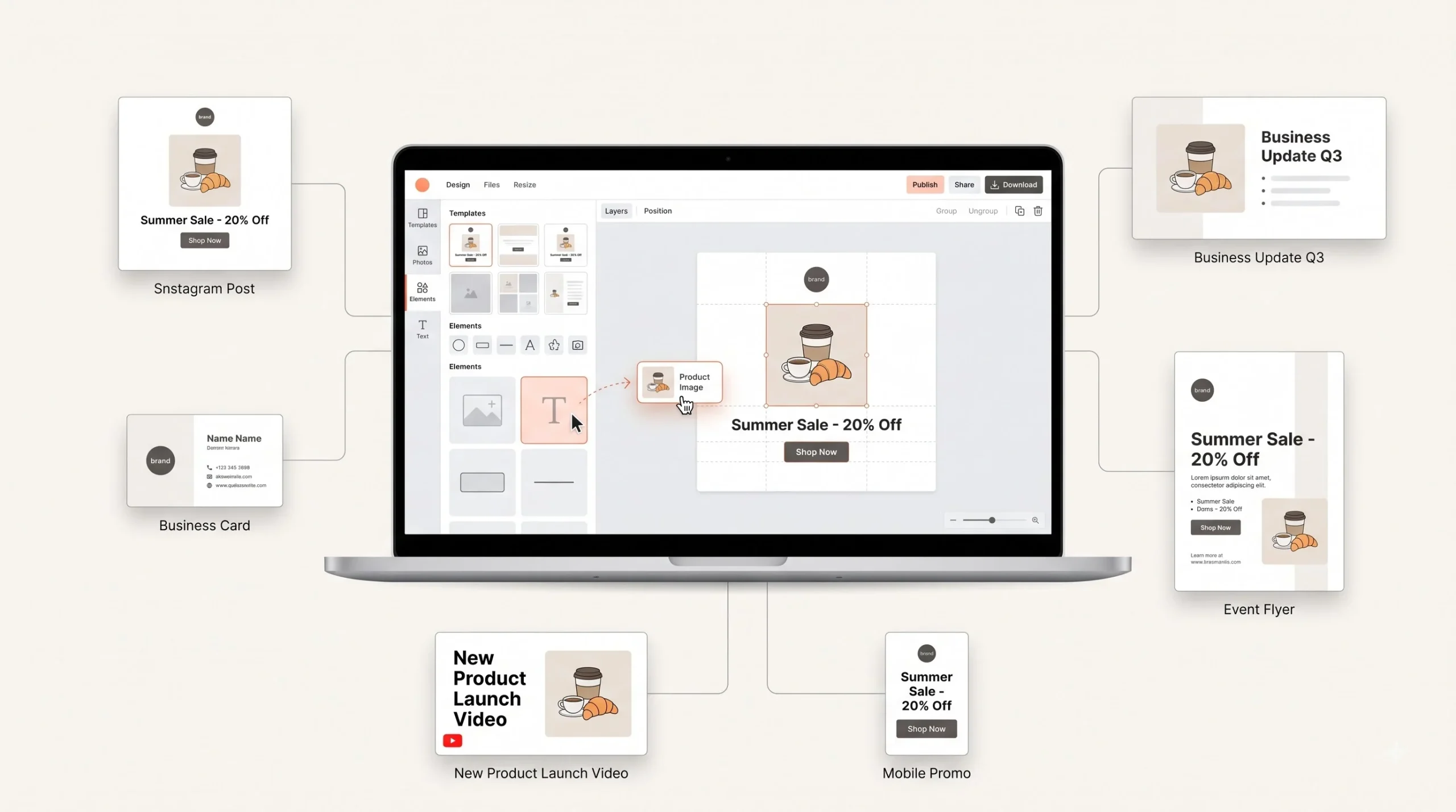
Canva is a drag-and-drop design tool that runs in your browser and also as an app. No installation headaches, no learning a menu system that takes six months to get comfortable with. You open it, you pick a size, you start dragging things onto a page. That’s the entire learning curve, more or less.
It wasn’t built for professional designers who already know Illustrator and Photoshop inside out. It was built for the person who needs a poster by tomorrow morning and doesn’t have three thousand rupees to pay someone else to make it. Small business owners. Marketing folks juggling five different platforms. Students freelancing on the side. Shop owners in Tier-2 and Tier-3 cities who used to just skip visual marketing altogether because hiring a designer felt like overkill for one Instagram post.
Here’s the thing though, and most beginner guides won’t tell you this straight up: Canva is not the tool for everything. If you’re building a full brand identity from scratch, logo, typography system, the whole thing, Canva is going to feel limited fast. It’s also not great for heavy print production work where color accuracy down to the exact Pantone shade matters, like packaging for a product that’s going into thousands of retail stores. And it’s not built for detailed illustration work either. Canva is what you use once your brand already has a face. It’s the daily driver for turning that identity into actual content, not the tool that builds the identity in the first place.
Canva isn’t a replacement for a brand designer building your identity from scratch. It’s the tool you use once that identity exists, to produce daily marketing material fast.
Where it genuinely shines: Instagram and Facebook posts, flyers, presentations, resumes, business cards, YouTube thumbnails, WhatsApp status ads, basically anything that needs to look clean and go out the door quickly without a design team behind it.
Think about what changed for a small business owner over the last decade. Ten years ago, if a boutique in Jaipur wanted a Diwali sale poster, the options were: hire a local designer and wait two days, or skip the poster entirely and just tell regular customers by word of mouth. Now the owner opens Canva on a phone between customers, picks a festive template, swaps in the shop’s colors, adds the discount percentage, and it’s ready to post before the chai gets cold. That speed is the entire point. It’s not that Canva makes better design decisions than a trained designer would. It doesn’t. It’s that it makes decent design accessible to someone who has zero design training and fifteen minutes to spare, and for a huge chunk of everyday marketing needs, decent and fast beats perfect and slow.
There’s also a psychological shift worth naming here. A lot of beginners avoid visual marketing altogether because they’re scared of doing it wrong, of putting out something that looks embarrassing. Canva lowers that fear because the templates already have working structure baked in. You’re not staring at a blank page wondering where to even start. You’re adjusting something that already looks like a finished product, which makes the whole process feel less intimidating and a lot more likely to actually get done.
Canva Free vs Canva Pro: What Beginners Actually Need
Everyone asks this in the first five minutes. Do I need to pay, or is free enough? The honest answer depends on what you’re making and how often.
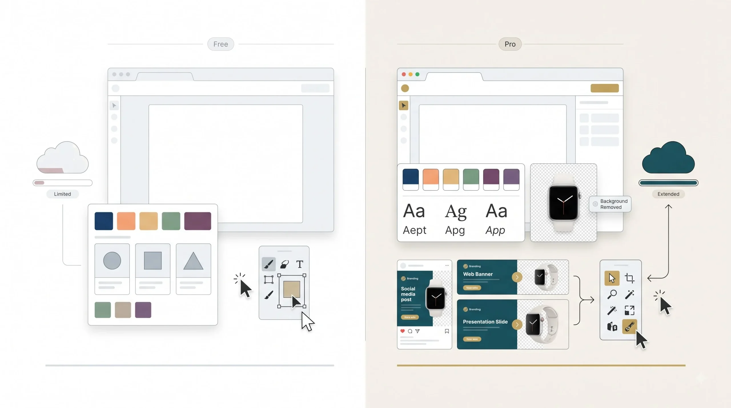
The free version gives you a solid chunk of templates, basic elements, and enough tools to make something that looks professional. What it doesn’t give you is the background remover, which honestly is one of the most useful tools in the entire platform once you start working with product photos or portrait shots that need a clean background. Free also limits your Brand Kit to one, which is fine if you’re working on one business, but becomes a problem fast if you’re a freelancer juggling multiple clients. Magic Resize, the feature that takes one design and reformats it into ten different sizes automatically, is locked behind Pro too. That one alone saves hours if you’re pushing the same campaign across Instagram, Facebook, and a print flyer.
Storage is another quiet difference. Free gives you 5GB, which sounds like a lot until you’re uploading high-res product shots and video content regularly.
| Feature | Free | Pro |
|---|---|---|
| Templates | Limited selection | 100+ million, including premium |
| Background remover | Not available | Available |
| Brand Kit | 1 kit, limited slots | Multiple kits |
| Magic Resize | Not available | Available |
| Storage | 5GB | 1TB |
| Stock photos/videos | Limited free library | Full premium library |
If you’re making the occasional post for your own small business, free will get you through. If you’re doing this regularly, for multiple clients, or need consistent resizing across platforms, Pro pays for itself within the first couple of projects just from the time you save. Pricing changes often enough that it’s worth checking Canva’s own pricing page for the current India rate rather than trusting a number written months ago.
Here’s a way to actually decide instead of guessing. Ask yourself three things. Are you designing for more than one brand or client? If yes, the multiple Brand Kit slots alone make Pro worth it, because switching brand colors and fonts manually every time you jump between projects wastes real time and invites mistakes. Are you regularly working with product photos that need a clean background, jewellery on a plain backdrop, clothing shots for an online store? The background remover alone can save the cost of a basic photo editing tool. And are you pushing the same content across more than two platforms with different dimensions? If so, Magic Resize turns a fifteen-minute manual resizing job into a thirty-second click.
If none of those apply and you’re mostly making the occasional festival post or announcement for your own shop, don’t pay for Pro yet. Free covers that use case completely, and there’s no reason to spend money on features you won’t touch.
Getting Started: Setting Up Canva and Understanding the Interface
Signing up is nothing complicated, Google login or email, takes thirty seconds. The one thing worth doing properly is picking “Business” when it asks what you’re using Canva for during setup. This isn’t just a formality. It changes what templates and suggestions Canva shows you by default, so you’re not wading through wedding invitation templates when you’re trying to make a product ad.
Once you’re in, the interface looks busy at first. It’s not, once you know what each part does.
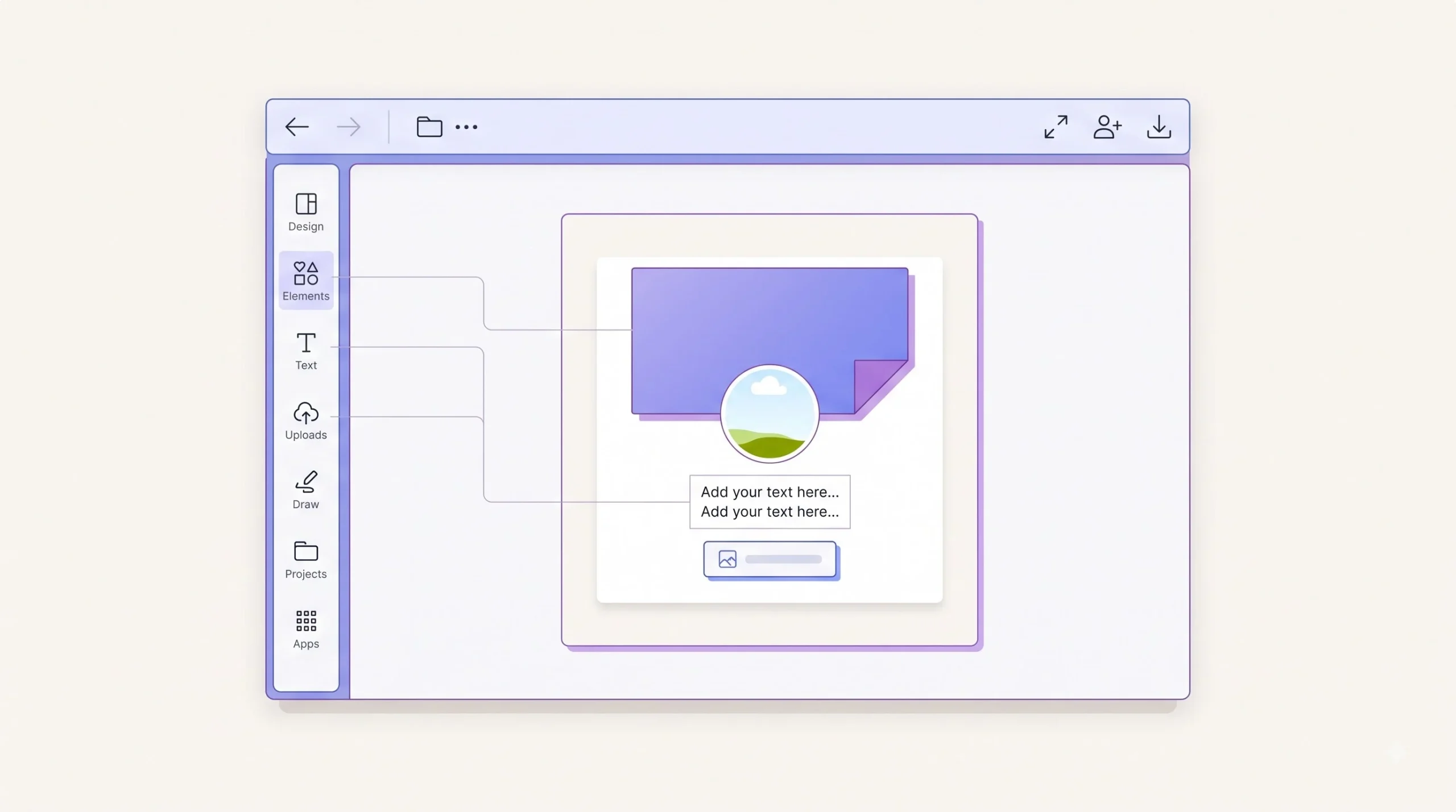
On the left, you’ve got your sidebar: Design (search templates), Elements (shapes, icons, illustrations, stickers), Text (headings, body text, font combos), Uploads (your own images and logos), Draw (freehand drawing, rarely used by beginners but there if you need it), Projects (your saved work), and Apps (integrations like QR code generators, stock photo services, and other add-ons).
The top toolbar has your Undo and Redo buttons, which you’ll use more than you’d expect, plus File, Resize (to change your canvas dimensions mid-project), Share, and Download.
The middle is your actual canvas, the blank or template-filled space where the design happens.
Two words trip up almost every beginner: frames and layers. A frame is basically a container, usually for images, that crops whatever you drop into it to fit a specific shape. Drag a photo into a circle frame and it automatically crops to that circle. Layers refer to stacking order, what’s sitting on top of what. If your text disappears behind an image, it’s a layer problem, not a bug. Right-click any element and you’ll find options to bring it forward or send it backward.
| Panel | What It Does | When You’ll Use It |
|---|---|---|
| Design | Search and browse templates | Starting a new project |
| Elements | Shapes, icons, stickers, illustrations | Adding visual detail |
| Text | Pre-styled text boxes and font pairs | Adding headlines and body copy |
| Uploads | Your own photos, logos, videos | Bringing in brand assets |
| Draw | Freehand sketching tool | Rarely, for handwritten touches |
| Apps | QR codes, stock content, integrations | Adding functional extras |
Design Fundamentals Every Beginner Needs Before Opening a Template
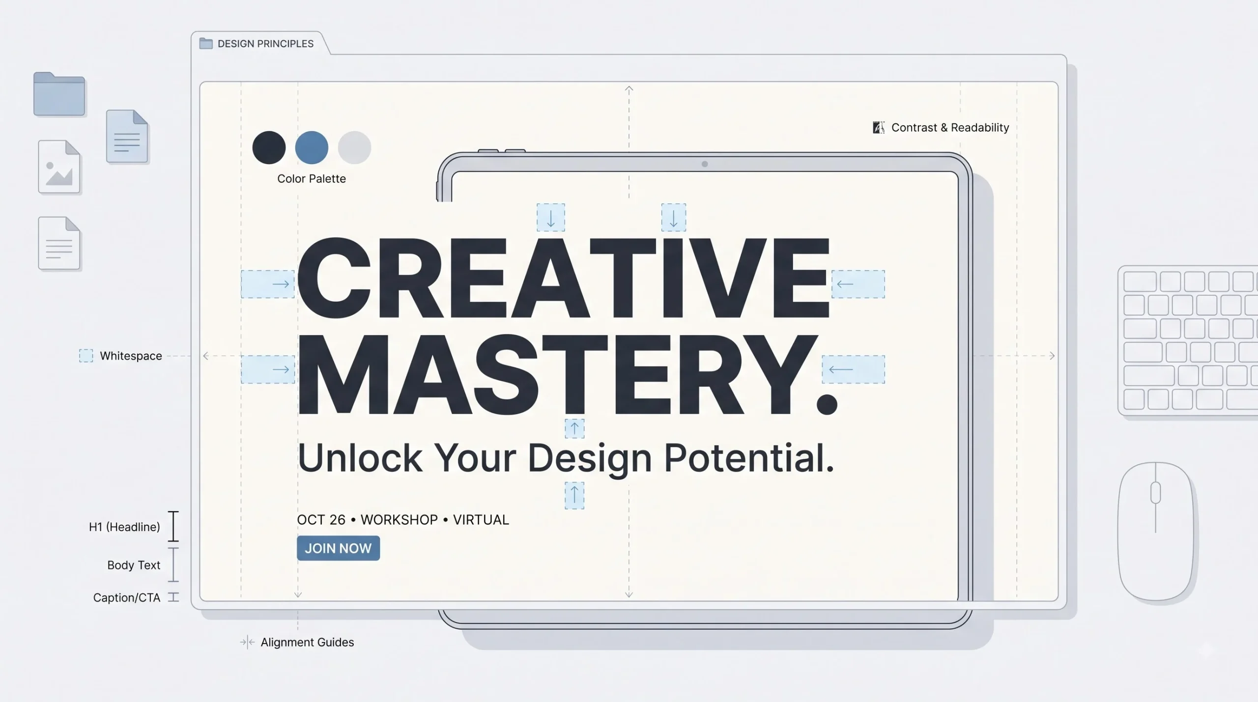
This is the part most Canva tutorials skip completely, and it’s exactly why so many Canva designs look, well, like Canva designs. Knowing where the buttons are doesn’t make your poster look good. Understanding a handful of design basics does.
Start with color. You don’t need a color theory degree, but you do need to know that two or three colors max is almost always the right call for marketing material. Beginners tend to throw in every color they like, and the result looks chaotic instead of intentional. Color also carries mood, and this matters more in Indian marketing than people give it credit for. A jewellery brand leaning into gold and deep maroon is signaling heritage and trust. A D2C skincare brand going with soft pastels and white space is signaling clean, modern, premium. A kirana store flyer in bright red and yellow is signaling urgency, a sale happening right now. None of this is random. Pick your colors based on what feeling you’re trying to create, not just what looks nice to you personally.
Typography works the same way. Pair one heading font with one body font, and stop there. The moment you go past two fonts, even someone with zero design training can sense something’s off, even if they can’t explain why. Readability matters just as much as style, and here’s something specific to keep in mind for Indian audiences: most of your marketing material is going to be viewed on a phone screen first, not a desktop monitor. That thin, elegant script font might look gorgeous on your laptop and turn into an unreadable smudge on a five-inch screen.
Hierarchy is about controlling what the eye sees first, second, and third. Your headline should be the biggest, boldest thing on the page. Supporting details come next, smaller and quieter. Fine print or contact details come last. If everything on your poster is the same size, the reader doesn’t know where to look, and their eyes just slide right off it.
Whitespace, the empty space around your elements, is the single biggest thing beginners get wrong. There’s this instinct to fill every inch of the page because empty space feels like wasted space. It’s the opposite. Cramming everything in makes a design look cheap and hard to read. Space is what makes the important stuff stand out.
And alignment. Elements with edges that line up, text boxes that sit on a consistent grid, that’s what separates a design that looks put-together from one that looks slapped together in five minutes. Canva actually shows you alignment guides automatically when you drag things around, little pink lines that pop up. Use them.
If your design has more than 3 fonts or more than 3 colors, a beginner eye can already tell something’s off, even if they can’t say why.
There’s one more piece worth mentioning, and it’s contrast. Not color contrast for mood, but literal readability contrast between your text and whatever’s behind it. Light gray text on a white background, or dark blue text on a black photo, might look fine on a bright laptop screen in an air-conditioned room. Try reading that same combination on a phone screen in direct sunlight, which is exactly how a lot of Indian audiences are going to encounter your posts, standing at a bus stop or walking through a market. If you’re not sure whether your contrast holds up, a simple test works: squint at your design, or shrink it down small on screen. If the text starts disappearing into the background, fix it before you post it, not after someone tells you they couldn’t read your offer.
None of these rules are about being a trained designer. They’re about training your eye to notice the same five or six things that separate a design that works from one that just sits there. Once you start noticing them, you can’t really unsee them, and that’s honestly the biggest shift that happens for most beginners somewhere around their tenth or twelfth design.
Setting Up Your Brand Kit in Canva (So Every Design Stays Consistent)
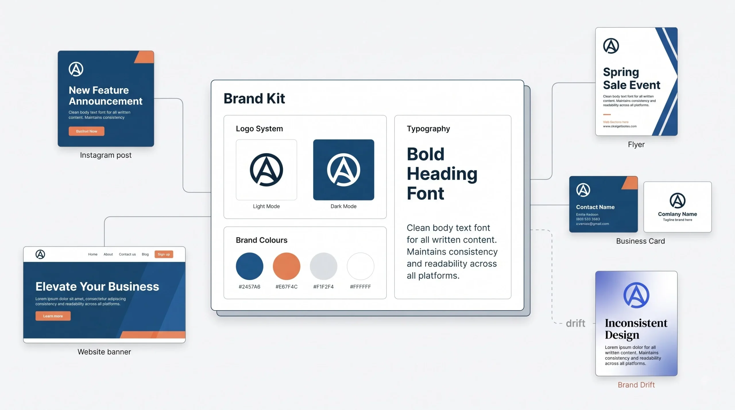
Skipping the Brand Kit is probably the most common mistake new Canva users make, and it’s an easy one to fix in ten minutes.
Head to Brand Kit in your sidebar and upload your logo, ideally both with and without a background so you’ve got flexibility depending on what you’re placing it over. Add your brand colors using their exact hex codes rather than eyeballing a similar shade every time, because “close enough” adds up to inconsistency across ten different posts. Set your brand fonts too, so you’re not hunting through hundreds of font options every single time you open a new design.
Why does this actually matter? Because recognition is built through repetition. If your Instagram posts, your flyers, and your business cards all use slightly different blues and different fonts, nobody’s brain is stitching those together as “the same business.” Consistency is what makes people recognize your content before they even read your name on it. This ties directly into whatever brand identity work you’ve already done, logo, color choices, fonts. Brand Kit in Canva is just the mechanism that keeps you from redoing that decision-making every single time you open a new project.
Once it’s set up, every new design pulls your brand colors and fonts automatically. You stop resetting from scratch and start actually designing faster.
A mistake worth flagging here, because it’s common: business owners who set up a Brand Kit once and then quietly drift away from it over time. Someone finds a template with a nice teal accent color, likes it more than their actual brand color, and uses it “just this once.” Then it happens again a week later with a different shade. Three months in, none of the posts actually match anymore, and the whole point of setting up a Brand Kit has quietly unraveled. If you genuinely want to change your brand colors, that’s a real decision, go ahead and update the Brand Kit itself so every future design reflects it. But don’t let individual designs drift color by color without anyone deciding that on purpose. Consistency isn’t a one-time setup step, it’s a habit you have to actually keep.
Choosing the Right Template and Size for Your Marketing Material
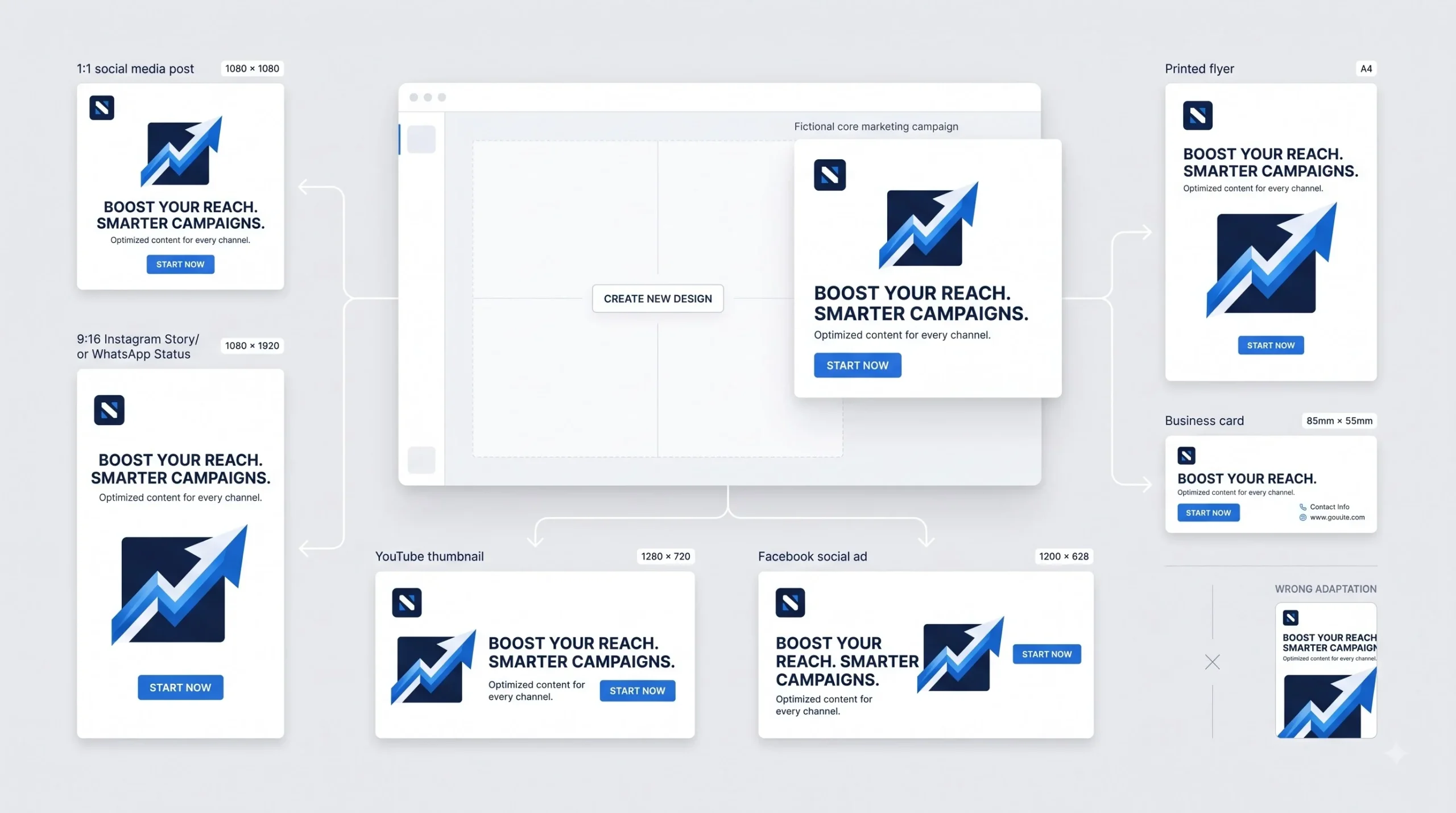
Size is the first decision you make, not the last one. Pick the wrong dimensions and you’ll be fighting the layout the entire time, or worse, exporting something that gets cropped weird when it’s actually posted.
Canva gives you a library of pre-set sizes for basically every platform, but you can also punch in custom dimensions if you need something specific, say for a banner that’s going on a shop’s shutter or a specific print size a local vendor asked for.
| Material Type | Platform | Recommended Size |
|---|---|---|
| Instagram Post | 1080 x 1080 px | |
| Instagram Story/Reel | 1080 x 1920 px | |
| Facebook Post | 1200 x 630 px | |
| YouTube Thumbnail | YouTube | 1280 x 720 px |
| A4 Flyer | 210 x 297 mm | |
| Business Card | 3.5 x 2 in | |
| Standard Poster | 18 x 24 in | |
| WhatsApp Status Ad | 1080 x 1920 px |
Notice something here. A square Instagram post and a vertical Instagram Story are not interchangeable, even though they’re both “Instagram.” Text that sits perfectly in a square gets awkwardly cropped in a 9:16 vertical frame. This is exactly the kind of thing Magic Resize handles for Pro users, but if you’re on free, just build each size as its own design from the start instead of stretching one to fit another.
Step-by-Step: Designing a Social Media Post in Canva
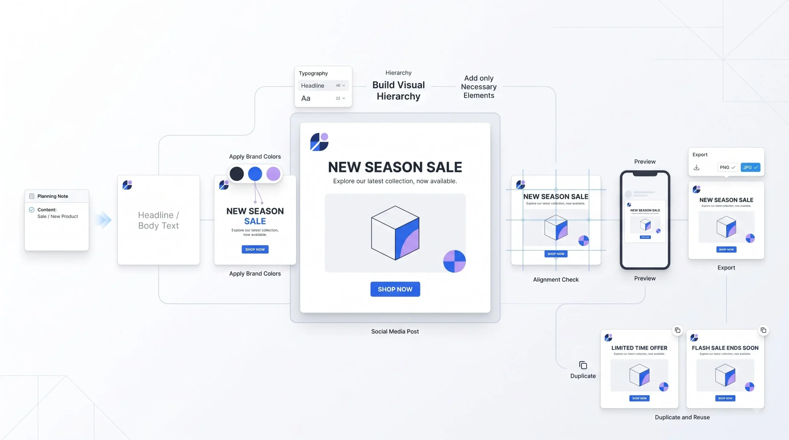
Time to actually make something. Open Canva, hit Create a Design, and choose Instagram Post, or type in your custom size if you’re going elsewhere.
You’ve got a choice here between starting with a template or a blank canvas. For a first-timer, start with a template. It’s easier to learn by adjusting something that already works than staring at a blank page wondering where to even begin.
Once you’ve picked a template, work through it in this order rather than jumping around randomly, because each step depends a bit on the one before it.
1. Lock the message before you touch the design.
Before you swap a single color, write down in one line what this post needs to say. A festival sale, a new product drop, a testimonial. Sounds obvious, but skipping this is exactly why beginners end up rearranging text boxes for twenty minutes without the post ever feeling finished. If you don’t know what the post is trying to say, no amount of fiddling with fonts fixes that.
2. Swap colors to match your Brand Kit.
Click on any shape or background element, and the color palette on the left will show your brand colors first if Brand Kit is set up. Do this before you touch text or images, because color sets the mood for everything you add after it, and it’s a lot easier to pick a headline color that works with your background than the other way round.
3. Change fonts to your brand fonts.
Click the text, and pick from your saved font pair instead of the template’s default. Do this early too, since font choice affects how much space your headline actually needs, and you don’t want to finalize your layout around a font you’re going to replace anyway.
4. Edit the text itself, with hierarchy in mind.
This is where most of the actual thinking happens. Your headline should be the boldest, biggest thing on the page, and it should be the one thing someone reads even if they only glance at the post for half a second. Supporting text sits below it, smaller, filling in the detail. Don’t just type over the placeholder text and call it done. Ask yourself what needs to grab attention first, second, and third, and size accordingly.
5. Add elements or icons only if the message genuinely needs them.
One or two supporting graphics, a small arrow, an icon representing free delivery, a decorative shape behind the headline, is usually plenty. Every extra element you add is competing for the same two seconds of attention as your headline. More isn’t more here.
6. Check alignment before you call it finished.
Right-click any element and use Align, or just watch for the pink guide lines Canva shows automatically while you’re dragging things around. Nothing sitting slightly off-center, nothing crowding an edge unintentionally. This step alone fixes a huge chunk of what makes a beginner design look unpolished.
7. Preview at actual size before exporting.
Zoom out to see the full canvas the way it’ll actually appear in someone’s feed, not zoomed in close where every detail looks bigger and clearer than it will on a phone screen.
8. Export in the right format.
For social posts, PNG is usually your best bet if there’s any transparency involved, otherwise JPG works fine and keeps the file size smaller, which matters if you’re uploading from a slower connection.
One thing beginners consistently get wrong at this stage: treating the caption and the design as two separate jobs that don’t talk to each other. If your design already says “50% Off This Weekend Only” in big bold letters, your caption doesn’t need to repeat that word for word. Use the caption to add what the image can’t, more context, a call to action, maybe the actual link or store timing. The design and the caption should feel like they’re finishing each other’s sentence, not saying the same thing twice.
It’s also worth building a habit of duplicating your finished post before you start your next one instead of building every single design from zero. Right-click the design in your Projects panel, hit duplicate, and you’ve got a starting point that already has your fonts, colors, and rough layout sorted. Swap the text and the image, adjust as needed, and what used to take twenty minutes now takes five. This is honestly how most people who post regularly on Canva actually work once they’re past the beginner stage, they’re rarely starting from a completely blank template every time.
Step-by-Step: Designing a Marketing Flyer or Brochure
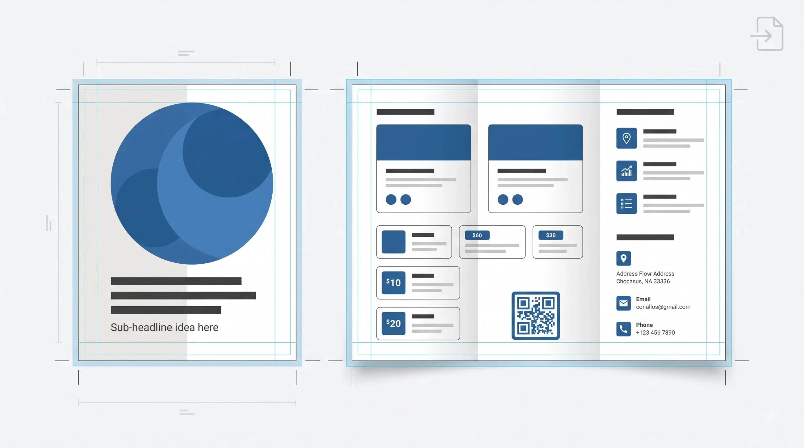
Flyers and brochures work a bit differently because there’s a real chance this is heading to a printer, not just a screen. That changes the order of operations a little.
1. Set the correct print size first.
A4 for most flyers in India. If you’re doing a multi-page brochure, Canva lets you add pages within the same design file, which keeps everything consistent instead of juggling five separate documents. Getting the size wrong at this stage means redoing layout work later, so don’t skip ahead to picking a template before this is locked.
2. Plan the reading order before you fill in content.
A trifold brochure has panels that get seen in a specific sequence, the cover first, then whatever’s opened next depending on the fold. Beginners sometimes design each panel as its own separate mini-poster without thinking about the sequence the reader actually experiences. Sketch out, even just mentally, what the reader sees first, second, and third as they open it. The cover panel’s job is to earn the open. It’s not the place to cram in your entire product list.
3. Build the cover or front panel first.
This is the panel doing the heaviest lifting, since it decides whether the flyer gets picked up and read at all or tossed aside. Keep it to one clear headline, one supporting line, and enough whitespace that it doesn’t compete with itself.
4. Fill in the inner panels or body content.
This is where the actual detail lives, product list, pricing, offer terms, service descriptions. Use consistent text sizing across repeated elements, if you’re listing five products, all five should follow the same font size and spacing pattern rather than each one being sized to fit however much text happens to be in it.
5. Add bleed and check margins.
Bleed is the extra bit of design that extends past the edge of the page, so when the printer trims it, you don’t end up with an accidental white sliver at the border. Canva’s print templates usually have this built in, but it’s worth checking before sending anything to a printer, especially if you’ve resized or repositioned elements near the edges.
6. Add a QR code if it’s relevant.
Canva has a native QR code tool built right into the Elements panel, which is genuinely underused. Add one linking to your website, your menu, your Instagram, whatever’s relevant, and it just works without needing a third-party generator.
7. Zoom to 100% and proofread the smallest text.
Check your smallest text is legible at the real size it’ll be printed at, not just at whatever zoom level you happened to be designing at. A phone number that reads fine when your screen is showing the design at 150% zoom can turn into a blur once it’s actually printed at A4 size and someone’s trying to read it from arm’s length.
8. Export as PDF Print, not PDF Standard.
Export settings matter a lot more here than for a social post.
For print in India, always export as PDF Print, not PDF Standard. Local printers often reject standard PDFs for bleed and color mismatch reasons.
This one trips up a lot of first-timers who then can’t figure out why their local print shop is rejecting the file or the colors come out looking washed out compared to what they saw on screen.
Step-by-Step: Designing a Business Card
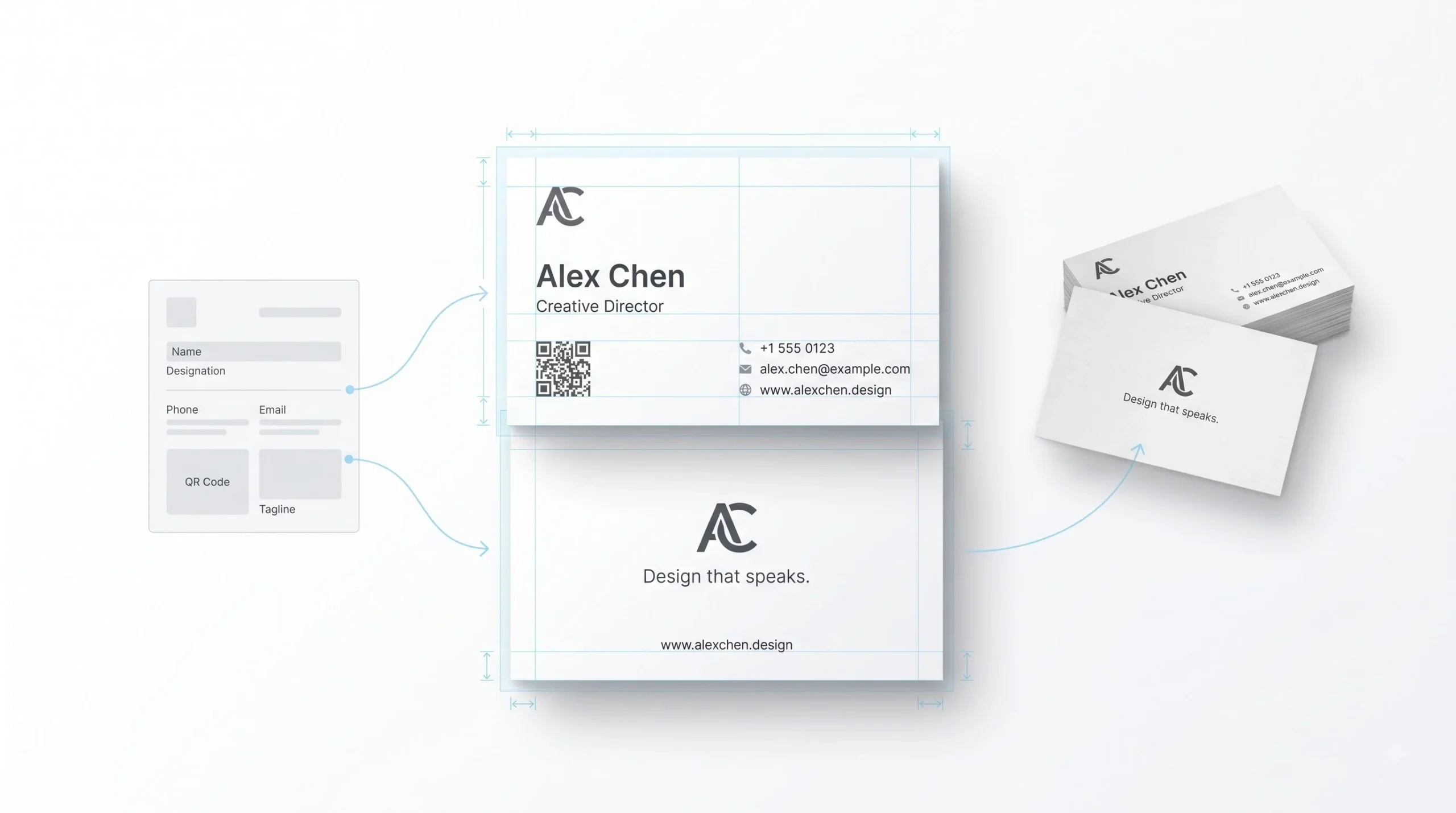
Business cards are small, which makes every decision on them louder. There’s no room to hide a bad layout choice on a 3.5 x 2 inch card, so each step here matters more than it would on a larger format.
1. Decide what actually needs to be on the card. Before opening a template, list out only the essentials: name, designation, one phone number, one email or a QR code, and maybe a tagline. Anything beyond that is a candidate for cutting. This decision, made before you start dragging elements around, saves you from the overcrowding trap almost every beginner falls into.
2. Set up front and back as two separate pages within the same file. Canva handles this cleanly, so there’s no need for two separate design files. Keep the front focused on identity and contact, and let the back carry secondary information if there’s anything left worth including.
3. Build the information hierarchy deliberately. Name first, biggest and boldest, since that’s what people are actually meant to remember. Designation right under it, smaller. Contact details below that, smaller still. Tagline or logo, if there’s room, sits wherever it doesn’t crowd the rest. Resist the urge to make everything the same size just because it all feels equally important, it isn’t.
4. Choose contrast that survives real lighting, not just your screen. Poor contrast, light gray text on a white card, is a classic mistake and it’s genuinely hard to read under normal indoor lighting, let alone in a dim restaurant or outdoors. Test your color choice against the actual background, not just how it looks in Canva’s preview.
5. Add the logo last, not first. A lot of beginners build the entire card around the logo’s placement and end up cramping the text to fit around it. Lay out your text hierarchy first, then find a spot for the logo that doesn’t fight the text for space, usually a corner or as a small watermark-style element in the background.
6. Double-check bleed before exporting. A business card’s edges are cut with a precision blade at scale in a print run, and even a millimeter of misalignment on a card this small is far more noticeable than it would be on a larger flyer. Make sure nothing important sits right at the trim edge.
7. Print a single test copy before ordering the full batch. Most local print vendors in India will run one test print for a small fee or sometimes free. Check the actual paper stock, the actual colors under real light, and the actual size in your hand before committing to five hundred copies that might need a reprint.
Think about how a business card actually gets used in real life. Someone hands it over at an event, or a client tucks it into their wallet after a meeting, and it sits there for weeks before it’s looked at again. In that moment, nobody is reading paragraph-length detail off a card. They’re glancing at it for maybe two seconds to remember who you are and how to call you back. Design for that two-second glance, not for the version of the reader who’s going to study every detail carefully. That’s also why a QR code linking to a fuller portfolio or website makes more sense than trying to squeeze your entire service list onto a card the size of your palm.
On the back of the card, resist the urge to just repeat the front. A tagline, a short list of core services, or even just your logo mark alone with breathing room around it, all work better than duplicating contact information on both sides.
Working With Text in Canva Like a Beginner Who Wants to Look Advanced
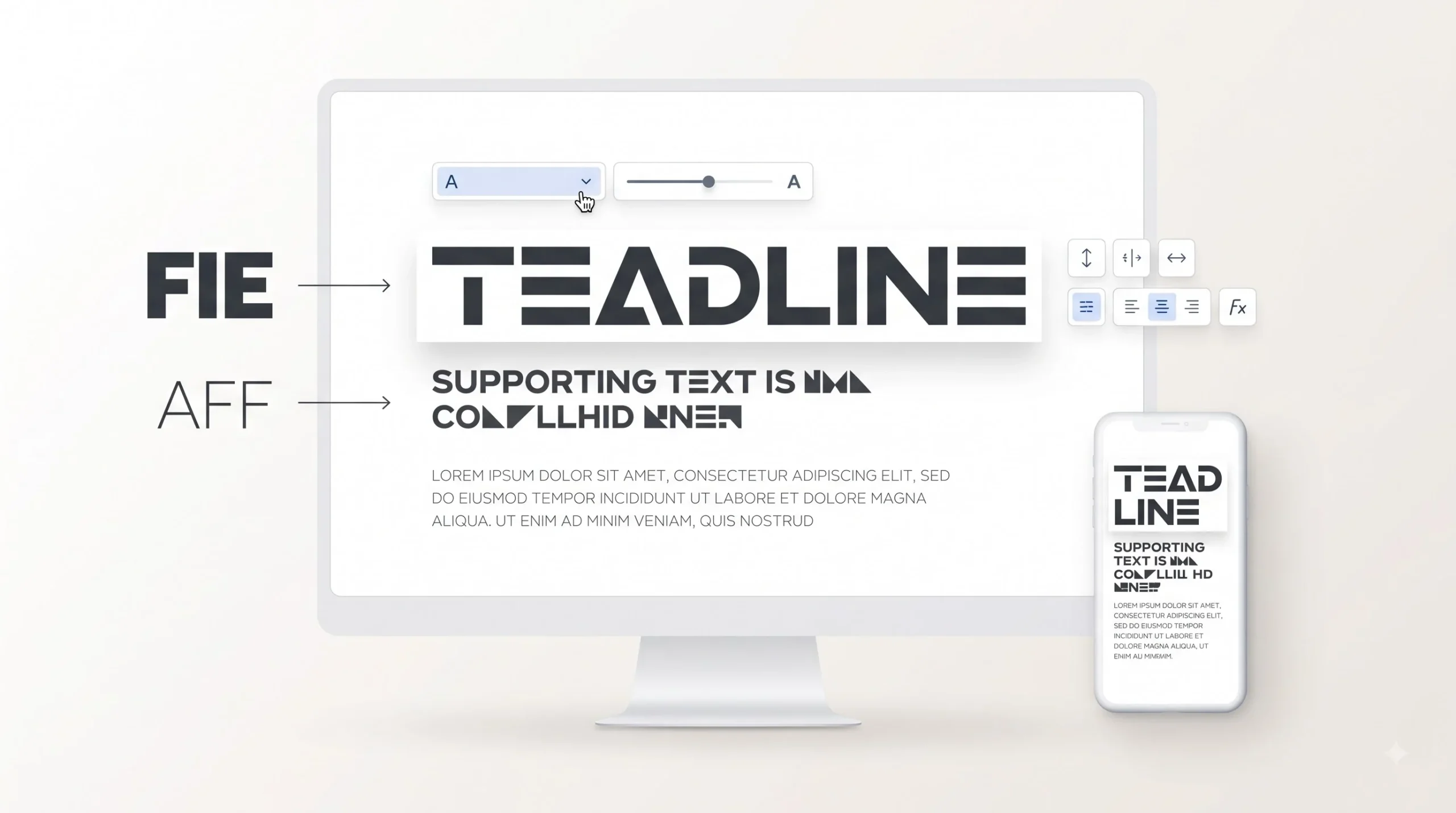
Canva’s font pairing tool is worth actually using instead of guessing. When you select a text box and browse font combos, Canva suggests pairs that are already tested to work well together, a heading font and a body font that complement rather than compete. This alone will save you from a lot of trial and error.
Text effects, shadow, curve, outline, exist and they can look sharp when used sparingly. The problem is beginners tend to apply three effects at once because each one individually looked cool in testing. A subtle shadow on a headline over a busy photo? Fine, it helps readability. A curved, outlined, shadowed font on every single text box in the design? That’s overkill, and it reads as amateur rather than polished.
Line spacing and letter spacing are small adjustments with a big payoff. Text that’s cramped together, lines sitting too close, is genuinely harder to read and feels rushed even if the content is good. Canva lets you adjust both under the text properties panel, and nudging line spacing up slightly almost always improves readability without changing anything else.
And again, since most of what you’re making is going to be viewed on a phone: size your text for a small screen, not your laptop monitor. What looks like a comfortable, readable size on a 15-inch screen can shrink down to nearly invisible on a phone. If you’re not sure, preview your design at actual size before finalizing.
Using Photos, Elements, and the Background Remover
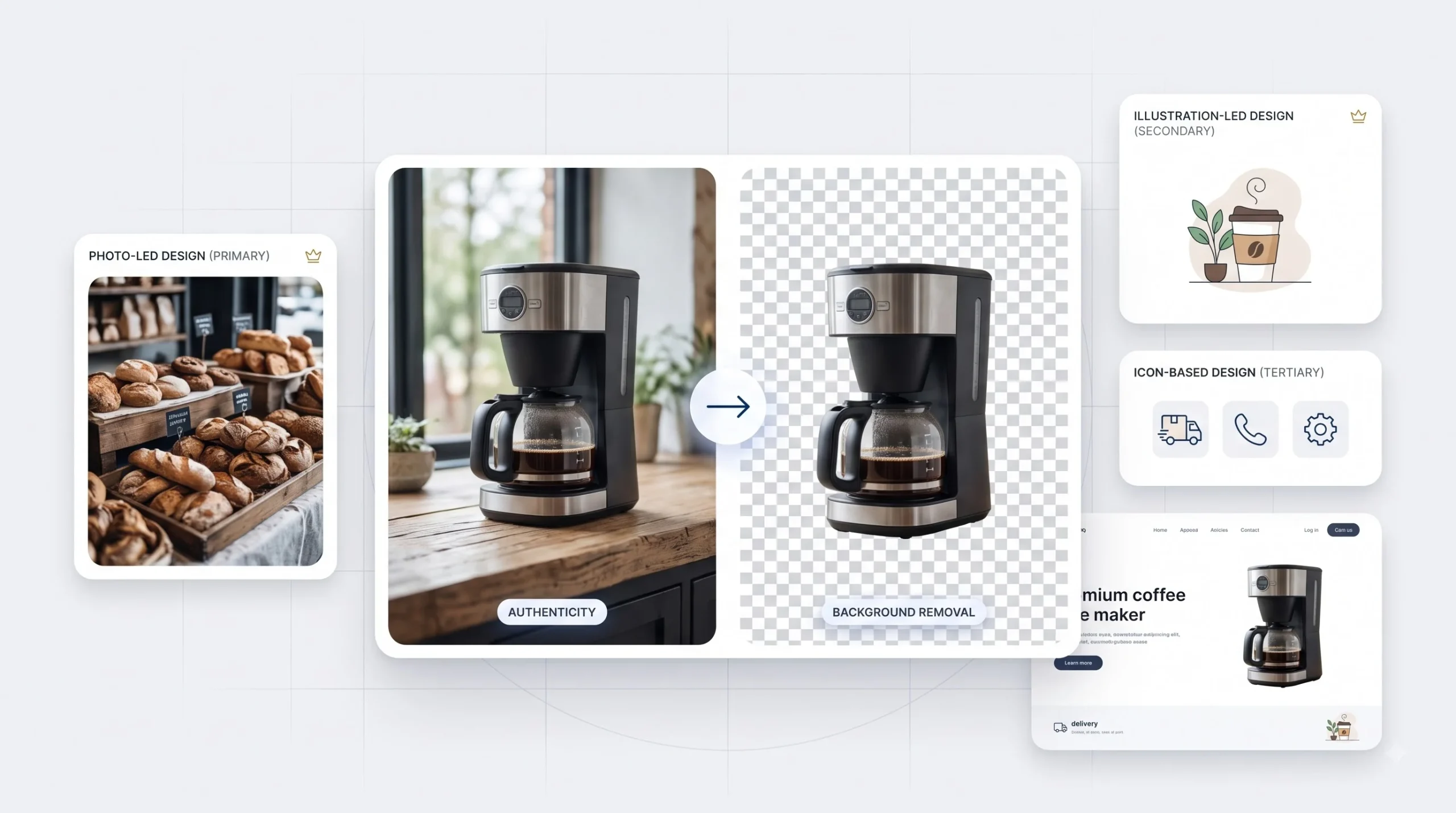
Canva’s stock photo library is large, and also, let’s be honest, a little overused across the internet. If you’ve spent any time scrolling Instagram, you’ve probably seen the exact same stock photo used by five different unrelated businesses. That’s the tradeoff with a free, massive library everyone has access to.
For small businesses specifically, using your own product photos or actual shop photos instead of stock images does more for trust and authenticity than a polished stock shot ever will. A slightly imperfect photo of your actual product beats a generic stock image of a similar-but-different product every time, because people can tell the difference even if they don’t consciously register it.
The background remover, a Pro feature, is one of the most genuinely useful tools in the platform. Upload a product photo, hit remove background, and it isolates the subject cleanly in seconds. This used to take real Photoshop skill and now takes one click.
For icons vs illustrations vs photos, think about the tone you’re going for. Icons work well for quick, functional information, delivery timing, contact methods, feature lists. Illustrations suit a friendlier, more casual brand tone. Photos work best when authenticity and realism matter, actual products, actual people, actual spaces.
One habit worth building early is not mixing these three too freely inside one single design. A poster that has a realistic product photo, a cartoonish illustration, and a flat line icon all sitting next to each other tends to look disjointed, because each style carries a different visual weight and a different level of realism. Pick one primary style per design, photo-led, or illustration-led, and use the other categories sparingly as small supporting details rather than competing focal points.
Also worth knowing, since it trips people up: not everything in Canva’s Elements library is free to use even on a paid plan without checking. Some illustrations and photos are marked with a small crown icon indicating premium content, and using those without a Pro subscription either blocks the download or adds a watermark. If you’re building for client work, it’s worth a quick glance at whether the assets you’ve used are premium, so you’re not caught off guard when a client on the free plan tries to duplicate the design and can’t access the same elements.
Avoiding the “Canva Look”: Making Templates Feel Like Your Own
Here’s something almost nobody talks about directly: using a template exactly as it comes, same layout, same default colors, same stock photo, is recognizable. People who scroll Instagram a lot can spot “that’s a Canva template” within a second or two, and it quietly undercuts trust in your brand, even if they can’t articulate why.
The fix isn’t complicated. Swap colors and fonts to your Brand Kit immediately, don’t wait until you’ve finished the whole design. Rearrange the elements instead of keeping the default layout exactly as it downloaded, move the headline, shift where the image sits, change the proportions slightly. And a trick that works well once you’ve made a few designs: take the best element from one template, say the layout structure, and combine it with the best element from another, maybe the color treatment. Mixing two templates’ strengths into one design almost always produces something that doesn’t look like either original template anymore.
Common Beginner Mistakes in Canva (and How to Fix Them)
| Mistake | Why It Hurts | Fix |
|---|---|---|
| Too many fonts | Looks unprofessional, breaks visual consistency | Stick to 2 fonts max |
| Ignoring Brand Kit | Inconsistent look across every design | Set it up once, reuse every time |
| Low-res uploaded images | Blurry, pixelated in print or large formats | Use 300 DPI images for print |
| Overcrowded design | Confuses the message, no clear focal point | Use whitespace deliberately |
| Wrong export format | Print rejections, poor social media quality | Match export format to the actual use case |
These aren’t rare mistakes. They’re the same five things showing up over and over in beginner work, and every single one of them is a five-minute fix once you know to look for it.
Canva’s AI Tools (Magic Studio) for Beginners
Canva has folded a set of AI tools under what it calls Magic Studio. Magic Write generates text content based on a prompt. Magic Eraser removes unwanted objects from a photo. Magic Resize reformats one design into multiple sizes automatically. Magic Media generates images from a text description.
The realistic take: these tools save real time on rough drafts and quick fixes. Magic Resize genuinely is a time-saver if you’re pushing the same campaign across five platforms. Magic Eraser is handy for cleaning up a stray object in a product photo without needing actual photo editing skills.
Where they fall short, especially for Indian marketing use cases, is anything requiring nuance or cultural specificity. Magic Write tends to produce generic copy that needs a real edit pass before it sounds like an actual person wrote it, let alone sounds like it understands the specific audience you’re talking to. Magic Media’s image generation is fine for abstract backgrounds or illustrations but isn’t reliable for anything that needs to look like a real product or a real place. Use these tools to speed up the boring parts. Keep doing the judgment calls, the actual copywriting, the final polish, yourself.
A practical way to think about it: treat Magic Write like a first draft machine, not a final draft machine. Ask it for a headline option and it’ll give you something usable as a starting point, maybe not the exact phrasing you’d land on, but enough to react to and improve. That’s genuinely faster than staring at a blank text box. Where it falls apart is tone. If your brand voice is casual and a bit cheeky, or specifically local in how it talks to a Tier-2 city audience, Magic Write’s default output tends to land somewhere generic and corporate-sounding, and you’ll end up rewriting most of it anyway. Which is fine, that’s still faster than starting from nothing, just don’t expect to copy-paste its output straight into a client-facing design without a real read-through.
Magic Eraser deserves a specific mention too because it’s quietly one of the more reliable tools in the set. Got a product photo with a stray price tag sticker still on it, or a random object in the background of an otherwise clean shot? Select it, hit erase, and it usually fills the gap convincingly. It’s not flawless on complex backgrounds, but for small fixes it saves a trip back to reshoot something.
Collaboration and Sharing: Using Canva With a Team or Client
If you’re working with a team, or handling design work for clients, Canva’s sharing setup is straightforward. Generate a share link and choose whether the recipient gets view access or edit access, depending on how much control you want to hand over.
The comment feature matters more than it might seem at first. Instead of a client sending feedback over WhatsApp that then needs to be manually applied, they can drop comments directly on the specific element they’re reacting to inside the design itself. Cuts down on the back-and-forth confusion of “which button did you mean” considerably.
For anyone managing multiple clients or multiple ongoing projects, folders are worth setting up early rather than after things get messy. One folder per client, or per campaign, keeps everything findable instead of scrolling endlessly through a flat list of fifty unnamed designs three months in.
A naming convention helps more than people expect too. “Design 1,” “Design 1 Copy,” “Design 1 Copy Final,” “Design 1 Copy Final v2” is a pattern almost everyone falls into if they’re not deliberate about it, and six months later nobody, including the person who made it, can tell which file is actually the one that got used. Something as simple as ClientName_MaterialType_Date, saree-boutique_diwali-post_oct24, sounds a little rigid at first but saves real confusion once you’re working across multiple ongoing projects at once.
If you’re handling approvals for client work, it’s worth setting expectations upfront about how feedback should come in. Comments directly on the design are far easier to act on than a WhatsApp message saying “make the text bigger,” bigger than what, bigger where. A comment pinned to the exact headline that needs adjusting removes that back-and-forth entirely.
Preparing Designs for Print vs Digital Use
CMYK and RGB, in plain terms: RGB is how colors work on a screen, built from light. CMYK is how colors work in ink, built from a mix of four inks. A color that looks vivid on your monitor in RGB can shift, sometimes noticeably, when it’s converted to CMYK for print. This is why a design that looked perfect on screen sometimes comes back from the printer looking slightly off, a red that’s a bit more orange, a blue that’s a touch duller.
Bleed and safe zone come back into play here too. Bleed is the extra edge that gets trimmed off. Safe zone is the inner area where your important text and logos should sit, away from the edges, so nothing important gets accidentally clipped during trimming.
For export settings heading to a local Indian print vendor, PDF Print is the safer default over PDF Standard, for the same reasons mentioned earlier around bleed and color handling. It’s also worth just asking your specific print vendor what file format and color mode they prefer before sending anything over, since setups vary shop to shop, and a five-minute phone call saves a reprint.
Common rejection reasons from print shops: missing bleed, wrong color mode, low-resolution images that were fine on screen but fall apart at print size, and text sitting too close to the trim edge. All five of these are avoidable if you check for them before hitting export, not after the printer calls you back confused.
It’s also worth building a simple pre-send checklist for yourself if print work is something you do regularly. Check that bleed is included where the design touches the edge. Check that any uploaded images, not Canva’s own stock library, are high enough resolution, generally 300 DPI at the actual print size, not just at the size you happened to view it on screen. Check that nothing important, text, logos, contact details, sits inside what would be the trim zone. And export as PDF Print. Five checks, thirty seconds each, and it’s the difference between a clean first print run and a reprint that costs both time and money.
One more thing worth knowing since it surprises a lot of first-timers: what you see on your monitor is never a perfect preview of what comes out of a printer. Monitors are backlit, so colors glow in a way ink on paper simply can’t replicate. A slightly duller result from the printer than what you saw on screen isn’t necessarily a mistake, it’s just the nature of how light-based color and ink-based color behave differently. If color accuracy really matters for a specific job, a branded packaging run for example, asking the print vendor for a physical proof before the full run is worth the small extra time it takes.
Conclusion
None of this needed a design degree. It needed knowing which button does what, understanding a handful of rules about color and hierarchy and spacing, and a bit of practice actually making things instead of just reading about how to make things. That’s really the whole shift Canva created. It didn’t make design easy exactly, good design still takes thought, but it removed every excuse for not trying.
The gap between a beginner’s first Canva post and their twentieth one is bigger than most people expect. Not because Canva changes. Because the eye trains itself. Once you’ve noticed why a cramped flyer feels off, or why three fonts on one card look amateur, you start catching those same mistakes before you make them, and that’s when the work actually starts looking intentional instead of accidental.
Start small. Pick one thing from this guide, the Brand Kit setup, or the alignment habit, or just sticking to two fonts, and apply it to the next thing you make. Build from there. A shop owner in Jaipur, a student building a portfolio, a freelancer managing five clients, none of them started out knowing any of this either. They just kept making things, kept noticing what worked, and kept fixing what didn’t.
Frequently Asked Questions
Is Canva free good enough for a small business?
For occasional use, yes, absolutely. If you’re posting a handful of times a week and not juggling multiple brand kits or resizing content across a dozen formats, free covers most of what a small business actually needs day to day.
Can Canva replace a graphic designer?
For daily marketing content, largely yes. For building an actual brand identity from the ground up, logo design, a full visual system, no. Canva is the tool for producing content once that identity already exists, not for creating it from nothing.
What’s the difference between Canva and Photoshop for beginners?
Photoshop is built for deep photo editing and complex design work, and it has a real learning curve that takes weeks or months to get comfortable with. Canva is built for speed and simplicity, drag, drop, done, with a much shorter learning curve but noticeably less depth of control.
Can I use Canva designs for commercial or client work?
Yes, both free and Pro plans allow commercial use of designs you create, though it’s worth double-checking the license terms on individual premium elements or stock photos if you’re using anything from the paid content library.
How do I make my Canva design print-ready in India?
Export as PDF Print rather than PDF Standard, check that bleed is included if the design goes edge to edge, and confirm the resolution is high enough, ideally 300 DPI, before sending it to a local printer.
Does Canva work well on mobile?
Yes, the mobile app carries most of the same functionality as the desktop version, though detailed layout work, especially multi-page brochures, is genuinely easier on a bigger screen.
What’s the best Canva plan for freelancers?
Pro tends to make sense once you’re handling more than one client, mainly because of multiple Brand Kits and Magic Resize, both of which save real time across repeat projects.
Can I remove the “Canva” branding or watermark from free templates?
Most standard templates don’t carry a visible watermark. Certain specific premium elements do require a Pro subscription to use without a watermark or paywall prompt, and Canva flags these clearly before you use them.