

Open Instagram right now and scroll for ten seconds. Count how many posts you actually looked at versus how many just flew past your thumb. Be honest. It’s probably two, maybe three, out of the twenty or so that technically appeared on your screen. That’s not a you problem. That’s just how feeds work now. Everyone’s fighting for the same half second of attention, and most of them are losing without even knowing it.
Here’s the thing nobody tells beginners: making a graphic “look nice” and making a graphic that actually stops someone’s thumb are two completely different skills. You can spend three hours in Canva picking the perfect gradient and still get scrolled past in a heartbeat, because pretty isn’t the same as noticeable. What stops a scroll is interruption. Something in the pattern breaks, and the brain, out of pure habit, checks what that break was. That’s it. That’s the whole game.
This guide is for the person who’s designing their own posts, maybe for a small business, maybe for a client, maybe just to build a personal brand, and who’s tired of watching their content get zero traction while some random page with worse products gets thousands of likes. No design degree needed here. Just an understanding of why some graphics grab eyes and others don’t, and a system for making the first kind on purpose instead of by accident.
By the end of this, the plan is you’ll know exactly what makes a graphic stop a scroll, how that changes depending on which platform you’re posting to, which tools actually make sense for a beginner, and how to build a repeatable system so you’re not reinventing the wheel every single time you need a post out.
Why Most Social Media Graphics Get Scrolled Past
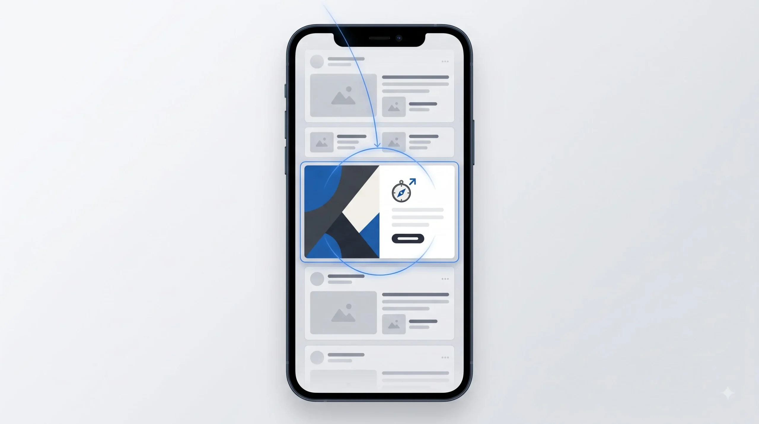
Think about how many businesses are posting on Instagram alone every single day. Millions. Every one of them competing for the same small pool of attention in the same feed. And the feed itself isn’t neutral, it’s an algorithm actively deciding what deserves a spot in front of your eyes, which means even getting shown is only step one. Getting noticed once you’re shown is a completely separate battle.
Here’s what actually happens in someone’s brain during a scroll session. It’s not conscious thought, it’s pattern recognition running on autopilot. The brain has seen thousands of Instagram posts. It knows what a typical post looks like: rounded image, some text maybe, standard proportions. So when post after post follows that exact pattern, the brain just filters them out as “more of the same” and keeps moving. It’s not being rude. It’s being efficient. Your brain can’t consciously process everything it sees, so it built a shortcut system that ignores anything that matches the expected pattern.
A graphic stops a scroll when it breaks that pattern. Not randomly breaks it, that just looks like an error, but breaks it in a way that makes the brain go “wait, what’s that” for a split second. That split second is everything. That’s the window where you either earn the next three seconds of attention or lose the person forever.
There are basically three unconscious questions running through someone’s head in that first second, and they happen so fast the person doesn’t even realize they’re asking them. What is this. Is it for me. Do I care. If your graphic doesn’t answer at least the first two clearly and instantly, you’ve already lost. Nobody’s going to stick around to figure out what your post is about. They’ve got four hundred more posts waiting.
This is exactly why stock templates fail so often, even the well-designed ones. When ten thousand other pages are using the same Canva template with a different photo swapped in, the brain has already seen that layout a hundred times this week without consciously registering any of them. It’s template blindness, the same way banner blindness made people stop seeing ads on websites years ago. The template did the design work, sure, but it also made the post invisible.
And here’s a piece most global design guides completely skip: audience conditions matter. Someone scrolling Instagram in a metro city on unlimited 5G with a flagship phone is looking at a completely different feed experience than someone scrolling in a Tier-2 or Tier-3 city on a mid-range phone with data-saving mode switched on half the time. Heavy, text-cluttered graphics that rely on fine detail or subtle color separation often just don’t render clean at lower image quality or smaller preview sizes. If your design depends on someone zooming in to understand it, you’ve already lost a huge chunk of your actual audience before the message even lands.
You’re not designing a graphic. You’re designing an interruption. That’s the mindset shift this whole guide is built around, and once it clicks, every other principle in this post is just execution.
The Core Design Principles Every Scroll-Stopping Graphic Follows

This is the part most beginners skip because it feels like theory, and theory feels boring compared to just opening Canva and dragging things around. But skipping this is exactly why so many graphics look “fine” but don’t perform. These aren’t abstract art rules. They’re the actual mechanics behind why some designs pull the eye and others don’t.
Visual Hierarchy
Visual hierarchy is just the order in which someone’s eye moves across your design. First stop, second stop, third stop. If you haven’t decided that order on purpose, the viewer’s eye is going to wander randomly, and a wandering eye almost never lands on your actual message before it moves on.
Two common scanning patterns show up again and again in how people read visual content. The Z-pattern, where the eye moves left to right, drops down, then left to right again, tends to fit wider, less text-heavy layouts. The F-pattern, where the eye scans across the top, drops down, scans a shorter line, then drops again, fits content that’s more text-dense, like an infographic or a carousel slide packed with information.
For square or vertical social formats, you don’t have a ton of room to work with, so hierarchy usually comes down to three tools working together: size, weight, and contrast. The biggest, boldest, highest-contrast element wins the first look, always. So the question to ask before you design anything is simple: what’s the one thing I want someone to see first? Not “what’s the most important information,” what’s the one thing that earns the first glance. Everything else is secondary.
Color Theory for Feed Visibility
Nobody needs an art history lesson here, just the practical version. Complementary colors, ones sitting opposite each other on the color wheel like blue and orange, create tension and contrast that naturally pulls the eye. Analogous colors, ones sitting next to each other like blue and teal, feel calm and cohesive but honestly don’t stop a scroll nearly as fast. Both have their place, but if the goal is interruption, complementary contrast usually wins.
Here’s something that trips up a lot of small business owners though. Using your exact brand colors on every single post, all the time, can actually work against you if your brand palette happens to be similar to the general “clean and modern” aesthetic everyone else is already using. Soft pastels, muted earth tones, the usual minimalist palette, they all blend into a sea of other posts using the same vibe. Sometimes a strategic pop of an unexpected color, used sparingly, does more work for scroll-stopping than staying perfectly on-brand every time.
Color also carries cultural weight worth thinking about for an Indian audience specifically. Bright reds, yellows, and golds carry festive, celebratory associations tied to occasions like Diwali or Holi, and using them around those seasons taps into something the viewer already feels emotionally primed for. It’s not about slapping festival colors on everything year-round, it’s about knowing when that association works in your favor and when it just looks random.
Typography That Works at Thumbnail Size
This is where a lot of otherwise decent graphics fall apart. Someone designs at full screen, zoomed in, everything looks crisp and readable. Then that same graphic shows up as a two-inch thumbnail on someone’s phone and the text turns into a blur. Thin, delicate fonts that look elegant up close often just disappear at small sizes. Legibility at actual mobile scale matters more than how the font looks while you’re designing it.
A safe pairing rule that actually works: one display font for the headline, something with personality and weight, paired with one clean, simple workhorse font for any supporting text. Using more than two fonts in one graphic almost always looks chaotic rather than intentional, even if each individual font is nice.
There’s also a real gap in most global design guides here, and it matters a lot for Indian content creators. Mixing Hindi or regional script with English in the same graphic is genuinely tricky, because most font pairings are designed with only Latin script in mind. Devanagari and other regional scripts have different natural weight, spacing, and line height needs. Slapping an English font style choice onto Hindi text often makes it look cramped or oddly proportioned. If a graphic mixes both scripts, it’s worth testing the regional script rendering separately rather than assuming whatever works for English automatically works for Hindi too.
Contrast and Negative Space
There’s a common beginner instinct to fill every inch of the canvas because empty space feels like wasted space. It’s actually the opposite. Negative space, the empty area around your main subject, is doing real work. It gives the eye somewhere to rest and it makes whatever you didn’t leave empty feel more important by comparison. A graphic packed edge to edge with text, icons, and decoration usually reads as cluttered and anxious, even if every individual element is well designed.
Contrast matters for more than just accessibility reasons, though it matters there too. High contrast between your subject and background is what lets a graphic get “read” in a fraction of a second while scrolling. If your text color is only slightly different from your background color, someone has to slow down and squint to read it, and nobody’s slowing down for that. They’ll just scroll past.
Composition and the Rule of Thirds
The rule of thirds is a simple grid concept: imagine your canvas divided into nine equal sections with two horizontal and two vertical lines. Placing your main subject along one of those lines, or where the lines intersect, tends to feel more balanced and intentional than dead-centering everything. It’s not a hard law though. Centered compositions can work great for quote cards or minimal typography-led designs, where the symmetry itself is the point. Know the rule so breaking it is a choice, not an accident.
| Principle | Problem It Solves | 3-Second Self-Check |
|---|---|---|
| Visual hierarchy | Viewer doesn’t know where to look first | Cover the graphic, what do you see first? |
| Color contrast | Graphic blends into feed | Squint test, does the subject still pop? |
| Typography scale | Text unreadable on mobile | View at actual thumbnail size, not full screen |
| Negative space | Design feels cluttered and anxious | Is there one clear focal point? |
Anatomy of a Scroll-Stopping Graphic
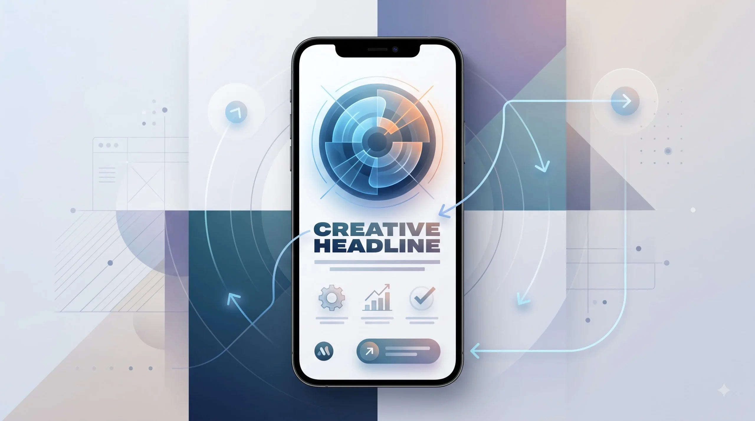
Break any graphic that actually performs well into its component parts, and you’ll notice the same pieces showing up over and over. Understanding these parts separately means you can diagnose exactly what’s broken when a graphic isn’t working, instead of just staring at it wondering why it flopped.
The focal point is whatever earns that first half second of attention. It could be a face, a bold headline word, a striking color block, a product shot with unusual framing. Every scroll-stopping graphic has exactly one obvious focal point. The moment there are two or three things competing for that role, the eye doesn’t know where to land and just moves on.
The hook line or headline text is what earns the next two or three seconds, after the focal point earns the first glance. There used to be a rough rule floating around that text shouldn’t cover more than twenty percent of an image, mostly tied to old Facebook ad policy. That specific rule doesn’t really apply anymore the way it used to, but the underlying idea still holds up: less text, chosen carefully, almost always outperforms more text crammed in. One sharp line beats three mediocre ones.
Supporting visual elements, icons, illustrations, secondary photography, exist to reinforce the main message without competing with the focal point. The mistake here is using them as decoration instead of communication. An icon should clarify something, not just fill empty space because the design felt too plain otherwise.
Brand signature elements are the small, consistent touches that build recognition over time. Logo placement, a signature color tag in the same corner every time, consistent font choices. These don’t need to be big or loud. Actually, the more subtle and consistent they are, the more they work, because the goal is for someone to recognize your content style before they even consciously register your logo.
White space, already covered above as a principle, deserves a second mention here specifically as a structural element rather than just a design rule. It’s not empty leftover space after you finish designing. It’s something you plan for from the start, the same way you’d plan where the headline goes.
And then CTA placement, the part most graphics get completely wrong. Most people bury their call to action in tiny text at the bottom, if they include one at all, almost like they’re embarrassed to ask for anything. A clear, visible CTA, even something as simple as “swipe for more” or “link in bio,” gives the viewer a next step instead of leaving them to figure it out themselves. Most people won’t figure it out themselves. They’ll just move on.
Platform-by-Platform Design Requirements
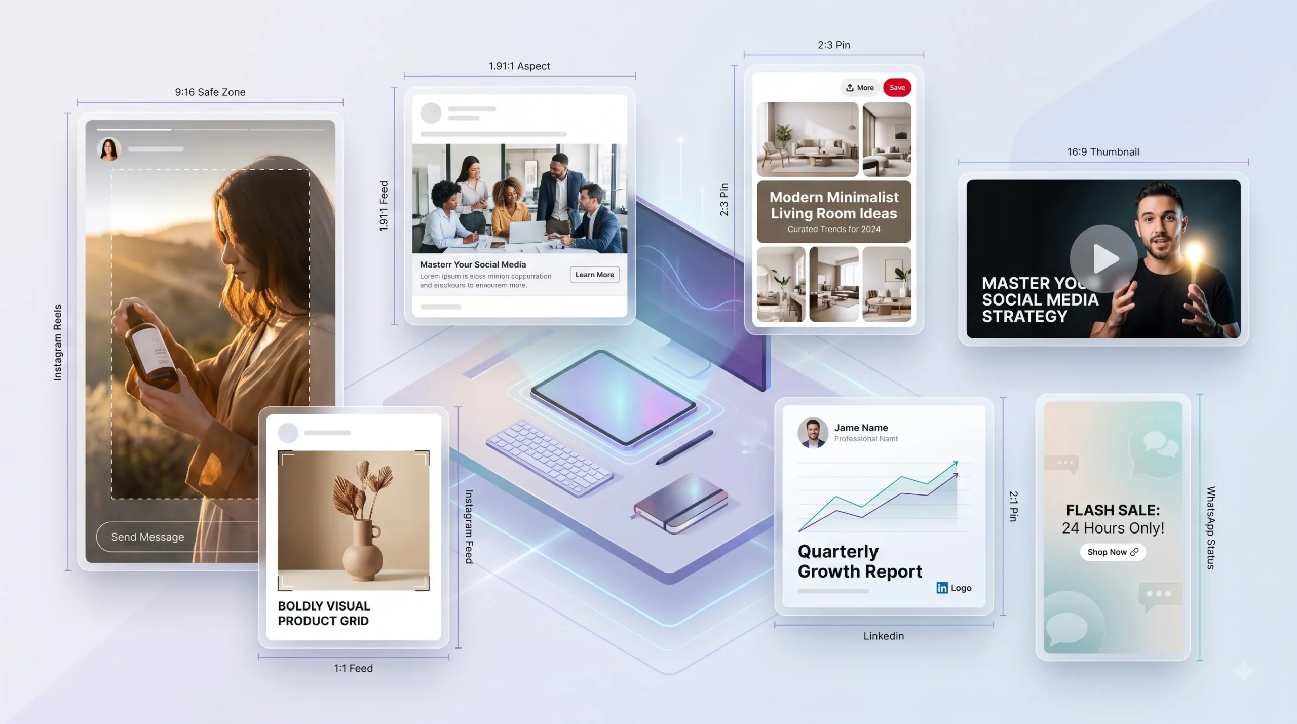
This is probably the most practically useful section in this whole guide, because a graphic that crushes it on Pinterest can completely die on LinkedIn, and it’s not because the design quality changed. It’s because each platform has a different audience mindset, different algorithm behavior, and different visual expectations baked in.
Posting the exact same graphic everywhere, just resized to fit, is one of the most common mistakes small businesses make. It feels efficient. It’s actually leaving performance on the table on every platform except the one you originally designed for.
Instagram alone has several formats that behave differently from each other. A regular feed post competes in a grid of other feed posts, so bold color and a clear subject matter more than anything else. A Story lives for fifteen seconds max before someone taps through, so the message needs to land almost instantly, and there are safe zones at the top and bottom where profile icons and reply bars sit, so important text there gets covered. A Reel cover is basically a thumbnail decision, it needs to work as a tiny still image that convinces someone to actually tap and watch. Carousel first slides carry the heaviest weight of the whole set, because if that first slide doesn’t earn a swipe, nobody ever sees slides two through ten no matter how good they are.
Facebook’s feed behaves similarly to Instagram in a lot of ways, but the audience skews a bit older and more varied in how they use the platform, and posts inside groups behave differently again since people are there for community discussion rather than pure browsing. Ad placements on Facebook also have their own visual expectations, tending to tolerate a bit more explanatory text than organic feed content would.
LinkedIn is a different animal entirely. Overly polished, ad-looking graphics tend to actually underperform there, because the platform’s culture leans toward things that feel native and authentic rather than produced. A slightly rougher, more “someone actually made this themselves” quote card or data visual often does better than a slick agency-style design, simply because it matches what LinkedIn users expect to see while they’re in a professional, less entertainment-driven headspace.
Pinterest works on a completely different mental model from every other platform on this list, and treating it like Instagram is a mistake a lot of people make. Pinterest is closer to a visual search engine than a social feed. People are actively searching for something, and your graphic needs to be vertical, text-forward, and essentially answer a search intent the way a blog title would. Keyword-rich text in the graphic itself genuinely helps discoverability there in a way it doesn’t on other platforms.
YouTube thumbnails deserve their own mini-lesson because they follow completely different rules from feed graphics. A thumbnail’s entire job is to win a click against nine other thumbnails sitting right next to it on the same screen. High contrast, an expressive face or clear emotional cue, and a tight text-to-image ratio, usually just two or three words max, tend to outperform cluttered thumbnails every time. And the platform overlays video duration and sometimes title text in the bottom right corner, so keeping that zone clear matters.
WhatsApp Status and WhatsApp Business are genuinely underused compared to how much reach they actually offer, especially for an Indian audience where WhatsApp usage is enormous. Status graphics work more like Stories, short-lived and vertical, but the audience there tends to be closer contacts and existing customers rather than cold discovery, so the tone can be a bit more direct and less “stop the scroll of a stranger” and more “remind someone who already knows you that you exist.”
| Platform | Ideal Ratio | Safe Zone Notes | Design Behaviour That Works |
|---|---|---|---|
| Instagram Feed | 1:1 or 4:5 | Avoid edge-cropping text | Bold focal point, minimal text |
| Instagram Story/Reel | 9:16 | Top and bottom UI overlap zones | Vertical hierarchy, safe-zone text |
| Facebook Feed | 1:1 or 4:5 | Similar to Instagram, wider audience | Slightly more explanatory text works |
| 1:1 or 4:5 | Native, less ad-like | Data visuals, quote cards perform well | |
| 2:3 | Text at top performs better | Text-heavy, keyword-descriptive | |
| YouTube Thumbnail | 16:9 | Title overlaps bottom-right | High contrast, emotion or face cues |
One honest note here, worth saying out loud instead of pretending otherwise: exact pixel dimensions on these platforms get updated periodically, so it’s always worth double checking current specs directly on the platform before a big campaign rather than trusting any single source blindly, including this one.
Content Formats and How Design Changes for Each
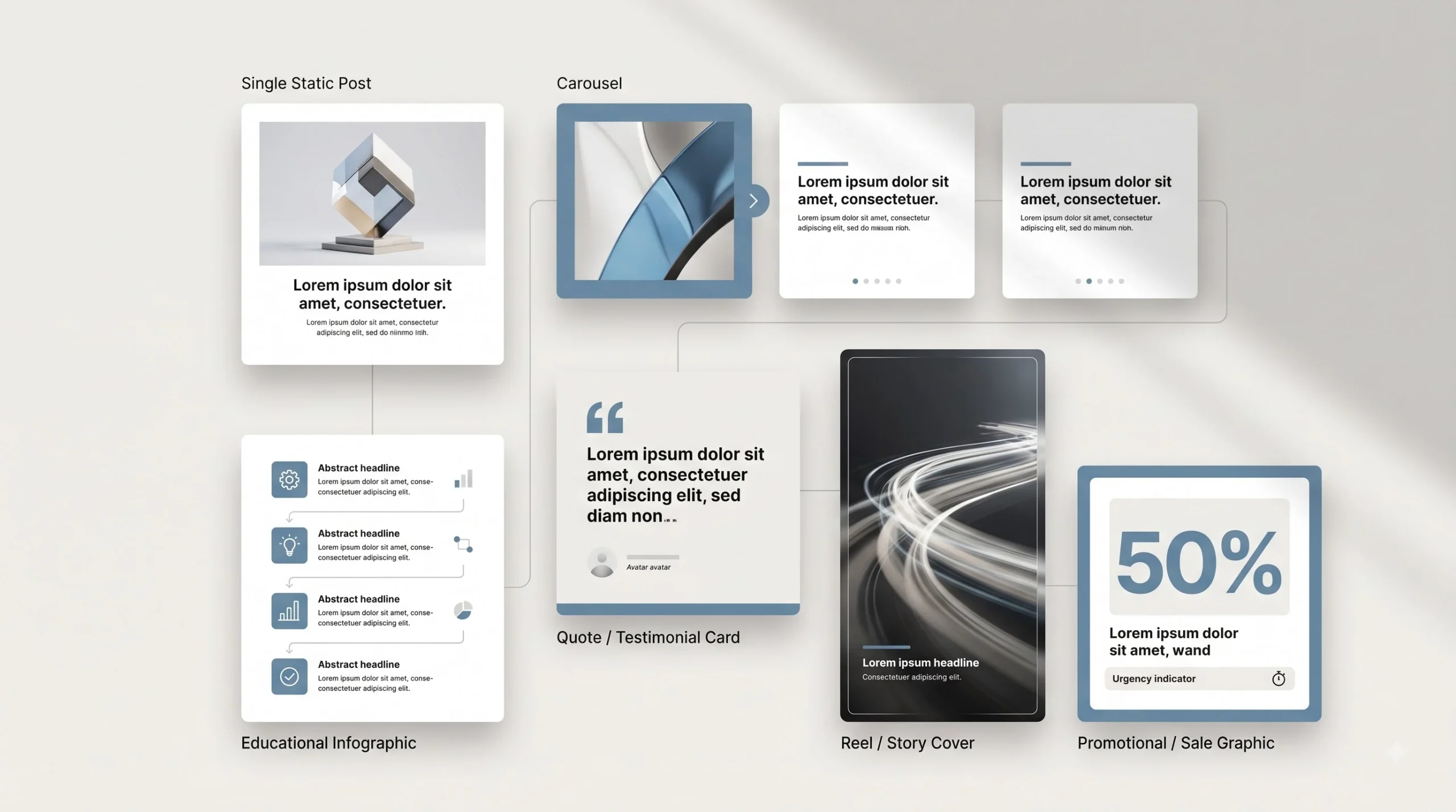
Design principles don’t apply the same way across every type of post. A single static image, a ten-slide carousel, and a quote card are all “graphics,” technically, but the design thinking behind each one is genuinely different, and treating them the same is where a lot of otherwise capable designers lose performance.
Single static posts are the simplest case and mostly come down to everything already covered: one focal point, clear hierarchy, minimal text. Straightforward, but easy to overcomplicate by trying to cram a whole message into one frame.
Carousels are trickier than people expect, mainly because the first slide has to do double duty. It needs to work as a standalone scroll-stopper and also set up a reason to swipe. Beyond that first slide, design continuity matters more than most people realize. If slide three suddenly changes color scheme or font style from slide two, it breaks the visual flow and makes the whole carousel feel disjointed, even if the content itself is solid. Consistent layout templates across slides, with just the content changing, usually perform better than a fresh design on every single slide.
Quote or testimonial cards live or die on typography, since there’s often little to no imagery involved. The temptation is to add a busy background to “fill space,” but a strong quote card usually works better with a simple, high-contrast background and typography doing all the heavy lifting. The words themselves are the design here.
Infographic-style educational posts need a different kind of hierarchy, one built around data and sequence rather than a single focal point. Icon consistency matters a lot in these, using the same icon style throughout rather than mixing flat icons with 3D ones or line icons with filled ones, because inconsistency there reads as sloppy even when the information is genuinely useful.
Reels and Story covers require thumbnail-first thinking even though they’re technically part of a video format. The cover frame someone sees before tapping play needs to work exactly like a YouTube thumbnail does, standalone and instantly readable, not just a random freeze-frame pulled from the middle of the clip.
Promotional and sale graphics carry their own challenge, especially heading into festive sale seasons that hit hard on the Indian retail calendar. Urgency needs to come through clearly, limited time, limited stock, whatever the actual hook is, without tipping into looking cheap or desperate. Bold color blocks and clear numbers, like a specific discount percentage, tend to outperform vague “big sale” language, because specificity itself reads as more trustworthy than a generic claim.
Tools for Designing Without a Design Degree
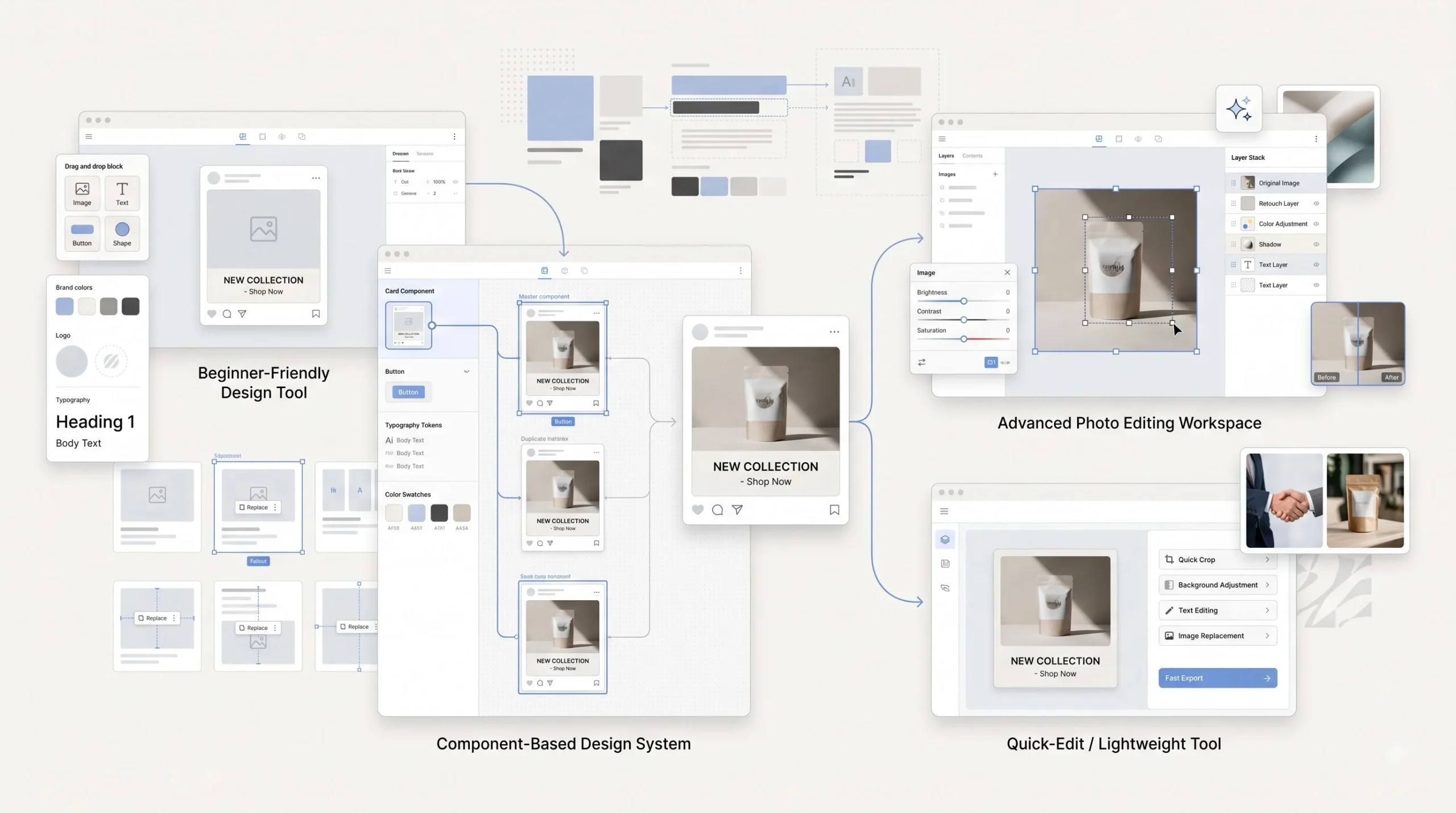
Nobody needs Photoshop mastery to make graphics that stop a scroll. Honestly, some of the best-performing social content out there was made entirely in Canva. What matters more than the tool is understanding the principles from the sections above and then applying them consistently, whichever tool ends up being the right fit.
Canva is the obvious starting point for most beginners, and for good reason. Its Brand Kit feature lets you lock in your colors, fonts, and logo so every new design starts from a consistent base instead of guessing each time. Where Canva falls short is customization depth. Once a design needs something genuinely unique, outside what a template or its element library offers, Canva starts feeling limiting fast.
Figma is where a lot of more serious creators eventually graduate to, and it’s worth learning even if it feels intimidating at first. The real power is in reusable components and frames, building design systems rather than one-off graphics. Once a brand template exists as a proper Figma component, updating it across dozens of future posts becomes dramatically faster than starting fresh in Canva every time.
Adobe Express and Photoshop sit at the more advanced end. Photoshop specifically matters when raw creative control is needed, detailed photo editing, custom illustration work, precise masking, things that templated tools just aren’t built to handle. It’s a steeper learning curve, no question, but for anyone doing heavy photo-based content it’s worth the investment eventually.
AI-assisted tools for generating backgrounds or design elements have gotten genuinely useful lately, and they’re worth knowing about even briefly here, though a deeper breakdown of AI in content creation deserves its own separate discussion entirely.
Free stock resources are a mixed bag. Some genuinely blend in well and add real value. Others scream “stock photo” the second anyone looks at them, overly staged smiles, unnaturally clean office scenes, that specific lighting that never quite looks real. Learning to spot the difference before using an image saves a lot of wasted design time later.
| Tool | Best For | Learning Curve | Cost (India) |
|---|---|---|---|
| Canva | Fast templated design, brand kits | Low | Free to roughly 500/month |
| Figma | Custom, reusable design systems | Medium | Free tier is generous |
| Photoshop | Full creative control, photo editing | High | Subscription-based |
| Adobe Express | Middle ground, quick edits | Low to Medium | Free and paid tiers |
Building a Repeatable Design System (Not Just One-Off Posts)
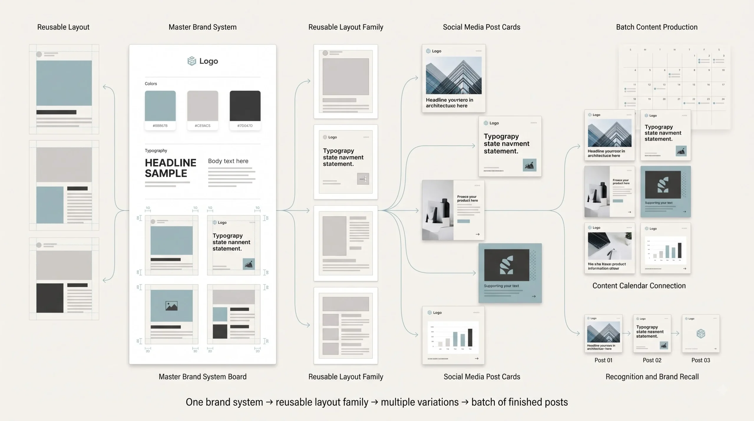
Here’s where most people plateau. They get decent at making individual graphics, one post at a time, but never build a system, so every single post starts from a blank canvas and takes way longer than it should. Brand consistency isn’t just an aesthetic nicety, it actually compounds over time. Someone who sees three of your posts in a row, even if they never consciously register your logo, starts recognizing your content just from the color and layout pattern. That recognition builds trust, and trust is what eventually turns a scroll-stopper into an actual follower or customer.
A simple brand kit doesn’t need to be complicated to work. Two or three core colors, one dominant and one or two accents, is plenty. Two fonts, one for headlines and one for body text, same as covered earlier. And one layout template family, meaning a handful of proven layout structures that get reused with new content dropped in, rather than reinventing composition every single time.
The trick to making templates that still feel native rather than corporate-stamped is variation within consistency. Same color palette and fonts, sure, but let the actual composition shift slightly post to post so it doesn’t look like the exact same template with different words pasted in. That subtle variety is what keeps a consistent brand from feeling repetitive or lazy.
Batch design workflows tie directly into having an actual content calendar planned out in advance. Designing five or ten posts in one sitting, working from a plan rather than scrambling to make something the morning it needs to go live, produces noticeably better work. Rushed design almost always shows, even if it’s hard to pinpoint exactly why a rushed graphic feels off.
Common Mistakes That Kill Scroll-Stopping Power
A lot of these mistakes come from good intentions gone slightly wrong, trying too hard rather than not trying at all, which is honestly why they’re so common even among people who genuinely care about their content.
- Cramming too much text into one graphic, trying to say everything at once instead of picking the one message that actually matters
- Abandoning brand consistency chasing whatever’s trendy that week, which might get a short-term boost but quietly erodes recognition over time
- Designing and reviewing only at full desktop size, never checking how the graphic actually looks as a small mobile thumbnail before publishing
- Copying a competitor’s exact aesthetic without understanding why it worked for their specific audience, which often means it just doesn’t translate the same way for a different audience
- Leaning on generic stock photography that instantly reads as stock, undermining the authenticity a lot of small brands are actually trying to build
- Ignoring basic accessibility, low contrast text, tiny font sizes, missing alt text, which shuts out a chunk of potential audience and honestly just makes for objectively worse design regardless of anyone’s specific needs
Testing, Measuring, and Improving Your Graphics Over Time
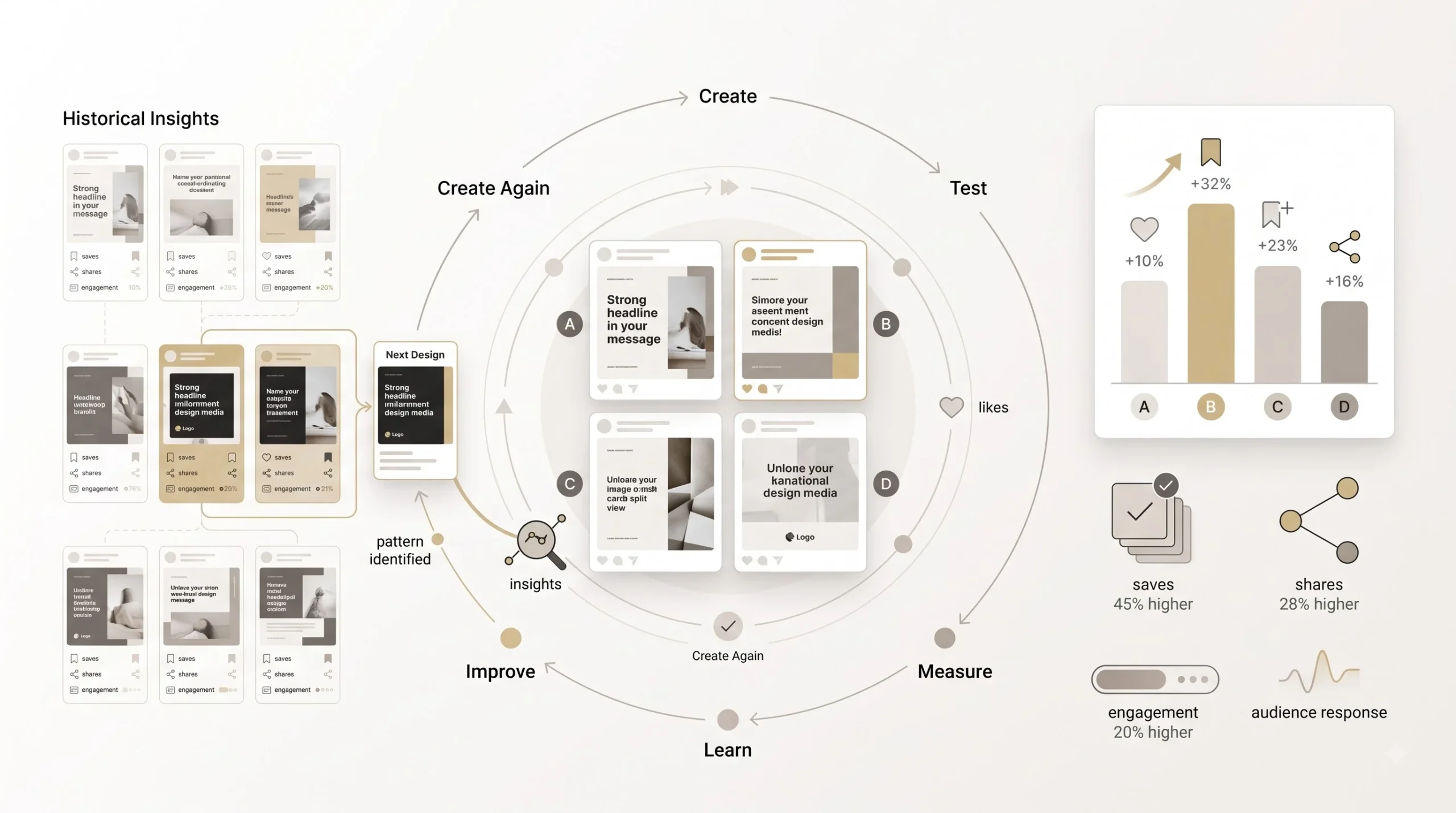
Design isn’t a one-and-done skill where you learn the principles once and you’re set forever. What actually works shifts depending on the specific audience, the platform’s current algorithm behavior, even the season. Treating graphic design as something to keep testing and refining, rather than something to master once, is the real long-term advantage here.
Likes are honestly one of the weakest signals to judge a graphic’s scroll-stopping power by, even though they’re the metric most people fixate on. Save rate and share rate tell a much more honest story, because saving or sharing something takes real intent, someone deciding this is worth coming back to or worth showing someone else. A graphic that gets a modest number of likes but a strong save rate is often doing its actual job better than one with tons of likes and almost no saves.
A/B testing doesn’t require a big ad budget to be useful. Posting two visually different versions of essentially the same message, at similar times, to a similar audience, and comparing how each performs is something any creator can do organically, even without running paid ads. It won’t be scientifically perfect, feed timing and algorithm variables aren’t fully controllable, but over enough posts, real patterns start showing up.
And honestly, the most underused resource most people have is their own past content. Going back through what’s already been posted and looking for patterns, which color schemes tended to perform better, which layout style got more saves, which type of headline earned more shares, usually reveals more about what a specific audience actually responds to than any general design rule ever could. Every account’s audience is a little different, and that historical data is the fastest way to figure out what “different” means for yours specifically.
A Quick-Start Checklist for Your Next Graphic
Before hitting publish on the next graphic, running through a quick checklist catches most of the common mistakes covered throughout this guide, without needing to rethink every principle from scratch each time.
| Check | Why It Matters |
|---|---|
| Clear focal point within 1 second | Determines scroll-stop or scroll-past |
| Legible at thumbnail size | Most viewers never see the full-size version |
| Brand colors and fonts consistent | Builds feed recognition over time |
| Text stays within safe zones | Avoids platform UI overlap |
| One clear CTA | Prevents visual and message confusion |
Conclusion
None of this is complicated once it clicks, but almost nobody explains it this way, which is exactly why so many graphics get made every day that never had a real shot at stopping anyone’s scroll in the first place. It comes back to that one idea from the very start: a graphic that looks nice and a graphic that interrupts a pattern are not the same thing, and only one of them actually gets seen.
Scroll-stopping design isn’t some rare talent a few lucky people were born with. It’s a system, built from understanding why the eye moves where it moves, why some colors and typography choices earn attention and others get filtered out automatically, and why the exact same message needs to look completely different depending on whether it’s landing on Instagram, LinkedIn, or Pinterest. Learn the mechanics once, build them into a repeatable process, and every future post gets easier and faster to design, without sacrificing the thing that actually makes it work.
The next step from here is turning all of this into a consistent output, which comes down to planning what to post and when, so design never has to be a last-minute scramble again.
Frequently Asked Questions
1. What size should my social media graphics be?
It depends entirely on where the graphic is going, and that’s the whole point of the platform section above. Instagram feed posts work well square or in a 4:5 ratio, Stories and Reels need full vertical 9:16, Pinterest wants a taller 2:3, and YouTube thumbnails are widescreen 16:9. Designing one size and stretching it to fit everywhere is a fast way to lose quality and safe-zone accuracy. Always worth double-checking exact current specs on the platform itself before a big push, since these get tweaked from time to time.
2. Do I need Photoshop to make good social media graphics?
No, not at all. Plenty of genuinely well-performing content gets made entirely in Canva. Photoshop matters more once heavy photo editing or fully custom illustration work comes into play. For most beginners and small businesses, Canva or Figma cover what’s actually needed.
3. How much text is too much on a graphic?
There’s no exact word count that works every time, but the pattern holds up consistently: one sharp, clear line almost always beats three mediocre ones crammed together. If a viewer needs more than a second or two to read the text, it’s probably too much for a scroll-stopping graphic specifically, even if that same amount of text would be fine somewhere like a carousel’s later slides.
4. Why do my graphics look good on desktop but bad on mobile?
This is one of the most common design mistakes out there. Most people design zoomed in at full screen, where everything looks crisp, then never check how it actually renders as a small thumbnail on an actual phone. Thin fonts, subtle color contrast, and fine detail often just disappear at that smaller size. Always preview at actual mobile scale before publishing.
5. Should every post match my brand colors exactly?
Mostly yes, but not rigidly. Staying on-brand builds recognition over time, which matters a lot. That said, if a brand palette is very close to the generic “clean minimalist” look everyone else is using, sticking to it perfectly on every single post can sometimes work against scroll-stopping power. A little strategic variation, used carefully, doesn’t break brand consistency, it just keeps the feed from feeling flat.
6. What’s the difference between designing for Instagram versus LinkedIn?
Instagram audiences respond to bold, polished, high-contrast visuals since they’re mostly there to browse and be entertained. LinkedIn audiences are in a more professional headspace, and overly polished, ad-looking graphics tend to actually underperform there. Something that feels a bit more native and less produced, like a simple data visual or quote card, usually does better on LinkedIn than the same slick design that would work fine on Instagram.
7. How do I know if my graphic is actually working?
Likes are the weakest signal here, even though most people fixate on them. Save rate and share rate say a lot more, because both require real intent from the viewer. A graphic that gets fewer likes but a strong save rate is usually doing its job better than one racking up likes with almost no saves or shares.
8. Is Canva good enough for a small business, or do I need to hire a designer?
For most day-to-day content, Canva with a properly set up Brand Kit is genuinely enough. Where it starts falling short is highly custom design work or anything needing a real design system with reusable components, which is where a tool like Figma, or eventually a designer, starts to make more sense.
9. Why does my carousel post underperform even though the content is solid?
Usually it’s the first slide. If slide one doesn’t work as a standalone scroll-stopper and doesn’t give a clear reason to swipe, nobody ever reaches the good content on slides two through ten. Design continuity across slides matters too. A sudden shift in color scheme or layout style partway through the carousel breaks the flow and makes the whole thing feel disjointed, even when each slide individually is fine.
10. How often should I redesign my templates?
There’s no fixed schedule, but a good sign it’s time is when engagement on a specific template style has been quietly dropping for a while, or when the design has started to feel stale even to you. Full brand consistency doesn’t mean freezing a template forever. Small refreshes every few months, keeping the core brand kit intact but updating layout details, usually work better than either constant change or total stagnation.
11. Do stock photos hurt my brand?
Not automatically, but the wrong kind absolutely can. Stock images that read as obviously stock, overly staged smiles, unnaturally clean settings, that specific generic lighting, tend to undermine the authenticity a lot of small brands are trying to build. Well-chosen stock imagery that blends naturally with the rest of the design usually doesn’t hurt at all.
12. What’s the biggest mistake beginners make with social media graphics?
Trying to say too much in one graphic. It comes from good intentions, wanting to communicate everything valuable at once, but it almost always backfires. A graphic with one clear focal point and one clear message consistently outperforms a crowded one trying to do five things simultaneously.