


Open your phone right now and pull up any website you built or manage. Go on, actually do it. If you had to pinch and zoom, if a menu button hid somewhere off-screen, or if a form field made you scroll sideways just to type your name, you already know why this guide exists. Most site owners don’t find out their site is broken on mobile until someone tells them, usually a customer who gave up and bought from a competitor instead.
Here’s the number that should bother you: more than 60% of all web traffic worldwide now comes from phones, not desktops. That’s not a trend anymore; that’s just how people browse. Google figured this out years ago and switched to mobile-first indexing, which means Google mostly looks at your mobile site, not your desktop one, when deciding how to rank you. So if your mobile experience is bad, your rankings suffer even if your desktop site looks fantastic.
Learning how to make your website mobile-friendly isn’t a nice-to-have anymore. It’s the baseline. And honestly, most guides on this topic either drown you in jargon or skip the parts that actually move the needle, like why your buttons keep getting missed by thumbs or why your images load like it’s 2012. This guide fixes that. We’re going deep on every piece: design, speed, SEO, UX, WordPress specifics, eCommerce checkout flows, local business pages, all of it.
What You Will Learn in This Guide
By the end of this, you’ll know exactly what makes a site mobile-friendly versus just “responsive,” how Google actually judges your mobile experience, the tools to test it yourself, and a full step-by-step process to fix what’s broken. You’ll also get a checklist you can run through every quarter, real examples of before-and-after fixes, and answers to the questions people actually type into Google about this topic. No fluff, just the stuff that changes your bounce rate and your rankings.
What Is a Mobile-Friendly Website?
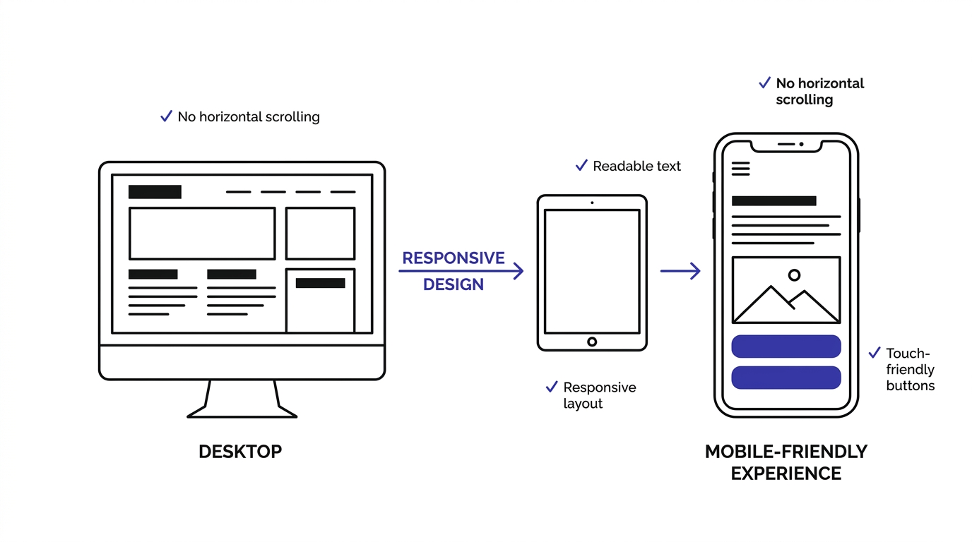
A mobile-friendly website is one that works properly on a phone or tablet without the visitor needing to zoom, scroll sideways, or fight with tiny buttons. That’s the plain definition. But in practice, it means the layout reflows to fit the screen, text is readable without pinching, buttons are big enough for a thumb, and the whole thing loads fast on a mobile connection, not just Wi-Fi in an office.
When someone says a site is mobile-friendly, they mean the content and layout adapt to smaller screens automatically. You’re not looking at a shrunk-down version of the desktop site, you’re looking at something built to actually work at that screen size. Text wraps properly, images resize, navigation collapses into something usable, and nothing gets cut off or overlaps. This is the minimum bar, not the finish line.
Mobile-Friendly vs Responsive Website
People use these two terms like they’re the same thing, and mostly they are, but there’s a subtle difference worth knowing. “Responsive” describes the technical method, using flexible grids and CSS media queries so the layout changes based on screen size. “Mobile-friendly” describes the outcome, whether the end result is actually usable on a phone. You can technically have a responsive site that’s still a pain to use on mobile if the design choices were bad. Responsive is the how; mobile-friendly is the result.
Mobile-Friendly vs Mobile-Optimized vs Mobile-First
These three get thrown around interchangeably too, but they sit on a spectrum. Mobile-friendly just means the site doesn’t break on a phone. Mobile-optimised goes a step further, meaning the site has been specifically tuned for mobile performance, speed, and usability, not just “it doesn’t look broken.” Mobile-first means the entire design process started with the phone screen and then scaled up to desktop, which usually produces the cleanest, fastest result because you’re not stripping features down; you’re building up from a lean base.
How Mobile Websites Have Evolved
Back in like 2012 to 2015, a lot of businesses just built a separate “m.website.com” version of their site for mobile users. That approach is basically dead now because it meant maintaining two sites, and Google eventually stopped favouring it. Then responsive design took over, one codebase that adapts to any screen. Now we’re seeing mobile-first development become the default, where designers literally start sketching on a phone-sized canvas before they even think about the desktop layout.
Examples of Mobile-Friendly Websites
Think about sites like Airbnb or Amazon on your phone. Menus collapse into a hamburger icon or a bottom tab bar, images load fast and crop smart, and checkout flows are stripped down to the essentials with big tappable buttons. These aren’t accidents. Every element on those pages has been tested across dozens of device sizes and refined based on actual user behavior data, not guesswork.
Why Mobile-Friendly Websites Matter in 2026 for Your SEO and Revenue
If you’re still treating mobile as an afterthought, you’re leaking money and rankings at the same time, and honestly, that combination should be enough to get anyone’s attention. Let’s break down exactly why this matters so much right now.
Mobile Traffic Statistics
Globally, mobile devices account for the majority share of website visits, and in a lot of industries like retail, food, and local services, that number climbs even higher, sometimes past 70%. If your site was built desktop-first and mobile was patched on later, you’re serving your biggest chunk of visitors your weakest experience. That’s backwards, and it shows up in your analytics as high bounce rates on mobile sessions compared to desktop.
Google’s Mobile-First Index
Since Google rolled out mobile-first indexing fully, it primarily uses the mobile version of your site’s content for indexing and ranking, not the desktop version. This means if your mobile site is missing content that exists on desktop, or if it loads slower, Google sees that stripped-down, sluggish version as the “real” version of your page. That directly affects how you rank for every keyword you’re targeting.
Impact on Search Rankings
Page experience signals, which include mobile usability and Core Web Vitals, factor into how Google ranks pages, especially when multiple pages are otherwise similar in relevance and quality. So two competing pages with similar content, the one with the better mobile experience often wins the ranking battle. It’s not the only factor, but it’s one you can control directly and quickly.
User Experience Benefits
A site that works well on mobile just feels better to use. Visitors find what they need faster, forms are less annoying to fill out, and nobody’s swearing at their screen trying to tap a button that’s the size of a pinhead. Good mobile UX builds trust almost instantly, and trust is what turns a visitor into a customer.
Higher Conversion Rates
Mobile-friendly sites convert better, plain and simple. When checkout is easy, forms are short, and buttons are easy to tap, people actually complete the action instead of abandoning halfway through. I’ve seen businesses fix mobile checkout friction and watch their conversion rate jump noticeably within weeks, not months, just from removing the friction that was pushing people away.
Lower Bounce Rate
If your site takes forever to load or looks broken on a phone, people leave within seconds. That’s a bounce. High mobile bounce rates tell Google your page isn’t satisfying the search intent, which then affects how often that page gets shown for relevant searches going forward.
Increased Page Views
When mobile navigation is smooth and content is easy to scan, people naturally browse more pages per session. They click through to related articles, check out more products, explore your service pages. A clunky mobile site kills that natural browsing behaviour because every click feels like a chore.
Better Brand Trust
Nobody trusts a business whose website looks broken on the device they’re using. It doesn’t matter how good your product is; a janky mobile experience makes you look outdated or careless, and that perception bleeds into how people judge your credibility overall, especially for service businesses where trust is the whole sale.
Better Local SEO Performance
Most local searches, like “plumber near me” or “coffee shop open now,” happen on phones, often while someone’s out and about. If your local business site isn’t mobile-friendly, you’re losing exactly the customers who are closest to making a decision right then and there, standing outside with their phone out.
Competitive Advantage
Plenty of small and mid-sized businesses still haven’t fixed their mobile experience properly. That gap is an opportunity. If your competitor’s site is slow and clunky on mobile and yours isn’t, you win that comparison every single time someone checks both on their phone before deciding who to call or buy from.
How Google Determines Whether Your Website Is Mobile-Friendly
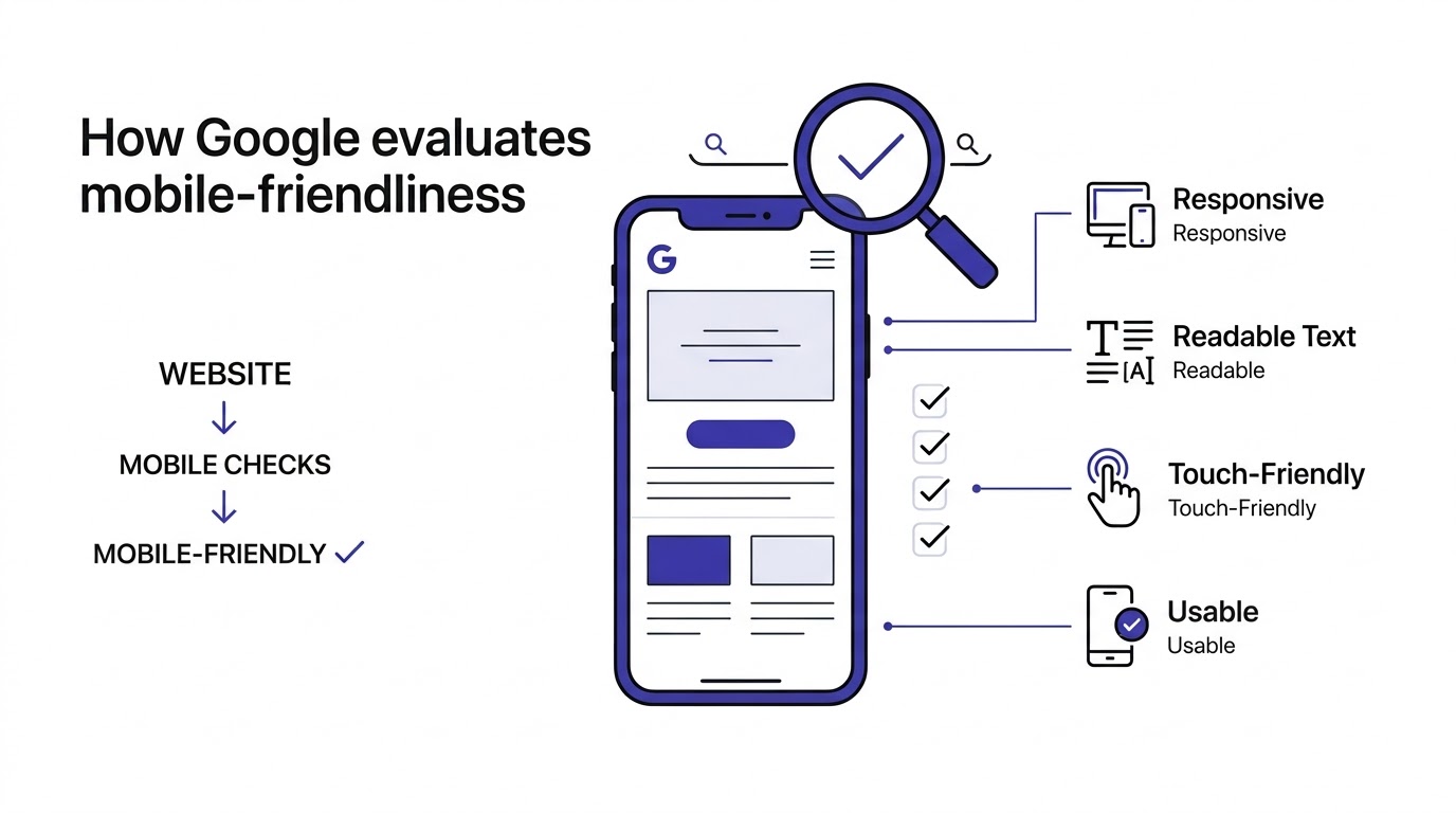
Google doesn’t just eyeball your site and guess. It runs specific checks and looks at specific signals to decide whether your pages pass the mobile-friendly bar, and understanding these helps you fix the right things instead of guessing.
Mobile-First Crawling
Googlebot Smartphone is the primary crawler Google uses now to index most websites. It crawls and evaluates your site the same way a mobile visitor would experience it. If your mobile version is missing content, has broken links, or loads differently than your desktop version, that’s what gets indexed and ranked, not the fuller desktop experience.
Core Web Vitals
These are specific, measurable metrics Google uses to judge page experience: Largest Contentful Paint (how fast the main content loads), Interaction to Next Paint (how responsive the page feels when someone taps or clicks), and Cumulative Layout Shift (how much stuff jumps around while loading). Poor scores on any of these, especially on mobile connections which are often slower than home Wi-Fi, can hurt how your pages perform in search.
Mobile Usability Signals
Google’s Search Console flags specific usability issues like text too small to read, clickable elements too close together, and content wider than the screen. These aren’t abstract concepts, they’re concrete errors Google actively looks for and reports on, and fixing them is usually pretty mechanical once you know what to look for.
Viewport Configuration
Your site needs a proper viewport meta tag telling browsers how to scale the page on different screen sizes. Without it, mobile browsers often render the desktop layout and then shrink it down, which is exactly the broken, zoomed-out experience nobody wants. This is one line of code, and it’s shocking how many sites still get it wrong.
Touch-Friendly Elements
Buttons and links need enough size and spacing for a thumb to tap accurately. Google’s guidelines suggest tap targets around 48 pixels with enough space between them so people aren’t accidentally hitting the wrong link. Cramped navigation menus are one of the most common mobile usability failures out there.
Readability
Text needs to be legible without zooming, which usually means a minimum font size around 16 pixels for body copy, decent line height, and enough contrast between text and background. Tiny gray text on a white background might look sleek on a designer’s monitor, but on a phone in direct sunlight, it’s unreadable.
Content Accessibility
All your important content, not a stripped-down version, needs to actually exist and be reachable on mobile. Hiding key content behind extra clicks or leaving it out entirely because “it didn’t fit” defeats the purpose and can hurt your rankings since Google indexes what’s actually there on mobile.
Page Experience Signals
Beyond Core Web Vitals, Google looks at things like whether your site uses intrusive interstitials (those popups that cover the whole screen the second you land on a page) and whether the site is served over HTTPS. These smaller signals add up and contribute to the overall page experience score Google factors into rankings.
Signs Your Website Is Not Mobile-Friendly
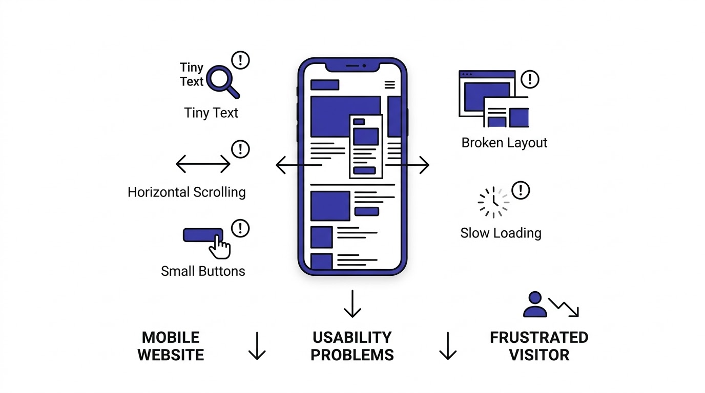
Sometimes you don’t need a fancy tool to know something’s wrong. Here are the tells that show up first, the ones your visitors are noticing even if you haven’t caught them yet.
Tiny Text
If you have to zoom in to read a paragraph, so does every visitor, and most of them won’t bother. They’ll just leave. This usually happens when a desktop font size gets carried over to mobile without any adjustment in the responsive CSS.
Horizontal Scrolling
Having to scroll sideways to read a sentence or see the rest of an image is one of the clearest signs of a broken layout. It usually means an element, like a wide image or a fixed-width table, is forcing the page wider than the screen itself.
Slow Loading
Mobile connections are often slower and less stable than home broadband. If your page takes more than a few seconds to become usable, people bail. Heavy images, bloated scripts, and unoptimized code are the usual culprits here, and they’re fixable.
Buttons Too Small
Tiny buttons crammed close together mean people mis-tap constantly, hitting the wrong link or having to zoom in just to press the right one. This frustrates people fast and it’s one of the top reasons for mobile cart abandonment on eCommerce sites specifically.
Broken Layout
Overlapping text, images spilling outside their containers, sections that look fine on desktop but collapse into a mess on mobile. This happens when a site wasn’t actually tested across different screen widths, just assumed to “probably work” because it’s technically responsive.
Images Overflow
Images that don’t resize properly and spill past the edge of the screen are a dead giveaway of missing or broken responsive image CSS. It’s a quick fix technically, but it makes a site look genuinely unprofessional when it happens.
Popup Issues
Full-screen popups that are hard to close on mobile, especially ones with a tiny “X” button buried in a corner, drive people away instantly and Google actively penalizes intrusive interstitials in mobile search rankings.
Poor Navigation
Menus that don’t collapse properly, dropdowns that require hovering (which doesn’t even work on touchscreens), or navigation that takes five taps to find a basic page, all of this signals the site wasn’t designed with mobile behavior in mind.
Difficult Forms
Long forms with tiny input fields, no proper input types (like using a text field for a phone number instead of a number pad trigger), and no autofill support make filling anything out on mobile a genuine chore.
High Bounce Rate
If your analytics show mobile visitors leaving within seconds compared to desktop visitors sticking around, that gap is usually a mobile experience problem, not a content problem. Check your mobile-specific bounce rate in Google Analytics segmented by device.
Poor Mobile Rankings
If your desktop rankings for a keyword look solid but mobile search results show you buried lower or missing entirely, that’s Google’s mobile-first index telling you something concrete is broken on the mobile version of that page.
How to Check if Your Website Is Mobile-Friendly
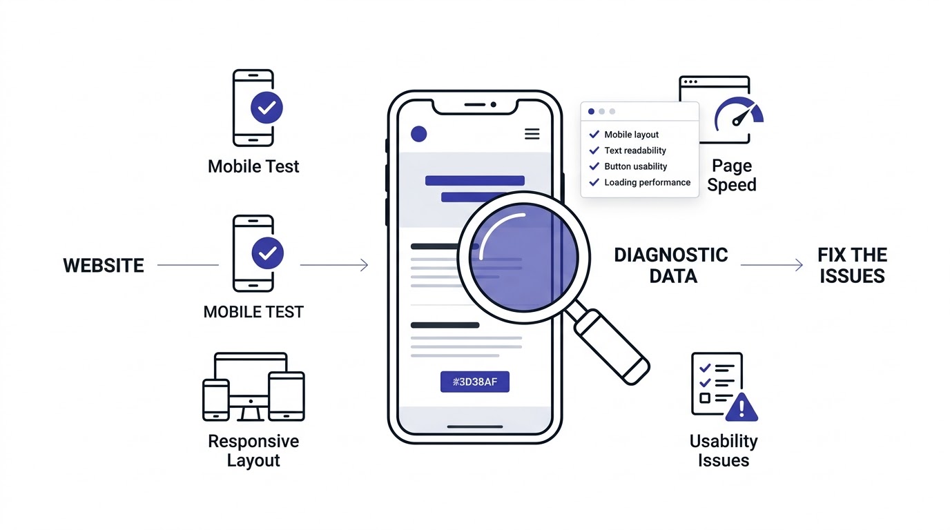
Before fixing anything, you need to actually know what’s broken. Here’s how to get real data instead of guessing based on how it looks on your own phone.
Google Search Console
The Mobile Usability report inside Search Console lists specific errors Google found across your site, like text too small or clickable elements too close together, page by page. This is the single most useful free tool for this because it’s the same data Google uses to judge you.
Chrome DevTools
Open any page in Chrome, hit F12, and toggle the device toolbar to preview how your site looks across different phone and tablet sizes without needing an actual device. You can throttle the network speed too, to simulate a slower mobile connection and see how loading actually feels.
Lighthouse
Built right into Chrome DevTools, Lighthouse runs an automated audit covering performance, accessibility, and SEO, and gives you a mobile-specific score along with a prioritized list of exactly what to fix first. It’s the fastest way to get a diagnostic snapshot in under a minute.
Browser Testing
Testing across Chrome, Safari, and Firefox matters because rendering engines handle CSS slightly differently sometimes. What looks perfect in Chrome might have a small layout quirk in Safari on iOS, which happens to be a huge chunk of mobile traffic in a lot of markets.
Manual Testing on Different Devices
Nothing replaces actually picking up a real iPhone and a real Android phone and clicking through your own site like a customer would. Emulators are good for a first pass, but real devices catch things like touch responsiveness issues that simulators miss entirely.
Real User Testing
Ask a few actual people, not designers or developers, to complete a task on your mobile site while you watch, like finding a product or filling out a contact form. Watching someone struggle with something you thought was obvious is one of the most eye-opening things you can do.
Core Web Vitals Report
Inside Search Console, the Core Web Vitals report shows you real-world performance data pulled from actual Chrome users visiting your site, broken down by mobile and desktop separately. This is field data, not lab data, so it reflects what real visitors on real connections actually experience.
Performance Monitoring Tools
Tools like PageSpeed Insights, GTmetrix, and WebPageTest give you deeper performance breakdowns, showing exactly which resources are slowing your page down and by how much. Running these monthly helps you catch regressions before they tank your rankings.
Mobile-First Design Principles Every Website Should Follow
Designing mobile-first means starting with the smallest, most constrained screen and building up, rather than designing for desktop and shrinking things down later. It changes how you prioritize everything.
Start with Small Screens
When you design for a 375-pixel-wide screen first, you’re forced to make hard decisions about what actually matters. That discipline usually results in a cleaner, faster experience even on desktop, because you’ve already cut the fluff instead of adding restraint after the fact.
Prioritize Essential Content
Mobile screens don’t have room for everything, so you have to decide what visitors actually need first. Usually that’s your main value proposition, a clear call to action, and easy navigation, not five paragraphs of company history above the fold.
Simple Layout
Single-column layouts generally work best on mobile because they match how people naturally scroll, straight down. Complex multi-column grids that work fine on desktop often turn into a confusing mess when squeezed onto a phone screen.
Visual Hierarchy
Clear visual hierarchy, meaning obvious differences in size, weight, and spacing between headings and body text, helps mobile visitors scan content quickly instead of reading every word. People skim on phones way more than they read line by line.
White Space
Cramming everything together to “fit more” on a small screen backfires. Proper white space between elements actually makes a page feel faster and easier to navigate, and it reduces accidental mis-taps on buttons that are too close together.
Readability
Font size, line height, and contrast all need extra attention on mobile because screens are smaller and often viewed in less-than-ideal lighting, like outdoors in bright sun. What reads fine on a 27-inch monitor can be genuinely hard to read on a 6-inch phone screen.
Thumb-Friendly Design
Most people hold their phone in one hand and navigate with their thumb, which means important buttons and navigation elements should sit within comfortable thumb reach, generally the bottom half of the screen, not stretched way up top.
Accessible Interfaces
Designing for accessibility, things like sufficient color contrast, proper alt text, and keyboard-navigable elements, benefits every visitor, not just those using assistive technology. It also happens to align closely with a lot of what makes a site genuinely mobile-friendly in the first place.
Responsive Web Design Explained
Responsive design is the technical foundation that makes mobile-friendliness possible at scale, using one codebase that adapts across every screen size instead of maintaining separate versions of your site.
Flexible Grids
Instead of fixed pixel widths, responsive design uses percentage-based or fractional grid systems so columns resize proportionally based on the available screen width. This is what lets a three-column desktop layout collapse into a single column on mobile without breaking anything.
Fluid Layouts
A fluid layout means elements resize smoothly as the browser window changes size, rather than jumping abruptly between fixed states. Combined with flexible grids, this creates that smooth “the page just fits” feeling regardless of what device someone’s using.
CSS Media Queries
Media queries are the CSS rules that let you apply different styles based on screen width, like changing font sizes, hiding elements, or rearranging layout at specific breakpoints. This is the actual mechanism that makes responsive design technically possible.
Responsive Images
Using the srcset attribute or the picture element lets browsers pick the right image size for the current screen, instead of forcing a phone to download a massive desktop-sized image it doesn’t need. This alone can shave real seconds off mobile load times.
Responsive Typography
Font sizes that scale using relative units like rem or viewport-based units, instead of fixed pixel values, adjust more gracefully across different screen sizes and respect a user’s browser accessibility settings too.
Breakpoints
Breakpoints are the specific screen widths where your layout shifts to a different arrangement, commonly around 480px for phones, 768px for tablets, and 1024px and up for desktop. Setting these based on your actual content, not arbitrary device widths, usually gives better results.
Flexible Containers
Using max-width percentages instead of fixed pixel widths on your containers keeps content from overflowing or looking cramped no matter what screen it’s viewed on, and it’s one of the easiest fixes for horizontal scrolling issues.
Common Responsive Design Mistakes
The biggest one I see constantly is developers testing only at a couple of standard breakpoints and assuming everything in between works fine. It often doesn’t. Another common mistake is forgetting to test landscape orientation on phones and tablets, which behaves very differently than portrait mode.
Step-by-Step Guide to Make Your Website Mobile-Friendly
Alright, here’s the actual process. Follow these steps in order and you’ll cover the ground that matters most.
Step 1: Choose a Responsive Theme
If you’re on a platform like WordPress, Shopify, or Squarespace, start by making sure your theme is genuinely responsive, not just “mobile compatible” in marketing copy. Test the theme’s demo site on an actual phone before committing, because plenty of themes claim responsiveness but handle it poorly in practice.
Step 2: Configure Mobile Viewport
Make sure your pages include the viewport meta tag: <meta name="viewport" content="width=device-width, initial-scale=1">. This single line tells the browser to render the page at the actual device width instead of a shrunk-down desktop version, and it’s shockingly easy to overlook on custom-built sites.
Step 3: Improve Mobile Navigation
Simplify your menu into a collapsible hamburger menu or a bottom tab bar with your most important sections visible immediately. Avoid deep, nested dropdown menus that require hovering, since hover doesn’t exist on touchscreens and forces extra taps to reach anything.
Step 4: Optimize Fonts
Set a minimum body font size around 16px and use relative units so text scales properly. Stick to web-safe or properly loaded custom fonts, and limit yourself to two or three font weights so the page doesn’t get bogged down loading extra font files.
Step 5: Improve Button Size
Make every tappable element at least 44 to 48 pixels tall with enough spacing around it. This single change dramatically reduces mis-taps and makes forms and navigation feel noticeably smoother on mobile.
Step 6: Make Images Responsive
Use max-width: 100% and height: auto in your image CSS as a baseline, and implement srcset for serving appropriately sized images based on device. Compress every image before upload too, since raw camera or design files are often way bigger than needed.
Step 7: Optimize Videos
Embed videos with responsive wrappers so they scale with the container instead of overflowing the screen, and avoid autoplay with sound, which annoys mobile users and can spike your bounce rate fast, especially on social media referral traffic.
Step 8: Remove Horizontal Scrolling
Audit your CSS for fixed-width elements, wide tables, or embedded content that doesn’t scale, since these are the usual causes of horizontal scroll. Chrome DevTools’ mobile view will show you exactly which element is pushing past the screen edge.
Step 9: Optimize Forms
Shorten forms to only essential fields, use proper input types (type="tel" for phone numbers, type="email" for emails) so mobile keyboards adjust automatically, and enable autofill wherever possible to reduce typing.
Step 10: Test Across Devices
Once changes are live, retest across Google Search Console, Lighthouse, and at least one real iPhone and one real Android device before calling it done. Don’t skip this step just because it worked in the emulator.
Mobile Website Speed Optimization
Speed is arguably the single biggest lever you can pull for mobile experience, because slow mobile connections magnify every inefficiency in your code.
Why Speed Matters
Every extra second of load time on mobile increases the chance someone bounces before the page even finishes rendering. Google has published data showing bounce probability climbs sharply as load time increases past a couple seconds, and mobile users are even less patient than desktop users typically are.
Compress Images
Large, uncompressed images are the number one cause of slow mobile pages. Tools like TinyPNG or built-in compression in image editors can cut file size dramatically with barely any visible quality loss, and this is often the single fastest win available.
Use Next-Gen Image Formats
Formats like WebP and AVIF produce noticeably smaller file sizes than JPEG or PNG at similar visual quality. Most modern browsers support them now, and using a picture element with fallbacks keeps older browsers covered too.
Lazy Loading
Loading images and videos only as they scroll into view, using loading="lazy", means the browser doesn’t waste time and bandwidth loading content the visitor hasn’t scrolled to yet, which speeds up the initial page load significantly.
Browser Caching
Setting proper cache headers means returning visitors don’t have to re-download unchanged assets like your logo or stylesheet every single visit, which speeds up repeat visits considerably, especially valuable for content sites with regular readers.
Minify CSS
Removing unnecessary whitespace, comments, and characters from your CSS files reduces file size and speeds up how quickly the browser can parse and apply your styles, particularly noticeable on larger stylesheets.
Minify JavaScript
The same principle applies to JavaScript files. Minifying and, where possible, splitting code so only what’s needed for the current page loads, keeps your scripts lean and your page interactive faster.
Reduce HTTP Requests
Every image, script, and stylesheet is a separate request the browser has to make. Combining files where sensible and removing unnecessary third-party scripts (tracking pixels you don’t actually use anymore, for example) cuts down on this overhead.
Eliminate Render-Blocking Resources
CSS and JavaScript that load before the page can render delay everything visitors see. Deferring non-critical scripts and inlining critical CSS helps the page appear usable faster, even if some resources are still loading in the background.
Use CDN
A content delivery network serves your site’s assets from servers geographically closer to your visitor, which cuts down loading time significantly, especially for visitors far from your primary hosting location.
Optimize Fonts
Limit the number of font weights and styles loaded, use font-display: swap so text shows in a fallback font while custom fonts load, and consider self-hosting fonts instead of pulling from third-party services that add extra requests.
Reduce Server Response Time
If your server itself is slow to respond, no amount of front-end optimization fully fixes it. Look at your Time to First Byte metric and consider better hosting, caching plugins, or a faster database setup if this number is consistently high.
Enable Gzip/Brotli Compression
Server-side compression shrinks the size of files sent to the browser before they even download, and it’s usually a simple server configuration change that most hosting providers support with a single setting.
Database Optimization
For dynamic sites like WordPress with WooCommerce, a bloated database full of old revisions, spam comments, and expired transients slows down every page generation. Regular database cleanup keeps things running smoothly.
Hosting Performance
Cheap shared hosting often can’t handle traffic spikes or serve pages quickly under load. Upgrading to managed hosting built for your platform, whether that’s WordPress-specific hosting or a proper cloud setup, often produces a bigger speed jump than any code tweak.
Optimizing Mobile User Experience (UX)
Speed and layout get you halfway there. The rest comes down to how the experience actually feels to use.
Thumb-Friendly Navigation
Placing key actions within easy thumb reach, generally the lower two-thirds of the screen, reduces the physical strain of using your site one-handed, which is how most people actually browse on their phones.
Sticky Navigation
A navigation bar that stays visible while scrolling means visitors never lose track of how to get back to the menu, search, or cart, instead of having to scroll all the way back to the top every time.
Simple Menus
Limit your main mobile menu to the essential categories, and push secondary links into a “more” section or footer. Overloaded menus overwhelm mobile visitors who are already dealing with limited screen real estate.
Search Functionality
A visible, easy-to-tap search icon that expands into a full search bar helps mobile visitors find specific content fast, especially valuable on larger sites like blogs or eCommerce stores with lots of pages or products.
Clickable Phone Numbers
Using tel: links on phone numbers means a tap immediately opens the dialer instead of forcing someone to copy and paste the number manually, which is a small detail that makes a real difference for local businesses.
Easy Contact Options
Making your contact information, email, phone, and address, easy to find and tap on mobile removes friction for visitors ready to reach out, and this matters especially for service businesses where the phone call is the actual conversion.
Mobile CTAs
Call-to-action buttons on mobile need to be visually obvious, appropriately sized, and placed where visitors naturally reach them during scrolling, not buried at the bottom of a long page they may never get to.
Readable Content
Break up long paragraphs into shorter chunks, use bullet points where it makes sense, and add subheadings frequently so mobile readers can scan and find what they need without reading an entire wall of text.
Dark Mode Considerations
Supporting dark mode, either through browser preference detection or a manual toggle, has become expected on a lot of apps and sites, and it can reduce eye strain for users browsing at night.
Accessibility Best Practices
Sufficient color contrast, properly labeled form fields, and alt text on images benefit visitors using screen readers and also tend to improve overall usability for everyone, since accessible design is generally just clearer design.
Mobile SEO Best Practices to Rank Higher
Getting the technical mobile experience right feeds directly into your SEO performance, since Google’s whole indexing system is built around the mobile version of your site now.
Mobile-First Indexing
Since Google predominantly uses your mobile page content for indexing, make sure your mobile version contains the same structured data, meta tags, and core content as your desktop version. Stripping content down for mobile can quietly tank your rankings without you realizing why.
Structured Data
Schema markup helps Google understand your content better and can earn you rich results in search, like star ratings or FAQ dropdowns, which take up more visual space on mobile search results and tend to increase click-through rate.
Optimized Meta Titles
Keep titles concise since mobile search results truncate titles more aggressively than desktop. Front-loading your primary keyword and value proposition near the start of the title ensures it’s visible even when cut off.
Meta Descriptions
Write meta descriptions that clearly answer the search intent within the first sentence, since mobile results show less text before truncating. A strong first sentence increases the odds someone taps your result over a competitor’s.
Heading Structure
A clean H1 through H3 structure helps both readers scanning on mobile and Google’s crawlers understand your content hierarchy, and it improves your odds of being pulled into featured snippets or AI-generated search summaries.
Internal Linking
Linking to related pages within your content helps mobile visitors, who are less likely to use a full navigation menu, discover more of your site organically, and it also helps distribute SEO authority across your pages.
XML Sitemap
Keeping an updated XML sitemap ensures Google can find and index all your important pages efficiently, which matters even more on mobile-first indexing since it’s the primary way Google’s crawler prioritizes what to check.
Robots.txt
Make sure your robots.txt file isn’t accidentally blocking CSS or JavaScript files that are needed to render your mobile layout properly, since Google needs to render the page fully to judge mobile usability accurately.
Canonical Tags
If you still maintain separate mobile and desktop URLs (an older, largely outdated setup), proper canonical and alternate tags are essential to avoid duplicate content issues. Most sites today avoid this entirely by using one responsive URL for both.
Mobile-Friendly URLs
Short, readable URLs are easier to share and read on mobile screens, where long strings of parameters get truncated or look messy in search results and social shares alike.
Local SEO Optimization
For local businesses, make sure your Google Business Profile links to a mobile-optimized page, since most people tapping through from a local search are on their phone and often looking for hours, directions, or a phone number immediately.
Mobile-Friendly Design Best Practices
Beyond the technical fixes, good mobile design has some recurring patterns worth building into your process every time.
Consistent Branding
Your colors, fonts, and overall visual identity should feel the same across mobile and desktop. Inconsistency between versions confuses returning visitors and can make a brand feel less trustworthy or polished.
Responsive Layouts
Beyond just resizing, a genuinely responsive layout rearranges content order when needed, so the most important information appears first on mobile even if it’s positioned differently on desktop.
Proper Color Contrast
Sufficient contrast between text and background isn’t just an accessibility checkbox, it directly affects readability outdoors or in bright light, which is a very common real-world condition for mobile browsing.
Touch Gestures
Supporting familiar gestures, like swiping through image galleries or pull-to-refresh, makes your site feel native and intuitive rather than like a desktop page awkwardly squeezed onto a phone.
Card-Based Design
Organizing content into cards, distinct visual blocks with clear boundaries, works particularly well on mobile because it creates natural scroll stops and makes scanning content faster and more organized.
Sticky Buttons
A persistent “Add to Cart” or “Book Now” button that stays visible while scrolling removes the need for visitors to scroll back up to convert, which is a small change that consistently improves conversion rates.
Mobile-Friendly Tables
Wide data tables need special handling on mobile, either through horizontal scroll within a contained box, collapsing into stacked cards, or prioritizing only the most essential columns for smaller screens.
Interactive Elements
Accordions, tabs, and expandable sections help pack more information into limited mobile screen space without overwhelming visitors with a long scroll of everything at once.
Loading Indicators
Showing a visible loading state, like a skeleton screen or spinner, when content is fetching reassures mobile visitors on slower connections that something is actually happening instead of assuming the page is broken.
WordPress Mobile Optimization Guide
WordPress powers a huge chunk of the web, and mobile optimization here has some platform-specific considerations worth knowing.
Choosing Responsive Themes
Popular themes like Astra, GeneratePress, and Kadence are built responsive by default and tend to be lightweight, which matters a lot for mobile speed. Avoid heavy, feature-bloated themes that load dozens of unused scripts on every page.
Mobile Optimization Plugins
Plugins like WP Rocket handle caching, minification, and lazy loading in one package, which covers a lot of mobile speed ground without needing manual code changes for most sites.
Image Optimization Plugins
Tools like Smush or ShortPixel automatically compress images on upload and can convert them to WebP format, which is one of the easiest set-it-and-forget-it wins for WordPress site speed.
Caching Plugins
Caching plugins generate static versions of your pages so the server doesn’t rebuild everything from scratch on every visit, which noticeably speeds up load times, especially important on shared hosting environments.
Page Builders
Popular builders like Elementor and Divi are convenient but can add extra CSS and JavaScript bloat if not configured carefully. Use built-in performance settings within these builders, like disabling unused widgets, to keep mobile load times reasonable.
Gutenberg Optimization
The native WordPress block editor is generally lighter than most page builders, so for content-heavy sites like blogs, sticking closer to Gutenberg with minimal extra plugins often produces faster mobile pages.
WooCommerce Mobile Optimization
For online stores, make sure product galleries support swipe gestures, checkout forms are shortened, and payment options are clearly visible without excessive scrolling, since mobile cart abandonment rates run higher than desktop across most eCommerce data.
Mobile Menu Plugins
Plugins that specifically handle responsive menu behavior can help when a theme’s default mobile menu isn’t cutting it, giving you more control over collapsing behavior and menu structure without custom code.
Common WordPress Mistakes
The biggest one is running too many plugins that each add their own scripts and stylesheets, slowing the site down without the site owner realizing which plugin is actually responsible. Regular plugin audits help catch this before it compounds.
Mobile-Friendly eCommerce Websites
Online stores have extra stakes here, because every friction point on mobile directly costs sales, not just traffic.
Product Pages
Product images need to load fast and support pinch-zoom or swipe galleries, and key details like price, size options, and the add-to-cart button should be visible without excessive scrolling on the product page.
Category Pages
Filter and sort options need a mobile-friendly interface, often a slide-out panel rather than a sidebar, since sidebars that work on desktop usually get cramped or hidden awkwardly on smaller screens.
Mobile Filters
Well-designed mobile filters let shoppers narrow down products quickly without excessive tapping, and showing the active filter count helps people understand what’s currently being applied to their results.
Shopping Cart
A cart that’s easy to review and edit on mobile, with clear quantity controls and an obvious path to checkout, reduces the chance someone abandons their cart out of frustration before completing a purchase.
Checkout Optimization
Shortening checkout to the fewest steps possible, offering guest checkout, and auto-filling address fields where possible all reduce the friction that causes mobile cart abandonment, which tends to run higher than desktop across most eCommerce data.
Payment Methods
Supporting mobile-native payment options like Apple Pay or Google Pay lets shoppers check out with a single tap instead of manually typing card details on a small keyboard, which is a genuine conversion booster.
Mobile Search
A fast, accurate search bar with autocomplete suggestions helps mobile shoppers find specific products quickly, especially important since typing extensively on a phone is more tedious than on desktop.
Product Images
High-quality but properly compressed images, with zoom functionality, help mobile shoppers evaluate products closely since they can’t physically inspect the item, and slow-loading images here directly hurt conversion.
Trust Signals
Displaying security badges, clear return policies, and customer reviews prominently on mobile product and checkout pages reassures shoppers who are more hesitant to enter payment details on a smaller, less familiar interface.
Mobile-Friendly Websites for Local Businesses
Local businesses live and die by mobile experience since most local search happens on the go.
Click-to-Call
A prominent, tappable phone number lets potential customers call immediately without hunting for contact info, and this single feature often drives more conversions for local service businesses than any other mobile element.
Google Maps Integration
An embedded, mobile-friendly map with clear directions helps customers navigate to your location without leaving your site or fumbling to copy an address into a separate maps app.
Appointment Booking
A mobile-optimized booking widget that works smoothly without excessive scrolling or tiny date pickers removes a major friction point for service businesses trying to convert mobile visitors into scheduled appointments.
Local Landing Pages
Pages targeting specific neighborhoods or service areas need to be just as mobile-optimized as your homepage, since a lot of local search traffic lands directly on these pages, not your homepage.
Customer Reviews
Displaying reviews in a mobile-friendly, easy-to-scan format builds trust quickly, especially for visitors making a fast decision while standing outside your business or comparing you to a competitor on their phone.
Business Hours
Clearly displayed, up-to-date business hours near the top of your mobile site save customers a wasted trip and reduce the number of “are you open” calls your staff has to field.
Contact Forms
Short, mobile-friendly contact forms with minimal required fields make it easy for potential customers to reach out without the frustration of a lengthy form on a small screen.
Advanced Mobile Optimization Techniques
Once the fundamentals are solid, these advanced techniques push mobile performance and experience further.
Progressive Web Apps (PWA)
PWAs let your website behave more like a native app, with offline functionality, home screen installation, and push notifications, all without requiring users to download anything from an app store.
Adaptive Images
Beyond basic responsive images, adaptive image delivery serves different image content, not just different sizes, based on device or connection speed, further reducing unnecessary data usage on mobile.
Edge Caching
Serving cached content from edge servers closer to the user, often through a CDN, reduces latency significantly compared to pulling everything from a single origin server, especially noticeable for visitors far from your main hosting location.
AI-Powered Personalization
Using behavioral data to personalize mobile content, like showing different homepage sections based on browsing history, can increase engagement, though it needs to be implemented carefully so it doesn’t slow the page down in the process.
Dynamic Content Delivery
Serving different content variations based on device capability or connection speed, rather than a one-size-fits-all approach, helps balance rich experiences for capable devices against lean, fast experiences for slower connections.
Mobile Analytics
Segmenting your analytics by device type reveals mobile-specific behavior patterns, like which pages have unusually high mobile exit rates, that get hidden when you only look at aggregate data across all devices combined.
Heatmaps
Tools like Hotjar or Microsoft Clarity show exactly where mobile visitors tap, scroll, and rage-click, which surfaces usability problems that wouldn’t be obvious from standard analytics numbers alone.
A/B Testing
Testing variations of mobile-specific elements, like button placement or checkout flow, with real traffic lets you make data-backed decisions instead of relying purely on design intuition about what should work better.
Measuring Mobile Website Performance
You can’t improve what you’re not tracking. Here’s what to actually keep an eye on.
Core Web Vitals
Regularly checking your Core Web Vitals report in Search Console shows real-world mobile performance trends over time, letting you catch regressions after a theme update or new plugin before they tank your rankings.
Mobile Bounce Rate
Comparing bounce rate between mobile and desktop segments in your analytics highlights whether mobile visitors specifically are having a worse experience, which points you toward mobile-specific fixes rather than general content issues.
Conversion Rate
Tracking conversion rate separately for mobile traffic shows whether your mobile experience is actually driving business results, not just traffic, and it’s the metric that ultimately justifies the effort put into mobile optimization.
Session Duration
Shorter average session duration on mobile compared to desktop can indicate content is hard to consume or navigate on smaller screens, worth digging into on a page-by-page basis.
Scroll Depth
Measuring how far mobile visitors actually scroll down a page reveals whether your most important content and calls to action are positioned where people are actually reaching, or buried too far down.
Click Tracking
Tracking which mobile elements actually get clicked or tapped shows whether your calls to action are visible and compelling enough to prompt action, versus getting scrolled past unnoticed.
Heatmaps
Beyond initial usability testing, ongoing heatmap monitoring after changes helps confirm whether a redesign actually improved engagement or accidentally made things worse for mobile visitors.
User Recordings
Session recording tools let you watch anonymized real mobile sessions, catching specific friction points, like someone repeatedly tapping a non-clickable element, that wouldn’t show up in aggregate metrics alone.
Mobile SEO Rankings
Tracking your keyword rankings specifically from a mobile search perspective, using rank tracking tools with a mobile setting, shows whether your mobile optimization work is translating into actual visibility gains in search results.
Mobile-Friendly Website Checklist
Run through this before considering a mobile project finished. Each section covers a different angle of the work.
Design Checklist: Single-column layout on small screens, consistent branding across devices, adequate white space, clear visual hierarchy, card-based content blocks where appropriate, and support for both light and dark viewing conditions.
Performance Checklist: Compressed and next-gen format images, lazy loading enabled, minified CSS and JavaScript, browser caching configured, CDN in place, and server response time under control.
SEO Checklist: Proper viewport meta tag, structured data implemented, optimized meta titles and descriptions, clean heading hierarchy, updated XML sitemap, and no accidental blocking of CSS or JS in robots.txt.
Accessibility Checklist: Sufficient color contrast, readable font sizes, properly labeled form fields, descriptive alt text on images, and keyboard or screen-reader navigability where relevant.
Navigation Checklist: Collapsible mobile menu, sticky navigation where useful, functional and visible search, thumb-friendly placement of key links, and no dead-end dropdowns requiring hover.
Content Checklist: Same core content available on mobile as desktop, short scannable paragraphs, frequent subheadings, and no content hidden purely to “make it fit.”
Conversion Checklist: Large tappable CTAs, shortened forms, mobile payment options where relevant, visible trust signals, and a streamlined checkout or contact flow.
Security Checklist: HTTPS enabled site-wide, no mixed content warnings, secure payment processing for eCommerce, and regularly updated plugins or software to close security gaps.
Real-World Mobile Optimization Examples
Before vs After Improvements
Business Website: A service-based business site with a slow, image-heavy homepage cut its load time significantly by compressing images and removing unused plugins, and saw its mobile bounce rate drop noticeably within the first month after the changes went live.
eCommerce Store: An online store that shortened its checkout from six steps to three and added mobile wallet payment options saw fewer abandoned carts on mobile, since the biggest friction point, typing card details manually, was removed for most shoppers.
Blog Website: A content site struggling with intrusive ads that pushed content off-screen on mobile repositioned its ad placements and saw both session duration and pages per session improve, since visitors weren’t fighting the layout to actually read anything.
SaaS Website: A software company simplified its mobile navigation from a sprawling multi-level dropdown into a clean, categorized hamburger menu, and saw improved engagement on mobile-referred trial signups, since visitors could actually find the signup path quickly.
Local Business Website: A local service company added a sticky click-to-call button and simplified its mobile contact form to three fields, and started seeing a noticeably higher rate of phone calls generated directly from mobile visits.
Lessons Learned
Across all these kinds of fixes, the pattern is consistent: reducing friction, whether that’s load time, form length, or navigation complexity, tends to produce faster and more measurable results than a full visual redesign. Start with friction reduction before you start with aesthetics.
Future Trends in Mobile Web Design
Mobile design keeps shifting, and a few directions are worth keeping an eye on going forward.
AI-Driven Personalization is becoming more common, with sites adjusting content and layout dynamically based on individual visitor behavior rather than showing everyone the same static experience.
Voice Search Optimization matters more as voice assistants get used for local and quick informational searches, which shifts some SEO focus toward natural, conversational phrasing in content.
Foldable Devices introduce new screen size and aspect ratio considerations that responsive design frameworks are still catching up to fully, since a foldable phone can shift between phone and tablet dimensions instantly.
PWAs continue gaining ground as businesses look for app-like experiences without the cost and friction of building and maintaining separate native apps for iOS and Android.
WebAssembly enables more complex, performance-heavy applications to run smoothly in a mobile browser, expanding what’s technically possible without needing a native app.
AR Experiences, like virtual product try-ons directly in a mobile browser, are becoming more common in retail, letting shoppers visualize products without needing a dedicated app installed.
Motion UI, subtle animations and transitions, is being used more deliberately to guide attention and provide feedback on mobile, though overusing it can hurt performance if not implemented carefully.
Zero-Click Experiences, where search results answer the query directly without a click-through, are pushing content strategy toward more concise, structured answers that work well in featured snippets and AI overviews.
Privacy-First Design is becoming a bigger factor as regulations tighten, meaning mobile sites need clear, non-intrusive consent flows that don’t wreck the user experience while still staying compliant.
Conclusion
Making your website mobile-friendly isn’t a single afternoon project you check off and forget about. It’s layout, speed, navigation, SEO structure, and ongoing testing, all working together. Start with the basics: a proper viewport tag, responsive images, readable fonts, and tap-friendly buttons. Then move into speed optimization, since a beautiful mobile design still fails if it takes eight seconds to load on a phone.
The relationship between mobile UX, SEO, and conversions isn’t separate threads, they’re the same rope. A faster, easier mobile experience keeps people on your site longer, which signals quality to Google, which improves your rankings, which brings more visitors who then convert because the experience doesn’t frustrate them. Audit your site today using Search Console and Lighthouse, fix what’s flagged, implement responsive design properly if you haven’t already, and keep monitoring your Core Web Vitals going forward. That loop, test, fix, monitor, repeat, is how you actually stay mobile-friendly long term, not just for one launch.
Frequently Asked Questions
What is a mobile-friendly website?
A mobile-friendly website is one that displays and functions properly on phones and tablets without requiring visitors to zoom, scroll sideways, or struggle with tiny buttons. It adapts its layout, text size, and navigation automatically based on the screen it’s being viewed on.
How can I make my website mobile-friendly?
Start by adding a proper viewport meta tag, switching to a responsive theme or framework, compressing images, and enlarging tap targets like buttons and links. From there, test using Google Search Console’s Mobile Usability report and fix whatever specific issues it flags for your pages.
What is responsive web design?
Responsive web design is a development approach using flexible grids, fluid layouts, and CSS media queries so a single website automatically adjusts its layout to fit any screen size, rather than maintaining separate desktop and mobile versions of the same site.
How do I know if my website is mobile-friendly?
Check the Mobile Usability report in Google Search Console for specific flagged issues, run a Lighthouse audit in Chrome DevTools for a performance and usability score, and manually test the site on a real phone to catch anything automated tools might miss.
Does mobile friendliness affect SEO?
Yes, since Google uses mobile-first indexing, meaning it primarily evaluates the mobile version of your site’s content when determining rankings. A poor mobile experience, including slow load times or usability issues, can directly hurt your search visibility.
What is mobile-first indexing?
Mobile-first indexing means Google predominantly uses the mobile version of your website’s content for indexing and ranking purposes, rather than the desktop version. If your mobile page is missing content or performs poorly, that’s the version Google factors into your rankings.
Can I make an old website mobile-friendly?
In most cases, yes. If the site’s underlying framework supports responsive CSS, you can often retrofit mobile-friendliness through a theme update or custom CSS adjustments. For very old, table-based layouts or Flash-heavy sites, a more substantial rebuild is usually the more practical path.
Is WordPress mobile-friendly?
WordPress itself isn’t inherently mobile-friendly or unfriendly, it depends entirely on the theme and plugins used. Choosing a responsive, lightweight theme and avoiding plugin bloat is what actually determines how well a WordPress site performs on mobile.
How much does mobile optimization cost?
Costs vary widely depending on the scope, from a few hours of CSS and image compression fixes on a small site to a full redesign for larger or more complex sites. Basic fixes like image compression and viewport configuration are often low-cost and high-impact starting points.
How often should I test my mobile website?
Testing after any major update, whether that’s a theme change, new plugin, or content redesign, is essential, and a general quarterly check using Search Console and Lighthouse helps catch performance regressions before they compound over time.
What is a good mobile page speed score?
Aiming for a Lighthouse mobile performance score of 90 or above is a strong target, though even scores in the 70s to 80s range with good Core Web Vitals can still deliver a solid real-world experience. The actual field data from Search Console matters more than a single lab score.
Which devices should I test on?
At minimum, test on a recent iPhone and a recent Android device, since these cover the two dominant mobile operating systems with different rendering engines. Testing on a tablet size is also worth doing if a meaningful chunk of your traffic comes from tablets specifically.
What is the difference between responsive and adaptive design?
Responsive design uses fluid layouts that continuously adjust across any screen size, while adaptive design uses a set of fixed layouts triggered at specific breakpoints. Responsive is generally more flexible and is the more common approach used today.
Do Core Web Vitals affect mobile rankings?
Yes, Core Web Vitals are part of Google’s page experience signals and can influence rankings, particularly when competing pages are otherwise similar in relevance and content quality. They’re measured separately for mobile and desktop, so mobile-specific performance matters on its own.
Is a separate mobile website still recommended?
No, maintaining a separate mobile site (like an “m.” subdomain) is largely considered outdated now. Responsive design using a single URL and codebase is the current standard, since it’s easier to maintain and aligns better with how Google’s mobile-first indexing works.