

Here’s a thing nobody tells you when you start running ads or writing SEO content. Getting someone to your website is the easy part. Getting them to actually do something once they land there, that’s where most businesses quietly bleed money every single day. You can double your traffic this month and still make the same revenue you made last month, and that’s not a traffic problem. That’s a conversion problem. Say your site does 10,000 visitors a month and converts at 1.5%. That’s 150 conversions. Double the traffic to 20,000 and keep converting at 1.5%, you get 300 conversions, sure, but you also just doubled your ad spend to get there. Now instead fix the conversion rate to 3% on the original 10,000 visitors, same 300 conversions, and you paid for the traffic once. That’s the entire argument for CRO in one sentence. This guide is about fixing that second thing, the part almost nobody talks about because it’s less flashy than “we got 50,000 visitors last month.”
By the end of this, you’ll know what CRO actually is, why it deserves more of your attention than chasing new traffic sources, how to figure out where your website is losing people, how the psychology behind buying decisions actually works, how to run your first A/B test without messing it up, and how to build a simple roadmap so this doesn’t just stay theory.
What Is Conversion Rate Optimisation?
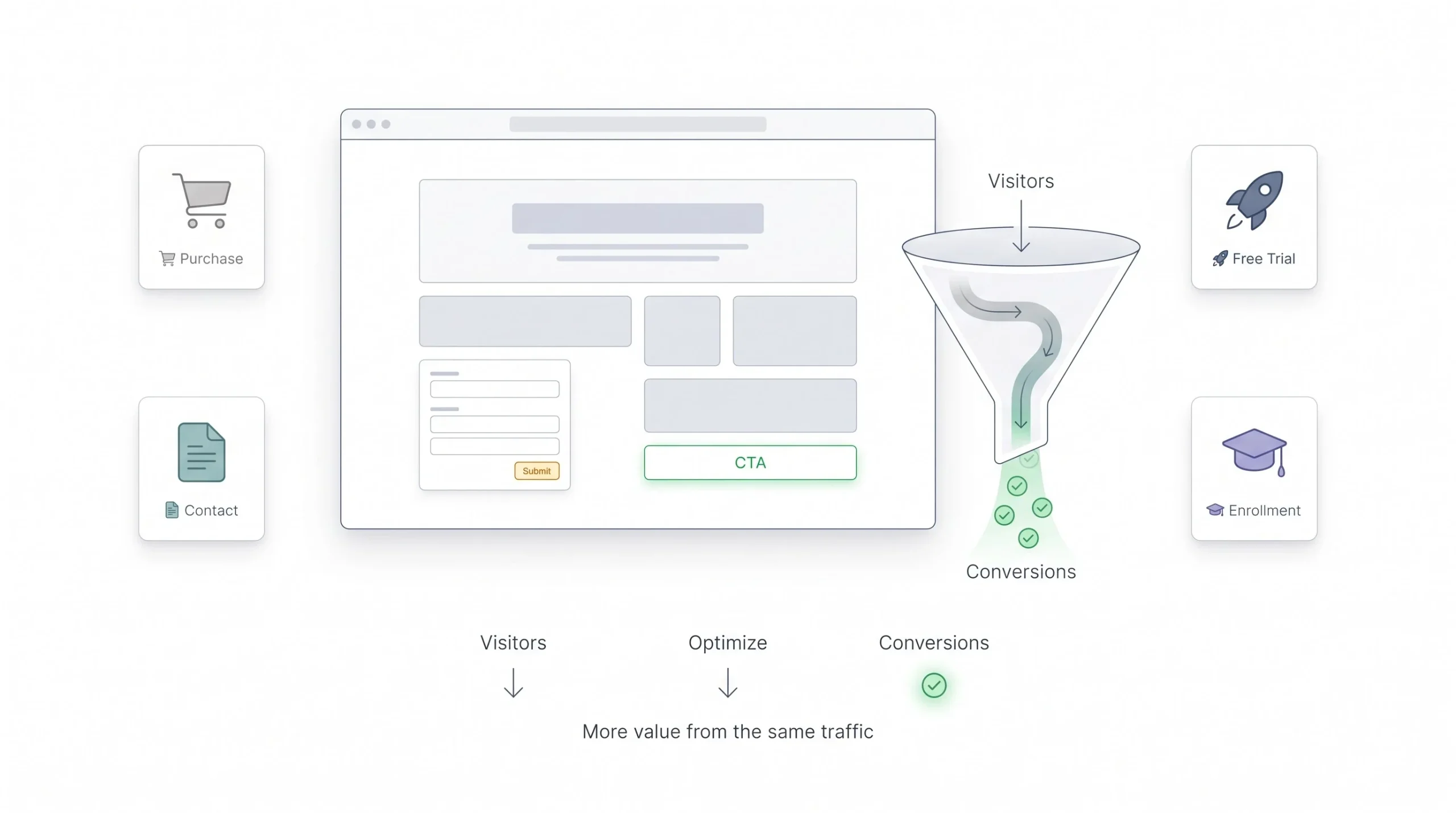
Conversion Rate Optimisation, or CRO, is the process of getting more value out of the visitors you already have. Not more visitors. The same visitors, converting at a higher rate. That’s it. That’s the whole idea, and honestly it’s simpler than most blog posts make it sound.
A “conversion” isn’t always a sale. Depends entirely on what your website is for. If you run an online store, a conversion might be a completed purchase. If you run a SaaS product, it could be someone signing up for a free trial. If you’re an agency or a service business, it’s probably someone filling out a contact form or booking a call. If you’re an education platform, it might be someone enrolling in a course or requesting a brochure. The point is, you need to sit down and decide what counts as a win on each page of your site before you can start optimising for it. A lot of businesses skip this step entirely and end up “optimising” for the wrong thing, like chasing newsletter signups on a page whose actual job is to sell a product.
The math behind it is stupidly simple:
Conversion Rate = (Conversions ÷ Total Visitors) × 100
So if 1,000 people visit your product page and 20 of them buy something, your conversion rate is 2%. Nothing complicated there. What’s complicated is figuring out why it’s 2% and not 4%, and that’s where the actual work starts. And here’s a detail beginners miss constantly: conversion rate should almost always be measured per page or per traffic source, not as one blended number for your whole website. Your homepage, your blog posts, and your checkout page all have wildly different jobs, so lumping them into a single site-wide conversion rate hides exactly the information you need.
One more thing worth saying early. CRO isn’t a task you finish. It’s not like redesigning your homepage once and moving on. It’s a process you keep running, month after month, because what works today might stop working in six months when your traffic mix changes, a competitor undercuts your pricing, or Google changes how your listing shows up in search.
| Business Type | Primary Conversion Goal | Secondary Conversion Goal |
|---|---|---|
| E-commerce | Purchase completed | Add to cart |
| SaaS | Free trial signup | Demo request |
| Agency/Service | Contact form submission | Newsletter signup |
| Education | Course enrollment | Brochure download |
Why CRO Matters More Than Traffic Growth
Look, more traffic feels good. Watching your analytics dashboard climb every month gives you a nice little dopamine hit. But traffic on its own doesn’t pay your bills. Conversions do. And here’s the part that should actually change how you think about your marketing budget.
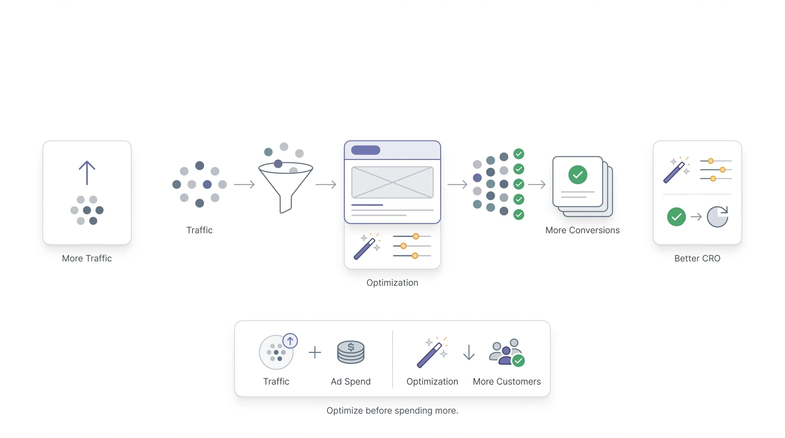
Ad costs keep going up. Every platform, every year, it’s the same story, more advertisers competing for the same eyeballs pushes cost per click higher across most industries on both Google Ads and Meta. So if you’re only focused on getting more people to your site, you’re fighting a battle that gets more expensive every quarter just to stay even. But if you improve your conversion rate, you’re getting more customers out of the exact same ad spend. That’s not a marginal win. That’s the difference between a campaign that’s profitable and one that isn’t.
Walk through the actual numbers for a second, because this is where it clicks for most people. Say you’re spending 100,000 rupees a month on ads, sending traffic to a landing page that converts at 1%. If your average order value is 2,000 rupees and your cost per click is 20 rupees, you’re getting 5,000 clicks, 50 conversions, and 100,000 rupees in revenue. You broke even. Now push that same page to a 2% conversion rate through better CRO work, no extra ad spend, and you get 100 conversions and 200,000 rupees in revenue on the same budget. That’s the leverage CRO gives you, and it’s why agencies that only focus on media buying and ignore the landing page are leaving money on the table for their clients.
There’s also a compounding effect that people underestimate. Say you improve your conversion rate from 2% to 3%. That’s not just a one-time bump. Every future traffic source you add, every new campaign, every organic search visitor, every referral from a blog post, all of it now converts at that higher rate. You fixed it once and it keeps paying you back for as long as that page stays live.
And here’s something CRO has going for it that most marketing tactics don’t. It works across every channel at once. SEO traffic, paid traffic, email traffic, social traffic, all of it eventually lands on the same handful of pages, your homepage, your product pages, your checkout. Fix those pages and every channel benefits simultaneously. You don’t get that kind of leverage from most other marketing activities, where the effort you put into one channel usually stays locked to that channel.
A 1% traffic increase gets you 1% more visitors. A 1% conversion rate increase gets you 1% more customers from the exact same traffic, for free.
Understanding the Conversion Funnel
Before going any further, it helps to have a mental model for how people actually move through your website. This is the funnel, and once you understand it, pretty much every CRO tactic in this guide will make more sense because you’ll know where it fits.
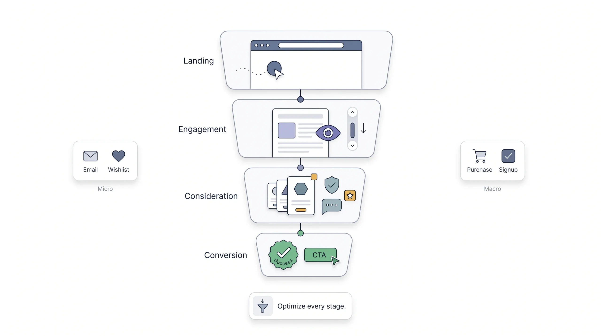
Think of it in four rough stages. Someone lands on your site, usually from an ad, a Google search, or a link someone shared (Landing). They start looking around and reading, trying to figure out if this place is legit and relevant (Engagement). They start weighing whether this is worth their time or money, maybe comparing you to two other tabs they’ve got open (Consideration). And then, hopefully, they act (Conversion). Simple on paper. Messy in real life, because people jump around, leave and come back three days later, get distracted halfway through checkout because their phone buzzed with a WhatsApp message.
The mistake a lot of beginners make is obsessing over the conversion stage only, tweaking button colors and CTA copy, while ignoring the fact that 80% of their visitors are dropping off way earlier, at the landing stage, because the page didn’t load fast enough or didn’t match what the ad promised. Here’s a concrete version of this mistake: an ecommerce brand runs a Meta ad promising “flat 40% off,” someone clicks, lands on a generic homepage with no mention of the discount anywhere, and bounces in four seconds. That business could spend the next three months A/B testing their checkout button colour and it would do nothing, because the actual leak is happening one step earlier. Fixing the wrong stage of the funnel is like rearranging furniture in a house that’s on fire.
It also helps to separate micro-conversions from macro-conversions. A macro-conversion is the big thing, the purchase, the signup, the enrollment. A micro-conversion is a smaller step along the way, like someone giving you their email in exchange for a free guide, or adding a product to their wishlist without buying it yet. Micro-conversions matter because they’re stepping stones and they’re measurable proof that a page is doing part of its job even when the final sale doesn’t happen on the first visit. Someone who downloads your free resource today is a much warmer lead than someone who bounced off your homepage in four seconds, even though neither one bought anything.
| Funnel Stage | Visitor Mindset | CRO Focus |
|---|---|---|
| Landing | “Am I in the right place?” | Message match, page speed |
| Engagement | “Is this relevant to me?” | Content clarity, trust signals |
| Consideration | “Should I do this?” | Objection handling, social proof |
| Conversion | “How do I do this?” | CTA clarity, friction removal |
The CRO Process: A Step-by-Step Framework
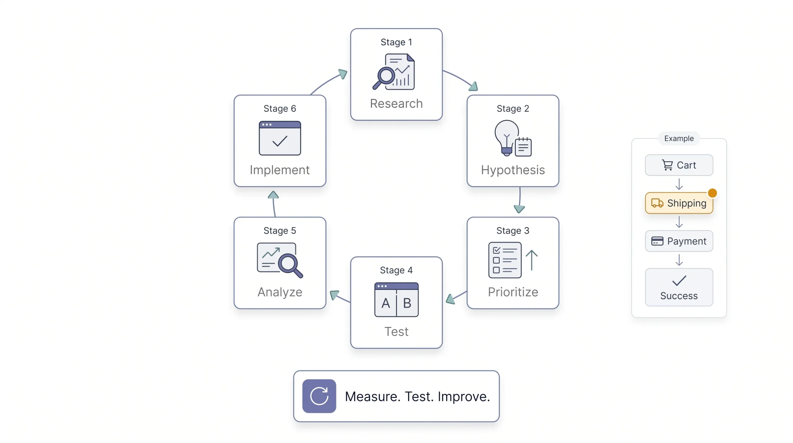
Here’s where a lot of beginner content stops short. It’ll tell you “test your headlines” or “add urgency” without ever explaining the actual process that connects those tactics together. So here’s the framework, the real one, that you can follow starting tomorrow, with a worked example running alongside each step so it’s not just theory.
Research and data collection. Before touching a single button or headline, you need to know where people are actually dropping off. Guessing at this stage is how you end up optimising the wrong page for six months. Say your analytics shows 60% of people who add a product to cart never make it to the payment page. That number alone is your starting point.
Hypothesis formation. Once you know where the leak is, you form an educated guess about why it’s happening and what might fix it. Not “let’s just try stuff.” A hypothesis looks more like this: “Visitors are abandoning at the shipping step because the shipping cost isn’t shown until the final page, so showing an estimated shipping cost earlier in the cart should reduce that drop-off.” Notice that’s specific enough to actually test, not vague like “improve checkout.”
Prioritisation. You’ll have more ideas than time. Rank them by two things, how much impact they’re likely to have and how much effort they’ll take to test. A common way to do this is a simple high/medium/low score on both impact and effort for each idea, then start with whatever lands in the high-impact, low-effort corner. Showing shipping cost earlier takes an afternoon of dev work. Redesigning your entire cart flow takes three weeks. Start with the afternoon.
Testing. This is where you actually run the experiment, usually an A/B test, comparing your current page (the control) against a variant with the one change you hypothesised.
Analysis. Look at the results honestly. Did it win, lose, or was it basically a wash? Resist the urge to call something a win just because you spent two weeks building it. If the shipping cost test only moved conversions from 2.0% to 2.05%, that’s probably noise, not a win, and you should say so instead of writing it up as a success in your report.
Implementation and iteration. If it worked, roll it out fully. If it didn’t, you still learned something concrete about your visitors, in this case maybe shipping cost wasn’t actually the objection, and now you can move to testing the next hypothesis, like payment method availability. Either way, you go back to research and do it again. This never really stops.
CRO without data is just guessing with extra steps.
How to Research Where You’re Losing Conversions
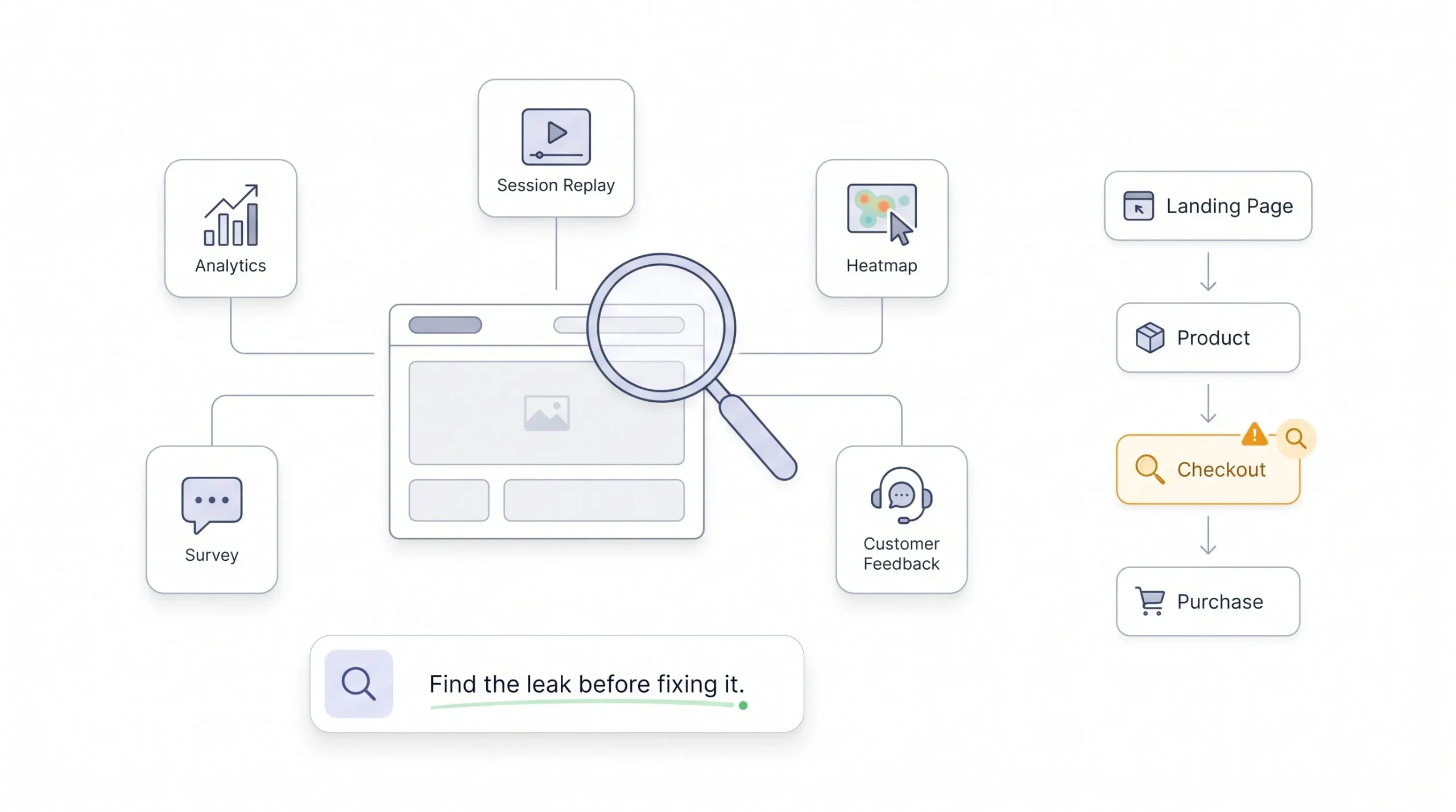
This is honestly the part beginners skip most often, and it’s the part that matters most. Everyone wants to jump straight to changing button colors. Nobody wants to sit down and actually look at where people are leaving.
There are two broad categories of research here, and you need both. Quantitative research tells you what’s happening, the actual numbers. Qualitative research tells you why it’s happening, the human reasons behind those numbers. If you only use one, you’ll either have numbers with no story behind them, or opinions with no data to back them up.
On the quantitative side, Google Analytics is your starting point. Look at your funnel drop-off reports, your exit pages, your bounce rate by page. If half your traffic is leaving from one specific page in your checkout flow, that’s not a coincidence, that’s a signal worth chasing. Heatmaps and scroll maps go a step further and show you literally where people are clicking and how far down the page they’re scrolling before giving up. If your heatmap shows almost nobody scrolls past the first screen on a page where your main offer sits at the bottom, you’ve found a real problem without needing a single test. Session recordings take it even further, you can watch actual anonymized recordings of real visitors moving through your site, and honestly, watching even ten of these will teach you more than a week of staring at spreadsheets. You’ll see things like someone repeatedly clicking a button that isn’t actually clickable, or someone opening your FAQ section, reading it, and leaving anyway, which tells you your FAQ didn’t answer their real question.
On the qualitative side, on-site surveys are underrated. A simple popup asking “what almost stopped you from completing this purchase today” can surface objections you never would have guessed, things like “I wasn’t sure if this ships to my city” or “I couldn’t find a return policy.” Those two specific answers alone could each become a hypothesis worth testing. User testing sessions, where you literally watch someone unfamiliar with your site try to complete a task like “find and buy a pair of running shoes under 3,000 rupees,” are uncomfortable to watch sometimes because you’ll see them get confused by things you thought were completely obvious, like a filter that doesn’t do what its label suggests. And don’t sleep on your sales and support team. They’re talking to customers every single day and hearing the same objections over and over, “is this genuine,” “why is delivery so slow,” “does this come with a warranty.” That’s free research most companies never bother collecting, sitting in WhatsApp chats and support tickets nobody reads back.
| Method | What It Reveals | Best Used For |
|---|---|---|
| Google Analytics | Where users drop off | Identifying leak points |
| Heatmaps | Where users click/scroll | Layout and attention issues |
| Session recordings | How users actually behave | Spotting confusion or hesitation |
| Surveys | Why users hesitate or leave | Understanding intent and objections |
| Sales/support feedback | Recurring customer objections | Messaging and FAQ gaps |
Key Elements of a High-Converting Page
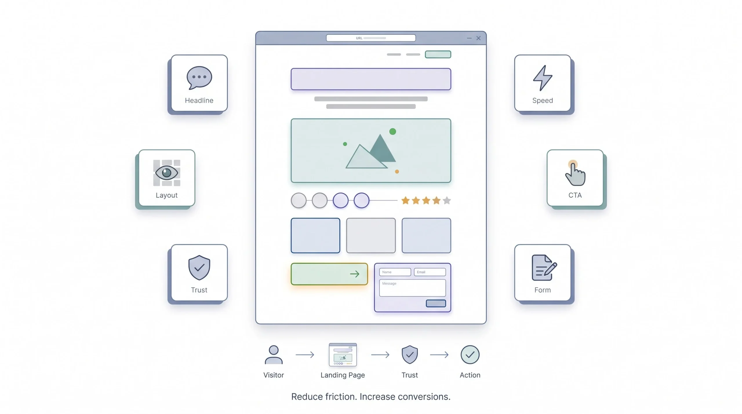
Now let’s get into the actual page. Once you know where people are dropping off, these are the elements that usually need attention, roughly in the order they matter most.
Headlines and messaging
Your headline isn’t the place to get clever. It’s the place to be instantly clear about what this page is and why someone should care. And this matters more than most people realise: if your ad says “50% off winter jackets” and your landing page headline talks about your brand story instead, you’ve just lost that visitor. This is called message match, and breaking it is one of the fastest ways to tank a conversion rate. Whatever promise got them to click, your page needs to keep that promise in the first five seconds, ideally in the headline itself. Compare “Welcome to Our Store” against “Winter Jackets, Flat 50% Off, Ends Sunday.” One of those tells a visitor exactly what they’re getting and why now. The other one makes them work to figure out if they’re even in the right place.
Page speed and technical performance
Nothing else on this list matters if your page takes six seconds to load. People bounce before they even see your carefully written headline. Every additional second of load time chips away at how many people stick around long enough to see your offer at all, which is exactly why page speed sits so close to the top of this list even though it feels like a technical problem rather than a marketing one. This deserves its own deep dive, which is worth reading separately if you haven’t already looked into how site speed affects both SEO and conversions. For this guide, just know that page speed is the floor, not a nice-to-have. Fix it before you fix anything else, because a beautifully designed page that loads slowly will lose to an ugly page that loads instantly, more often than you’d think.
Visual hierarchy and layout
People don’t read web pages top to bottom like a book. They scan. Eye-tracking patterns like the F-pattern and Z-pattern describe how visitors’ eyes move across a page depending on the layout, F-pattern for text-heavy pages like blog posts, Z-pattern for simpler pages with a clear visual path from top-left to bottom-right. What this means practically is that your most important information, your headline, your value proposition, your primary CTA, needs to sit in the places people’s eyes naturally go first. Cramming everything above the fold doesn’t help either, it just makes people work harder to find what matters. Neither does burying your CTA at the bottom of a wall of text that most visitors will never reach.
Call-to-action design
One primary CTA per page. Not three competing buttons asking someone to “Buy Now,” “Learn More,” and “Subscribe” all in the same viewport, fighting for the same attention. Pick one action you want this page to drive and make that button impossible to miss, with copy that says exactly what happens next. “Start Your Free Trial” beats “Submit” every time, because it tells people what they’re getting, not just what action they’re performing. Even something as small as changing “Submit” to “Get My Free Quote” on a contact form changes how much friction a visitor feels clicking it, because one sounds like paperwork and the other sounds like a benefit.
Trust signals
People are cautious online, and rightly so, especially in markets where fake products and scam sites are common enough that caution is the default. Reviews, testimonials, security badges, certifications, case studies, all of these reduce the perceived risk of taking action. A product page with zero reviews next to one with 400 reviews and a 4.6 star average, that’s not a small difference in how safe a purchase feels, it’s often the entire deciding factor between two nearly identical products.
Forms and friction reduction
Every field you add to a form is a small tax on your visitor’s patience. Ask yourself honestly whether you need someone’s phone number, company size, and job title just to send them a free ebook, or whether an email address alone would have gotten you the lead anyway. Autofill, progress indicators on multi-step forms so people know how much is left, and guest checkout options instead of forcing account creation before purchase, all of these reduce the friction between someone wanting to convert and actually completing it. A five-field form will almost always outperform a twelve-field form asking for the same eventual outcome, simply because fewer people quit halfway through.
Every extra form field is a reason to leave. Every unnecessary click is a chance to lose them.
The Psychology Behind Conversions
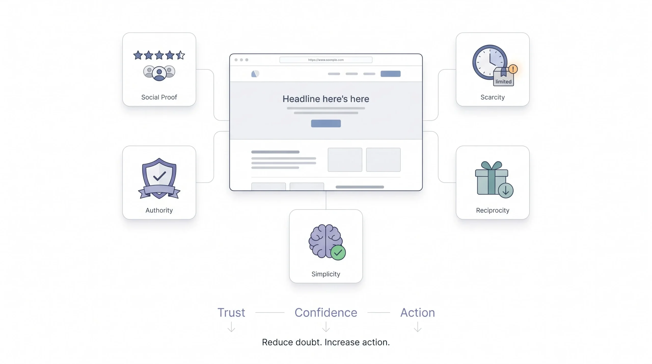
This is the part that separates people who just copy tactics from people who actually understand why those tactics work. And once you get the psychology, you can apply it to situations no blog post ever specifically covered for you.
Social proof works because humans are wired to look at what other people are doing before making a decision, especially when they’re uncertain about something new. That’s why “join 10,000+ customers” or a wall of reviews does real work on a page. It’s not decoration, it’s reducing the mental risk of being the first person to try something. This is also why a product with three reviews saying “not as described” sitting right at the top can do more damage than having no reviews at all, so trust signals cut both ways and need actual attention, not just collection.
Scarcity and urgency tap into loss aversion, which is basically the fact that people feel the pain of losing something more sharply than the pleasure of gaining something equivalent. “Only 3 left in stock” isn’t just a marketing trick, it genuinely shifts how people weigh their decision, because now not acting feels like losing an opportunity rather than just delaying a purchase. Where this backfires is when it’s obviously fake, a “sale ends in 24 hours” countdown that resets every day the moment someone revisits the page. Visitors notice that faster than businesses think, and it burns trust for every trust signal that comes after it on that page.
Authority and credibility cues, things like certifications, press mentions, expert endorsements, work because people default to trusting signals of expertise when they don’t have the knowledge to evaluate something themselves. If someone doesn’t know how to judge a solar panel installer’s work quality, a government empanelment badge or an ISO certification does some of that trust-building for them, doing in one glance what three paragraphs of text could never accomplish.
Reciprocity is the psychology behind giving something away for free before asking for the sale. A free guide, a free tool, a free consultation, a free sample. People feel a subtle pull to reciprocate when they’ve received value first, and that’s why lead magnets work as well as they do when they’re actually useful and not just a thin excuse to grab an email address.
And then there’s cognitive ease. Simply put, confused people don’t convert. Every extra decision, every unclear choice, every cluttered layout adds mental friction, and friction kills conversions faster than almost anything else on this list. A page that feels easy to understand and easy to act on will consistently outperform one that’s technically more impressive but harder to process, which is part of why some of the highest-converting pages in the world look almost boring compared to what a designer might want to build.
| Principle | On-Page Application | Example |
|---|---|---|
| Social proof | Reviews, user counts | “Join 10,000+ customers” |
| Scarcity | Limited stock/time messaging | “Only 3 left in stock” |
| Authority | Certifications, press mentions | “Featured in Forbes” |
| Reciprocity | Free resources before the ask | Free guide before signup |
| Cognitive ease | Simple layout, minimal choices | Single clear CTA |
A/B Testing for Beginners
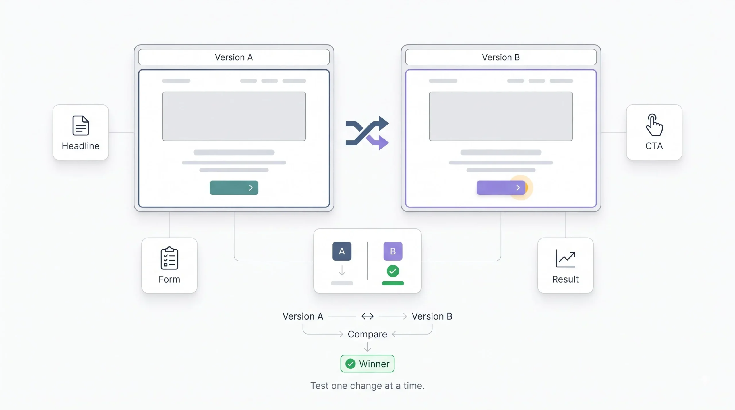
A/B testing sounds intimidating until you break it down. It’s really just this: you take your current page, call it the control, and you create one variant with a single change. You split your traffic so half sees one version and half sees the other, and you measure which one converts better over a set period of time. That’s it. No PhD required.
Where to start? Test the highest-impact, lowest-effort stuff first. Headlines, CTA button copy, form length. These are quick to change and can move the needle significantly. A headline test might take an hour to set up. A full page redesign might take three weeks. Get the quick wins done first. Don’t start by redesigning your entire homepage layout as your first test, because if it wins or loses, you won’t know which of the fifty things you changed actually caused it, and you’ll have burned a month learning nothing you can repeat elsewhere.
Now, statistical significance. This scares people off for no reason. All it really means is, are you confident the difference you’re seeing is real and not just random noise? If you only send 40 visitors to each version and one converts at 5% and the other at 7%, that’s not a real result yet, that’s just two or three extra people who happened to click, and the exact same test run again next week could easily flip the other way. You need enough traffic and enough conversions on both sides before you can trust the number. As a rough rule, if your page doesn’t get much traffic, say under a few thousand visitors a month, a formal A/B test is going to take a long time to tell you anything reliable, and that’s worth knowing before you get impatient and call it early based on a lead that isn’t real yet.
Common mistakes worth avoiding. Testing five things at once and then trying to figure out which one caused the lift, that’s a mess, don’t do it, you’ll never be able to repeat that win on your next page because you won’t know which change actually did the work. Stopping a test after three days because one version is “winning,” that’s almost always premature, early leads flip more often than people expect, sometimes because of what day of the week it is, weekday shoppers and weekend shoppers don’t always behave the same way. And ignoring outside factors, like running a test during a big sale event or right when your ad targeting changed, that can quietly poison your results without you realising it, because now you’re not comparing two page designs, you’re comparing two completely different traffic conditions.
A test that ends too early doesn’t give you an answer. It gives you a guess dressed up as data.
Tools for CRO
You don’t need a massive budget to start doing real CRO work. Here’s what actually matters, organised by what job each tool does.
| Category | Purpose | Example Tools |
|---|---|---|
| Analytics | Track behaviour and funnels | Google Analytics 4 |
| Heatmaps/Recordings | Visualise user behaviour | Hotjar, Microsoft Clarity |
| A/B Testing | Run and measure experiments | VWO, Optimizely |
| Surveys | Collect direct user feedback | Hotjar surveys, Typeform |
| Page Speed | Measure and improve load times | PageSpeed Insights, GTmetrix |
Start with the free stuff. Google Analytics and Microsoft Clarity cost nothing and will already tell you more than most businesses currently know about their own website. If you’re a small business or a beginner reading this, spend your first month purely on the free tools before spending a single rupee on paid software. Once you’ve got a handle on the basics and you’re running consistent tests with enough traffic to make them meaningful, that’s when it makes sense to look at paid testing platforms like VWO or Optimizely.
Common CRO Mistakes Beginners Make
A lot of these come from impatience, honestly, or from copying advice that wasn’t meant for a site with your traffic level.
Testing without enough traffic to reach significance is probably the most common one. If your site gets 200 visitors a month, running a formal A/B test on a low-traffic page might take half a year to give you a reliable answer, and by then the market’s moved on, your product line changed, or the test isn’t relevant anymore. Sometimes for low-traffic pages, it makes more sense to just make the change based on strong qualitative research, session recordings, and survey feedback, rather than waiting on a test that’ll never reach significance in a reasonable time.
Optimising for vanity metrics is another trap. Time on page and bounce rate going down look nice in a report, but if they’re not connected to actual conversions, they don’t mean much on their own. A visitor spending four minutes confused on your pricing page isn’t a win just because “engagement” went up, that’s four minutes of frustration, not four minutes of interest.
Copying “best practices” blindly is a big one too. Every “best practice” you read, including several in this guide, was learned from someone else’s audience, someone else’s product, someone else’s traffic source. What worked for a SaaS company selling to enterprise buyers might do nothing, or even hurt, on a page selling t-shirts to teenagers, because the psychology, the price point, and the buying urgency are completely different. Test it on your own audience before trusting it fully, no matter how confidently it was written up elsewhere.
Redesigning everything at once instead of isolating variables makes it impossible to learn anything. If you change your headline, your images, your CTA, and your layout all in one go and conversions go up, you genuinely don’t know why. Was it the headline? The layout? The new product photos? You’ve spent all that effort and learned nothing you can repeat on your next page.
And ignoring mobile experience, honestly, this one still surprises how common it is. Plenty of businesses still design and test primarily on desktop while most of their actual traffic is coming in on phones, especially in markets where mobile browsing dominates. A page that converts beautifully on a laptop screen can be a nightmare to navigate on a five inch screen with a thumb, buttons too small to tap accurately, forms that are painful to fill out on a mobile keyboard, and if that’s most of your traffic, that’s most of your lost revenue too, quietly, without ever showing up as an obvious problem unless you actually segment your data by device.
How to Build a CRO Roadmap for Your Website
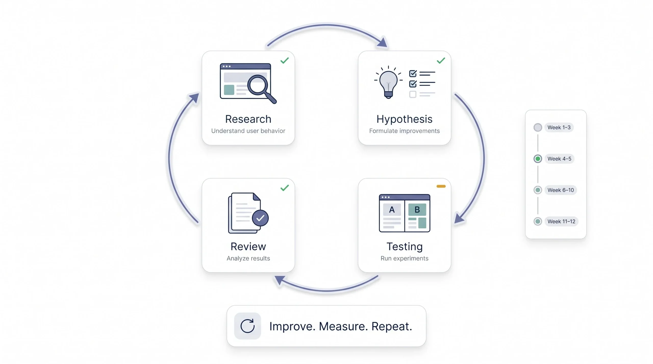
Knowing all of this is one thing. Actually doing it in some kind of order is another. Here’s a simple way to structure your first 90 days if you’re starting from zero.
Spend the first few weeks purely on research. Get your analytics set up properly if it isn’t already, install a heatmap tool, and get a basic exit survey running. Don’t touch anything on the site yet. You’re just collecting evidence, resisting the urge to fix things before you actually understand what’s broken.
Once you’ve got a few weeks of data, sit down and identify your top three to five friction points. Not fifteen. Three to five, ranked by how much impact fixing them is likely to have and how easy they’d be to test, so you’re not spreading your attention thin across problems that barely move the number.
Then move into testing. Pick your highest priority item, build a hypothesis, create your variant, and run the test properly, giving it enough time and traffic to reach a real conclusion instead of calling it early because you’re excited about the early numbers.
After that first testing window, review what happened. Did it win? Did it lose? What did you learn about your visitors either way? Document it, because six months from now you won’t remember why that headline test failed, and that knowledge is worth keeping so you don’t repeat the same failed idea with a different label on it. Then go back to research and start the next cycle, because the businesses that treat this as a repeating loop are the ones that keep improving quarter after quarter, not the ones that do one big redesign and call it done.
| Phase | Timeframe | Key Activities |
|---|---|---|
| Research | Weeks 1–3 | Set up analytics, heatmaps, surveys |
| Hypothesis | Weeks 4–5 | Identify top 3–5 friction points |
| Testing | Weeks 6–10 | Run first A/B tests |
| Review | Weeks 11–12 | Analyse results, plan next cycle |
Conclusion
CRO isn’t something you finish and check off a list. It’s a habit, more than a project, and the businesses that take it seriously tend to pull ahead of competitors who are still throwing more ad budget at the same leaky website month after month. The good news is you don’t need a big team or a fancy toolset to start. You need to actually look at what your visitors are doing, form a real hypothesis about why they’re leaving, and test it properly instead of guessing. Do that consistently and the gains add up in ways that compound over every channel you run. Traffic will always cost more next year than it does this year. What you do with that traffic once it lands is entirely up to you, and that’s the part worth getting good at.
Frequently Asked Questions
What is a good conversion rate for a website?
There isn’t one universal number, it depends heavily on your industry, your traffic source, and what you’re asking people to do. Ecommerce sites often see conversion rates somewhere between 1% and 3% for purchases, while a simpler action like a newsletter signup can run much higher. The more useful question isn’t “what’s a good conversion rate” in general, it’s “what’s my own conversion rate compared to last month,” because that’s the number you actually have control over.
How long should an A/B test run?
Long enough to reach statistical significance and cover at least one full business cycle, usually a minimum of one to two weeks so you’re not just capturing a single unusual day. Low-traffic sites will need to run tests longer than high-traffic sites to reach a reliable sample size. Ending a test early because one version is ahead is one of the most common mistakes beginners make.
What’s the difference between CRO and SEO?
SEO is about getting more people to find and click through to your website in search results. CRO is about what happens after they arrive, turning that visit into an actual action. They work together, better SEO traffic means nothing if the page it lands on doesn’t convert, and a great converting page is wasted if nobody ever sees it.
Do I need a lot of traffic to start CRO?
You need traffic to run formal A/B tests with statistical confidence, but you don’t need much traffic to start the research phase. Even a handful of session recordings or a few survey responses on a low-traffic site can reveal obvious friction points worth fixing without needing to run a test at all.
What’s the first thing I should optimise?
Start with whatever has the biggest gap between traffic and conversions, usually found through your analytics funnel report. For most sites that’s either the landing page people first arrive on or a specific step in checkout where a large percentage of visitors disappear. Fix the biggest leak first, not the smallest annoyance.
Can CRO work for small businesses with low budgets?
Yes, and honestly it matters more for small businesses, since every visitor costs more relative to your overall budget compared to a large company. Free tools like Google Analytics and Microsoft Clarity cover most of what a beginner needs to get started without spending anything.
How often should I run CRO tests?
As often as your traffic allows you to reach meaningful results. For most small to mid-sized sites that means one or two well-designed tests running at a time, not five simultaneous tests competing for the same visitors and muddying your data.
What’s a statistically significant result?
It means the difference between your control and your variant is large enough and consistent enough that it’s unlikely to be random chance. In practice, most testing tools will calculate this for you and show a confidence percentage, and it’s generally safer to wait for that number to cross a solid threshold, commonly around 95%, before trusting the result.
Is CRO a one-time project or ongoing?
Ongoing, always. Visitor behaviour changes, your product changes, your competitors change, and a page that converted well last year can quietly decline without an obvious reason unless you keep testing and reviewing it.
What’s the difference between micro and macro conversions?
A macro-conversion is the main goal of your site, a purchase, a signup, an enrollment. A micro-conversion is a smaller step along the way that signals interest, like adding something to a wishlist or downloading a free resource. Tracking both gives you a fuller picture of where visitors are engaging even before they’re ready for the big commitment.
Why did my conversion rate drop even though I didn’t change anything on the page?
This happens more than people expect, and usually the page isn’t the problem. A shift in your traffic source, like a new ad campaign bringing in a less qualified audience, or a seasonal change in buying behaviour, can lower your conversion rate without the page itself being broken. Always check where your traffic is coming from before assuming the page needs fixing.
Should I hire a CRO agency or do it myself as a beginner?
For most small businesses starting out, doing the research phase yourself first makes sense, since it costs nothing and teaches you what your own visitors actually struggle with. Once you’ve got a baseline understanding and enough traffic to make formal testing worthwhile, bringing in outside help for the technical testing setup can speed things up, but the qualitative research and honest look at your own funnel is something no outsider can do better than someone who knows the business.