

Picture a website with genuinely good content. Clean design, fast load time, the copy actually answers the question someone searched for. And then the visitor reads it, nods along, and leaves. No signup, no purchase, no email captured. Nothing. That happens constantly, and most of the time the reason isn’t the content or the design. It’s that nobody told the visitor what to do next.
That’s the whole problem a CTA solves. People don’t act on their own nearly as often as marketers assume. They need a clear, specific nudge: click here, sign up now, get the guide. Without that nudge, even a genuinely interested visitor just closes the tab and moves on with their day, because default human behavior is inertia, not initiative.
This matters everywhere, not just on a homepage. A blog post without a CTA converts curiosity into nothing. A landing page without one is just an expensive brochure. An email without a clear next step gets read and forgotten within minutes. Every format where you’re asking for attention needs an equally clear ask for action, or you’re leaving conversions on the table you already paid to generate through traffic, ads, or content.
This guide covers what a CTA actually is, why it matters so much more than its size on the page would suggest, the psychology behind why people click one button and ignore another, and the practical mechanics of writing, designing, and placing CTAs that actually convert. It also gets into funnel stage, channel-specific examples, common mistakes, and how to measure and improve what you’ve already got live.
What You Will Learn in This Guide
- What a CTA is, and how it’s different from a regular link or a menu item
- Why calls-to-action directly affect conversions, leads, and revenue
- The psychology behind why some CTAs get clicked and others get ignored
- The main types of CTAs and where each one fits in a marketing funnel
- How to write CTA copy that actually moves people, not just describes an action
- Design and placement rules that consistently outperform guesswork
- Channel-specific and industry-specific CTA examples you can adapt directly
- Common CTA mistakes that quietly cap conversion rates
- How to test, measure, and keep improving CTA performance over time
What Is a CTA (Call-to-Action)?
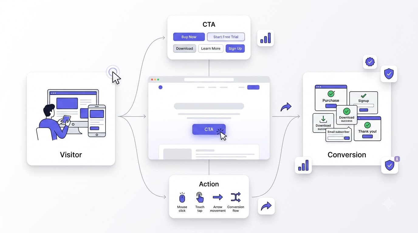
A CTA, short for call-to-action, is a prompt, usually a button or a short line of text, that tells a visitor exactly what to do next. Buy Now. Start Free Trial. Download the Guide. It’s the single moment on a page where interest is supposed to turn into an action, and most pages get exactly one real shot at that moment before the visitor leaves.
A CTA is any element on a page, email, ad, or post specifically designed to prompt an immediate, specific action from the reader. It’s usually a button, sometimes a hyperlinked phrase, and occasionally just bold, standalone text, but the defining feature is intent: it exists to move someone from passive reading to active doing.
CTA Meaning in Digital Marketing
In marketing specifically, a CTA is the bridge between a marketing effort (an ad, a blog post, an email campaign) and the business outcome that effort was actually built to produce, whether that’s a sale, a signup, or a booked call. Without it, you’re spending money and time generating attention that has nowhere to go.
Why Every Marketing Campaign Needs a CTA
Every campaign, no matter how creative or well-targeted, needs a clear next step or it’s just noise with good production value. Look at what actually happens without one: someone sees your ad, feels something, and then does absolutely nothing because you never told them what “next” looked like.
Difference Between Information and Action
Information tells someone something. Action asks them to do something. A page can be packed with useful, accurate information and still convert at zero percent if it never transitions from explaining to asking. That transition point is exactly where a CTA belongs.
CTA vs Navigation Link
A navigation link helps someone explore your site. A CTA asks them to commit to something specific, right now. “About Us” in your header is navigation. “Book a Free Consultation” is a CTA. Mixing the two up, treating every link like it should convert, waters down the ones that actually matter.
CTA vs Conversion Goal
A conversion goal is the business outcome you’re tracking, like “500 signups this month.” The CTA is the actual mechanism, the button or line of copy, that drives toward that goal. You can have a great conversion goal and still miss it completely if the CTA asking for it is weak, vague, or buried.
Why Calls-to-Action Matter
CTAs aren’t a design afterthought you slap on at the end. They’re one of the highest-leverage elements on any page, because they sit at the exact moment where a visitor decides whether this was worth their time or not.
Direct Users Toward the Next Step
Most visitors won’t figure out the “right” next step on their own, even if it seems obvious to you. A clear CTA removes that guesswork entirely, telling them precisely where to go and what happens when they get there.
Improve Website Conversions
Pages with a single, clear, well-placed CTA consistently outperform pages with none or with several competing options. The CTA is often the difference between a visitor who reads and leaves and one who actually converts into a lead or a customer.
Generate More Leads
Lead generation depends entirely on asking for the lead. A resource page with genuinely valuable content but no CTA to capture an email address is just giving away value with nothing coming back, no matter how much traffic it pulls in.
Increase Sales
On ecommerce and sales pages specifically, the CTA is the literal transaction point. Add to Cart, Buy Now, Get Started, these aren’t decoration, they’re the mechanism the entire page exists to lead someone toward.
Encourage Engagement
CTAs like Watch Video, Read More, or Share This keep people moving deeper into your content and your brand instead of bouncing after one page. Engagement CTAs matter even when there’s no direct sale involved, because they build the relationship that eventually leads to one.
Reduce Decision Fatigue
When people face too many choices, they often choose nothing at all. A clear, singular CTA reduces that fatigue by making the decision simple: do this one thing. That simplicity is a genuine conversion lever, not just good manners.
Improve User Experience
A well-placed CTA actually helps users, it’s not purely a business tactic. People visiting a site with a question or a need want to know what to do next, and a clear CTA answers that unspoken question directly instead of leaving them to hunt for it.
Support Business Goals
Every CTA should tie back to something the business actually needs, whether that’s revenue, leads, or retention. A CTA that doesn’t connect to a real business goal is just filler taking up space that could be doing actual work.
Make Marketing Measurable
CTAs give you something concrete to measure. Click-through rate, conversion rate, cost per click, all of it traces back to a specific CTA. Without one, you’re stuck trying to measure vague “engagement” instead of an actual, countable action.
The Psychology Behind High-Converting CTAs
Good CTA copy isn’t really about clever wording. It’s about understanding why people click one thing and scroll past another, which comes down to some fairly predictable psychological patterns.
Why People Click
People click when the perceived value of taking the action outweighs the perceived effort or risk of doing it. That’s the whole equation. Every improvement to a CTA, wording, design, placement, is really just an attempt to shift that balance in your favor.
Motivation vs Friction
Motivation is what pulls someone toward clicking, curiosity, need, desire. Friction is what pushes back: uncertainty, effort, distrust. A high-converting CTA either increases motivation, reduces friction, or ideally does both at the same time.
Cognitive Load
Every extra word, every unclear phrase, adds a small amount of mental effort a visitor has to spend figuring out what you’re actually asking. Simple, direct CTAs convert better largely because they cost the reader almost nothing to process.
Choice Overload
When a page offers five different CTAs competing for attention, visitors often freeze and choose none of them. One clear, dominant CTA per page section consistently beats a wall of equally weighted options fighting for the same click.
Curiosity Gap
CTAs like “See What Happens Next” or “Find Out Why” work by opening a small gap between what someone knows and what they want to know, and clicking is the fastest way to close that gap. It’s one of the oldest and most reliable psychological triggers in marketing.
Fear of Missing Out (FOMO)
FOMO-driven CTAs, “Only 3 Spots Left,” “Offer Ends Tonight,” tap into loss aversion, the fact that people are often more motivated to avoid losing something than to gain something equivalent. Used honestly, it’s a strong lever. Used dishonestly, it destroys trust fast.
Urgency
Urgency creates a time pressure that pushes someone to act now instead of later, and later usually means never. “Limited Time,” “Today Only,” and countdown timers all lean on this, and it genuinely works when the urgency is real.
Scarcity
Scarcity works similarly to urgency but focuses on quantity instead of time. “Only 5 Left in Stock” taps into the same psychological wiring: things that seem limited feel more valuable and more worth acting on immediately.
Reciprocity
When you give someone something valuable first, a free guide, a useful tool, they feel a mild social pull to reciprocate, which is exactly why “Download Your Free Guide” CTAs consistently outperform generic “Learn More” buttons.
Social Proof
CTAs paired with proof, “Join 50,000+ Marketers,” “Rated 4.9 by 2,000 Customers,” borrow trust from other people’s decisions. Humans are wired to look at what others are doing when they’re uncertain, and social proof directly reduces that uncertainty.
Commitment and Consistency
Once someone takes a small action, they’re psychologically more inclined to take a bigger, related one later. This is why multi-step CTAs (start with an email, then ask for a purchase) often outperform asking for the big commitment right away.
Trust Signals
Security badges, testimonials, and clear guarantees placed near a CTA reduce the perceived risk of clicking it. A visitor who’s unsure whether a form is safe to fill out simply won’t fill it out, no matter how good the offer is.
Emotional Triggers
People rarely make decisions on pure logic. CTAs that tap into a specific emotion, relief, excitement, ambition, tend to outperform purely functional copy, because the emotional hook gives someone a reason to act right now instead of “eventually.”
Value Perception
The CTA needs to make the value of clicking obvious in the moment, not just implied. “Get Started” is vague. “Start Saving 20% Today” tells the visitor exactly what they’re getting, which raises perceived value and lowers hesitation.
Types of Calls-to-Action
Not every CTA is trying to do the same job. Matching the right type of CTA to the right stage of the funnel is one of the most overlooked levers in conversion optimization.
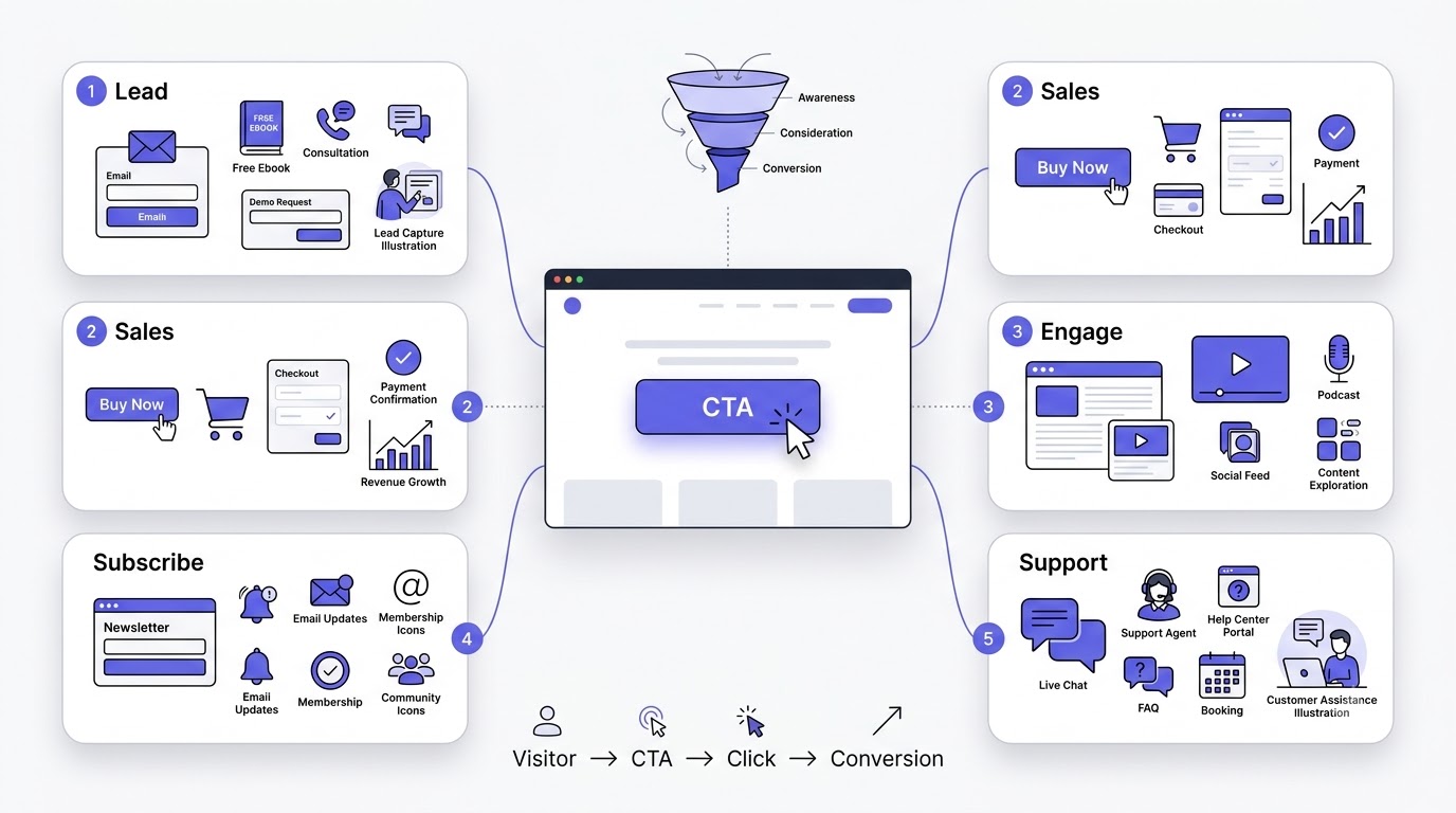
Lead Generation CTAs
These aim to capture contact information in exchange for value, and they work best when the offer is genuinely useful, not just a thin excuse to grab an email. Common examples include Download an Ebook, Get a Free Guide, Free Consultation, Request Demo, and Contact Sales, each suited to a slightly different level of buying intent.
Sales CTAs
Sales CTAs push directly toward a transaction and work best once a visitor already understands the value on offer. Buy Now, Add to Cart, Start Free Trial, Upgrade Now, and Get Started all fall here, and they should generally appear later in a page or funnel, not the first thing a cold visitor sees.
Engagement CTAs
Engagement CTAs keep visitors moving through content rather than asking for a hard commitment. Read More, Watch Video, Listen Now, Explore Features, and Learn More work well early in a relationship, when someone isn’t ready to buy but is willing to keep exploring.
Subscription CTAs
Subscription CTAs like Subscribe, Join Newsletter, and Get Updates aim for an ongoing relationship rather than a one-time action, which makes them a lower-commitment ask that can still build long-term value through repeated touchpoints.
Social Media CTAs
Follow Us, Share This, Comment Below, and Tag a Friend all encourage interaction and amplification rather than direct revenue. They’re valuable for reach and community building, even though they rarely tie to an immediate sale.
Community CTAs
Join Community, Become a Member, and Join Discord aim to pull people into an ongoing space, not just a single interaction. These work particularly well for brands building loyalty and peer-driven engagement over time.
Event CTAs
Register Now, Reserve Your Seat, and Book Your Spot drive toward a specific, time-bound action, which makes urgency an especially natural and effective lever to pair with this type of CTA.
Download CTAs
Download PDF, Get Template, and Download Checklist are close cousins of lead generation CTAs but often skip the friction of a full form, trading a lower barrier to entry for a slightly less qualified lead.
Customer Support CTAs
Chat With Us, Contact Support, and Book a Call reduce friction for existing or prospective customers who have a specific question blocking them from converting, and they often quietly rescue conversions that would otherwise be lost to hesitation.
CTA Funnel Mapping
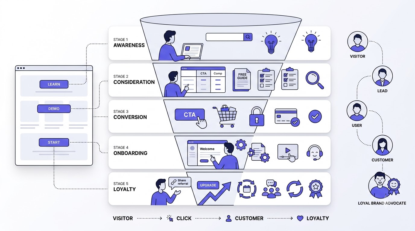
A CTA that works brilliantly at one funnel stage can flop completely at another, because the visitor’s mindset and level of trust are completely different depending on where they are in the buying journey.
Top of Funnel (TOFU)
At the top of the funnel, visitors are just becoming aware of a problem or a brand, so CTAs here should stay low-commitment: Learn More, Read the Guide, Watch the Video. Asking a cold visitor to “Buy Now” at this stage almost always underperforms.
Middle of Funnel (MOFU)
Middle-of-funnel visitors already know they have a problem and are evaluating solutions, so CTAs here can ask for a bit more: Download the Comparison Guide, Request a Demo, Start Your Free Trial, matching their growing but not yet complete buying intent.
Bottom of Funnel (BOFU)
Bottom-of-funnel visitors are ready to decide, so CTAs here should be direct and specific: Buy Now, Start Subscription, Book Your Consultation. Hesitant or vague copy at this stage just adds friction to a decision someone’s already close to making.
Post-Purchase CTAs
After a purchase, CTAs shift toward onboarding and retention: Set Up Your Account, Explore Your Dashboard, Leave a Review. These keep the relationship active instead of letting it go quiet right after the sale closes.
Customer Retention CTAs
Retention-focused CTAs like Upgrade Your Plan, Refer a Friend, and Renew Now target existing customers specifically, and they matter more than most businesses realize since retaining an existing customer is consistently cheaper than acquiring a new one.
Anatomy of a High-Converting CTA
Break apart any CTA that’s actually converting well, and you’ll find it’s usually doing several of these things at once, not relying on one clever trick alone.
Action-Oriented Verb
Every strong CTA starts with a verb that implies immediate action: Get, Start, Download, Join, Book. Passive phrasing like “More Information” gives the reader nothing to actually do, which is exactly why it underperforms almost everywhere it’s tested.
Clear Value Proposition
The CTA should make it obvious what the visitor gets, not just what they’re clicking. “Start Saving Today” beats “Click Here” because it answers the unspoken question every visitor is silently asking: what’s in it for me.
Benefit-Focused Messaging
People don’t care about your product’s features nearly as much as what those features do for them. “Get 10GB of Free Storage” beats “Sign Up” because it leads with the actual benefit instead of the bare mechanical action.
Low Friction
The easier a CTA feels to act on, fewer form fields, fewer steps, less required thought, the higher it converts. Every additional field or step you can remove from the path to conversion tends to lift completion rates measurably.
Specific Outcome
Vague CTAs like “Submit” or “Go” leave the outcome unclear. Specific CTAs like “Get My Free Quote” or “Send My Application” tell the visitor exactly what happens the moment they click, which reduces hesitation.
Sense of Urgency
Adding a time or quantity element, “Today Only,” “Limited Spots,” gives visitors a reason to act now instead of bookmarking the page and never coming back, which is honestly what happens to most “I’ll do it later” intentions.
Relevance
A CTA needs to match the content and intent of the page it’s sitting on. A “Buy Now” button on a beginner blog post aimed at total newcomers is going to underperform badly compared to a lower-commitment “Learn More” suited to where that reader actually is.
Simplicity
Short, clear CTAs beat clever, complicated ones almost every time in real testing. If a visitor has to pause and think about what a CTA actually means, you’ve already lost some percentage of clicks right there.
Emotional Appeal
CTAs that tap into how someone wants to feel, confident, relieved, excited, tend to outperform purely transactional phrasing. “Start Feeling Confident About Your Finances” carries more pull than a flat “Sign Up for Budgeting App.”
Visual Contrast
A CTA button needs to visually stand out from everything around it through color, size, or spacing, or it simply gets lost in the page regardless of how good the copy is. Visual hierarchy and copy quality have to work together.
Mobile Friendliness
With most traffic arriving on mobile, CTAs need to be large enough to tap easily, positioned where a thumb can naturally reach, and short enough not to wrap awkwardly across multiple lines on a small screen.
How to Write Effective CTA Copy
Writing CTA copy is a specific skill, closer to writing a great headline than writing regular body content. Every word has to earn its place.
Know Your Audience
CTA copy that works for a cost-conscious small business owner won’t necessarily work for an enterprise buyer weighing a six-figure decision. Know who’s actually reading the page and write the CTA in language that matches how they already talk about the problem.
Match User Intent
A visitor searching “best CRM for startups” is in research mode, not buying mode. A CTA like “Compare Plans” fits that intent far better than “Buy Now,” which assumes a decision that hasn’t actually been made yet.
Focus on Benefits Instead of Features
“Start Your Free Trial” is fine, but “Start Growing Your Pipeline Today” tells the reader what actually changes for them. Features describe the product. Benefits describe the outcome, and outcomes are what actually motivate clicks.
Use Strong Action Verbs
Verbs like Get, Start, Claim, Unlock, Discover, and Join create momentum that passive phrases like “Click Here” or “Submit” simply don’t carry. The verb sets the emotional tone of the entire CTA.
Make the CTA Specific
“Get My Free SEO Audit” converts better than “Get Started” because it removes ambiguity about what’s actually being offered. Specificity consistently beats vague, broad language in almost every CTA test.
Create Curiosity
Phrases like “See How It Works” or “Find Out What’s Included” create a small information gap that a click resolves, which often pulls in visitors who wouldn’t respond to a flat, purely transactional CTA.
Reduce Anxiety
Adding reassurance directly into or near the CTA, “No Credit Card Required,” “Cancel Anytime,” addresses the hesitation happening in someone’s head right before they click, and removing that hesitation directly lifts conversions.
Eliminate Risk
Risk reversal language like “100% Money-Back Guarantee” or “Free 30-Day Trial” shifts the perceived risk away from the visitor, which matters enormously for higher-priced or unfamiliar offers where trust hasn’t been built yet.
Personalize When Possible
Dynamic CTAs that reflect a visitor’s location, previous behavior, or account status (“Continue Where You Left Off”) consistently outperform generic, one-size-fits-all copy because they feel specifically relevant instead of mass-produced.
Use First-Person Language
Switching from “Start Your Free Trial” to “Start My Free Trial” sounds small, but plenty of tests have shown first-person CTA copy can lift clicks, likely because it mirrors the internal voice someone uses when they’re actually deciding to act.
Keep It Short
Most high-performing CTAs sit somewhere between two and five words. Long CTA copy forces the visitor to read and process more than necessary right at the moment they should just be clicking.
Test Different Variations
No CTA formula works identically across every audience and offer. What converts on one landing page can underperform on another, which is exactly why testing variations matters more than chasing a single “perfect” CTA phrase.
CTA Formula Frameworks
Having a few reliable formulas in your back pocket makes writing new CTAs faster and more consistent, instead of starting from a blank page every single time.
Action + Benefit
This pairs a clear verb with the outcome the visitor gets: “Start Saving Money,” “Get Fit Faster.” It’s simple, direct, and works across nearly every industry and offer type without much adjustment.
Verb + Outcome
Similar to Action + Benefit but leans slightly more specific: “Unlock Premium Features,” “Claim Your Discount.” The outcome here is framed as something the visitor is actively gaining or unlocking, not just a generic benefit.
Problem + Solution
This framework names the pain point directly in the CTA area, then offers the fix: “Tired of Slow Websites? Speed Yours Up Now.” It works especially well in ad copy and landing pages targeting a specific, known frustration.
Curiosity + Reward
Combining an information gap with a payoff, “See Why 10,000 Marketers Switched,” pulls in visitors driven by curiosity while still implying a concrete reward waiting on the other side of the click.
Question-Based CTA
Framing the CTA as a question, “Ready to Grow Your Business?”, invites a mental yes before the visitor even reaches the button, which can make the actual click feel like a natural continuation rather than a cold ask.
Personalized CTA
Personalized formulas insert specific details relevant to the visitor: “Get Your [City] Quote Now.” These consistently outperform generic versions because they signal the offer was built with that specific person in mind.
Social Proof CTA
Weaving proof directly into the CTA area, “Join 50,000+ Happy Customers,” borrows credibility from existing users and reduces the perceived risk of being an early or lone adopter of something unproven.
Urgency Formula
Time-based framing, “Offer Ends in 24 Hours,” creates a deadline that pushes hesitant visitors to act now instead of drifting off to “think about it,” which for most people means never coming back.
Risk Reversal Formula
Pairing the ask with a guarantee, “Try It Free, Cancel Anytime,” directly addresses the fear of commitment that stops a lot of otherwise interested visitors from ever clicking in the first place.
CTA Design Best Practices
Great copy on a poorly designed button still underperforms. Design and copy have to work together, not compete for attention.
Button Size
A CTA button needs to be large enough to notice immediately but not so oversized it looks desperate or clumsy on the page. Size should scale naturally with the importance of the action being requested.
Button Shape
Rounded corners tend to read as more approachable and are widely used across modern interfaces, while sharp corners can feel more formal or corporate. Neither is universally “correct,” but consistency across your site matters more than the specific shape chosen.
Color Psychology
Button color should contrast sharply with the surrounding page, not necessarily follow generic color psychology rules like “red means urgency.” What actually matters most is standing out clearly against your specific existing color palette.
Contrast
High contrast between the CTA button and its background is one of the single most reliable design factors in getting a button noticed at all, regardless of the specific colors chosen.
White Space
Space around a CTA button draws the eye toward it by removing visual competition. A button crammed next to other elements gets lost, while one with breathing room around it naturally becomes a focal point.
Typography
CTA text should be legible at a glance, using a clear, readable font weight, generally bolder than surrounding body text, so it visually signals importance without needing the visitor to actively search for it.
Icon Usage
A small arrow or relevant icon next to CTA text can reinforce the action and even nudge click rates upward slightly, but icons should support the copy, not replace clear, readable text with ambiguous symbols.
Hover Effects
A subtle hover state, a slight color shift or shadow, signals interactivity and reassures visitors the button is genuinely clickable, which matters more on desktop where hover behavior is actually visible before the click happens.
Button Labels
Labels need to match visitor expectations exactly. A button that says “Get Started” but leads to a hard sales pitch instead of a simple signup creates a mismatch that damages trust immediately after the click.
Accessibility
CTA buttons need sufficient color contrast for visually impaired users and should work properly with screen readers and keyboard navigation, since accessible design is both an ethical baseline and a practical way to avoid losing conversions from excluded users.
Mobile Optimization
On mobile, CTAs need larger tap targets and clear spacing from other clickable elements, since a mistapped, too-small button is a common and entirely avoidable source of lost conversions on phones.
Responsive Design
CTAs should scale and reposition intelligently across screen sizes rather than just shrinking proportionally, which can turn a perfectly clear desktop button into an unreadable, cramped mess on a smaller viewport.
Where to Place CTAs for Maximum Conversions
Placement is just as important as the copy itself. The exact same CTA can perform completely differently depending on where it sits on the page.
Above the Fold
Placing at least one CTA above the fold ensures visitors see it without scrolling, which matters most for high-intent visitors who already know what they want and shouldn’t have to hunt for how to get it.
Hero Section
The hero section CTA is often the first real decision point on a page, so it should be the clearest, simplest ask on the entire page, not the moment to introduce something complicated or unfamiliar.
Navigation Menu
A CTA button in the main navigation, distinct from regular menu links, keeps a conversion path visible on every single page a visitor browses, without needing to scroll back up or hunt for it later.
Blog Introduction
Placing a soft CTA near the top of a blog post, often a related resource or newsletter signup, captures visitors who might not read the entire article but are still interested enough to take a smaller first step.
Middle of Blog Posts
A mid-content CTA catches engaged readers at a natural pause point, and it typically converts well because these visitors have already demonstrated real interest by reading that far into the piece.
End of Articles
A CTA at the end of a post is one of the highest-intent placements on a blog, since anyone still reading at that point has effectively pre-qualified themselves as genuinely interested in the topic.
Sidebar
Sidebar CTAs stay visible as visitors scroll through content, offering a persistent, lower-pressure option without interrupting the main reading flow the way a popup or full-width banner would.
Sticky CTA
A sticky CTA bar that stays fixed at the top or bottom of the screen as someone scrolls keeps the action available at every moment, which is especially effective on longer pages where the primary CTA would otherwise scroll out of view.
Floating CTA
A floating button, often used for chat or quick contact, stays accessible without taking up permanent page space, giving hesitant visitors a low-commitment way to reach out exactly when they’re ready.
Exit Intent Popups
Triggered when a visitor’s cursor moves toward closing the tab, exit intent popups offer one last chance to capture attention, often with a specific incentive, right before that visitor would have left with zero conversion at all.
Landing Pages
Landing pages should generally center around one single, dominant CTA repeated at key scroll points, since these pages exist for exactly one conversion goal and shouldn’t distract visitors with competing options.
Product Pages
Product page CTAs like Add to Cart need to stay visible and accessible throughout the scrolling experience, since losing sight of the buy button even briefly can be enough friction to lose the sale entirely.
Category Pages
Category pages benefit from CTAs guiding visitors toward filtering or comparing options, since visitors here are often still browsing rather than ready to commit to one specific product just yet.
Pricing Pages
Pricing pages need extremely clear CTAs under each plan, usually paired with reassurance like a free trial or money-back guarantee, since this is often the exact moment hesitation peaks right before a purchase decision.
Contact Pages
Contact page CTAs should make the very next step obvious, whether that’s Send Message, Book a Call, or Chat Now, since ambiguity at this stage often means the visitor simply leaves without reaching out at all.
Thank You Pages
Post-conversion thank you pages are an underused CTA opportunity, guiding new leads or customers toward a logical next step like following on social, joining a community, or exploring related content while attention is still fresh.
Checkout Pages
Checkout CTAs need to be unambiguous and free of last-minute distractions, since even a small design or copy issue at this final step can undo all the work that got the visitor this far in the funnel.
Email Signature
A CTA in an email signature turns every single outgoing email into a small, passive marketing touchpoint, which adds up meaningfully across a team sending dozens or hundreds of emails a day.
Website Footer
A footer CTA catches visitors who scroll all the way down without converting earlier on the page, offering one final, low-pressure chance before they navigate away entirely.
CTA Examples by Marketing Channel
The same underlying principles apply everywhere, but the specific wording and format need to adapt to how each channel actually gets used.
Website Homepage CTAs
Homepage CTAs need to work for a wide range of visitor intents at once, which is why broader phrasing like “Explore Solutions” or “Get Started” often performs better here than a highly specific ask suited to just one segment.
Landing Page CTAs
Landing pages built for a single campaign should use CTAs matching that campaign’s exact offer, like “Claim Your Free Trial” for a trial-focused ad, keeping the promise made in the ad consistent all the way through to the button.
SaaS CTAs
SaaS CTAs like Start Free Trial, Book a Demo, or See Pricing need to match the buyer’s stage clearly, since a cold visitor and someone who’s already compared three competitors need very different asks.
Ecommerce CTAs
Ecommerce CTAs like Add to Cart, Buy Now, and Shop the Collection should stay short, direct, and visually dominant, since shoppers browsing product pages generally know what they want and just need a frictionless path to get it.
Blog CTAs
Blog CTAs work best as a lower-commitment bridge, download a related guide, subscribe to updates, rather than pushing straight for a sale on content that a reader found through informational search intent.
Email Marketing CTAs
Email CTAs need to be visually obvious within a scannable format, since most people skim emails quickly, and a single, clear button consistently outperforms multiple competing links buried in paragraph text.
Social Media CTAs
Social CTAs like Follow, Share, or Swipe Up work within the native behavior of each platform, and forcing an unfamiliar action format tends to underperform compared to CTAs that match how people already use that specific app.
LinkedIn CTAs
LinkedIn responds well to professional, value-driven CTAs like “Download the Report” or “Connect to Learn More,” matching the platform’s more business-focused, research-oriented user mindset.
Facebook CTAs
Facebook supports built-in CTA buttons on ads (Shop Now, Learn More, Sign Up) that should match campaign objective directly, since mismatched CTA buttons against actual landing page intent tend to hurt both cost per click and conversion rate.
Instagram CTAs
Instagram leans visual and immediate, so CTAs like “Swipe Up” or “Tap to Shop” fit the platform’s fast, scroll-driven behavior better than longer, more explanatory calls to action.
YouTube CTAs
YouTube CTAs work well as end screens and description links, “Subscribe for More” or “Watch Next,” capitalizing on the momentum of someone who just finished watching an entire video and is primed to keep going.
Google Ads CTAs
Google Ads CTAs need to closely match search intent behind the specific keyword triggering the ad, since a mismatch between ad promise and CTA destination is one of the fastest ways to waste ad spend on clicks that bounce immediately.
Display Ads
Display ad CTAs need to work in a small visual space competing against a busy web page, so short, punchy phrasing like “Shop Now” or “Get Offer” tends to outperform anything longer or more explanatory.
Push Notifications
Push notification CTAs need extreme brevity given the format’s limited character space, often relying on urgency or curiosity, “Your Cart Is Waiting,” to drive an immediate tap.
SMS Marketing
SMS CTAs benefit from directness given the intimate, high-open-rate nature of text messages, and a clear link paired with a short, specific action tends to outperform anything vague or overly casual.
Mobile App CTAs
In-app CTAs like Upgrade Now or Unlock Feature should appear at natural decision points within the user experience, not interrupt core functionality, since poorly timed CTAs inside an app tend to frustrate users rather than convert them.
Industry-Specific CTA Examples
CTA language that works in one industry can fall completely flat in another, since buyer expectations and typical sales cycles differ enormously across sectors.
B2B
B2B CTAs like Request a Demo or Talk to Sales reflect longer, more considered sales cycles, where a direct purchase CTA rarely fits the reality of how enterprise buying decisions actually get made.
SaaS
SaaS CTAs like Start Free Trial or See Live Demo work because they let a prospective buyer experience the product firsthand before committing financially, which matches how software purchase decisions typically happen.
Healthcare
Healthcare CTAs like Book an Appointment or Find a Provider need to feel reassuring and low-pressure, given the sensitive, often personal nature of what’s being decided.
Education
Education CTAs like Enroll Now or Request Info work well because prospective students are often comparing multiple programs and want details before committing to anything formal.
Real Estate
Real estate CTAs like Schedule a Tour or Get a Free Valuation match the high-stakes, research-heavy nature of property decisions, where visitors need a concrete next step rather than an immediate purchase ask.
Finance
Finance CTAs like Get a Free Quote or Talk to an Advisor need to build trust immediately, since financial decisions carry real perceived risk that a pushy or vague CTA only makes worse.
Travel
Travel CTAs like Book Now or Check Availability work because urgency and specific dates are naturally built into how people already think about travel planning.
Hospitality
Hospitality CTAs like Reserve Your Stay or View Rooms lean into the same booking-driven intent, often paired effectively with urgency around limited dates or availability.
Restaurants
Restaurant CTAs like Reserve a Table or Order Online match immediate, local intent, and speed of access matters enormously here since hungry visitors rarely wait around.
E-commerce
Ecommerce CTAs stay focused on Buy Now, Add to Cart, and Shop the Sale, prioritizing speed and clarity since shoppers browsing product listings are usually close to a purchase decision already.
Agencies
Agency CTAs like Get a Free Proposal or Book a Strategy Call work well because they offer a specific, tangible next step without demanding an immediate financial commitment from a prospective client.
Local Businesses
Local business CTAs like Call Now or Get Directions match immediate, nearby intent, and should stay simple given that many of these visitors are searching from mobile, often while already out and about.
CTA Mistakes That Hurt Conversion Rates
Even a well-intentioned CTA can quietly tank conversions if it falls into one of these common traps.
Generic Copy
“Click Here” or “Submit” tells the visitor nothing about what they’re actually getting, wasting the single best opportunity on the page to communicate value in just a few words.
Too Many CTAs
Competing CTAs on the same page split attention and often result in visitors clicking none of them, since choice overload tends to freeze decisions rather than accelerate them.
Weak Design
A CTA that blends into the background or looks like regular text gets skipped entirely, regardless of how strong the copy behind it actually is.
Poor Placement
Burying the CTA below excessive content, or leaving it out of the natural scroll path entirely, means even highly motivated visitors might never actually see it.
No Value Proposition
A CTA that doesn’t communicate what’s in it for the visitor relies entirely on them already knowing why they should care, which is a bet that usually doesn’t pay off.
Hidden Buttons
Low-contrast buttons or ones tucked into corners of a page get missed constantly, no matter how well-written the surrounding copy is.
Long CTA Text
Overly long CTA phrasing forces visitors to read and process more than necessary at exactly the moment they should just be clicking, adding friction where there should be none.
Confusing Messaging
A CTA that doesn’t match what happens after the click, promising a demo but leading to a hard sales form, breaks trust immediately and often results in an instant bounce.
Slow Loading Pages
Even a perfect CTA won’t get clicked if the page itself loads too slowly for a visitor to stick around long enough to see it.
Mobile Issues
Buttons that are too small, too close together, or positioned awkwardly on mobile screens cause frustrating mis-taps that quietly kill conversions on the device most traffic now arrives from.
Ignoring User Intent
A hard sales CTA shown to someone still in the research phase feels pushy and mismatched, and mismatched CTAs consistently underperform compared to ones aligned with where the visitor actually is.
No Testing
Assuming a CTA works without ever testing it against alternatives means leaving conversion improvements on the table indefinitely, based purely on a guess that happened to feel right at launch.
How to Optimize CTAs
CTA performance isn’t something you set once and forget. It needs ongoing testing and refinement based on real user behavior data.
A/B Testing
A/B testing compares two CTA variations against real traffic to see which one actually converts better, replacing guesswork with actual evidence about what your specific audience responds to.
Heatmaps
Heatmaps show exactly where visitors click, hover, and pay attention on a page, often revealing that a CTA is being ignored entirely or that visitors are clicking somewhere else expecting it to be interactive.
Scroll Maps
Scroll maps reveal how far down a page visitors actually scroll before leaving, which helps determine whether a CTA placed further down the page is even being seen by most visitors in the first place.
Click Tracking
Click tracking measures exactly how many visitors interact with a specific CTA, giving a hard number to compare against page traffic and figure out the real click-through rate for that element.
Session Recordings
Session recordings show real, individual visitor behavior in full, often revealing hesitation, confusion, or mis-clicks around a CTA that aggregate data alone wouldn’t clearly explain.
Analytics
Analytics platforms tie CTA clicks back to downstream outcomes like signups or purchases, showing not just whether a CTA gets clicked but whether that click actually leads anywhere valuable.
Conversion Funnel Analysis
Funnel analysis tracks where visitors drop off between clicking a CTA and completing the full conversion, often revealing that the CTA itself works fine but something after the click, like a long form, is the real problem.
Personalization
Personalized CTAs based on visitor behavior, location, or history tend to outperform static, one-size-fits-all versions because they feel specifically relevant to that individual visitor’s situation.
Dynamic CTAs
Dynamic CTAs change based on visitor context, showing a returning customer a different CTA than a first-time visitor, which lets one page serve multiple audiences without diluting relevance for any of them.
Behavioral Targeting
CTAs triggered by specific behavior, like exit intent or time spent on page, catch visitors at a moment when their intent has actually shifted, rather than showing the same static ask to everyone regardless of engagement level.
AI-Powered Optimization
AI-driven testing tools can generate and test CTA variations far faster than manual A/B testing alone, though the underlying principles, clarity, relevance, and value, still matter more than the tool generating the copy.
CTA Metrics You Should Track
Without tracking the right numbers, CTA optimization is just guessing with extra steps.
Click-Through Rate (CTR)
CTR measures the percentage of people who see a CTA and actually click it, giving a direct read on how compelling the CTA itself is, independent of what happens after.
Conversion Rate
Conversion rate tracks how many of those clicks actually complete the full desired action, whether that’s a purchase or a form submission, revealing whether the CTA led somewhere that actually worked.
Bounce Rate
A high bounce rate on pages with a CTA might indicate the CTA isn’t compelling enough, or that visitors aren’t finding what they expected once they land, both worth investigating separately.
Exit Rate
Exit rate shows where in a journey visitors are leaving, and a high exit rate right before a CTA suggests something about that specific point in the page is pushing people away before they even get the chance to see it.
Engagement Rate
Engagement rate measures broader interaction beyond just the CTA itself, offering context on whether visitors are generally interested enough in the page for a CTA to have a real shot at converting them.
Form Completion Rate
For lead generation CTAs specifically, form completion rate reveals whether the friction is happening at the CTA or later, inside the actual form itself, which often turns out to be the real bottleneck.
Revenue Per Visitor
Revenue per visitor connects CTA performance directly to actual dollars, which matters more than click volume alone since a CTA with fewer but higher-value clicks can outperform one with more clicks and lower value.
Cost Per Acquisition
Cost per acquisition ties CTA and campaign performance together, showing whether the cost of generating each conversion through a given CTA still makes financial sense at scale.
Customer Lifetime Value
Tracking lifetime value against which CTAs originally acquired a customer helps identify whether certain CTAs, even with lower initial conversion rates, are actually bringing in more valuable long-term customers.
CTA Tools to Create and Optimize Calls-to-Action
The right tools make building, testing, and improving CTAs significantly faster than doing everything manually.
Landing Page Builders
Landing page builders let marketers design and launch CTA-focused pages without needing a developer for every small change, which matters enormously for teams running frequent campaigns.
A/B Testing Tools
Dedicated A/B testing platforms manage traffic splitting and statistical significance automatically, removing the guesswork involved in knowing when a test result is actually reliable versus just random noise.
Heatmap Software
Heatmap tools visualize exactly how visitors interact with a page, making it far easier to spot a CTA that’s being ignored or misunderstood than trying to infer that from raw numbers alone.
Analytics Platforms
Analytics platforms tie CTA performance back to broader site and business metrics, giving a fuller picture of whether a specific CTA is actually contributing to real outcomes.
Popup Builders
Popup tools manage exit-intent and timed CTA popups without requiring custom development, letting marketing teams test and iterate on popup offers quickly.
CRM Platforms
CRM platforms track what happens to a lead after they click a CTA, connecting front-end marketing performance to actual sales outcomes further down the pipeline.
Marketing Automation Tools
Automation platforms can trigger personalized CTAs based on a visitor’s behavior or lifecycle stage, delivering the right ask at the right moment without manual intervention for every single visitor.
AI Copywriting Tools
AI writing tools can quickly generate CTA variations for testing, though every generated option still needs a human review against the actual principles covered earlier in this guide before going live.
WordPress CTA Plugins
For WordPress sites specifically, dedicated CTA plugins simplify adding, styling, and tracking buttons across a site without needing to touch code for every placement.
CTA and SEO: How Calls-to-Action Support Organic Growth
CTAs and SEO might seem like separate disciplines, but they connect more directly than most people assume.
Do CTAs Affect SEO?
CTAs don’t directly influence rankings the way backlinks or keywords do, but they influence the user behavior signals, engagement, time on site, return visits, that Google does factor into how it evaluates overall page and site quality.
Improving User Experience
A clear CTA improves the overall experience of a page, helping visitors accomplish what they came for, and Google’s broader quality evaluation increasingly rewards pages that genuinely serve user intent well.
Increasing Engagement Signals
CTAs that lead to deeper site engagement, more pages viewed, more time spent, indirectly support the kind of positive engagement signals that correlate with stronger organic performance over time.
Encouraging Internal Navigation
CTAs like “Read Related Guide” or “Explore More Topics” function as internal links, helping distribute link equity and keep visitors moving through more of the site rather than bouncing after one page.
Supporting Topic Clusters
CTAs pointing toward related pillar or cluster content reinforce the topical structure Google rewards, connecting individual pages into a coherent, interlinked content ecosystem instead of isolated islands.
Reducing Bounce Rate
A well-placed CTA gives visitors a reason to stay and take another action instead of leaving immediately, which can meaningfully lower bounce rate on content pages.
Increasing Time on Site
CTAs that lead to videos, related content, or interactive tools naturally extend how long a visitor stays engaged, another behavior signal tied to overall site quality perception.
Converting Organic Visitors
Organic traffic is only valuable if it eventually converts into something, a lead, a sale, a subscriber, and CTAs are the actual mechanism that turns free search traffic into a measurable business result.
CTAs in Pillar Pages
Pillar pages should include CTAs guiding visitors toward related cluster content, deepening engagement with the broader topic while reinforcing the internal linking structure that supports topical authority.
CTAs for Content Upgrades
Offering a downloadable checklist or template related to a specific blog post is one of the highest-converting CTA types in content marketing, since the offer is directly relevant to what the reader is already engaged with.
CTA Copy Examples You Can Use Today
Sometimes the fastest way to write a better CTA is to start from a proven pattern and adjust it to your specific offer.
Lead generation: “Get Your Free Consultation” or “Claim Your Free Audit.” Newsletter signup: “Join 10,000+ Subscribers” or “Get Weekly Tips in Your Inbox.” Webinar registration: “Save My Seat” or “Reserve Your Spot Now.” Product purchase: “Buy Now and Save 20%” or “Add to Cart.” Free trial: “Start My Free Trial” or “Try It Free for 14 Days.” Contact form: “Send My Message” or “Get in Touch Today.” Quote request: “Get My Free Quote” or “Request Pricing.” Consultation booking: “Book My Free Call” or “Schedule a Consultation.” Download guide: “Download the Free Guide” or “Get Instant Access.” Read more: “Keep Reading” or “See the Full Guide.” Watch demo: “Watch the Demo” or “See It in Action.” Join community: “Join the Community” or “Become a Member.” Upgrade plan: “Upgrade My Plan” or “Unlock Premium Features.” Referral program: “Refer a Friend, Get $20” or “Share and Earn.” Customer support: “Chat With Us Now” or “Get Help Today.”
CTA Checklist Before Publishing
Before any CTA goes live, running it through a quick checklist catches most of the mistakes that quietly hurt performance later.
Is the CTA Visible?
Check that the button stands out clearly against its background and sits somewhere a visitor would naturally see without excessive scrolling or searching.
Is the Benefit Clear?
Read the CTA on its own, without any surrounding context, and ask whether it’s obvious what the visitor gets by clicking it.
Is It Action-Oriented?
Confirm the CTA starts with a strong, specific verb rather than passive or vague phrasing that doesn’t clearly ask for anything.
Does It Match User Intent?
Make sure the CTA fits where the visitor actually is in their decision process, not what you wish they were ready for.
Is It Mobile Friendly?
Test the button on an actual mobile device to confirm it’s easy to tap, properly sized, and not crowded by nearby elements.
Is the Button Easy to Click?
Check that the clickable area is generous enough that visitors don’t need pinpoint accuracy to hit it successfully.
Is the CTA Tested?
Confirm there’s a plan to test this CTA against at least one alternative rather than assuming the first version is the best one.
Are There Trust Signals Nearby?
Look for whether a testimonial, guarantee, or security badge near the CTA could reduce hesitation and improve the odds of a click turning into a completed conversion.
Conclusion
A CTA looks small on the page, a button, a few words, but it’s carrying more weight than almost anything else on that screen. It’s the exact point where all the work behind a page, the content, the design, the traffic you paid or worked to get, either pays off or gets wasted.
Getting it right means writing copy that leads with benefit, designing it so it can’t be missed, and placing it exactly where a visitor is ready to act, not before and not after. It also means treating every CTA as something to keep testing, not something you write once and forget about. CTAs sit at the center of SEO, UX, content marketing, email, and paid advertising all at once, which makes them one of the few elements worth obsessing over across your entire site.
So go pull up your homepage, your top landing page, and your last three blog posts right now. Look at the CTA on each one. If it’s vague, buried, or missing entirely, that’s the fix to make today, before you write another word of new content.
Frequently Asked Questions
What is a CTA in marketing?
A CTA, or call-to-action, is a prompt, usually a button or short phrase, that tells a visitor exactly what to do next, whether that’s making a purchase, signing up, or downloading something. It’s the mechanism that turns interest into a measurable action.
What is a CTA button?
A CTA button is the clickable visual element, usually distinct in color and shape from surrounding content, that houses the call-to-action text and leads the visitor to the next step, whether that’s a checkout page, a signup form, or another destination.
Why are CTAs important?
CTAs are important because visitors rarely take action on their own without a clear prompt. Without one, even genuinely interested traffic tends to leave a page without converting, wasting the effort spent driving that traffic in the first place.
How many CTAs should a webpage have?
Most pages perform best with one dominant, clear CTA repeated at key points, rather than multiple competing options. Too many different CTAs on one page tends to create choice overload and reduces overall conversion rates.
What makes a CTA effective?
An effective CTA combines a strong action verb, a clear benefit, low friction, and strong visual contrast, all placed at a point in the page where the visitor is genuinely ready to act.
What color works best for CTA buttons?
There’s no single universally best color. What matters most is contrast against the surrounding page design, since a button that stands out clearly will outperform one that blends in, regardless of the specific color chosen.
Where should I place CTAs on my website?
CTAs should appear above the fold for high-intent visitors, at natural pauses in content like the middle and end of blog posts, and at key decision points like pricing and product pages, matching placement to visitor intent at each spot.
How do I improve CTA conversion rates?
Improving CTA conversion rates comes down to testing different copy, design, and placement combinations using tools like A/B testing and heatmaps, then applying what the data shows rather than relying on assumptions.
What is the difference between CTA and conversion?
A CTA is the specific prompt asking for action. A conversion is the actual completed outcome, like a finished purchase or submitted form. The CTA is the mechanism; the conversion is the result it’s trying to produce.
What are the best CTA examples?
Strong CTA examples tend to be short, specific, and benefit-driven, phrases like “Start My Free Trial,” “Get My Free Quote,” or “Claim Your Discount Today,” rather than generic phrasing like “Click Here” or “Submit.”
Do CTAs help SEO?
CTAs don’t directly affect rankings, but they support user engagement signals like time on site and internal navigation, which do factor into how search engines evaluate overall page and site quality.
How often should CTAs be A/B tested?
CTAs should be tested regularly, especially after any major change to traffic sources, audience, or offer, since a CTA that performed well a year ago might not still be the best option as visitor behavior and expectations shift.