

Somebody runs a Google Ads campaign for two weeks. The keywords are tight, the bids are sensible, the ad copy actually says something instead of the usual filler. Cost per click sits at a number that looks fine on paper. And then the results come in and there’s nothing there. A hundred clicks, two leads, one of them fake. The ad worked. The targeting worked. The page killed it.
This happens more than anyone likes to admit, and it’s rarely the ad’s fault. Most people obsess over the ad because that’s the part with the dashboard, the numbers, the daily spend ticking up in real time. The landing page gets built once, in a hurry, usually by whoever was free that week, and then nobody touches it again unless something breaks visually. Meanwhile it’s the page, not the ad, deciding whether that click turns into money or gets thrown away.
A landing page for ads has one job, and most pages built in a rush are trying to do five things at once, which means they end up doing none of them well. This post walks through what actually goes into building a page that holds up its end of the deal, section by section, without skipping the boring parts that actually move the number. No fluff, no vague “best practices” list copied from ten other blogs. Just the actual build, in order, with the reasoning behind each piece so it’s obvious why it’s there.
What Actually Makes a Landing Page “High-Converting”
“High-converting” gets thrown around a lot, and half the time nobody defines it before using it. So let’s fix that first, because the definition changes how every other decision on the page gets made.
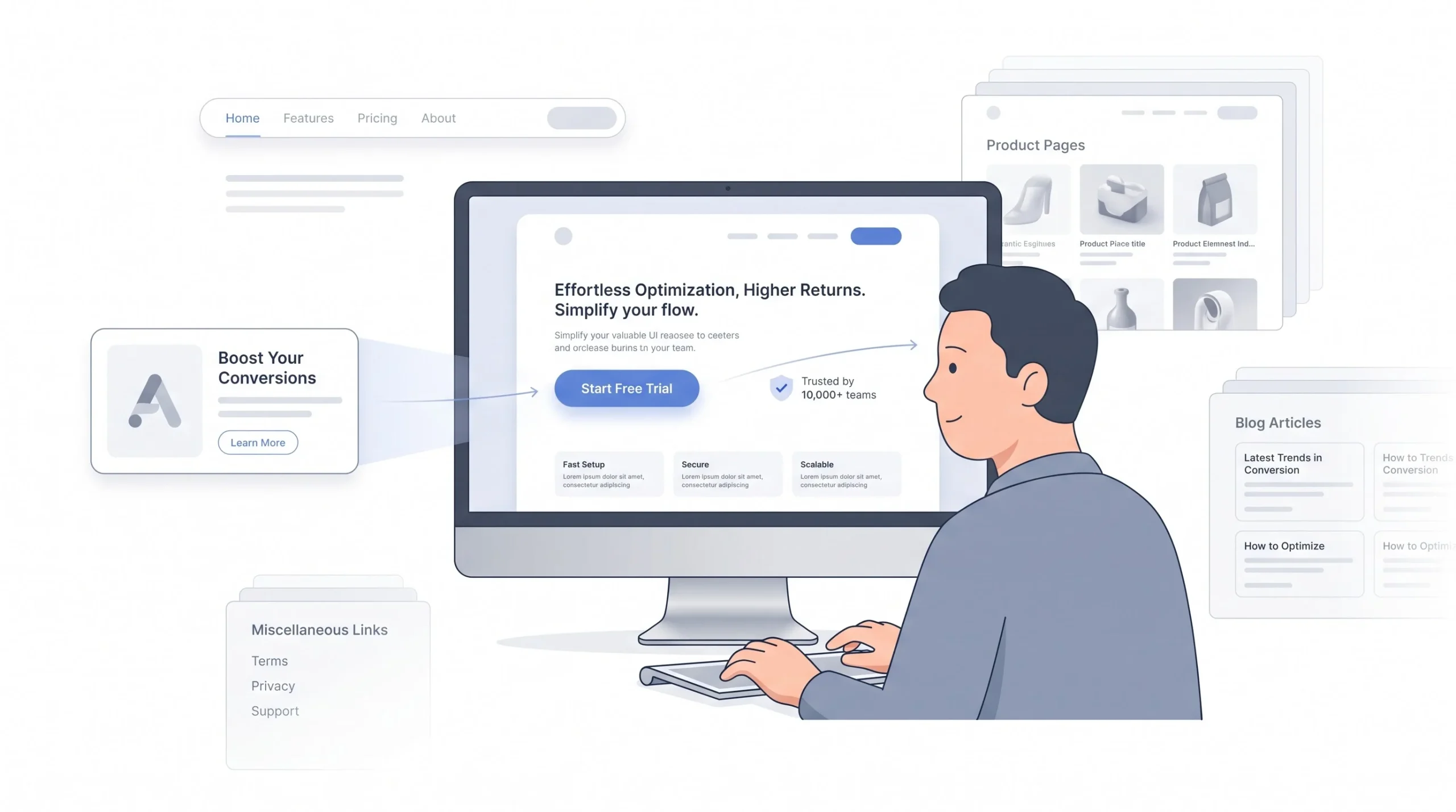
A high-converting landing page is a page built for one visitor, coming from one specific ad, with one specific thing you want them to do. That’s it. Not a general audience. Not “whoever finds this.” One person, one context, one action. Everything that follows in this post comes back to that sentence in some form.
The mistake most people make early on is treating a landing page like a mini homepage. It’s not. A homepage has to serve everyone who might land on it, whether that’s an existing customer checking pricing, a job seeker looking for a careers page, or a random visitor who typed the brand name into Google out of curiosity because they saw it somewhere else. A homepage carries all of that weight and has to keep everyone happy at once. A landing page doesn’t have that burden. It gets to be selfish. It exists to serve exactly one type of visitor who clicked exactly one type of ad, and everything on it should be built around that single visitor, not around trying to be everything to everyone.
Product pages have the same problem in a different shape. A product page is built to help someone compare, explore, maybe come back later after checking two competitors. It’s patient. It expects the visitor to browse. A landing page isn’t built for browsing, and if it behaves like one, with a full menu, links to other products, a blog sidebar, whatever, it’s giving the visitor a dozen easy ways to wander off before they ever do the one thing the ad paid to get them there for.
Here’s the difference laid out plainly, because it matters more than people think when they’re setting up a campaign in a hurry:
| Element | Landing Page | Homepage | Product Page |
|---|---|---|---|
| Navigation | Stripped or removed | Full site nav | Full site nav |
| Goal | One conversion action | Explore the brand | Learn and compare |
| Traffic source | Paid ad, specific | Mixed (organic, direct, referral) | Mixed |
| Copy focus | Matches the ad’s exact promise | Broad brand story | Product-specific detail |
| Exit paths | Minimal or none | Many | Several |
That “message match” idea, matching what the ad promised to what the page delivers, word for word in spirit if not literally, is the one concept that runs through everything else in this post. Every section that follows is really just a different angle on that same idea, whether it’s talking about headlines, page speed, or which testimonial goes where.
The Math Before the Design: What Conversion Rate Do You Actually Need
Nobody wants to talk numbers before they’ve picked a font or a color scheme, but skipping this step is how campaigns quietly bleed money for months before someone finally notices and asks why the leads aren’t showing up.
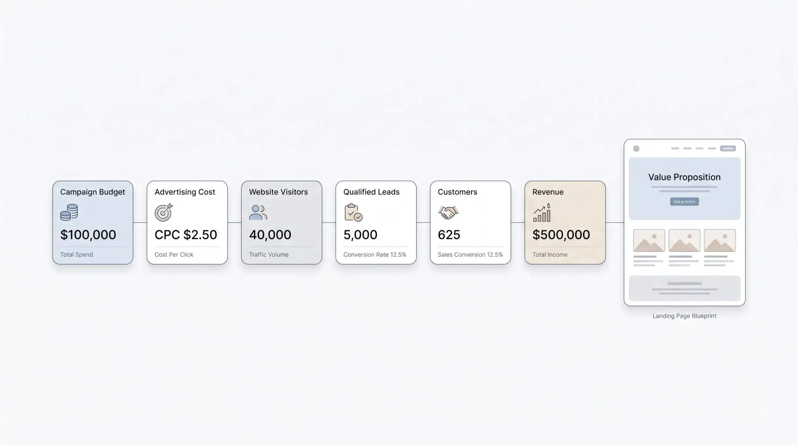
Here’s the thing. “What’s a good conversion rate” is the wrong question to start with. It sounds like the right question, and it’s the one most people ask first, but it’s not actually useful on its own. The right one is “what conversion rate makes this campaign worth running.” Those are not the same question, and the difference matters a lot once real budget is on the line every single day.
Say the cost per click sits at 40 rupees, and the product or service being sold has a decent margin, and the sales team can close, say, one out of every four qualified leads that come through. Work backward from there instead of forward. How many leads does the business actually need in a month to hit a revenue target? How many clicks does that require at the current conversion rate? Is the ad budget even large enough to get there, or is the campaign structurally incapable of hitting the goal no matter how good the page gets? Sometimes the honest answer is that the campaign was never going to work at this budget with this conversion rate, and that has nothing to do with the headline font or the button color. It’s a spend problem or a pricing problem wearing a landing page costume.
This matters because a lot of time gets wasted tweaking a page that’s already performing fine relative to what the campaign actually needs, while a genuinely broken page somewhere else in the account gets ignored because nobody ran the math to notice it. Knowing the target number first tells you where to actually spend your energy.
Industry benchmarks are useful as a reference point here, not a finish line to chase blindly. They swing wildly by category, by intent, by whether someone’s buying a 200 rupee product on impulse or signing a six-figure B2B contract that takes three meetings to close.
| Industry | Typical Landing Page Conversion Rate Range |
|---|---|
| E-commerce | 2% to 4% |
| SaaS and B2B software | 3% to 6% |
| Education | 6% to 9% |
| Legal and professional services | 5% to 8% |
| Finance | 5% to 7% |
These ranges shift over time and vary a lot depending on where you’re pulling the data from, so treat them as a rough sanity check, not gospel carved into stone. If a page is sitting way below its category’s typical range, that’s a signal something’s genuinely broken, worth stopping everything else to dig into. If it’s already sitting above the range, the honest question becomes whether it’s even worth squeezing another half a percent out of it, or whether that same energy is better spent scaling the budget on what’s already clearly working.
This is also where a lot of internal arguments happen, usually between whoever runs the ads and whoever built the page, and both sides are sometimes half right. The ads person sees a low conversion rate and blames the page. The page builder sees traffic quality complaints and blames the targeting. Running the actual math before either argument starts settles it fast, because the numbers usually point pretty clearly at which half of the funnel is actually the problem, instead of leaving it as a guessing game between two people defending their own work.
Traffic-Source Match: Why One Landing Page Doesn’t Fit All Ad Platforms
This is the part most guides skip entirely, and it’s honestly the biggest lever nobody talks about, which is strange given how much it actually affects the number at the end of the month.
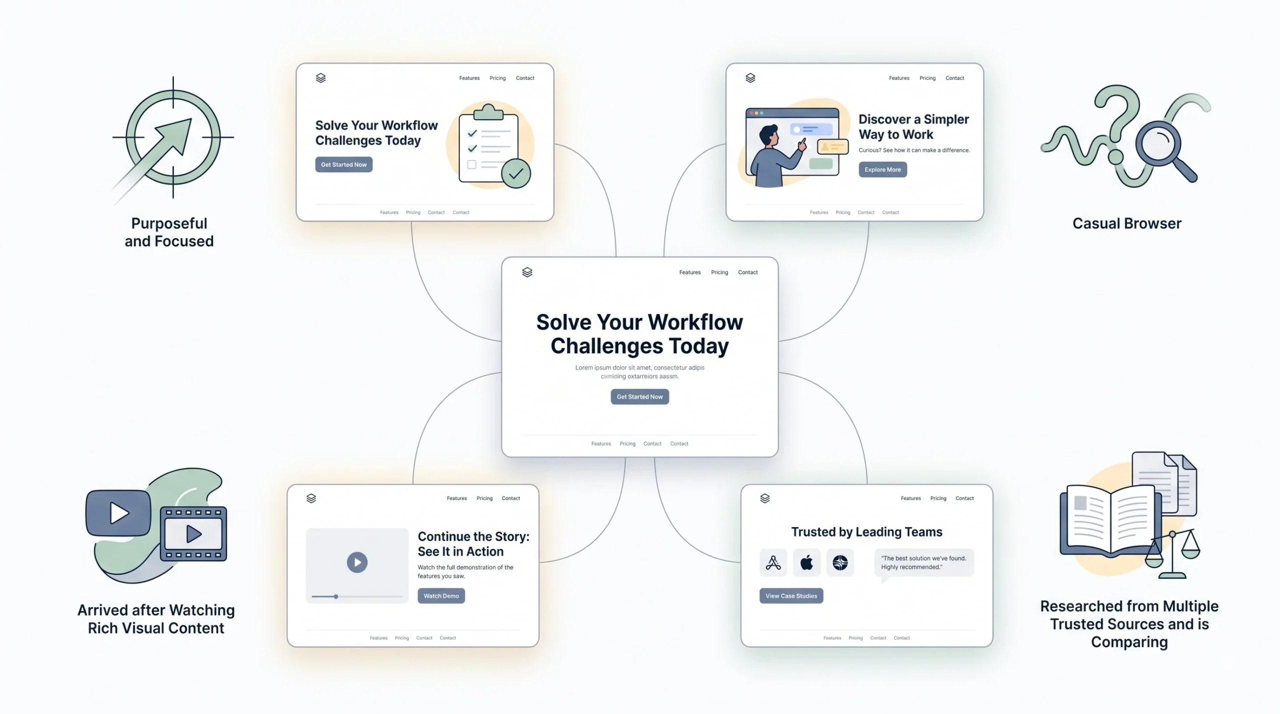
Think about who’s actually clicking these ads, not as a demographic, but as a person mid-action on their phone or laptop. Someone searching on Google typed something specific into a search bar. They have a question, and they came looking for the answer on purpose. Someone scrolling Instagram wasn’t looking for anything at all. They got interrupted mid-scroll by something that caught their eye for about two seconds before their thumb kept moving out of habit. Someone watching a YouTube ad sat through video content, sometimes willingly, sometimes because the skip button hadn’t shown up yet, and they’re already partway into a story by the time they click through. And someone clicking an ad inside an AI-assisted search result, the newer ChatGPT-style and AI Overview ad placements that have started showing up more in 2026, has usually already done a chunk of research through the AI conversation itself before they ever clicked anything on a page.
Four completely different mental states, all arriving at a landing page expecting something slightly different from each other. Sending all four types of visitors to the exact same page, with the exact same headline and the exact same amount of persuasion before the ask, throws away conversions for at least three of those four groups, because the page is optimized for none of them specifically.
A Google Search visitor doesn’t need convincing that the category exists or that the problem is real. They already searched for it, which means they already know both of those things. Give them the answer fast, right up top, no long warm-up story before getting to the point. A Meta visitor needs the opposite treatment entirely. They weren’t looking for this, so the page has to do more work pulling them in, with a stronger visual hook and more of a story before asking for anything, because they’re arriving cold in a way the search visitor isn’t. A YouTube visitor already invested attention watching a video, so the page should feel like a continuation of that video’s story rather than a cold restart that ignores everything they just watched. And someone arriving from an AI-assisted search ad has often already compared several options inside the chat conversation before clicking through, which means a page full of basic category education is completely wasted on them. They want the differentiator, fast, with proof sitting right there where they can see it.
| Traffic Source | Visitor Mindset | Page Adjustment |
|---|---|---|
| Google Search Ads | High intent, actively searching | Fast, direct answer near the top, minimal persuasion needed |
| Meta or Instagram Ads | Passive scroll, interrupted | Stronger visual hook, more story and persuasion before the CTA |
| YouTube Ads | Already engaged with video content, warmer | Continue the video’s narrative on the page instead of restarting |
| AI-assisted search ads (ChatGPT-style, AI Overviews) | Already researched, further down the funnel | Skip basic education, lead with differentiation and proof |
Match the page to the mindset of the click, not just the product being sold.
This is exactly why the same brand sending Google Search traffic and Meta traffic to one identical landing page is leaving money on the table on at least one side of that split, sometimes both. It doesn’t need to be a completely separate page built from scratch every time a new channel gets added. But at minimum, the headline, the amount of context given before the ask, and the trust signals shown up top all need to shift based on where that specific click came from. Even swapping just the headline and the opening line based on traffic source, while keeping the rest of the page the same, tends to close a decent chunk of that gap without doubling the workload.
Anatomy of the Page: Section-by-Section Build
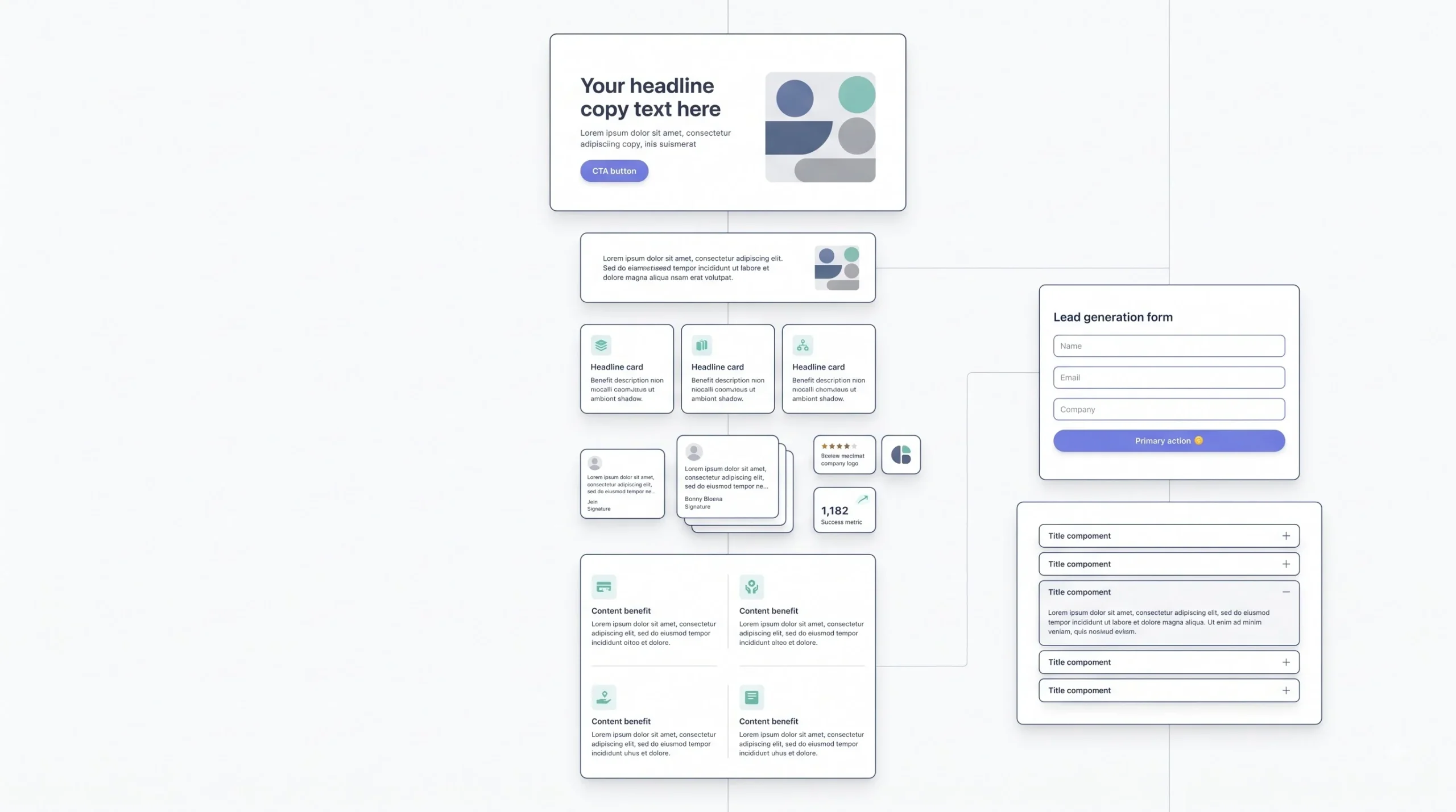
Alright, here’s the actual build. Every landing page is really a stack of smaller decisions stacked one on top of the other, and each one deserves its own attention instead of getting treated as filler space between the headline and the CTA button at the bottom.
Before getting into each piece individually, it’s worth saying this plainly: none of these sections exist in isolation. A great headline sitting above a slow-loading page still loses. A perfectly optimized form sitting below a headline that doesn’t match the ad still loses. Treat this as a chain, not a checklist to tick off independently, because a weak link anywhere in that chain drags the whole page down with it, no matter how strong the other links happen to be.
The Headline
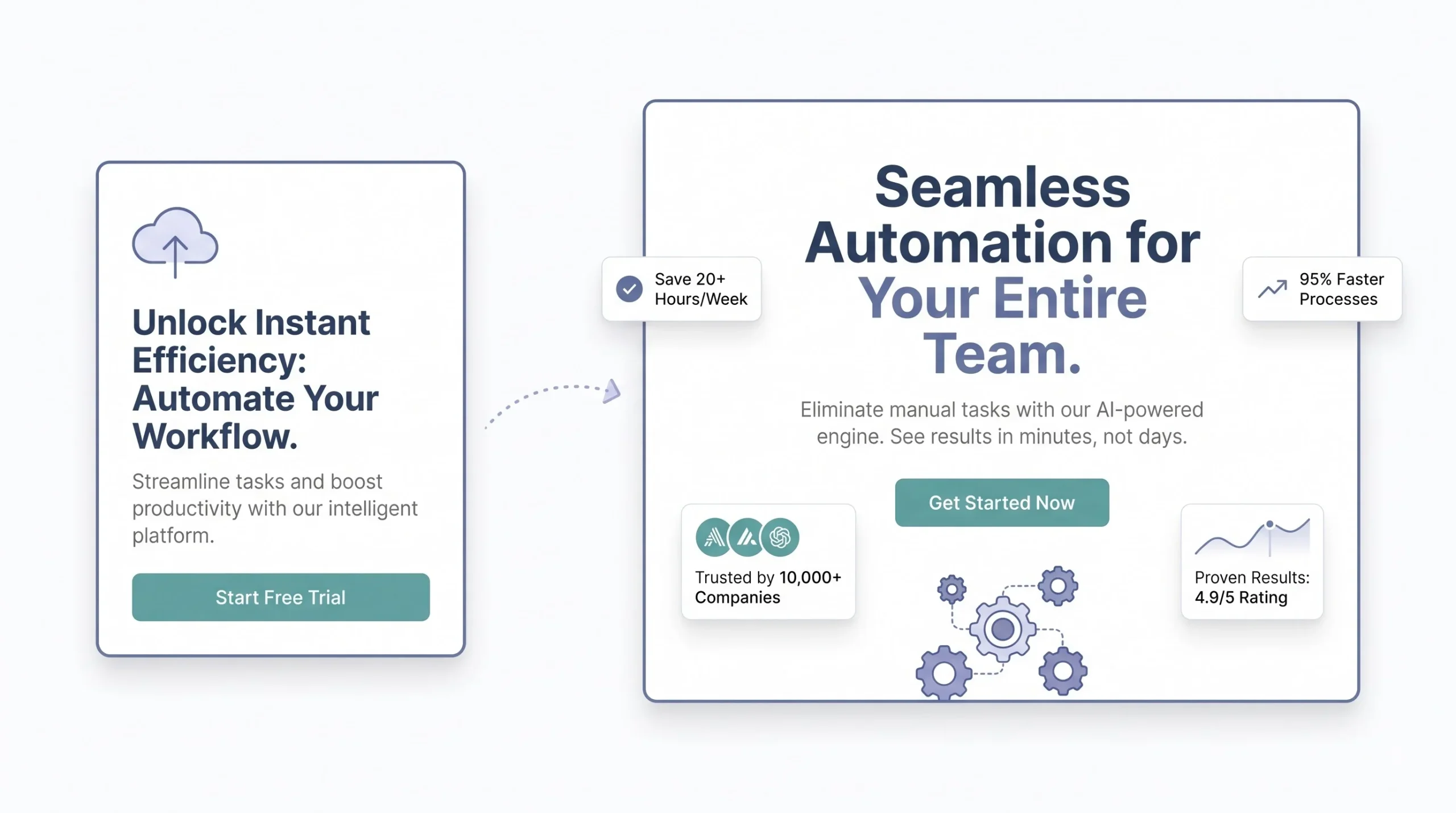
The headline has exactly one job: restate the promise from the ad, in the visitor’s own words, within about three seconds of the page loading. That’s the whole window. If someone clicked an ad that said “cut your electricity bill by 30%” and the page headline says something vague like “welcome to smart energy solutions,” that visitor is gone before they’ve even scrolled once. The connection broke the second the page loaded, and no amount of clever copy further down the page is going to bring them back, because they never got far enough to read it.
A few reliable formulas work here, and none of them need to be reinvented from scratch every time. Benefit-first, where the outcome leads the sentence and everything else supports it. Question-first, where the headline mirrors the exact question the visitor probably typed into the search bar or thought to themselves right before clicking. Number-first, where a specific figure anchors the promise and makes it feel concrete and real instead of vague and forgettable. None of these formulas need to be clever or cute. They need to be instantly clear, readable in one pass, understood without a second attempt.
The Subheadline
The subheadline isn’t just a repeat of the headline in slightly different words, which is a mistake that shows up constantly. Its actual job is to handle whatever objection the headline just created in the visitor’s mind, or to add the one specific detail the headline didn’t have room for because headlines need to stay short. If the headline promises fast results, the subheadline might address exactly how fast, or what makes that speed possible, in one clean line, without turning into a full paragraph that undoes the punch of the headline above it.
Hero Visual and Above-the-Fold Layout
People read in patterns, and this isn’t some abstract design theory, it’s just how eyes move across a screen without thinking about it. Most eyes move in something close to an F shape or a Z shape across a page, especially on the first screen before any scrolling happens. Top left first, then across the top, then down and across again lower on the page. That’s not something to overthink or obsess over, it’s just worth knowing where attention naturally lands first so the important stuff sits there instead of getting buried in a corner nobody’s eyes ever reach.
Directional cues help nudge that natural movement on purpose, pointing attention exactly where it needs to go next. A simple arrow pointing toward the form. A photo of a person looking toward the headline or toward the CTA button instead of staring straight out at the camera. It sounds like a small, almost silly detail, but it works consistently because eyes tend to follow other eyes, it’s basically automatic and hard to resist even when you know it’s happening.
The Offer or Value Proposition Block
This is where a lot of otherwise decent pages quietly fall apart. They list features. “24/7 support.” “Cloud-based.” “Fully customizable.” None of that actually tells a visitor what they get out of it in a way that matters to their actual life or business. The fix is separating what the thing is from why it matters to the person reading it right now. A feature is what the product does. A benefit is what changes for the visitor because of it. Both matter and both deserve space on the page, but if only features show up and the benefits are left for the visitor to figure out on their own, the page reads like a spec sheet instead of a pitch, and most visitors won’t do that translation work themselves. They’ll just leave and let a page that did the translation for them win instead.
Social Proof Placement
Adding testimonials isn’t the hard part of this whole process. Knowing where to put them is. Proof works best when it shows up right next to the doubt it’s specifically meant to kill, not dumped in one random block somewhere near the footer where barely anyone still scrolling actually sees it by that point.
| Proof Type | Best Placement | Why It Works There |
|---|---|---|
| Star ratings or review count | Near the headline | Builds instant trust before anything else even gets read |
| Detailed testimonial with name and photo | Mid-page, near the objection it answers | Answers “will this actually work for someone like me” |
| Client logos | Above the fold or near the CTA | Fast credibility signal without needing to be read closely |
| Case study number or stat | Right next to the CTA | Reinforces the outcome the second before someone acts |
Notice the pattern here. It’s not about cramming as much proof onto the page as possible. It’s about placing the right kind of proof exactly where a specific hesitation is most likely to show up in the visitor’s head, right before it has a chance to turn into them closing the tab.
The CTA
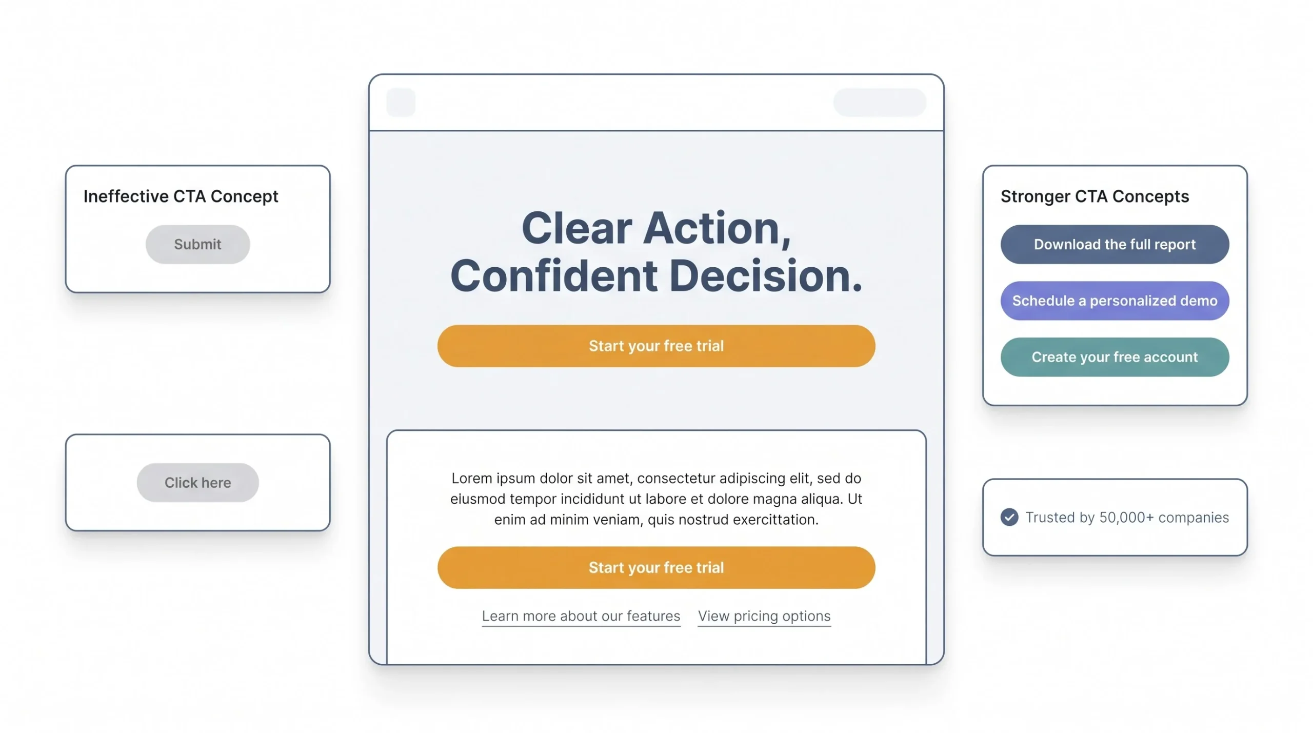
Call to action buttons that just say “Submit” are wasting a free opportunity that costs nothing to fix. “Submit” tells the visitor absolutely nothing about what happens next after they click it. “Get My Free Quote” or “Start My Free Trial” tells them exactly what they’re getting by clicking, removing a small bit of uncertainty right at the exact moment they’re deciding whether to act, and that small shift in specificity genuinely moves the number more than people expect from something so simple.
Contrast matters just as much as the copy on the button. If the CTA button blends into the background because it happens to match the brand’s color palette a little too closely, that’s a design choice quietly fighting against the entire conversion goal of the page, even if it looks tidy and “on brand” to whoever approved it. And one offer, one CTA, repeated a couple of times down the length of the page as needed for longer pages, consistently beats a page juggling three different competing calls to action side by side. Every extra option sitting on the page is one more decision the visitor now has to make before they can act, and every extra decision is one more chance for them to hesitate and leave instead of committing to the one thing the page was actually built for.
The Form
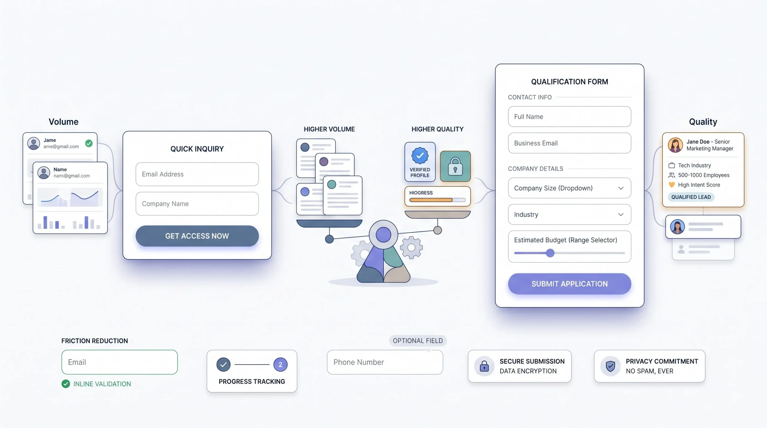
If the page is built for lead generation, the form is usually where a big chunk of the friction quietly lives, even when everything else on the page looks great. Fewer fields generally means more people finish filling it out and hit submit. That part isn’t really up for debate at this point. What is worth actually thinking through, rather than just assuming shorter is always better, is the tradeoff underneath it: a two-field form asking just for name and phone number brings in a lot more submissions, but some meaningful chunk of those leads will be lower intent or lower quality than what a five-field form produces, because filling out five fields makes someone stop and actually think for a second before submitting. Neither approach is universally correct for every business. It depends entirely on whether the sales team on the other end would rather sort through a bigger pile of leads to find the good ones, or work with a smaller pile that’s already been pre-filtered by the form itself.
FAQs on the Page Itself
An FAQ section sitting at the bottom of a landing page isn’t just a nice-to-have tacked on because every other page seems to have one. It’s doing two separate jobs at the same time. It handles lingering objections a visitor might still be sitting with right before they’d otherwise close the tab and bounce, and it gives search engines and AI-driven answer results something clean and structured to pull from later, long after the ad campaign that first brought traffic to the page has ended.
Every FAQ on the page should be an objection in disguise, not a random question nobody was actually asking.
If a question wouldn’t have stopped someone from converting had it gone unanswered, it probably doesn’t belong in this section at all, no matter how easy it would be to write an answer for it.
Page Speed and Mobile: The Silent Conversion Killers
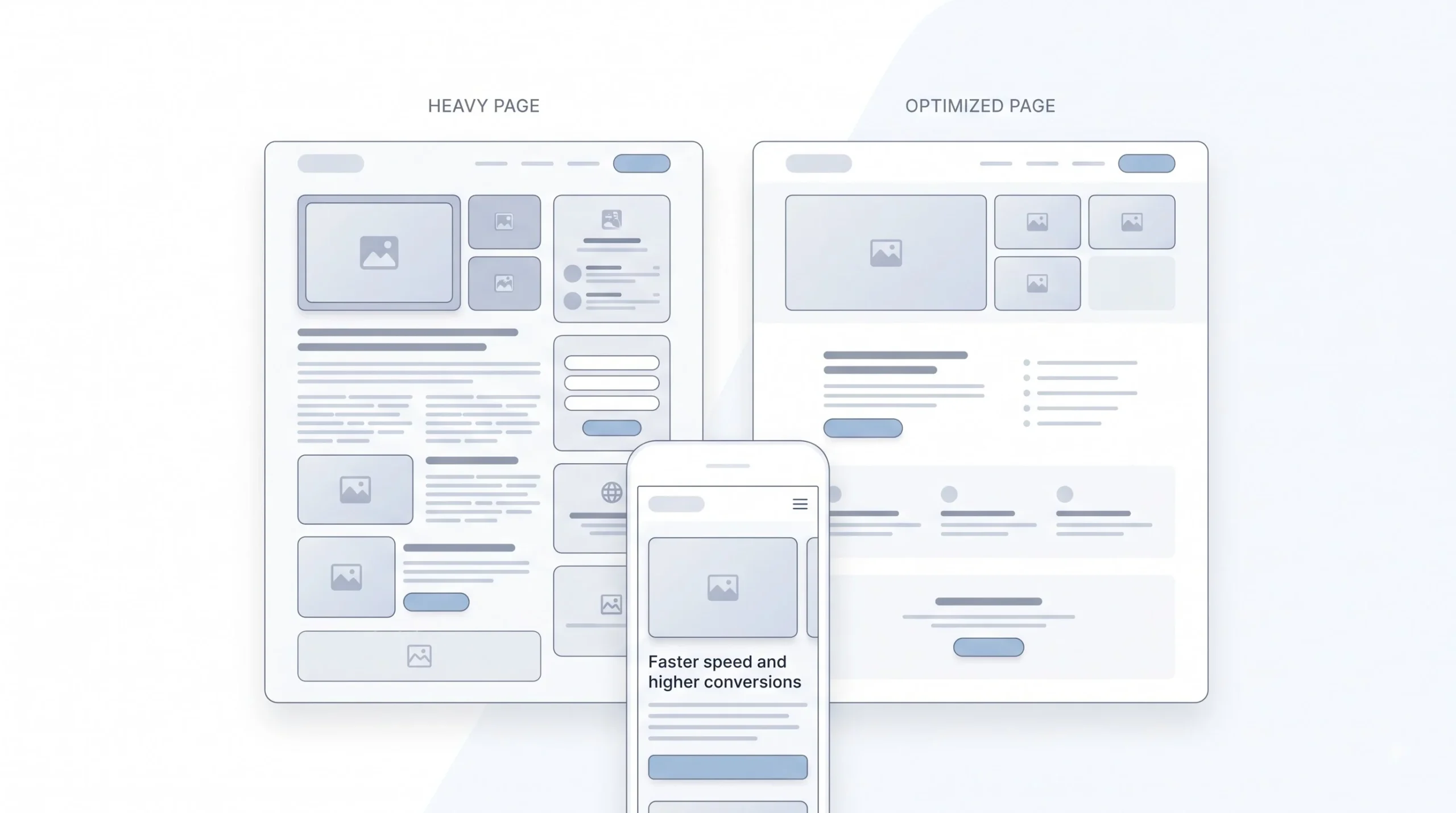
None of the copywriting work or the layout decisions above matter even a little if the page takes forever to actually load on a real device. A slow page loses people before they’ve even seen the headline that took so long to get right, and that’s a genuinely brutal way to waste ad spend that’s already been paid for the moment someone clicked.
The frustrating part is that speed problems are usually completely invisible to whoever actually built the page, because it loads instantly on their office wifi with a fast laptop and a big monitor sitting a few feet from the router. It’s a very different story on a mid-range phone running on patchy mobile data somewhere out in the real world, which describes a huge chunk of actual ad traffic, especially for anything running through Meta or YouTube where phone usage dominates.
Mobile isn’t a secondary consideration to bolt on after the desktop version is finished anymore. It’s the primary one, full stop. Most traffic hitting a landing page from social and search ads today comes from a phone screen rather than a desktop monitor, and a page that only really works well on desktop, with tiny text or buttons that need a precise tap to hit, is quietly failing the majority of its visitors without anyone realizing it until the numbers get pulled apart.
A few fixes handle most of the damage, and none of them require a rebuild from scratch:
| Issue | Fix |
|---|---|
| Large hero image | Compress it and serve a modern format like WebP or AVIF |
| Autoplay video | Replace with a static image plus a play button, or drop it entirely |
| Too many third-party scripts | Audit chat widgets and tracking pixels, remove anything unused |
| No lazy loading | Turn it on for anything below the first screen |
| Unoptimized fonts | Stick to one or two font families, subset them if the platform allows it |
None of this needs a developer with years of specialized experience sitting on call. Most of it is a checklist that can be worked through in an afternoon, and going through it once can fix a page that’s been quietly underperforming for months without anyone stopping to ask why the numbers never quite matched expectations.
Writing Copy That Converts: Psychological Triggers
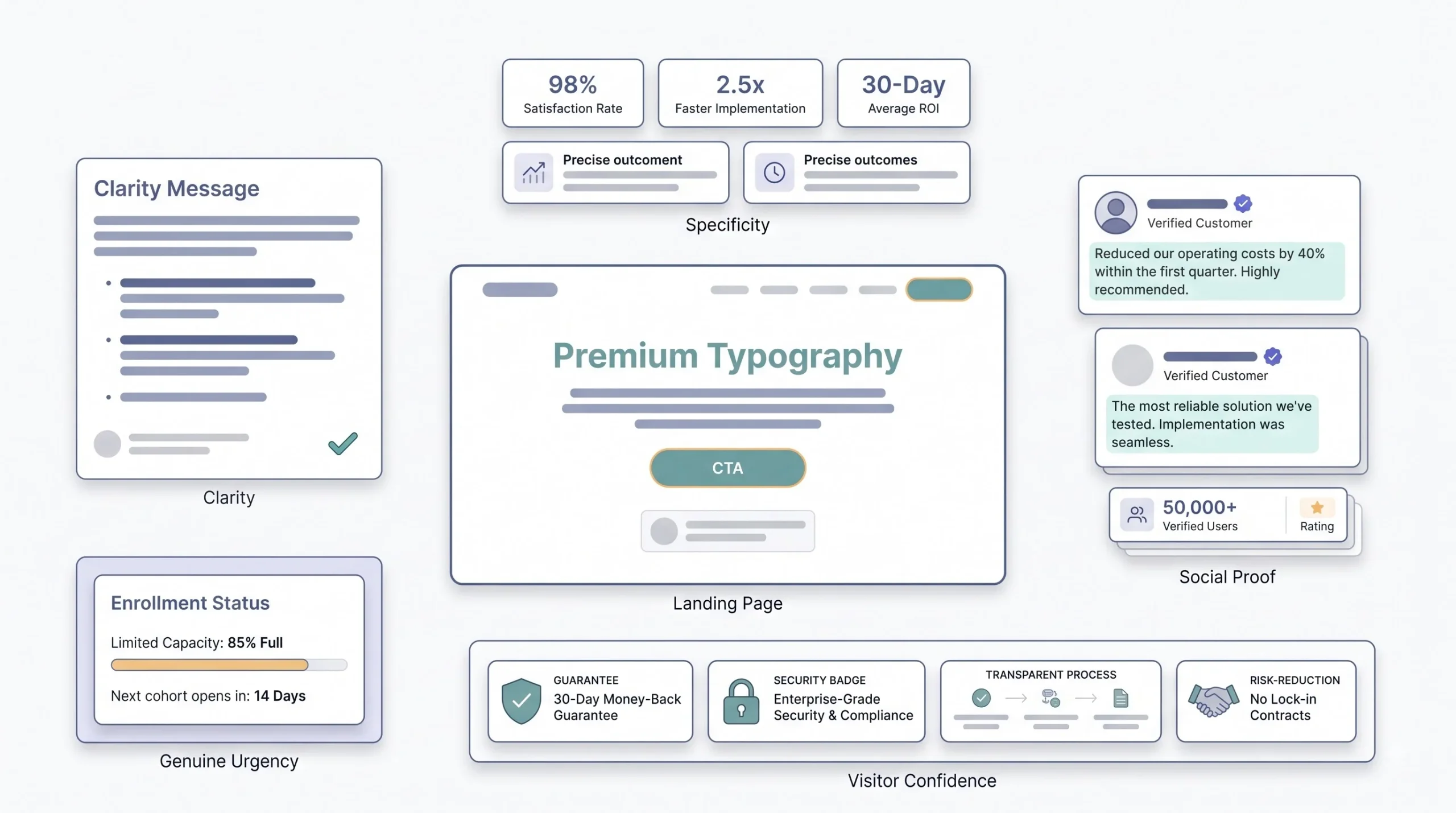
Copy is where a lot of genuinely good pages get ruined by someone trying to sound impressive instead of trying to be understood by the actual person reading it.
Clarity beats cleverness every single time on a landing page, no exceptions worth making here. A visitor who’s on the fence about whether to act isn’t in the mood to decode a clever pun or untangle a vague metaphor that sounded good in a brainstorm meeting. They want to know, immediately and without effort, what this is and whether it’s for them specifically. If a headline needs a second read just to make basic sense, it’s already lost the moment that mattered most.
Specificity does more work than most people give it credit for when they’re writing quickly. “Save money” says nothing at all, it could mean anything from ten rupees to ten thousand. “Cut your monthly bill by 30% within two billing cycles” says something concrete a visitor can actually picture happening to them specifically, with their own bill, on their own timeline. Numbers, exact timeframes, and specific outcomes beat vague claims every single time, because vague claims sound like every other page the visitor has already scrolled past that same week without remembering a single word of it.
Loss aversion and social proof both work because they tap into how people actually make decisions in the moment, not how they think or claim they make decisions when asked about it later. People move faster to avoid losing something they already feel they have than they do to gain something of equal value they don’t have yet. And people trust other people’s lived experiences a lot more than they trust a brand’s own claims about itself, no matter how well-written those claims are. Both of these are worth using, and both are worth using honestly, without stretching the truth to make the pitch land harder.
Urgency works too, but only when it’s genuinely real. Fake urgency, like a countdown timer that mysteriously resets every time someone refreshes the page or comes back the next day, gets noticed eventually, and it doesn’t take a particularly sharp visitor to catch it. And once a visitor catches a brand faking urgency one single time, they stop trusting everything else on the page too, including the parts that were completely true. That’s a genuinely bad trade to make for a small, short-term bump in conversions that isn’t worth the long-term damage.
On rhythm, since it matters more than people think for how a page actually reads: short sentence. Then one that runs a little longer, that gives the reader something to sit in for a second before the next short one lands right after it. Mixing it up like that keeps a page from reading like a wall of identical, robotic sentences stacked one after another, which is honestly one of the fastest ways to lose a reader’s attention halfway down the page, right when they were still deciding whether to keep going.
SEO and AEO for Landing Pages
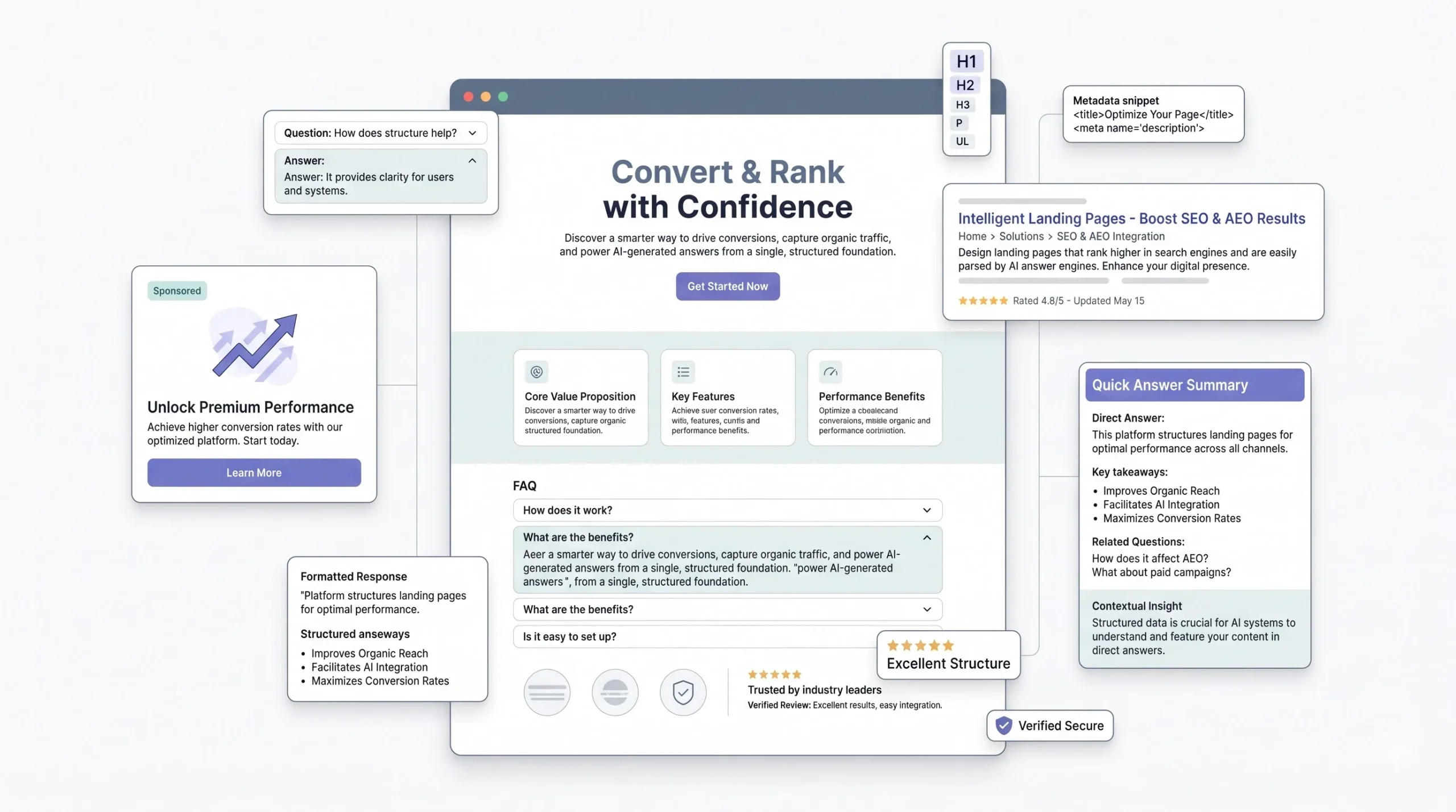
Landing pages built purely to catch paid ad traffic often get zero SEO thought put into them at all, and that’s a genuinely missed opportunity most people don’t even realize they’re leaving sitting on the table.
A landing page can absolutely rank organically over time, on top of whatever paid traffic it’s already pulling in from active campaigns. That means the same page keeps earning leads long after the ad budget for that specific campaign has run out and gotten reallocated elsewhere, assuming it was built with at least a little SEO structure baked in from the start instead of bolted on as an afterthought.
There’s also a newer piece of this worth paying real attention to going into 2026: answer engine optimization, usually shortened to AEO. AI-driven search results and chat-based answer engines pull their responses from pages that give clear, direct answers to specific questions, structured in a way that’s easy for those systems to lift and summarize accurately. That FAQ section covered earlier isn’t just handling human objections anymore, useful as that job already is on its own. It’s also feeding the exact kind of structured, direct-answer content these AI search tools are increasingly pulling from when someone asks a related question somewhere else entirely.
None of this means turning a tight, focused landing page into a sprawling, full-length blog post that loses its focus. It just means not treating SEO as something that only applies to organic content pages while completely ignoring it on pages built for paid traffic, when a little structure costs almost nothing to add.
A/B Testing and Iteration
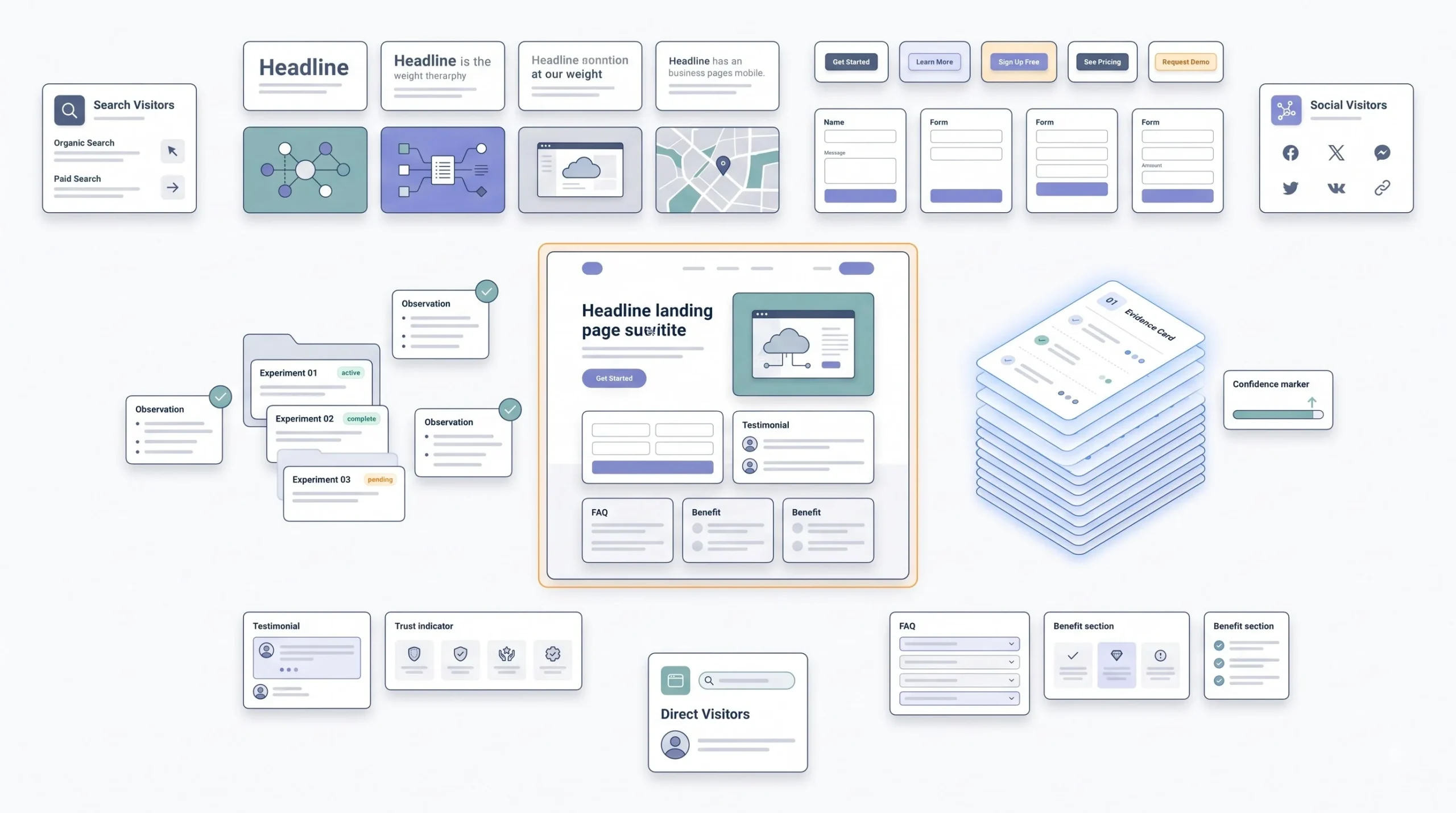
A landing page isn’t a finished product the day it finally goes live, no matter how much time went into getting it there. It’s a hypothesis, and the only real way to know if that hypothesis holds up is to test it against something else and let actual visitor behavior settle the argument.
The mistake beginners make with A/B testing, almost every time, is starting with the smallest, safest changes first, like button colors or font sizes, because those feel low-risk and easy to greenlight without much pushback. That’s backwards. Test the elements with the biggest potential impact first, because that’s where the real gains are actually hiding, not in a shade of blue.
| Priority | Element | Why It’s Worth Testing First |
|---|---|---|
| 1 | Headline | First thing read, sets the frame for everything that follows |
| 2 | CTA copy and placement | Directly tied to the actual conversion action |
| 3 | Hero image or video | Sets the emotional tone in the first few seconds |
| 4 | Form length | Directly affects how much friction a visitor faces |
| 5 | Button color or size | Real impact, but smaller, worth testing last |
One more thing worth saying plainly, because it trips up a lot of teams: don’t run one single test across all traffic sources lumped together into one pool. A headline that wins with Google Search traffic might actually lose with Meta traffic, because as covered earlier, those two groups of visitors aren’t arriving in the same headspace at all. Testing them together muddies the result and can lead to a decision that’s actually wrong for one of the two groups, even while it looks like a clean win in the aggregate numbers. And don’t trust a test result until there’s been enough traffic through it to mean something. A “winner” declared after forty total visitors isn’t a winner, it’s just noise that happened to lean one direction that week, and treating it like a real result is how good pages get replaced with worse ones by accident.
Patience is honestly the hardest part of this whole process, harder than writing the actual variations being tested. There’s always pressure to call a test early, especially when a campaign is burning budget every single day it runs and someone senior is asking for an update. But a page swapped out on a hunch, based on three days of shaky data, costs more in the long run than the few extra days it takes to let a test actually finish properly. Slow and correct beats fast and wrong here, even when it doesn’t feel that way in the moment.
Conclusion
Go back to that scenario from the very start. Good ad, right targeting, fair cost per click, and a page that quietly killed the whole thing without anyone catching it for weeks. That’s not a rare story pulled together to make a point. It’s the default outcome for anyone who treats the landing page as an afterthought tacked onto the ad campaign, instead of treating it as the other half of the same campaign that deserves just as much attention as the ad itself.
The single idea worth carrying out of this entire post is message match, built specifically for the traffic source sending each individual click. A Google searcher, a Meta scroller, a YouTube watcher, and someone coming in from an AI-assisted search result are not the same visitor wearing four different hats. They need different pages, or at bare minimum, different headlines and different amounts of persuasion before the ask lands. Build for that specifically, get the speed and mobile experience genuinely right instead of just checking a box, keep the path to one single action clean and obvious, and test the big things before wasting time on the small ones. That’s the whole job, really. Nothing about it is complicated once it’s broken down like this. It just takes actually doing the work instead of skipping straight ahead to picking a font and calling the page done.
Frequently Asked Questions
What’s the actual difference between a landing page and a regular website page?
A landing page is built for one visitor coming from one specific ad, with one action in mind. A regular website page, whether that’s a homepage or a product page, has to serve a mixed crowd with different intents, which is why it keeps full navigation and multiple paths forward. A landing page strips that away on purpose. It’s not trying to be helpful to everyone, just to the person who just clicked.
Do I need a separate landing page for every single ad I run?
Not every single one, no. But at minimum, separate pages by traffic source and by offer. A Google Search campaign and a Meta campaign selling the same thing shouldn’t share one identical page, because the visitors arrive in completely different headspaces. Even swapping just the headline and opening section per source, while keeping the rest of the page the same, closes most of that gap without needing a full rebuild for every ad set.
How long should a landing page actually be?
Long enough to answer every real objection, short enough that nothing on it feels like filler. There’s no fixed word count that works across every industry. A high-intent Google Search visitor might convert off a short page with a fast answer near the top. A cold Meta visitor scrolling past a product they’ve never heard of usually needs more story and more proof before they’ll act. Match the length to how much convincing that specific visitor actually needs, not to what looks impressive.
What’s a good conversion rate for a landing page?
It depends heavily on the industry and the offer, and chasing a generic number is the wrong move anyway. The better question is what conversion rate makes the campaign profitable given the cost per click and the close rate further down the funnel. A page converting at 3% can be a huge win in one industry and a quiet failure in another, depending entirely on the math behind it.
Should the landing page match the ad exactly, word for word?
Not word for word necessarily, but in spirit, yes. The headline should feel like a direct continuation of whatever the ad promised. If the ad says “free consultation” and the page opens with something unrelated, that mismatch registers immediately, even if the visitor can’t explain why the page suddenly feels off. Message match is the single biggest factor covered in this whole post for a reason.
Is it okay to remove the navigation menu completely from a landing page?
Yes, and honestly it’s usually the right call. A full navigation menu at the top of a landing page hands the visitor an easy exit ramp away from the one action the page exists for. Stripping it down to just the logo, or removing it entirely, keeps attention on the offer instead of letting people wander off into the rest of the site.
How many form fields should a lead-gen landing page have?
Fewer fields generally means more submissions, but it’s a real tradeoff, not a rule to follow blindly. A short two-field form brings in volume, including some lower-quality leads. A longer form filters harder before someone even submits. The right choice depends on whether the sales team would rather sort through more leads or work with fewer, better-qualified ones.
Does page speed really matter that much for conversions?
Yes, more than most people expect going in. A slow-loading page loses visitors before they’ve even seen the headline, which means every second of delay is quietly wasting ad spend that’s already been paid for the moment someone clicked. Mobile visitors on patchy data feel this even harder than desktop visitors do, and most ad traffic today is mobile.
What should get A/B tested first on a new landing page?
Start with the headline and the CTA, not the button color or the font. Those two elements carry the most weight because they shape the first impression and the actual conversion action. Testing small, low-impact details first is a common beginner move, but it wastes traffic that could be answering a bigger question instead.
Can a landing page built for paid ads also rank organically on Google?
Yes, and it’s a missed opportunity when people don’t plan for it. A landing page with a bit of SEO structure baked in, including a solid FAQ section like this one, can keep earning organic traffic long after the ad budget for that specific campaign has run out and moved elsewhere.
What’s the biggest mistake people make on their first landing page?
Putting too many competing calls to action on one page. “Buy Now,” “Learn More,” and “Contact Us” all sitting together forces the visitor to decide which decision to make first, and a lot of them just leave instead of choosing. One offer, one CTA, repeated as needed, consistently outperforms a page trying to cover every possible next step at once.
How often should an existing landing page get updated?
Every time the ad creative or targeting changes in a meaningful way, not just when something visually breaks. A page that converted well six months ago might be sitting on a colder, more fatigued audience today simply because the campaign has been running long enough that the easy wins already got captured. Treat the page as part of the ongoing campaign, not a one-time build to forget about.