


You’ve probably done this before. You run an ad, someone clicks it, they land on your homepage, and then… nothing. No sale, no signup, no email address. Just a bounce and a wasted dollar. This happens to businesses every single day, and most of the time it’s not the ad’s fault. It’s the page the ad sent people to.
Here’s the thing nobody tells you when you’re starting out: getting someone to click is the easy part. Getting them to actually do something once they arrive — that’s where most campaigns quietly fall apart. You can have the best offer on earth, the sharpest ad copy, a budget that would make your competitors nervous, and still lose the sale because the page on the other end of that click was confusing, cluttered, or just plain generic. That’s not a traffic problem. That’s a landing page problem.
So what is a landing page, really, and why does it matter so much more than people assume? A landing page is a standalone web page built around one goal. Not five goals. Not “explore our services and also read our blog and also check out our team page.” One goal. Someone lands there because of an ad, an email, a social post, whatever — and the entire page exists to move that one visitor toward one action. Buy the thing. Book the call. Download the guide. Sign up for the trial. That’s it.
This guide is going to walk through the whole picture — what a landing page actually is, how it’s different from your homepage, the types you’ll run into, what makes one convert versus flop, and then the actual step-by-step process of building one that works. We’re not going to dance around it with fluffy theory. We’re going to get into headlines, CTA wording, form length, trust signals, mobile design, SEO, testing, and the mistakes that quietly kill conversion rates without anyone noticing until the numbers come in.
What You Will Learn in This Guide
- What a landing page actually is and how it’s different from a regular website page
- The real difference between a landing page and a homepage, with a side-by-side comparison
- The different types of landing pages and when to use each one
- What separates a high-converting page from one that just sits there
- The full anatomy of a landing page, section by section
- A step-by-step process for building a landing page from scratch
- How to write copy that actually gets people to act
- Design principles that support conversion instead of just looking nice
- Whether landing pages can rank in Google, and how to approach landing page SEO
- How to improve your conversion rate once the page is live
- How A/B testing works and what’s actually worth testing
- The most common mistakes that quietly tank conversions
- Real examples broken down by business type
- Tools and platforms worth considering
- How to measure whether your page is actually working
- A pre-launch checklist you can use right before you hit publish
- Answers to the questions people ask most often about landing pages
Alright. Let’s get into it.
What Is a Landing Page?
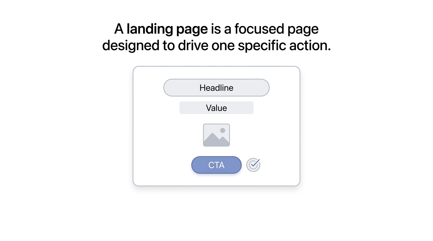
A landing page is a focused web page designed to encourage visitors to complete a specific action. That’s the short version. The longer version is that it’s a page built with almost surgical intent — everything on it, from the headline down to the button color, is there to push a visitor toward one outcome. Not browsing. Not exploring. One decision.
Common actions a landing page is built around include signing up for something, buying a product, booking a demo, requesting a quote, downloading a resource, registering for an event, starting a free trial, or contacting a business directly. Notice that none of these are vague. They’re all specific, trackable actions. That’s the whole point. If you can’t name the one thing you want a visitor to do on a page, you don’t actually have a landing page yet — you have a page that happens to exist.
How Landing Pages Work
The basic journey looks like this: Traffic Source → Landing Page → Offer → CTA → Conversion. Someone sees your ad on Google, clicks it, lands on a page built specifically for that ad’s promise, sees the offer laid out clearly, hits the call-to-action button, and converts. Simple in theory. Messy in practice, because every one of those steps can break down.
Traffic sources vary a lot, and honestly, the source matters more than people give it credit for. Google Ads traffic tends to have high intent — someone searched for something specific and clicked because your ad matched what they wanted. Social media traffic is different; people weren’t necessarily looking for you, so the page has to work a bit harder to explain why they should care. Email traffic is usually warmer because they already know who you are. Organic search traffic, LinkedIn traffic, referral traffic, display advertising — each one brings a different mindset to the page, and a landing page that ignores that mismatch is leaving conversions on the table.
Why Landing Pages Matter for Marketing
Look, you could send all your traffic to your homepage and call it a day. Plenty of businesses do. But here’s what you lose when you do that: message-to-audience alignment goes out the window. Your homepage has to speak to everyone — new visitors, returning customers, job seekers, investors, whoever. A landing page speaks to one person with one problem and one solution.
That focus pays off in a bunch of ways. You get reduced distractions because there’s no navigation menu pulling people away mid-decision. You get stronger campaign relevance because the page literally continues the conversation the ad started. You get better conversion opportunities because there’s nowhere else to go but forward. Measurement gets easier too — when a page has one goal, you know exactly what “success” looks like on that page, no guessing. And if you’re running paid ads, a dedicated landing page usually improves your ad efficiency, because platforms like Google reward relevance, and a tightly matched landing page is about as relevant as it gets. Lead generation specifically benefits here too, since a focused page with a focused form tends to pull in leads who actually match what you’re offering.
Landing Page vs. Website Page
A regular website page usually juggles several jobs at once. Your “About” page introduces the company, maybe links to careers, maybe mentions press coverage. Your services page might list ten different offerings with a dozen different CTAs scattered across it. That’s normal for a website — websites are meant to be explored.
A landing page doesn’t work that way. It has one primary objective, and everything on the page reports to that objective. If a sentence, image, or link doesn’t help move someone toward the conversion goal, it probably doesn’t belong on the page. That’s a hard discipline to keep, especially when stakeholders want to add “just one more thing,” but it’s the difference between a page that converts and a page that just exists.
Landing Page vs Homepage: What’s the Difference?
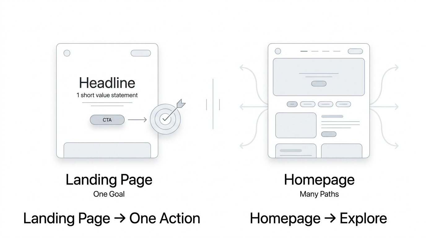
People mix these two up constantly, and honestly, it’s an easy mistake to make because they can look similar on the surface — both have a hero section, both have images, both have some kind of button. But the intent behind them is completely different, and that difference shows up in how they’re built.
| Factor | Landing Page | Homepage |
|---|---|---|
| Primary purpose | Drive one action | Introduce the business |
| Navigation | Limited | Usually extensive |
| Audience | Specific segment | Broad audience |
| Messaging | Offer-focused | Brand-focused |
| CTA | Usually one primary CTA | Multiple possible CTAs |
| Traffic | Campaign-specific | Multiple sources |
| Conversion goal | Specific | Multiple |
A homepage has to represent your whole business. It needs to work for a first-time visitor, a returning customer, someone comparing you to competitors, and sometimes even a journalist or investor poking around. That’s a lot of jobs for one page to do, so naturally it ends up with more navigation, more links, and more possible next steps. None of that is wrong — it’s just a different job.
When Should You Use a Landing Page?
You’ll want a dedicated landing page in a handful of situations that come up constantly in marketing. Running Google Ads is probably the biggest one — sending paid traffic to a generic homepage is one of the fastest ways to burn through ad spend without much to show for it. Promoting a specific service, launching a new product, capturing leads through a form, offering a downloadable resource like a guide or template, promoting a webinar, or running a focused email campaign — all of these deserve their own page, built around that one offer, rather than getting folded into your general website.
Can a Homepage Be Used as a Landing Page?
Sometimes, yeah. If your business genuinely has one core offer and your homepage is already built around driving one action — say, a small SaaS product with a single plan and one clear “start free trial” button — your homepage might function fine as a landing page. It happens, especially with early-stage startups that haven’t expanded their offering yet.
But for most campaigns, a dedicated landing page beats a homepage every time. Why? Because a homepage is trying to serve everyone, and a landing page is trying to serve the exact person who clicked that exact ad. When your ad promises “50% off your first order” and someone lands on a generic homepage with no mention of that discount anywhere, you’ve already lost some trust. The message doesn’t match, and mismatched messages cost conversions.
What Are the Different Types of Landing Pages?
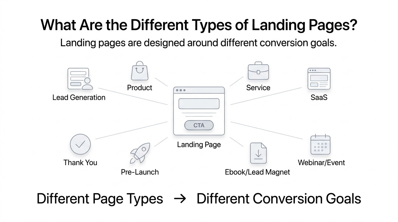
Here’s something worth sitting with for a second: landing pages shouldn’t really be classified by how they look. They should be classified by what they’re trying to achieve — the conversion goal behind them. A page can look almost identical in design terms and still be a completely different type depending on what happens when someone hits that button.
Lead Generation Landing Pages
These pages exist to collect contact information — usually a name and email, sometimes more depending on the business. The purpose is simple: get enough information to follow up later, whether that’s through a sales call, an email nurture sequence, or a retargeting campaign. Typical form fields include name, email, company name, and sometimes phone number, though every extra field tends to reduce completions a bit. Common offers tied to these pages include free consultations, quotes, demos, or gated content like reports and checklists. A B2B software company offering a free audit of someone’s current setup is a classic example — the audit itself isn’t the real product, it’s the door that opens a sales conversation.
Click-Through Landing Pages
These don’t collect information directly. Instead, they exist to warm someone up before sending them somewhere else — usually a checkout page or a signup flow. Think of it as a bridge page. It explains the offer, builds a bit of trust, and then hands the visitor off to the next step. This shows up a lot in ecommerce, where a product landing page might build interest before pushing someone to checkout, and in SaaS, where a feature page might build the case before sending someone to a signup form.
Product Landing Pages
A product landing page is built to sell one specific product, and it does that by walking through benefits, demonstrating features in action, addressing common objections head-on, and closing with a clear push toward purchase. These pages tend to be longer than people expect, especially for products with a real learning curve, because the page is doing the job a salesperson would normally do in person.
Service Landing Pages
These are especially useful for agencies, consultants, local businesses, professional services firms, and B2B companies offering something less tangible than a physical product. A marketing agency, for instance, might build a separate landing page for “SEO services,” another for “PPC management,” and another for “web design” — each one targeting a different search intent and ad campaign instead of cramming everything onto one generic services page. That specificity matters a lot, because someone searching “PPC management agency” wants to see PPC-specific proof, not a vague list of everything you do.
SaaS Landing Pages
SaaS landing pages usually revolve around getting someone into a free trial or a product demo. These pages lean heavily on feature-focused messaging, pricing-related CTAs, product screenshots that show the actual interface, and social proof from existing customers. Because software purchases often involve some hesitation — will this actually work for my team, is it worth the switching cost — SaaS pages tend to spend a lot of real estate addressing that hesitation directly.
Event/Webinar Landing Pages
These pages need to answer a handful of questions fast: what is this event, who’s speaking, what will I get out of attending, and when does it happen. Event details, speaker information, clear benefits of attending, the date and time, and a straightforward registration CTA are the backbone of this page type. People decide fast whether an event is worth their time, so clarity matters more than cleverness here.
Ebook/Lead Magnet Landing Pages
This type runs on a simple trade: valuable content in exchange for visitor information. Someone gets a free guide, template, or checklist, and in return, you get their email address. The page’s whole job is convincing the visitor that what’s behind the form is worth handing over their contact info for — which means the preview and description of the resource matter just as much as the form itself.
Coming Soon / Pre-Launch Landing Pages
Before a product or service officially launches, businesses often use a page like this to collect interest early. It might offer early access, a discount for early signups, or just a spot on a waitlist. These pages build anticipation and give a business real data on demand before spending money on a full launch.
Long-Form Sales Landing Pages
Long-form makes sense when the offer needs explaining. Expensive products, complex services, high-consideration purchases, and anything that requires some education before someone feels comfortable buying — these all benefit from a longer page that walks through the problem, the solution, the proof, and the objections in detail. Nobody buys a $3,000 coaching program off a three-sentence pitch. They need the full case made.
Thank-You Pages
People forget about these, but the conversion journey doesn’t actually end the moment someone fills out a form. A thank-you page is the next opportunity — it can confirm what happens next, offer a related resource, ask for a referral, or even present a secondary, smaller offer. Treating the thank-you page as an afterthought means missing a chance to keep the relationship moving forward.
What Makes a Landing Page High-Converting?
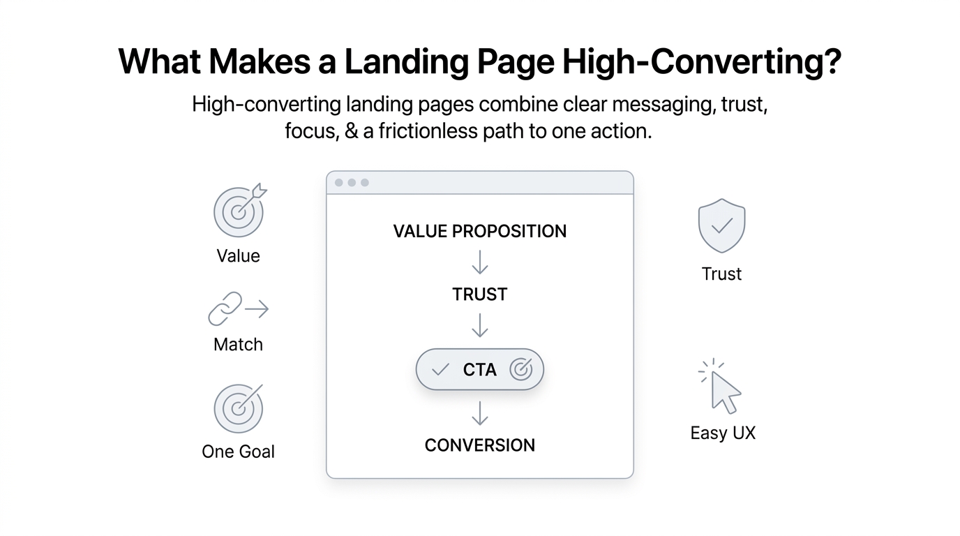
There’s no single trick that makes a page convert well. It’s a combination of things working together, and if even one of them is off, the whole page can underperform even when everything else looks polished.
A Clear Value Proposition
The visitor needs an answer to one question within seconds: why should I care? If your headline and hero section don’t answer that fast, most people won’t stick around long enough to find out. This isn’t about being clever. It’s about being clear.
Strong Message Match
The landing page needs to align with whatever brought the visitor there — the ad copy, the search intent, the email subject line, the social post, the keyword, the offer itself. If someone clicks an ad that says “20% off winter boots” and lands on a page about your whole shoe catalog with no mention of the discount, that mismatch creates doubt, and doubt kills conversions fast.
One Primary Conversion Goal
Competing CTAs create friction. If a page asks someone to “buy now” and also “sign up for our newsletter” and also “follow us on Instagram,” the visitor has to make a decision about which action matters, and often they’ll make none of them. One goal, one path forward — that’s what keeps the page working the way it should.
Strong Visual Hierarchy
Within a few seconds, visitors should understand three things: what’s being offered, why it matters, and what they should do next. If someone has to scroll and hunt to figure any of that out, the page has already lost some percentage of its visitors before they even got to the offer.
Trust and Risk Reduction
People hesitate before acting, especially online, especially with money involved. Testimonials, reviews, client logos, guarantees, security indicators, certifications, and case studies all chip away at that hesitation. None of these need to be flashy — they just need to be real and relevant to what the visitor is deciding on.
Frictionless User Experience
Simple forms, fast loading times, solid mobile usability, clear copy, and minimal distractions all add up. Individually, none of these feel like a big deal. Together, they’re often the difference between a page that converts at 2% and one that converts at 6%.
Anatomy of a High-Converting Landing Page
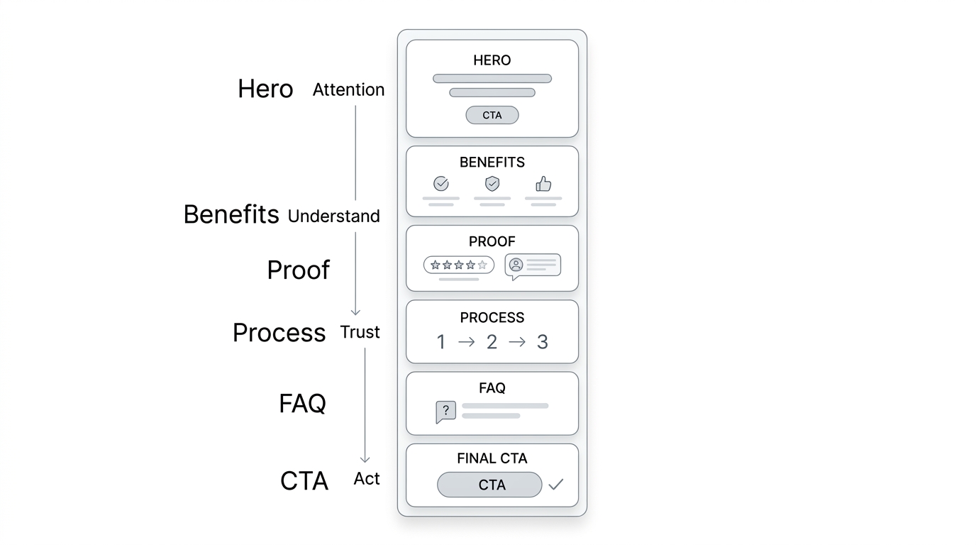
This is really the core of the whole guide, so let’s go section by section through what an actual high-converting page looks like from top to bottom.
1. Attention-Grabbing Headline
The headline is the first thing anyone reads, and for a lot of visitors, it’s the only thing they’ll read before deciding whether to keep scrolling or hit the back button. A strong headline is benefit-focused — it tells the visitor what they get, not what your company does. Specificity beats vagueness every time, and clarity beats cleverness almost always. Nobody’s impressed by a pun if they don’t understand what you’re offering.
A few headline formulas that hold up well: “Get [Desired Result] Without [Major Pain Point],” “The [Solution] for [Specific Audience],” and “[Achieve Outcome] in [Timeframe].” These aren’t magic formulas, but they force you to think about the actual outcome you’re promising instead of hiding behind vague brand language.
2. Supporting Subheadline
The subheadline’s job is to expand on the promise the headline just made. It clarifies the offer a bit further, adds context that wouldn’t fit in a punchy headline, and generally supports whatever claim the headline just made. If the headline is the hook, the subheadline is the explanation that keeps someone reading instead of bouncing.
3. Hero Section
The hero section is everything visible before someone starts scrolling, and it needs to carry a lot of weight. The essential pieces are the headline, subheadline, primary CTA, a relevant visual, and often a supporting trust signal like a customer count or star rating. The whole point of the hero section is communicating the offer without forcing anyone to scroll to understand it — if someone has to dig for the point, you’ve already lost some percentage of visitors.
4. Primary Call-to-Action
CTA copy matters way more than people assume. A good CTA is clear, specific, action-oriented, benefit-oriented, and visually prominent enough that nobody has to search for it. Compare a weak CTA like “Submit” against something like “Get My Free Guide” or “Start My Free Trial.” The weak version tells the visitor nothing about what happens next. The stronger versions restate the benefit right at the moment of decision, which matters more than most people realize.
5. Relevant Visuals
Product screenshots, product demonstrations, before-and-after images, explainer videos, service-related visuals, and real customer imagery all belong here — but only when they support the conversion goal. A stock photo of people smiling around a laptop doesn’t tell anyone anything useful. Visuals should show the actual product, the actual result, or the actual people using it. If a visual is purely decorative, it’s probably not earning its space on the page.
6. Benefits Section
This is where a lot of pages go wrong, because they list features instead of benefits. A feature is what the product does. A benefit is why the visitor should care. Take an example: the feature is automated reporting. The benefit is saving hours every week that used to go into building reports by hand. Visitors don’t buy features. They buy outcomes.
7. Social Proof
Customer testimonials, ratings, reviews, client logos, case studies, user numbers, and results all fall under this umbrella, and specificity is what makes them believable. “Great service!” from an anonymous reviewer doesn’t do much. “We cut our support response time from 12 hours to 45 minutes” from a named customer with a title and company does a lot more. The more specific the proof, the more it actually moves people.
8. How It Works
A simple three or four step process — something like Choose → Set Up → Launch → Get Results — reduces the perceived complexity of taking action. People hesitate when something feels complicated, even if it isn’t. Laying out the process in plain steps makes the whole thing feel more approachable than it might otherwise seem.
9. Features or Offer Details
Sometimes a detailed features section is necessary, especially for complex products where the visitor genuinely needs to understand what they’re getting. Other times, especially for simpler offers, this section should stay short and let the benefits section carry most of the weight. Knowing which situation you’re in comes down to how much explaining the offer actually needs.
10. Objection Handling
Every visitor has questions running in the back of their mind, even if they never type them into a search bar. Is it expensive? Is it difficult to use? Is it safe? Does it work for my specific situation? Can I cancel if it’s not right for me? How quickly can I actually get started? A page that addresses these head-on, instead of hoping visitors don’t think about them, tends to convert noticeably better.
11. FAQ Section
An FAQ section does double duty. It removes friction by answering lingering questions right there on the page, it addresses objections in a slightly less direct way than a dedicated objections section, and it can support search visibility when the questions match what people are actually typing into Google. Done well, it’s one of the most underrated sections on a landing page.
12. Final CTA
The page shouldn’t just trail off. It needs to end with a clear next step, restating the offer and the action one more time before the visitor scrolls past. Leaving someone uncertain about what to do at the bottom of the page is a missed opportunity — by that point, they’ve read everything, so the final CTA is often catching people at their most convinced.
How to Build a Landing Page Step by Step
This is the practical part — the actual process, start to finish.
Step 1: Define Your Conversion Goal
Before touching design or copy, decide exactly what action visitors should take, what actually counts as a conversion, and what happens right after someone converts. Is it a purchase? A lead submission? A demo booking? A phone call? A trial signup? A download? Getting vague here early on causes problems down the line, because every other decision on the page flows from this one.
Step 2: Define Your Target Audience
You need to know who they are, what problem they’re dealing with, what outcome they actually want, what’s stopping them from buying right now, what motivates them to act, and what language they naturally use to describe their problem. A simple framework worth using here: Audience → Problem → Desired Outcome → Objection → Solution. Walking through that chain for your specific offer clarifies a lot before you write a single word of copy.
Step 3: Research Search Intent and Customer Pain Points
Understanding what visitors actually want takes some digging. Good sources include Google search results for related terms, autocomplete suggestions, actual customer reviews (yours or competitors’), Reddit threads where people discuss the problem honestly, forums, competitor landing pages, direct customer interviews, sales call notes, existing FAQs, and support tickets. Support tickets especially are a goldmine, because they show the exact words customers use when something’s frustrating them.
Step 4: Create the Offer
Here’s a hard truth: a landing page cannot rescue a weak offer. No amount of clever copy or slick design fixes a product or deal that isn’t actually compelling. So before building anything, get clear on what’s being offered, who it’s actually for, what makes it genuinely valuable, why someone should act now rather than later, and what reduces the perceived risk of saying yes.
Step 5: Write the Landing Page Copy
A reliable copy sequence to follow: Problem → Promise → Benefits → Proof → Objections → CTA. Start by naming the problem the visitor already has, promise the outcome your offer delivers, lay out the specific benefits, back it up with proof, address the objections that are probably running through their head, and close with a clear call to action. This sequence covers headline writing, subheadline, benefit copy, CTA copy, social proof placement, and FAQ content.
Step 6: Choose the Right Landing Page Structure
Structure depends on a handful of factors — how complex the offer is, the price point, how aware the audience already is of the problem and solution, where the traffic is coming from, and what the conversion goal actually is. A short-form page works well for simple, low-commitment offers like a free download. A long-form page makes more sense for expensive or complex offers where the visitor needs more convincing before they’ll act.
Step 7: Design the Page
Good design supports the copy instead of competing with it. This means paying attention to visual hierarchy, whitespace, typography, color contrast, CTA placement, image quality, section spacing, and overall consistency. The guiding principle here is simple: design should make the next action obvious. If someone has to think about where to click, the design has failed at its main job.
Step 8: Build the Landing Page
There are several common approaches — a website CMS you’re already using, no-code landing page builders, dedicated landing page platforms built specifically for campaigns, or fully custom development. The right choice depends on your technical resources, how quickly you need to launch, and how much customization the page actually needs. This isn’t the place to get lost in a software tutorial — the important part is picking an approach that matches your team’s actual capabilities.
Step 9: Connect Forms, CRM, Analytics and Automations
What happens after someone converts matters just as much as the conversion itself. This step involves connecting the page to a CRM so leads don’t fall through the cracks, email marketing tools for follow-up sequences, analytics for tracking behavior, conversion tracking for measuring ROI, calendar booking tools if the goal is scheduling a call, and marketing automation to keep the relationship moving without manual work on your end.
Step 10: Optimize for Mobile
A huge chunk of traffic, sometimes the majority depending on your industry, comes from phones. That means the page needs a responsive layout, readable typography without pinching and zooming, thumb-friendly buttons that are actually easy to tap, short forms that don’t feel like a chore on a small screen, fast loading times, properly sized images, and a CTA that stays visible without extra scrolling.
Step 11: Test Before Launch
Before anything goes live, run through a checklist: links work, forms work, the thank-you page works, tracking actually fires, the CTA functions correctly, the page works properly on mobile, images load without issues, the page loads quickly, spelling and grammar are clean, and any privacy or legal information is present where it needs to be. Skipping this step is how businesses end up running ad campaigns to a broken form for two weeks before anyone notices.
How to Write Landing Page Copy That Converts
This section should explain how to write persuasive landing page copy that moves visitors toward one specific action, such as signing up, booking a demo, requesting a quote, downloading a resource, or making a purchase. Start by explaining why landing page copy differs from normal website copy and why clarity, relevance, and customer intent matter.
Cover the essential copy elements, including the headline, subheadline, value proposition, benefits, supporting copy, calls to action, objection handling, trust signals, testimonials, guarantees, and urgency. Explain how to write customer-focused copy instead of simply listing product features.
Also cover how to structure copy around the visitor’s problem and desired outcome, how to match copy with the traffic source, how to use persuasive language without sounding exaggerated, and how to create strong CTAs. Include examples of weak versus strong landing page copy and explain why one is more likely to convert.
Start With the Customer’s Problem
Don’t open with company history or a mission statement nobody asked for. Open with the visitor’s actual situation — the problem they’re dealing with right now, in language they’d use themselves. People don’t care how long you’ve been in business until they know you understand what they’re going through.
Sell the Outcome, Not Just the Product
There’s a useful chain here: Feature → Advantage → Benefit → Outcome. A feature is a fact about the product. An advantage is what that fact allows. A benefit is what that means for the visitor personally. And the outcome is the actual life or business change they experience. Copy that stops at the feature level leaves a lot of persuasive power on the table.
Use Specific and Concrete Language
Vague messaging like “improve your workflow” doesn’t move anyone, because it could mean almost anything. Specific messaging like “cut your invoicing time from three hours to twenty minutes” gives the visitor something real to picture. Concrete beats vague nearly every time in conversion copy.
Make the Value Proposition Easy to Understand
A visitor should be able to quickly grasp what it is, who it’s for, what they get, why it’s better than alternatives, and what to do next. If any one of those five things is unclear, the page is asking the visitor to do work it should be doing for them.
Use Customer Language
Pulling actual phrases customers use — from reviews, support tickets, or interviews — into your copy makes the page feel like it was written by someone who actually understands the visitor’s world, rather than a marketing team guessing from the outside.
Create Urgency Without Manipulation
Legitimate urgency comes from real constraints: limited enrollment spots, an actual deadline, a seasonal offer that genuinely ends, or limited availability that’s really limited. What doesn’t work, and what visitors increasingly see through, is fake countdown timers that reset every time you refresh the page or scarcity claims that aren’t true. That stuff erodes trust fast, and trust is hard to rebuild once it’s gone.
Write Better CTA Copy
Different business types call for different CTA language. SaaS pages often do well with something like “Start My Free Trial.” Ecommerce leans toward “Add to Cart” or “Shop the Sale.” Services might use “Book My Free Consultation.” Lead generation pages often go with “Get My Free Quote.” Free resources work well with “Download the Guide.” And consultation-focused offers might use “Schedule My Call.” Each version restates the specific benefit at the exact moment someone’s deciding whether to click.
Landing Page Design Best Practices
This section should cover the visual and UX side of creating a landing page that converts. Explain that good design is not simply about making a page attractive—it should guide visitors toward the intended conversion action while removing distractions and reducing friction.
Discuss page structure, visual hierarchy, whitespace, typography, colors, buttons, images, videos, forms, navigation, mobile responsiveness, page speed, accessibility, and trust elements. Explain how visitors typically scan a landing page and how design should make the most important information immediately visible.
The section should also explain above-the-fold design, CTA placement, form design, navigation decisions, and how to maintain consistency between an advertisement and the landing page.
Keep the Visual Hierarchy Clear
Everything on the page should have a clear order of importance, communicated through size, position, and contrast. The headline should be the biggest thing on the screen for a reason — it’s the most important thing to read first.
Use Contrast to Highlight Important Elements
Your CTA button shouldn’t blend into the background. Strong contrast between the button and the surrounding page makes it visually impossible to miss, which sounds obvious but gets ignored constantly, especially when designers prioritize aesthetics over function.
Minimize Navigation and Distractions
Unnecessary links pull visitors away from the conversion goal. A full navigation menu on a landing page basically hands visitors an exit ramp before they’ve even considered your offer. Most high-converting landing pages strip navigation down to almost nothing.
Use Whitespace Strategically
Cramming everything together makes a page feel overwhelming and hard to scan. Whitespace gives the eye room to rest and makes important elements, like the CTA, stand out more clearly against everything else.
Make CTAs Visually Distinct
Beyond contrast, CTAs benefit from consistent styling throughout the page. If your button color and shape stay the same everywhere it appears, visitors start recognizing it instinctively as “the next step” every time they see it.
Use Authentic and Relevant Images
Real photos of your actual product, actual team, or actual customers build more trust than generic stock photography ever will. Visitors can usually tell the difference, even if they can’t articulate why a page feels less trustworthy.
Keep Forms Short
Every additional field on a form tends to reduce completion rates. For businesses that genuinely need more information later, progressive profiling — collecting a bit more data over multiple interactions instead of all at once — solves this without scaring visitors off with a long form upfront.
Design Mobile-First
Building for mobile first, then scaling up to desktop, tends to produce cleaner results than the reverse. It forces you to prioritize what actually matters, since small screens don’t leave room for filler.
Maintain Consistent Branding
Fonts, colors, and tone should match the rest of your marketing. A landing page that looks nothing like your ads or your website creates a jarring disconnect that makes visitors second-guess whether they’re in the right place.
Landing Page SEO: Can Landing Pages Rank in Google?
Here’s an important distinction that gets missed a lot: not every landing page needs to rank organically. A landing page built specifically for a paid Google Ads campaign, for instance, usually doesn’t need SEO at all — its traffic comes entirely from the ad. But an SEO-focused landing page, or a product or service page designed to capture organic search traffic, absolutely needs SEO attention.
Optimize the Page for Search Intent
The page needs to match what someone’s actually looking for when they type in a related search. If the intent is informational and the page is purely a hard sell, it won’t perform well in search, because it doesn’t answer what the searcher wanted.
Use a Relevant Primary Keyword
The primary keyword should appear naturally throughout the page — in the headline, some subheadings, and the body copy — without feeling forced or repeated unnaturally.
Optimize the Title Tag and Meta Description
These don’t directly boost rankings much on their own, but they heavily influence whether someone clicks your result over a competitor’s, which matters just as much as ranking position.
Create a Clear H1
The page needs one clear, keyword-relevant H1 that matches the page’s actual topic and intent.
Build Helpful Supporting Content
Pages that only sell, with zero educational value, tend to underperform in search compared to pages that also genuinely help the visitor understand something, even while making the case for the offer.
Use Internal Links Where Appropriate
Linking to related content on your site, where it makes sense, helps both visitors and search engines understand how your content connects together.
Optimize Images
Compressed file sizes and descriptive alt text help both page speed and search visibility, and alt text specifically helps visually impaired visitors using screen readers.
Improve Page Speed and Core UX
Slow pages hurt rankings and hurt conversions simultaneously. This is one of the rare areas where SEO and CRO goals line up perfectly.
Add Relevant Structured Data Where Appropriate
Structured data can help search engines understand specific elements of the page, like reviews or FAQs, which sometimes leads to richer search result appearances.
Avoid Creating Thin or Nearly Identical Landing Pages
Some businesses try to create hundreds of nearly identical landing pages targeting slightly different locations or keywords. This tends to backfire, since search engines generally penalize thin, duplicate-feeling content rather than rewarding it.
How to Improve Landing Page Conversion Rates
Conversion Rate Optimization, or CRO, is basically the ongoing process of getting more value out of the traffic you’re already generating instead of just chasing more traffic. The basic formula is Conversion Rate = Conversions ÷ Visitors × 100.
Start With the Biggest Conversion Bottleneck
Before making random changes, look at where visitors are actually dropping off. Analyze traffic quality, engagement behavior, CTA clicks, form starts versus form completions, and checkout abandonment if you’re ecommerce. The biggest bottleneck usually points to where your optimization effort should go first.
Improve Message Match
Revisit whether the page still matches the ads, emails, or search queries sending traffic to it. Message match tends to drift over time as campaigns evolve, and it’s worth checking regularly.
Strengthen the Value Proposition
If visitors aren’t converting, sometimes the offer itself isn’t landing clearly enough. Tightening up how the value proposition is communicated can move the needle more than any design tweak.
Reduce Form Friction
Cutting unnecessary fields, simplifying the form layout, and reducing the number of steps required all tend to lift completion rates.
Add More Relevant Social Proof
Sometimes the existing proof just isn’t specific or recent enough to convince skeptical visitors. Fresh, specific testimonials often outperform older, vaguer ones.
Improve CTA Clarity
A CTA that’s technically visible but unclear about what happens next still creates hesitation. Testing clearer, more specific CTA copy often produces quick wins.
Remove Unnecessary Distractions
Any element that doesn’t support the conversion goal is a candidate for removal, even if it seems harmless on its own.
Address Visitor Objections
If drop-off happens at a predictable point, it’s worth asking what question the visitor might have right there that the page isn’t answering.
Improve Mobile Experience
Given how much traffic comes from phones now, mobile-specific friction — tiny buttons, awkward forms, slow load times — can quietly tank overall conversion rates even when desktop performance looks fine.
Increase Page Speed
Every extra second of load time tends to cost conversions. Compressing images, minimizing scripts, and using a fast hosting setup all contribute here.
A/B Testing Your Landing Page
Optimization should be based on actual evidence, not guesses about what “should” work better.
What Is A/B Testing?
A/B testing means showing two versions of a page — version A and version B — to different segments of your traffic at the same time, then measuring which one performs better on your defined conversion goal.
What Should You Test?
Not everything deserves equal testing priority. Generally, it’s worth focusing on the headline first, then the offer itself, the CTA, the hero section, form length, social proof placement and content, images, how pricing is presented, and overall page structure, roughly in that order of impact.
Test One Major Variable at a Time
Changing the headline, the images, and the CTA all at once might produce a better-performing page, but you’ll have no idea which change actually caused the improvement. Isolating variables makes results meaningful.
Avoid Making Decisions Too Early
Ending a test after a handful of conversions, before you have enough data for statistical confidence, leads to decisions based on noise rather than real signal. Patience matters here more than people expect.
Measure the Right Conversion
Click-through rate, form completion, lead quality, sales, and revenue are all different metrics, and they don’t always move together. A version that gets more form completions isn’t automatically the winner if those leads convert into customers at a much lower rate than the other version.
Landing Page Examples: What Different Businesses Should Include
This section should make the guide practical by showing how landing page requirements change depending on the business model, audience, offer, and conversion goal. Instead of presenting examples simply as a gallery, explain what each type of business needs on its landing page and why.
Cover examples for SaaS companies, service businesses, ecommerce brands, agencies, consultants, local businesses, B2B companies, coaches, online courses, lead-generation campaigns, and free-trial or demo-based businesses.
For each example, explain the ideal goal, headline approach, offer, CTA, trust elements, form requirements, objections to address, and page structure. This makes the section useful for readers who want to apply the principles to their own business.
SaaS Landing Page Example
A solid structure here looks like: Headline → Product Demo → Benefits → Features → Social Proof → Pricing/Offer → FAQ → CTA. This order builds understanding first, credibility second, and removes pricing-related hesitation before asking for the signup.
Local Service Business Example
Businesses like plumbers, dentists, home service providers, and digital marketing agencies tend to do well with: Problem → Service → Local Proof → Benefits → Reviews → Contact/Call CTA. Local proof matters a lot here — reviews from people in the same city or region carry more weight than generic testimonials.
Ecommerce Product Landing Page
A common structure is: Product → Benefits → Images → Reviews → Features → FAQ → Purchase CTA. Ecommerce visitors want to see the product clearly and hear from real buyers before committing to a purchase.
B2B Lead Generation Landing Page
B2B pages often follow: Business Problem → Solution → Business Benefits → Proof → Form → CTA. B2B buyers usually need more justification, often because they’re making a case to someone else internally, so the proof section carries extra weight.
Lead Magnet Landing Page
A typical layout is: Resource → Benefits → Preview → Form → Privacy reassurance → Download CTA. Including a privacy reassurance near the form helps address the unspoken worry about handing over an email address.
Best Landing Page Tools and Builders
This section should help readers choose the right technology for creating and managing landing pages. Explain that the best tool depends on factors such as budget, technical expertise, integrations, customization requirements, analytics, A/B testing capabilities, and whether the user already has a website or CMS.
Compare different categories of tools rather than simply listing platforms. For example, cover WordPress-based solutions, dedicated landing page builders, no-code platforms, website builders, ecommerce platforms, and tools designed specifically for marketers.
For each recommended platform, explain who it is best suited for, its key strengths, limitations, ease of use, customization options, integrations, testing capabilities, and pricing considerations. The section should ultimately help readers choose a tool based on their specific situation.
No-Code Website Builders
These work well for beginners, small businesses, and simple campaigns that don’t need heavy customization. They’re generally easy to use and quick to launch, though customization and advanced testing capabilities can be limited compared to more specialized platforms.
Dedicated Landing Page Builders
These tend to suit marketers, agencies, and businesses running frequent paid advertising campaigns that need to launch and test pages quickly. They usually offer stronger analytics, integrations, and testing capabilities built specifically for conversion-focused work.
WordPress-Based Landing Pages
For businesses already running on WordPress, especially ones focused on SEO and content, building landing pages within that same ecosystem often makes sense, since it keeps everything under one roof and benefits from existing SEO infrastructure.
Custom-Coded Landing Pages
For advanced functionality or highly customized experiences, custom development gives the most flexibility. This route makes the most sense for businesses with development resources on hand, since it takes more time and technical skill than the other options.
Across all four categories, it’s worth weighing ease of use, how much customization you actually need, the quality of built-in analytics, available integrations, testing capabilities, and how well the platform scales as your campaigns grow.
How to Measure Landing Page Performance
This section should explain what happens after the landing page goes live and how to determine whether it is actually working. The focus should be on measuring conversions and identifying where visitors are dropping off rather than simply looking at traffic numbers.
Explain the most important landing page metrics, including conversion rate, visitors, bounce/engagement metrics, form completion rate, CTA click-through rate, cost per conversion, lead quality, revenue per visitor, and return on ad spend where applicable.
Then explain how to use tools such as analytics platforms, heatmaps, session recordings, form analytics, and A/B testing to understand visitor behavior. Most importantly, show readers how to turn the data into optimization decisions.
Conversion Rate
The core metric — the percentage of visitors who complete the desired action. Everything else on this list ultimately feeds into whether this number is moving in the right direction over time.
Click-Through Rate
Relevant when the page’s job is to move visitors toward another page rather than convert them directly on that page. A low click-through rate often signals that the page isn’t building enough momentum toward the next step.
Form Completion Rate
Measures how many visitors who start filling out a form actually finish it, which can reveal friction points in the form itself, like too many fields or confusing labels.
Bounce/Engagement Metrics
These show whether visitors are actually engaging with the page content or leaving almost immediately, which often signals a message match problem between the ad and the page.
Cost Per Lead
Connects ad spend directly to lead generation results, giving a clearer picture of campaign efficiency than conversion rate alone, especially when comparing different traffic sources.
Cost Per Acquisition
Takes things a step further by connecting spend to actual customers acquired, not just leads generated, which matters more when leads don’t reliably turn into sales.
Lead-to-Customer Rate
Shows how many of the leads a page generates actually turn into paying customers, which matters more than raw lead volume when judging a page’s real business impact.
Revenue Per Visitor
Ties landing page performance directly to revenue generated, giving a bottom-line view of how much each visitor is actually worth to the business.
Return on Ad Spend
Connects the whole picture together, showing whether the money spent driving traffic to the page is actually paying off once everything downstream is accounted for.
Marketers should connect landing page performance to actual business outcomes, not just clicks or form fills that look good on a dashboard but don’t translate into real revenue.
Landing Page Optimization Checklist
Use this before publishing anything.
Strategy
- One clearly defined target audience
- One primary conversion goal
- Clear offer
- Strong message match
- Customer pain points understood
Copy
- Clear headline
- Benefit-focused subheadline
- Specific value proposition
- Strong CTA
- Objections addressed
- Relevant FAQ
Design
- Clear visual hierarchy
- CTA stands out
- Minimal distractions
- Relevant visuals
- Mobile responsive
- Consistent branding
Trust
- Testimonials
- Reviews
- Client logos or credentials where relevant
- Guarantees/security information where appropriate
Technical
- Fast loading
- Forms tested
- Analytics configured
- Conversion tracking configured
- Thank-you page works
- All links tested
Optimization
- Baseline metrics established
- A/B testing plan created
- Lead quality monitored
- Results reviewed regularly
This checklist won’t catch everything, but running through it before launch catches the mistakes that are cheap to fix now and expensive to fix later, once ad spend is already flowing to a broken or unclear page.
Conclusion
Everything in this guide really comes down to a handful of core ideas working together:
- Understand the audience
- Define the conversion goal
- Create a compelling offer
- Match the message to the traffic source
- Write benefit-focused copy
- Build a distraction-free design
- Add trust and objection handling
- Optimize for mobile and speed
- Track conversions
- Test and improve continuously
A high-converting landing page isn’t simply a nice-looking webpage sitting on your server. It’s a carefully built conversion experience that connects the right visitor with the right offer and makes the very next step completely obvious. Get that right, and the traffic you’re already paying for or earning starts working a lot harder for you.
Frequently Asked Questions
What is a landing page in simple terms?
A landing page is a standalone web page built around one specific goal — getting a visitor to sign up, buy, book, download, or contact you. It skips the broad, multi-purpose approach of a regular website page and focuses entirely on moving one type of visitor toward one action, without the usual distractions of full site navigation.
What is the main purpose of a landing page?
The main purpose is conversion. Everything on the page, from the headline to the final CTA, exists to move a visitor toward completing one specific action tied to a marketing campaign or offer, rather than exploring the site broadly.
What is the difference between a landing page and a homepage?
A homepage introduces the whole business to a broad audience and usually includes extensive navigation and multiple possible next steps. A landing page targets a specific audience with a specific offer and typically has one primary CTA and little to no navigation pulling visitors away from that one action.
How do I create a landing page?
Start by defining your conversion goal and audience, research their pain points, build a compelling offer, write copy that follows a problem-to-CTA sequence, design the page around clear hierarchy, build it using whatever platform fits your resources, connect your tracking and CRM tools, and test everything thoroughly before launch.
How much does it cost to create a landing page?
Costs vary widely depending on the approach. A no-code builder might cost very little beyond a monthly subscription fee, while custom development involving a designer and developer can run into the thousands. The right budget depends on how complex the offer is and how much customization the page actually needs.
Do I need coding skills to build a landing page?
Not necessarily. Plenty of no-code and dedicated landing page builders let you build a fully functional page without writing any code. Coding skills become more relevant when you need highly custom functionality that off-the-shelf tools can’t handle easily.
What should a landing page include?
At minimum, a strong headline, supporting subheadline, clear offer explanation, benefits section, social proof, a prominent CTA, and ideally an FAQ section addressing common objections. More complex offers may need additional sections like a how-it-works breakdown or detailed feature comparisons.
How many CTAs should a landing page have?
Generally, one primary CTA repeated in a few strategic places throughout the page, rather than multiple different CTAs competing for attention. Repetition of the same CTA is fine and often helpful; variety in what you’re asking visitors to do usually isn’t.
What is a good landing page conversion rate?
There’s no single universal benchmark that applies everywhere. Conversion rates vary quite a bit depending on industry, traffic source, the offer itself, audience awareness, where visitors are in the buying funnel, device type, and price point. A rate that’s excellent for one industry might be mediocre for another, so it’s more useful to track your own page’s performance over time than chase a generic number pulled from somewhere else.
Should a landing page have navigation?
Most high-converting landing pages minimize or completely remove navigation, since any link away from the page gives visitors an exit before they’ve considered the offer. Some businesses keep minimal navigation for brand trust reasons, but it’s generally worth testing whether removing it improves conversion for your specific audience.
Can landing pages rank on Google?
Yes, but not every landing page is meant to. Pages built purely for paid ad campaigns usually don’t need to rank organically. Pages meant to capture organic search traffic, however, can and should be optimized for SEO, including keyword usage, page speed, and genuinely helpful content that matches search intent.
Should landing pages be long or short?
It depends on the offer. Simple, low-commitment offers like a free download often work fine with a shorter page. Expensive, complex, or high-consideration offers usually need a longer page that has room to explain the value, address objections, and build enough trust before asking for the conversion.
How do I know if my landing page is working?
Track your conversion rate against your defined goal, but don’t stop there. Look at lead quality, cost per acquisition, and actual revenue generated, since a page can show a high conversion rate while still underperforming on the metrics that actually matter to the business long term.
How long does it take to build a landing page?
This depends heavily on the platform and complexity involved. A simple page using a no-code builder might take a few hours to put together. A more complex, custom-built page with extensive copywriting, design work, and integrations could take anywhere from a few days to a few weeks from start to launch.
Can I use the same landing page for multiple campaigns?
You can, but it’s usually not the best approach. Different campaigns often target different audiences or emphasize different angles of an offer, and a page built for one specific message tends to outperform a generic page trying to serve several campaigns at once.