


Open two websites selling the exact same pair of shoes. Same product, same price range, same target buyer. On one, your eye lands on the shoe, then the price, then the “Add to Cart” button, in that order, without you even trying. On the other, there’s a logo shouting at you, three banners fighting for space, a countdown timer, a chat bubble, and somewhere in that mess, the shoe. You have to hunt for it.
That second site isn’t badly designed because the designer picked the wrong font or a weird shade of blue. It’s badly designed because nobody decided what should be seen first. That’s it. That’s the whole problem, and it has a name: visual hierarchy.
Every design, whether it’s a website, a WhatsApp catalog image, a festival sale banner, or a slide in a pitch deck, has dozens of things competing for attention at once. Headlines, images, buttons, prices, badges, logos. Nobody looks at all of it equally. In the first two or three seconds, the eye picks a path, and either the designer controlled that path or they didn’t. Visual hierarchy is the discipline of controlling it on purpose instead of leaving it to chance.
This matters a lot more in the Indian market than most people give it credit for. Scroll through festival sale creatives on Instagram right now and count how many elements are screaming at the same volume. Discount percentage in bold red, “LIMITED TIME” in yellow, brand logo blown up in the corner, product photo squeezed into whatever space is left. Nothing wins because everything is trying to win. That’s not a taste problem. That’s a hierarchy problem, and it’s fixable once you understand how it actually works.
This guide walks through what visual hierarchy really means, why it affects things you actually care about like conversions and trust, the psychology behind why it works on the brain the way it does, the specific tools designers use to build it, how it shows up differently across web pages, social posts, decks, and packaging, and how to actually build and test it yourself. No fluff, no vague “best practices.” Just how this thing works and why it’s worth taking seriously.
What Is Visual Hierarchy?
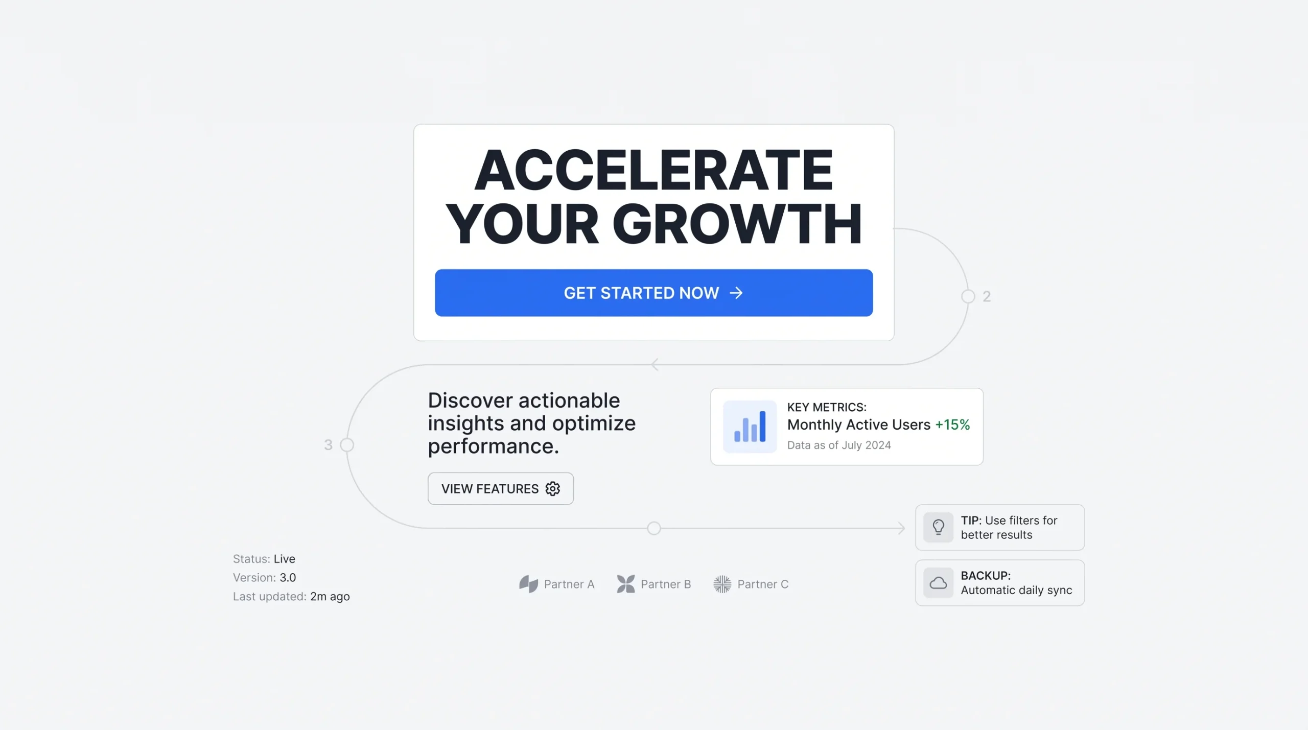
Visual hierarchy is the deliberate arrangement of design elements based on how important each one is to the viewer. Size, color, spacing, position, contrast, all of it gets used to control the order in which someone notices things. Not what they notice eventually if they stare long enough. What they notice first, second, third, in that exact sequence.
The word “deliberate” is doing a lot of work in that sentence. Hierarchy isn’t about what the designer personally finds beautiful or what took the longest to make. A designer might spend six hours perfecting an illustration in the corner of a landing page, but if that illustration isn’t what the visitor needs to see first, it shouldn’t be competing with the headline for attention. Hierarchy is decided by what the viewer needs, not by what the maker is proud of. That distinction trips up a lot of beginners, and honestly, some experienced designers too.
People often mix up visual hierarchy with layout or composition, and they’re related but not the same thing. Layout is where things sit on the page, like a floor plan. Composition is how all the pieces work together as a whole. Visual hierarchy is specifically about order of importance, the sequence in which the eye is meant to travel. You can have a perfectly balanced layout with zero hierarchy, where everything is spaced nicely but nothing tells the eye where to start.
Typography hierarchy is a piece of this, not the whole thing. It’s one tool, using font size and weight to separate a heading from a subheading from body text. Visual hierarchy is the umbrella that typography hierarchy sits under, along with color, spacing, alignment, and a handful of other tools covered further down.
Think of it as a scan path. Eyes don’t move across a page like they’re reading a book line by line, especially not on a first glance. They jump. They land on whatever grabs attention fastest, usually the biggest or highest-contrast thing, then move to the next loudest signal, and so on. Good hierarchy means that jump sequence matches what actually matters. Bad hierarchy means the eye jumps around randomly, or worse, doesn’t know where to land at all and just leaves.
💡 In one line: Visual hierarchy is the art of controlling what a viewer sees first, second, and last, using size, color, spacing, and placement instead of asking them to read everything at once.
Why Visual Hierarchy Matters (The Business Case)
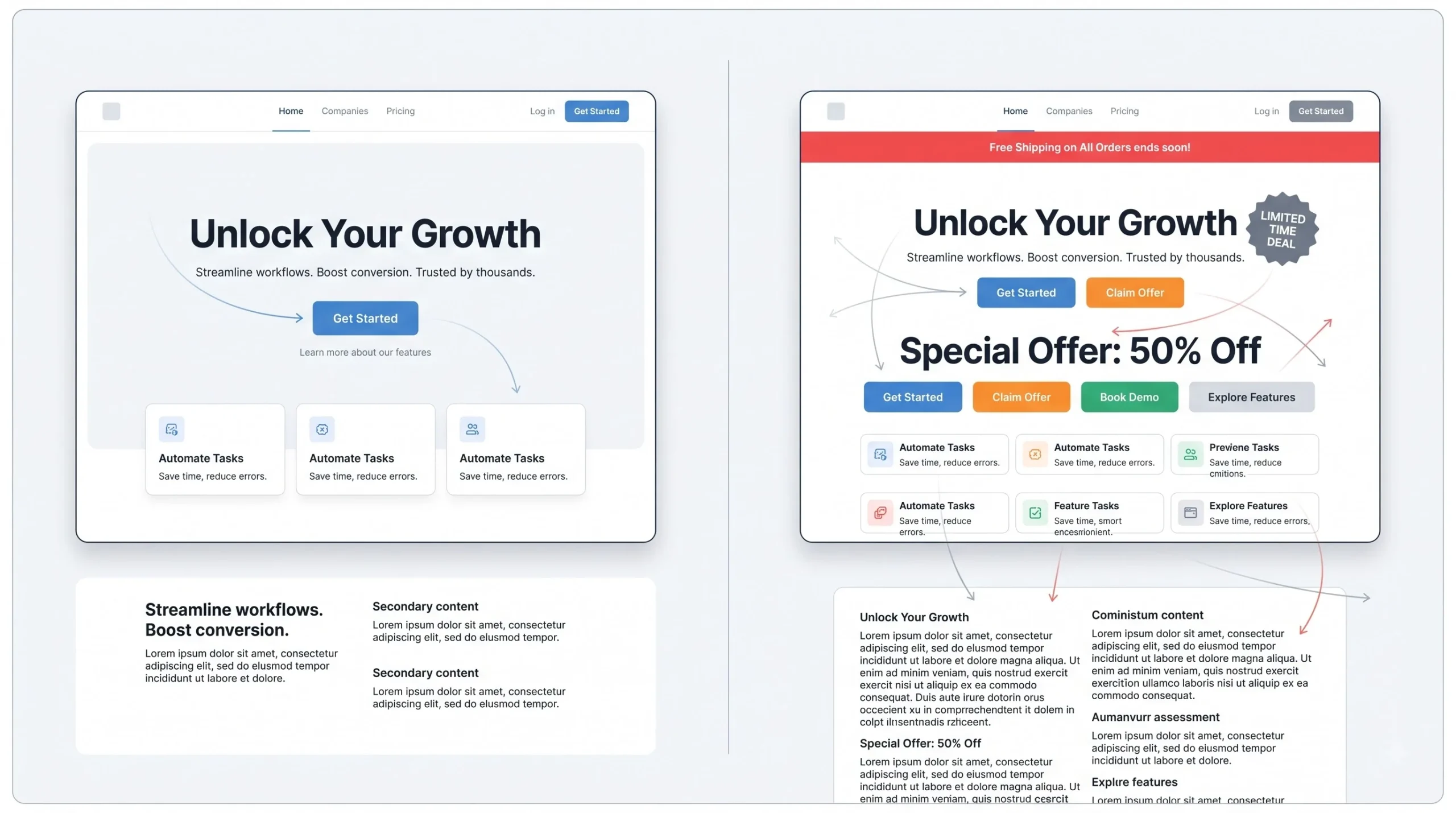
Look, “it looks nicer” is not a business argument, and nobody’s going to approve a redesign budget based on vibes. So here’s the actual case for why this stuff affects money, not just aesthetics.
Start with cognitive load. The brain processes visual information faster than it processes text, way faster. Before a single word is consciously read, the brain has already registered shapes, colors, and contrast. When a page has clear hierarchy, this happens effortlessly. When it doesn’t, the brain has to work to figure out what matters, and that work has a cost. People don’t sit there and consciously think “this page is confusing, I should leave.” They just leave. The friction happens below the level of thought, which is exactly why it’s so easy to underestimate.
Then there’s the conversion piece, and this is the one marketers should actually care about. If a “Buy Now” button is visually competing with a coupon badge, a shipping banner, and a countdown timer all screaming at the same intensity, click-through drops. Not because the offer is bad. Because the eye doesn’t know where to focus, so it either picks the wrong thing or picks nothing. This ties directly into conversion rate optimization work, where the goal is often just removing visual noise so the one action that matters actually gets noticed.
Trust matters too, and it’s underrated. Indian consumers are increasingly comparing local D2C brands against polished international ones, and hierarchy is one of those things that reads as “professional” or “amateur” before a single word gets processed. A cluttered page with no clear focal point signals, rightly or wrongly, that the business behind it isn’t quite there yet. Nobody consciously thinks “weak hierarchy, low trust.” They just feel like something’s off, and they bounce or hesitate to enter card details.
Accessibility is part of this conversation too, and it’s not a side issue. Someone with low vision, someone scrolling in bright sunlight, someone with a cognitive processing difference, all of them benefit when hierarchy is clear. A page that only works if you stare at it carefully is a page that fails a chunk of real users every single time.
And there’s a light SEO connection worth mentioning honestly, without overselling it. Clear hierarchy tends to keep people on a page longer because they can actually find what they came for. Longer engagement is generally good for on-page signals. That’s not a magic SEO trick; it’s just a side effect of a page that works the way it’s supposed to.
| Factor | Strong Visual Hierarchy | Weak Visual Hierarchy |
|---|---|---|
| Time to find key info | 2 to 3 seconds | 10+ seconds, or never |
| Bounce rate impact | Lower | Higher |
| Perceived brand trust | Comes across as put together | Feels amateur |
| CTA click-through | One clear focal point | Diluted across competing elements |
| Accessibility | Easy to scan for most users | Harder for low-vision or cognitive-load users |
The Psychology and Science Behind Visual Hierarchy
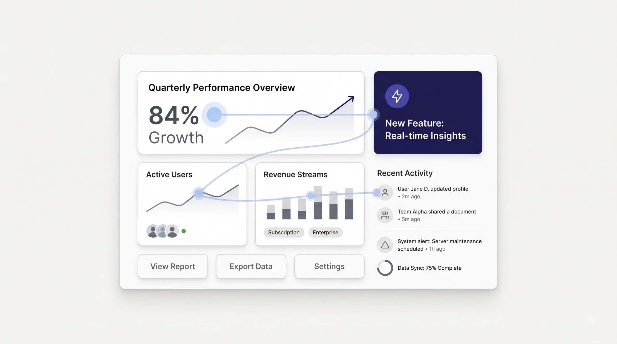
This is the part most beginner guides skip, and it’s kind of the whole point. Knowing “make the headline bigger” without understanding why bigger works is like memorizing a recipe without knowing what heat does to an egg. You can follow the steps, but you can’t improvise when something goes wrong.
Here’s roughly how the eye handles a page. Before any conscious reading happens, there’s a window, somewhere around 200 milliseconds, where the brain does what’s called pre-attentive processing. In that window, it’s not reading words. It’s registering raw visual properties: size, color, contrast, orientation, movement. This happens automatically, before thought kicks in. It’s why a bright red badge on an otherwise muted page gets noticed instantly, before anyone’s even aware they noticed it.
This is also where Gestalt principles come in, and these aren’t just design-school trivia, they explain the actual mechanics of why certain layouts feel intuitive and others feel chaotic.
Proximity means items placed close together get read as related, even without a label saying so. Put a price right next to a product name and the brain assumes they belong together. Put that price on the opposite side of the page and the brain has to work to connect them, if it bothers at all.
Similarity means items that look alike, same color, same shape, same style, get grouped mentally as the same category. This is why all your call-to-action buttons should probably look the same across a site. If one CTA is blue and rounded and another is red and square, the brain doesn’t automatically know they serve the same function.
Continuity is about implied lines. The eye follows a path even when there’s no actual line drawn, like a row of icons that subtly guides the gaze from left to right. Designers use this constantly, arranging elements along an invisible curve or line to lead the eye somewhere specific.
Closure is the brain’s habit of filling in gaps. Show someone 70% of a shape and they’ll mentally complete it. This is why minimal logos work, the brain does some of the visual work on its own, which oddly enough makes the image feel more memorable, not less.
Figure-ground is the separation between what’s in front and what’s the background. When this separation is unclear, like text placed over a busy photo with not enough contrast, the eye struggles to even identify what the subject is.
There’s also a large body of eye-tracking research on how people scan pages, using heatmaps to show exactly where attention lands and for how long. Without pointing to specific numbers that would need sourcing, the general pattern that keeps showing up is this: people scan first, they don’t read first. They skim the page to decide if it’s worth the effort of actually reading. Only after that quick scan says “yes, this is relevant” does real reading begin. Which means if the scan doesn’t immediately communicate value, the read never happens at all.
🧠 Pro Insight: Designers don’t get to choose what people look at first. They only get to choose what’s impossible to miss. That’s the entire discipline in one sentence.
The Core Principles of Visual Hierarchy
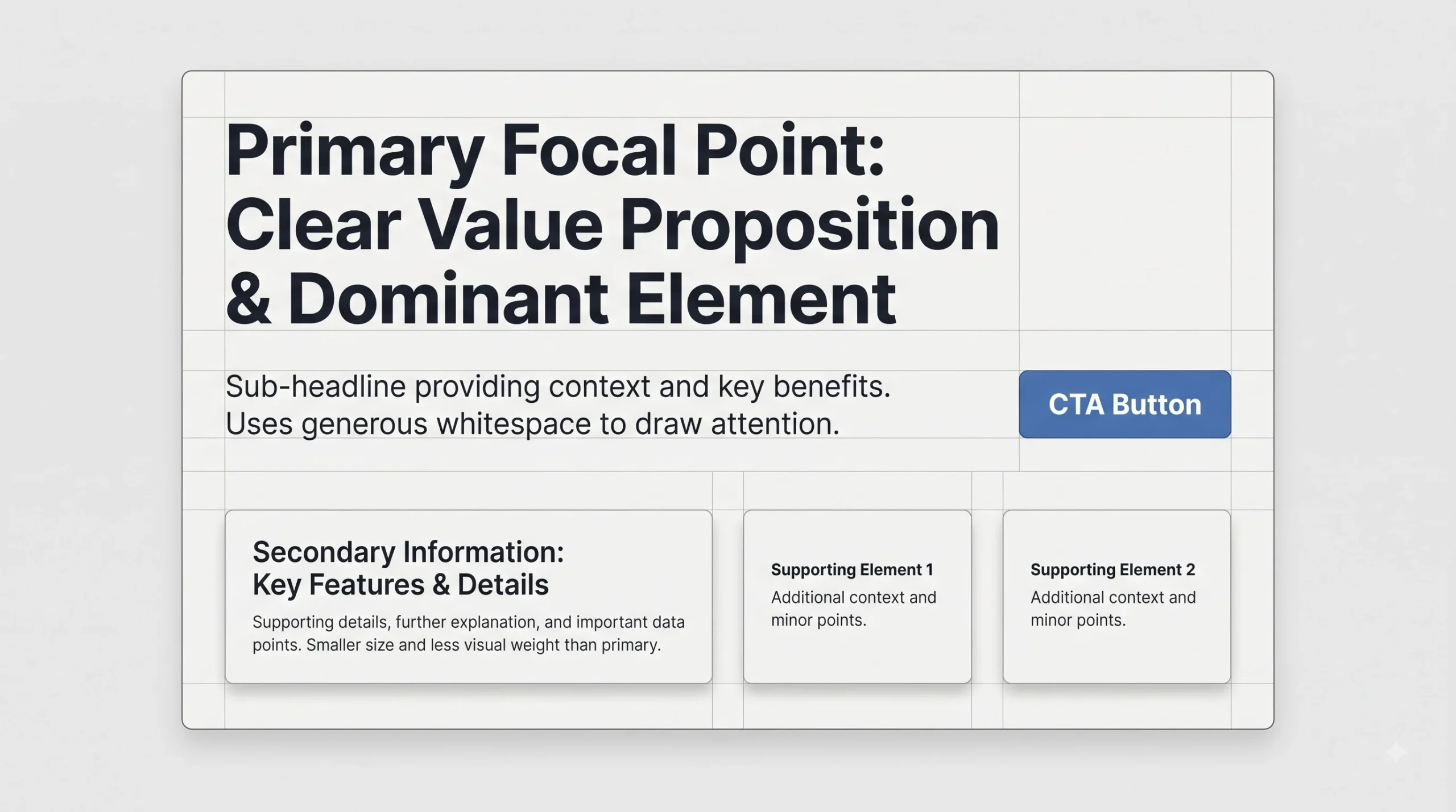
This is the toolbox. Nine tools, and each one does something specific. Skip any of them and hierarchy gets weaker. Overuse any of them and hierarchy collapses the other way, because if everything is emphasized, nothing is.
Size and Scale
Bigger reads as more important. That part’s obvious. What’s less obvious is that size only means something in relation to everything around it. A 40px headline looks huge next to 14px body text. That same 40px headline looks small and forgettable if everything else on the page is also sitting around 36 to 40px. Size is a relationship, not a fixed value, and treating it as a fixed value is where a lot of beginner mistakes start.
This is where a lot of beginner designs go wrong. Someone decides three or four things are “important,” so all of them get made big. Result: a page full of shouting, and the eye can’t tell what actually matters because there’s no contrast in scale anymore. Pick one, maybe two things that get to be big. Everything else has to be smaller by comparison, or the whole system breaks.
There’s also a jump-size problem worth mentioning. If a headline is 42px and the very next text element is 40px, the brain barely registers a difference, and the two end up competing instead of one clearly leading the other. The jump between size levels needs to be big enough for the brain to register a real gap, not a technical one. This is why most working type scales don’t move in small increments like 2px or 4px steps. They move in bigger jumps, or ratios, so each level is unmistakably a different tier, not just a slightly resized version of the one above it.
And size cuts both ways. Making the important thing bigger works, but so does making everything else smaller. Sometimes the fastest way to fix a page where nothing stands out isn’t to blow up the headline further, it’s to shrink three or four of the competing elements down until the headline naturally reads as dominant again, without ever touching its actual pixel value.
Color and Contrast
Contrast is probably the fastest hierarchy signal there is, faster even than size in a lot of cases. A dark element against a light background, or a saturated color in a field of muted tones, gets noticed almost instantly, before the brain even registers what the element actually is.
Color psychology gets talked about a lot, and sure, red feels urgent and green feels safe, but that’s a secondary effect. The primary job color plays in hierarchy is contrast, not mood. A muted olive-green button on a busy, colorful page can pull more attention than a bright red button surrounded by other bright colors, purely because it’s the odd one out. “Loud color equals important” is a trap. Sometimes restraint against a busy background does more work than volume.
There’s a version of this mistake that shows up constantly in sale creatives and banner ads: every element gets a bright, saturated color because bright supposedly equals attention-grabbing. But when the logo, the discount badge, the CTA, and the background are all fighting at full saturation, contrast disappears entirely, because contrast only exists between things that are different from each other. A page that’s uniformly loud is functionally the same as a page that’s uniformly quiet, in terms of what actually stands out, which is nothing. The fix usually isn’t turning the volume down everywhere. It’s picking one element to stay loud and deliberately muting everything around it so that one choice has somewhere to stand.
Worth mentioning too that contrast isn’t only about color hue, it’s also about value, meaning how light or dark something is. Two colors can be completely different hues, like blue and orange, but if they sit at a similar brightness level, the contrast between them ends up weaker than expected. This is why checking a design in grayscale catches so many hierarchy problems that colored versions hide. If two elements look nearly identical in grayscale, their color contrast probably isn’t doing as much work as it feels like it is.
Typography (Weight, Style, Case)
Font weight, size, and letter spacing all carry hierarchy signals on their own, separate from overall page layout. A bold heading against regular body text creates instant separation. This is usually built using a type scale, a consistent ratio between heading levels, something like each level being 1.25x or 1.5x the size of the one below it. It sounds like a small technical detail, but consistent ratios are what make a page feel intentional instead of random. Random font sizes chosen by eyeballing it, with no system behind them, is one of the most common reasons a page feels “off” without anyone being able to say exactly why.
Whitespace (Negative Space)
Whitespace is not empty space that got wasted. It’s an active tool, maybe the most underused one in hierarchy work. Space around an element isolates it, and isolation reads as importance. A crowded page where every inch is filled with text, badges, and images doesn’t feel rich, it feels exhausting, and the eye has nowhere to rest.
There’s a distinction worth knowing here: micro whitespace is the small stuff, spacing between letters and lines. Macro whitespace is the bigger picture, the breathing room between entire sections. Both matter, but macro whitespace is usually the one that gets sacrificed first when someone’s trying to “fit everything in.”
And honestly, this is worth being direct about. There’s a common instinct in a lot of Indian marketing creative, especially around sales and festival campaigns, to cram in every possible offer, badge, discount percentage, and urgency line because it feels like “more value shown equals more conversions.” It usually does the opposite. A page or a creative with one clear offer and enough room to breathe around it will almost always outperform one where five offers are all competing for the same three square inches. More information crammed in doesn’t mean more gets absorbed. Often it means none of it does.
Alignment
Alignment creates structure the eye trusts without even noticing it’s there. When text and elements line up along a consistent edge, the whole page feels organized, even if the person looking at it couldn’t explain why. When alignment is inconsistent, some things centered, some things left-aligned, some things just floating, the page feels unstable, even if every individual element looks fine on its own.
Grid systems exist because of this. A grid is basically the invisible skeleton that keeps everything aligned consistently across a page or a whole site, so hierarchy stays predictable no matter how much content gets added later.
Proximity and Grouping
This one connects straight back to the Gestalt principle covered earlier. Items placed close together get read as belonging to the same idea. A price sitting right under a product name reads as “this is the price of this product.” That same price sitting far away, maybe in a sidebar, forces the brain to do extra work connecting the two, and a chunk of people just won’t bother.
Color Psychology and Emotional Weight
Worth a quick separate mention from pure contrast. Color does carry emotional association, warm tones feeling urgent or energetic, cooler tones feeling calm or trustworthy. This layer sits on top of the contrast function color plays. Use it deliberately, not as decoration. A red CTA button works because it’s usually high contrast against most backgrounds and it carries urgency. But the contrast is doing the heavy lifting. The color meaning is the bonus.
Depth, Shadow, and Layering
Modern interfaces use elevation, shadows, overlap, subtle z-axis tricks, to signal what’s “closer” and therefore more important. A card that sits slightly above the page with a shadow underneath feels like it’s floating toward the viewer, and that reads as priority.
This is actually a good moment to be honest about a specific style choice: the graph-paper background with pill-shaped badges and hard-offset shadows, the kind of “digital notebook” aesthetic used in a lot of lead-magnet and freebie design work, leans on this principle constantly. Every card with a hard offset shadow is using depth as a hierarchy device on purpose, making each block feel like a distinct, tappable object rather than just flat text on a page. It’s a small trick, but it works because the brain reads elevation as significance almost instinctively.
Texture and Style Contrast
When one element looks different in texture, an illustration surrounded by photographs, or a flat icon sitting among textured images, it draws the eye regardless of its actual size. This one gets used less often than the others, but it’s a genuine tool. Sometimes the fastest way to make something stand out isn’t to make it bigger. It’s to make it look like it doesn’t belong stylistically, on purpose.
| Principle | What It Controls | Quick Example |
|---|---|---|
| Size | What gets noticed first | Large headline vs small caption |
| Color and Contrast | Speed of attention capture | Bright CTA button on a muted background |
| Typography | Reading order and tone | Bold heading, regular body text |
| Whitespace | Breathing room and grouping | Space around a CTA that isolates it |
| Alignment | Structural trust | Left-aligned block vs scattered text |
| Proximity | Perceived relationships | Price sitting right next to product name |
| Depth | Elevation and priority | A card with a shadow that “floats” above the page |
| Texture | Stand-out through style, not size | An illustration standing out among photos |
Visual Hierarchy Patterns: How People Actually Scan a Page
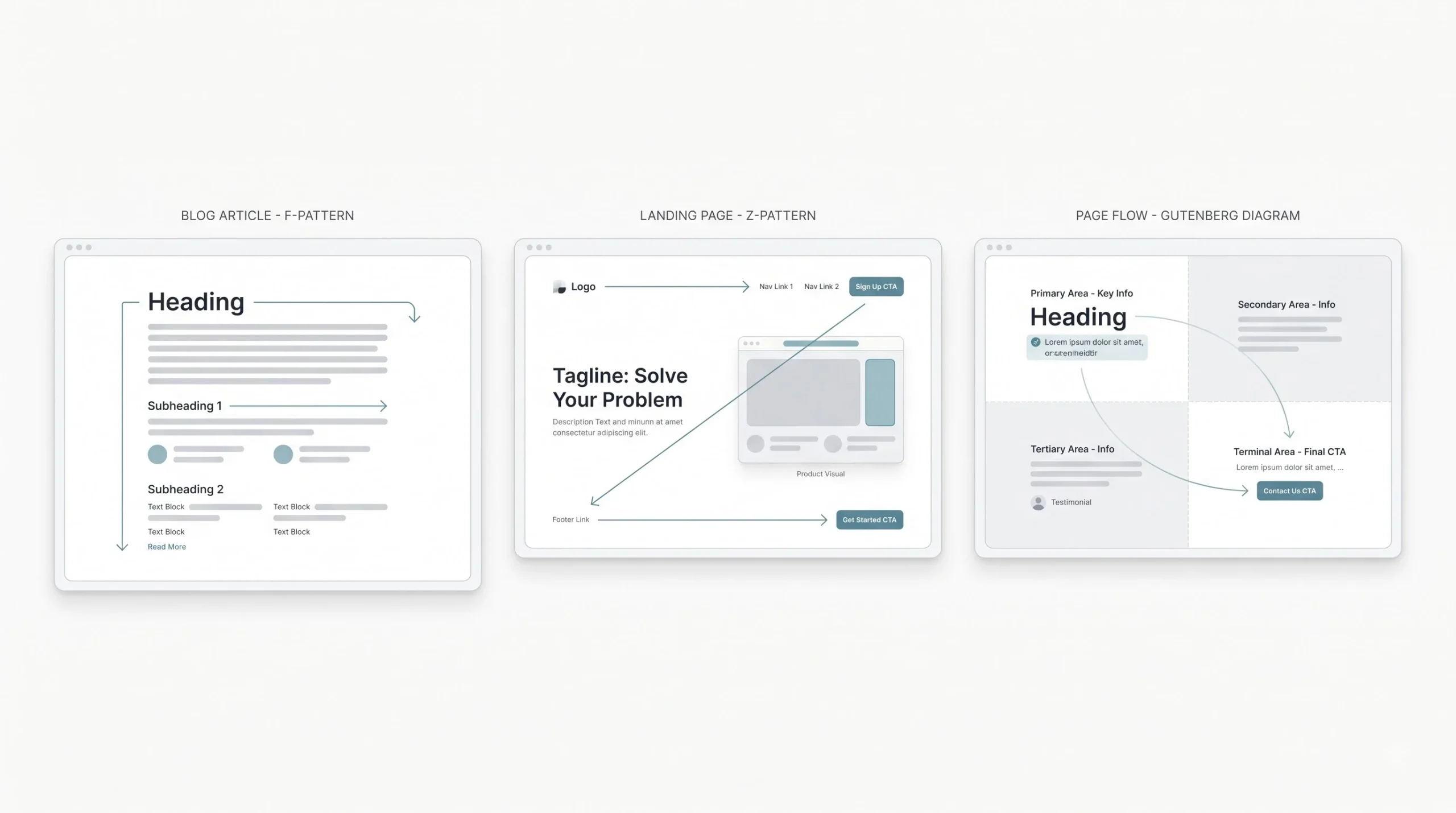
Knowing the individual tools is one thing. Knowing which overall scanning pattern applies to what you’re building is the next layer, and it’s where a lot of good instincts come from once it clicks.
F-Pattern shows up mostly on text-heavy pages, blog posts, search results, anything where reading dominates. The eye moves horizontally across the top, then again a bit lower but shorter, then trails down the left edge scanning for anything that catches attention. It looks like the letter F if you map it out, which is exactly where the name comes from. This is why the first couple of lines of a blog post or the first sentence under a heading carry so much weight. A lot of people never get past that initial horizontal scan.
Z-Pattern applies to pages with less text and more visual weight, landing pages, ad creatives, hero sections. The eye starts top-left, moves across to top-right, cuts diagonally down to bottom-left, then finishes at bottom-right. That’s basically the shape of a Z. This is exactly why so many landing pages put the logo top-left, a CTA top-right, then the main pitch left-aligned in the middle, ending with a final CTA bottom-right. It’s not a coincidence, it’s built around how the eye naturally travels when there’s not much text pulling it into a full read.
Gutenberg Diagram gets talked about less, but it’s genuinely useful and adds real depth here. It splits the page into four quadrants: primary optical area (top-left, gets seen first), strong fallow area (top-right, often ignored), weak fallow area (bottom-left, often ignored), and terminal area (bottom-right, where the eye naturally lands last, sort of like a resting point). This shows up more in evenly distributed layouts, print design, or simple homepages without a strong text-heavy or visual-heavy bias either way.
There’s also a simpler pattern worth naming for content-heavy pages: a layer-cake structure, alternating blocks of text and visuals stacked down the page. It’s less about eye direction and more about rhythm, giving the eye a break between dense reading sections and something lighter to look at, which keeps scanning going instead of dropping off.
Choosing between these isn’t random. Text-heavy content leans F-pattern. Visual, minimal-text pages lean Z-pattern. Balanced, simple layouts can lean Gutenberg. The content itself usually tells you which one fits, not personal preference.
| Pattern | Best For | Eye Movement | Example Use Case |
|---|---|---|---|
| F-Pattern | Text-heavy pages | Horizontal scans that shorten going down | Blog posts, search results, article pages |
| Z-Pattern | Minimal-text, visual pages | Diagonal, top-left to bottom-right | Landing pages, ad creatives, hero sections |
| Gutenberg Diagram | Evenly distributed content | Quadrant-based, ends bottom-right | Print layouts, simple homepages |
Visual Hierarchy Across Different Design Contexts

Principles don’t change, but how they get applied shifts a lot depending on where the design actually lives. What works on a slow-scroll blog post falls apart in a half-second Instagram scroll.
Web Design and Landing Pages
The hero section carries the most weight here. Whatever sits above the fold, the headline, the main image, the primary CTA, needs to dominate everything else on first load. This connects directly to conversion rate optimization work, because a landing page is basically one continuous hierarchy decision: what’s the one action this page wants someone to take, and does every visual choice point toward it, or away from it. A page where the CTA has to compete with three other equally loud elements is a page actively working against its own goal.
Scroll depth adds another layer here that a lot of people miss. Hierarchy doesn’t just apply to what’s visible on load, it needs to reset at every section as someone scrolls down. Each new section on a long landing page is basically a fresh hierarchy decision: what’s the one thing this section wants noticed first. A common mistake is nailing the hero section and then letting every section below it turn into a wall of equally weighted text, as if the hierarchy job was finished once the fold was handled. It isn’t. A page with fifteen scroll sections needs fifteen small hierarchy decisions, not one big one at the top.
Navigation bars deserve a mention too, since they’re often the most overlooked hierarchy zone on a site. A nav bar crammed with ten links, all the same size and weight, forces a visitor to read the entire thing before deciding where to go. A nav bar with one item styled slightly differently, maybe the account or cart icon, or a highlighted “Sale” link, gives the eye a starting point instead of a wall of equal options.
Mobile App and Responsive Design
Hierarchy has to adapt hard for small screens. There’s no room for five things competing for attention on a 6-inch screen the way there might be on a desktop layout. Thumb zones matter too, the areas of the screen a thumb can comfortably reach during one-handed scrolling, which affects where important actions like buttons actually get placed, not just how they look.
There’s a stacking problem specific to mobile that’s worth calling out. On desktop, elements can sit side by side, so two things can both feel prominent without directly competing because they occupy different horizontal space. On mobile, everything stacks vertically, which means whatever was “equally important but positioned differently” on desktop now has to be ranked, because it’s all fighting for the same narrow column, one element after another. A layout that never got tested at mobile width often reveals hierarchy problems that were invisible on a wide screen, simply because the wide screen had room to let things coexist without a real winner.
Social Media Graphics
Social media graphics are maybe the most unforgiving environment for hierarchy, because the scan window isn’t two or three seconds, it’s closer to half a second in a fast scroll. If a graphic doesn’t communicate its main point almost instantly, it gets scrolled past. This is exactly where a lot of Indian festival and sale creatives fall apart. Count the elements on a typical Diwali sale post: brand logo, discount percentage, “limited time” urgency text, product photo, offer code, sometimes even a second discount badge stacked on the first. Six elements, all fighting at the same visual volume, none of them winning. The fix isn’t removing all the information, it’s picking one hero element (usually the offer or the product) and letting everything else genuinely take a back seat in size and contrast.
There’s a format-specific piece too. A square feed post, a vertical story, and a widescreen ad banner all get scanned differently because the shape itself changes where the eye naturally starts. A story format is mostly read top to bottom since it’s tall and thumb-scrolled, so the top third of a story needs to carry the message fast, before a thumb taps past it. A square feed post gets more of a centered, all-at-once glance rather than a directional scan, which is part of why centered compositions tend to work better for feed posts than for stories. Reusing the exact same layout across every format without adjusting for how each one actually gets viewed is a common shortcut that quietly weakens hierarchy on at least one of the formats every time.
Presentation Decks
Same rule, different medium: one slide, one focal point. A slide packed with five bullet points, a chart, and a photo all at equal visual weight forces the audience to choose what to look at instead of the presenter guiding them. Good deck design usually means one dominant visual or statement per slide, with supporting details genuinely supporting, not competing.
Branding and Logo Design
Hierarchy exists inside a logo too, not just around it. In a logo lockup, there’s usually an icon, a wordmark, and sometimes a tagline, and all three shouldn’t carry equal visual weight. Usually the icon or wordmark leads, and the tagline sits smaller and quieter beneath it. A logo where every element is fighting for equal attention tends to feel busy and forgettable at small sizes, which matters a lot since most logos get seen tiny, on a favicon or a social profile photo, far more often than they get seen large.
Print and Packaging
Packaging has a brutal test built in: the shelf. A shopper glances at a shelf full of competing products for maybe a few seconds before deciding what to pick up. Whatever’s meant to catch that glance, brand name, a key visual, a flavor or variant callout, needs to win that fast scan against everything sitting next to it on the same shelf. Packaging that tries to communicate everything (ingredients, certifications, taglines, flavor, brand story) with equal emphasis usually loses that shelf test before anyone even picks it up to read the fine print.
How to Build Visual Hierarchy: A Step-by-Step Process
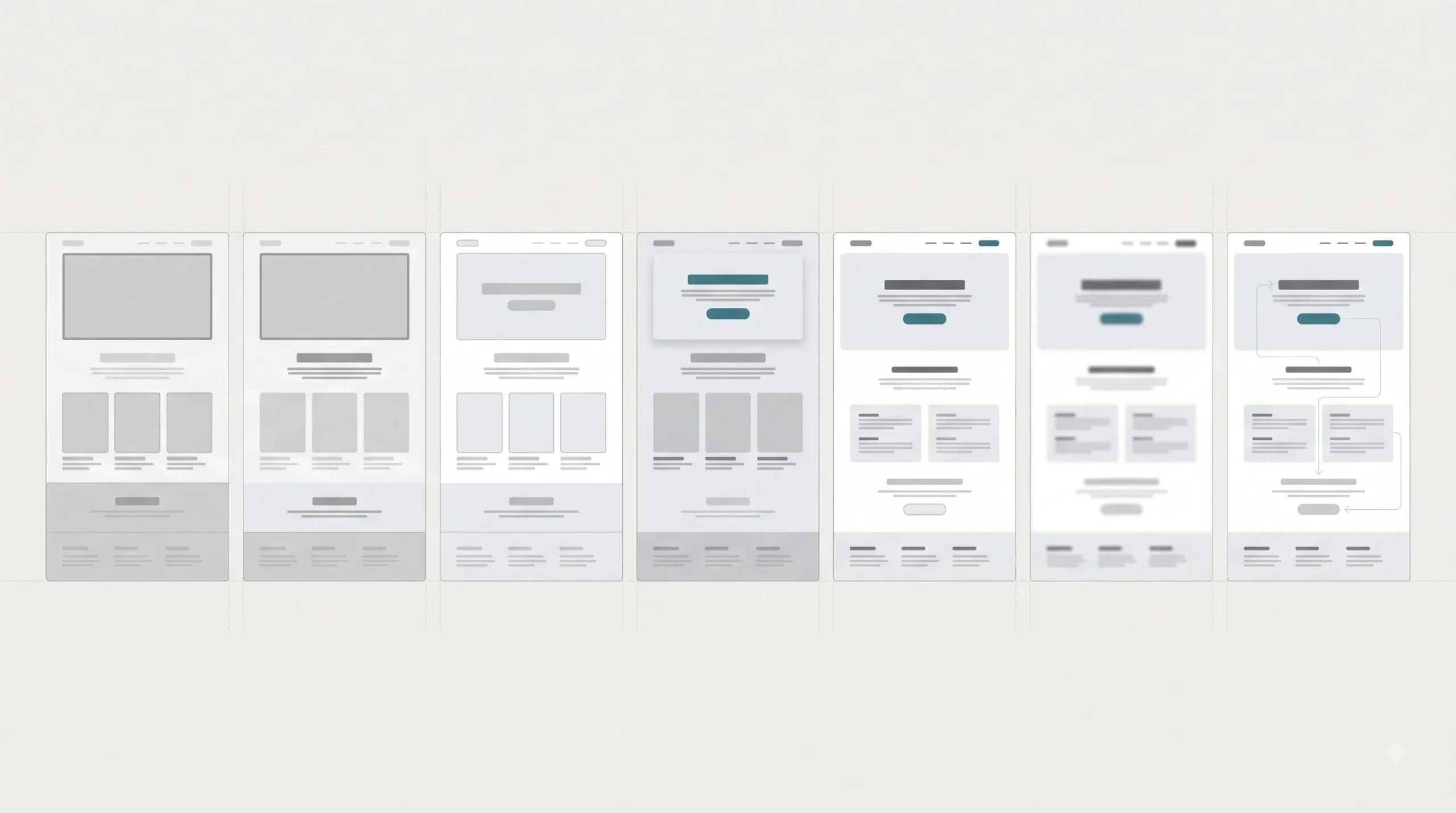
This is roughly how it actually gets done, not as abstract advice but as an actual sequence of steps.
- Decide the single most important element before opening any design tool. Not two things, not three. One. What’s the one thing this design absolutely needs someone to see or do? Everything else gets built around that answer.
- Rank everything else by priority. A simple numbered list works fine here. What’s second most important, third, and so on. This ranking becomes the blueprint for size, contrast, and placement decisions later.
- Sketch or wireframe in grayscale first. This one gets skipped constantly and it’s a mistake. Removing color forces size, spacing, and placement to do all the work of establishing hierarchy. If a grayscale wireframe already makes it obvious what matters most, hierarchy is solid before color even enters the picture. If it’s confusing in grayscale, color won’t fix it, it’ll just hide the problem temporarily.
- Apply size and contrast to the top-priority element first. Not last, first. Get the most important thing looking right before touching anything else.
- Layer in whitespace and grouping. Give the top element room to breathe, and group related secondary elements together using proximity.
- Run a squint test or a 5-second test. Literally squint at the design, or show it to someone for five seconds and ask what they remember. Whatever they mention first is what’s actually winning the hierarchy battle, whether or not that matches the intended plan.
- Refine based on where the eye actually goes versus where it’s supposed to go. These two things don’t always match on the first attempt, and that gap is exactly what needs fixing before calling it done.
✅ Quick Test: Blur the design, or just squint at it hard. If the most important part still stands out clearly, the hierarchy is working.
Common Visual Hierarchy Mistakes (and How to Fix Them)
Too many focal points. When everything is bold, big, or bright at once, nothing actually stands out, because standing out only means something in contrast to stuff that isn’t. This usually happens when multiple stakeholders each want “their” element to be the important one. The fix is picking one clear winner and being disciplined about it, even if it means a few people don’t get their way.
Ignoring whitespace to fit more in. Already covered above, but worth repeating because it’s genuinely one of the most common issues, especially in fast-turnaround marketing creative. Cramming five offers into one banner rarely converts better than one clear offer with room to breathe. The instinct to show “more value” often backfires into showing no value clearly at all.
Inconsistent type scale. Headings and subheadings that don’t follow a predictable size ratio across a page, or worse, across an entire site, make everything feel randomly assembled instead of intentional. The fix is picking a type scale early and sticking to it everywhere.
Low contrast between text and background. This is both a hierarchy failure and an accessibility failure at the same time, which makes it worth fixing twice as urgently. Light gray text on a white background might look “clean” in a mockup, but a real person squinting at their phone in daylight often can’t read it at all.
Decorative elements outranking functional ones. A logo bigger than the CTA button. An illustration more prominent than the actual price. This happens when brand pride overrides user need, and it’s an easy trap to fall into without realizing it, because the designer or business owner is naturally drawn to the branding elements they’re proudest of.
Hierarchy that works on desktop but collapses on mobile. A layout carefully balanced at 1440px wide can turn into a stacked mess at 375px wide if hierarchy wasn’t tested at both sizes. What was clearly secondary on desktop might end up sitting above the primary CTA once everything stacks vertically on a phone. Always check both.
Tools to Design and Test Visual Hierarchy
Figma handles full UI and web design work well, especially with its grid and component systems, and it’s become close to the standard tool for anyone working at an intermediate or advanced level. Canva Pro is a solid entry point for quick marketing and social graphics, particularly with its templates, though it’s more limited for full website or app-level hierarchy work. Adobe XD sits in a similar space to Figma, useful for prototyping and testing how hierarchy actually feels when a design is interactive rather than static.
On the testing side, there are contrast checker tools that verify whether text-to-background contrast meets accessibility standards, which doubles as a hierarchy check since low contrast is both an accessibility issue and a hierarchy failure at once. Heatmap and eye-tracking style tools exist too, used to see where attention actually lands on a real page rather than where it was intended to land, though these tend to require real traffic or user testing setups to be useful. Simple 5-second testing tools, where a design is shown briefly and testers report what they remember, are a low-effort way to catch hierarchy problems early, before a design goes anywhere near production.
| Tool | Best For | Skill Level |
|---|---|---|
| Figma | Full UI and web design with grids and components | Intermediate to Advanced |
| Canva Pro | Quick social and marketing graphics using templates | Beginner |
| Adobe XD | Prototyping and testing interactive hierarchy | Intermediate |
| Contrast checkers | Verifying color contrast meets accessibility standards | Beginner |
Visual Hierarchy and Accessibility
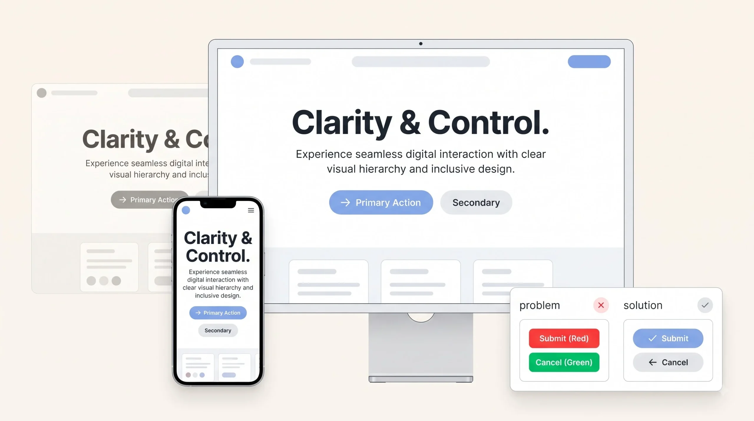
Contrast ratios matter more than most people realize until it’s pointed out directly. Text needs enough contrast against its background to be legible for people with low vision, and this isn’t a “nice to have,” it’s a baseline requirement that a lot of designs quietly fail without anyone noticing during the design phase, because it looks fine on a calibrated monitor in a dim studio and completely different on a phone screen in bright sunlight.
Font size minimums matter too. Body text set too small might look sleek on a mockup, but it becomes genuinely unreadable for a meaningful chunk of real users, especially anyone over a certain age or anyone with any visual impairment at all.
Here’s a mistake worth calling out directly: hierarchy that relies only on color to signal importance. Something like “the red items are the important ones” completely fails for colorblind users, who might not perceive that red as different from the surrounding elements at all. Good hierarchy always layers multiple signals together, size and position along with color, never color alone.
The honest framing here is that accessible hierarchy isn’t a separate checklist bolted onto “real” design work. It’s just better hierarchy, full stop. Clear contrast, readable sizing, and multiple layered signals help everyone, not just users with specific accessibility needs. Treating it as an afterthought usually means the base hierarchy wasn’t that strong to begin with.
How to Audit Your Own Design’s Visual Hierarchy
A quick self-check, useful before calling any design finished:
- Can the single most important element be identified in under three seconds, without being told what to look for?
- Does the eye actually follow the intended path, or does it wander somewhere else first?
- Is there at least one clear area of visual rest, some genuine whitespace, or does the whole thing feel packed edge to edge?
- Does it still make sense in grayscale, with color removed entirely?
- Does it still hold up at mobile width, or does it fall apart once things stack vertically?
If the answer to any of these is a shaky “sort of,” that’s usually the spot that needs another pass before it ships.
Conclusion
Visual hierarchy isn’t a style choice, and it isn’t about making things pretty. It’s a decision-making discipline, one where every size, color, and spacing choice either points a viewer toward what matters or gets in the way of it. Go back to those two shoe websites from the start of this. One had a designer who made a hundred small decisions about what deserved attention and what didn’t. The other had someone who let every element fight for the same spotlight and hoped it would work out. It rarely does.
Get the basics right, one clear focal point, honest contrast, room to breathe, and a lot of design problems that seem complicated on the surface start solving themselves. It’s not about talent or expensive tools. It’s about being willing to make a choice about what matters most, and then actually letting the design reflect that choice instead of trying to please everything at once.
Frequently Asked Questions
What is visual hierarchy in simple words?
It’s the order in which someone notices things on a page or design, controlled on purpose using size, color, spacing, and placement. Instead of everything asking for attention equally, one thing leads, the rest support it.
Why is visual hierarchy important in design?
Because it directly affects whether someone finds what they need, trusts what they’re looking at, and takes the action a business actually wants, like clicking a CTA or reading past the headline. Without it, people either bounce or guess, and guessing usually goes the wrong way.
What are the main principles of visual hierarchy?
Size, color and contrast, typography, whitespace, alignment, proximity, depth, and texture. Each one works a bit differently, but they all serve the same goal, guiding the eye toward what matters most first.
What’s the difference between visual hierarchy and layout?
Layout is where things sit on a page, basically the floor plan. Visual hierarchy is about the order of importance, which is what tells the eye where to go first within that layout. A page can be neatly laid out and still have zero hierarchy if nothing stands out from anything else.
Is visual hierarchy only about design, or does it affect SEO too?
Mainly, it’s a design and UX concept, but it does indirectly connect to SEO. Clear hierarchy usually keeps people on a page longer because they can actually find what they came for, and that engagement tends to support on-page signals. It’s a side effect, not a direct ranking factor.
What’s the fastest way to check if a design has good hierarchy?
Squint at it, or blur it slightly. If the most important element is still obvious even when details are hard to see, hierarchy is working. Grayscale is another quick check, if nothing stands out once color is removed, size and spacing probably aren’t doing enough work.
What is the F-pattern and when does it apply?
It’s a scanning pattern that shows up mostly on text-heavy pages, like blog posts or search results. The eye moves across the top, then a shorter pass a bit lower, then trails down the left edge. It looks roughly like the letter F, which is where the name comes from.
How is the Z-pattern different from the F-pattern?
The Z-pattern applies to pages with less text and more visual weight, like landing pages or ad creatives. The eye moves top-left to top-right, then diagonally down to bottom-left, ending at bottom-right. F-pattern suits reading-heavy content, Z-pattern suits scanning-heavy, visual content.
Does visual hierarchy matter for social media posts, or just websites?
It matters even more on social media, honestly. The scan window on a fast scroll is closer to half a second, so a post has less time to communicate what matters than a website does. A graphic with too many competing elements, like a sale post loaded with badges, discounts, and urgency text all at once, tends to get scrolled past before any of it registers.
Can good typography alone fix weak visual hierarchy?
No, typography is one tool, not the whole system. A page can have a perfectly set type scale and still fail at hierarchy if whitespace is missing, alignment is inconsistent, or too many elements are competing at the same visual weight. Typography helps, but it works alongside the other principles, not instead of them.
Does visual hierarchy affect accessibility?
Yes, directly. Low contrast between text and background is both a hierarchy failure and an accessibility failure at the same time. Hierarchy that relies only on color to show importance also fails colorblind users. Building hierarchy with multiple layered signals, size and position along with color, tends to work better for everyone, not just users with specific accessibility needs.
What tools are good for beginners to practice visual hierarchy?
Canva Pro is an easy starting point for quick social and marketing graphics, especially with templates already following decent hierarchy structure. Figma is the next step up for anyone working on full website or app layouts, since it handles grids and components well. Contrast checker tools are also useful early on, since they catch accessibility and hierarchy issues at the same time.