

Somewhere around your third year in marketing, you hit a wall. You ask a developer to “just move the button up a bit” and they come back with a question about z-index and flex containers, and you nod like you understood any of it. That moment is when most marketers realize they’ve been avoiding a question they should have answered years ago: what is HTML and CSS, actually, and why does everyone act like it’s this impenetrable wall of code?
Here’s the thing nobody tells you when you start in marketing. You don’t need to become a developer. Nobody is asking you to build a checkout flow or debug a JavaScript error at 11pm. But if you write content, run SEO, manage landing pages, send emails, or touch a CMS in any way, you are already working with HTML and CSS whether you know it or not. Every blog post you publish gets wrapped in HTML tags. Every landing page test you run lives or dies on how the CSS renders on mobile. Every email campaign that looks broken in Outlook is an HTML problem, not a “tech issue” someone else has to solve.
This guide exists because “what is HTML and CSS” gets answered badly almost everywhere online. Either it’s written for people who already want to become developers, buried in terminology and syntax rules nobody explains, or it’s dumbed down so much it doesn’t actually help you do your job better. Neither of those is useful if you’re a content marketer trying to understand why your headings aren’t ranking, or a PPC manager trying to figure out why your landing page loads slow, or a WordPress user who wants to stop being scared of the “Custom CSS” box in the theme customizer.
What You Will Learn in This Guide
- What HTML actually is, in plain language, with a real analogy that sticks
- What CSS does and why websites needed it in the first place
- The real difference between HTML and CSS, side by side
- Why this knowledge directly improves your SEO, your landing pages, your email campaigns, and your WordPress site
- The HTML tags you’ll actually run into as a marketer, explained one by one
- Basic CSS syntax, properties, and the three ways CSS gets applied to a page
- How HTML and CSS affect Google rankings and Core Web Vitals
- Accessibility basics that also happen to help your SEO
- Common mistakes beginners make, and how to avoid them
- A learning roadmap if you want to go deeper after this
This guide is for SEO professionals who keep hearing “semantic HTML” and nodding without knowing what it means. It’s for content writers who paste text into a CMS and watch the formatting break. It’s for PPC marketers building landing pages who need to talk to designers without sounding lost. It’s for business owners running their own WordPress site who are tired of paying a freelancer $50 to change one line of text. And it’s for anyone in digital marketing who wants to stop treating “the tech side” like a foreign country.
What Is HTML?
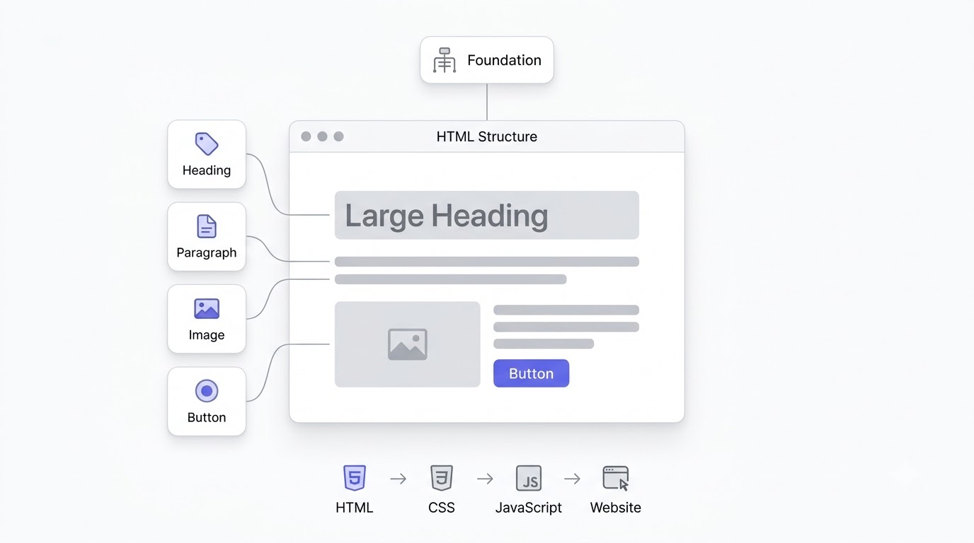
HTML is the code that gives a webpage its structure and meaning. It’s the layer that tells a browser “this is a heading,” “this is a paragraph,” “this is an image,” and “this is a button someone can click.” Every single webpage you’ve ever visited, from a five-page brochure site to a full-blown e-commerce store, has HTML sitting underneath it. Nothing loads without it.HTML Definition in Plain English
HTML stands for HyperText Markup Language. Break that phrase apart and it actually makes sense. “HyperText” means text that links to other text, which is basically what the web is: pages connected to other pages through links. “Markup Language” means it’s a system for labeling, or “marking up,” pieces of content so a computer knows what each piece is supposed to be.
HTML exists because a browser can’t guess what your content means on its own. If you just dump raw text into a browser with no markup, it shows up as one long unformatted block, no headings, no paragraphs, no styling, nothing. HTML is the labeling system that turns plain text into something with actual structure: this word is a heading, this block is a paragraph, this word links somewhere else. Without that labeling, the web wouldn’t function the way it does.
Think of HTML as the skeleton of every webpage that has ever existed. A skeleton doesn’t look pretty on its own, and nobody’s impressed by a bare skeleton. But nothing else works without it. Muscles, skin, everything else attaches to that frame. HTML plays the exact same role for a website. It holds everything else, including your CSS styling and your JavaScript interactivity, in place.
How HTML Works
When you type a URL and hit enter, your browser sends a request to a server somewhere, and that server sends back an HTML file. The browser reads that file line by line, from top to bottom, and starts building what’s called the DOM, short for Document Object Model. Think of the DOM as the browser’s internal map of your page, built directly from the HTML tags it just read.
Once the browser has that map, it renders it visually. Headings show up bigger than paragraphs by default, links show up underlined and blue unless styled otherwise, and lists show up with bullet points. This is HTML doing its baseline job with zero CSS involved. It’s ugly by modern standards, but it’s functional, readable, and technically a complete webpage.
This matters more than it sounds like it should, especially for SEO. Google’s crawler reads your HTML the same way a browser does, top to bottom, tag by tag. It doesn’t “see” your page the way a human does at first glance. It reads structure. That’s exactly why your heading tags, your alt text, and your semantic markup carry actual ranking weight. Google is quite literally parsing your HTML to figure out what your page is about.
A Real-Life Analogy
Picture building a house. Before any paint goes on the walls, before the furniture shows up, before anyone picks curtains, you need a frame. Walls go up where walls go up. Doorways get cut where doorways get cut. Windows go in specific spots, and none of that changes later without real construction work. That frame is HTML.
The living room is a div, a general-purpose container. The front door is a link, an <a> tag, because it’s how you get from one space to another. The big sign out front with the house number is your <h1>, the main heading announcing what this page is. Windows are like images: they let content in and let people see what’s inside, roughly what an <img> tag does for visual content on a page.
Nobody moves into a house that’s just a frame, and nobody wants a website that’s just unstyled HTML either. But you also can’t hang drywall on air. The frame has to exist first, has to be structurally sound, before anything else gets added on top of it. That’s the relationship between HTML and everything that comes after it, including CSS.
Example of Basic HTML
Here’s what plain HTML looks like in its simplest form:
<!DOCTYPE html>
<html>
  <head>
    <title>My First Page</title>
  </head>
  <body>
    <h1>Welcome to My Website</h1>
    <p>This is a paragraph of text on my page.</p>
    <a href="https://example.com">Click here to learn more</a>
  </body>
</html>
Walk through it line by line. <!DOCTYPE html> tells the browser “this is a modern HTML5 document,” so it renders correctly instead of guessing at an outdated format. <html> wraps the entire page, everything else lives inside it. <head> holds information about the page that isn’t visible content itself, like the page title and metadata. <title> sets what shows up in the browser tab, and it’s also what often shows as the clickable headline in Google search results.
<body> is where the visible content actually starts. Everything a visitor sees on the page goes inside those body tags. <h1> is your main heading, the biggest, most important title on the page, and there should only be one per page. <p> wraps a paragraph of regular text. <a href="..."> creates a clickable link, and the href attribute is where that link points to. Six lines of visible content, and already you can see how every piece has a job.
What Is CSS?
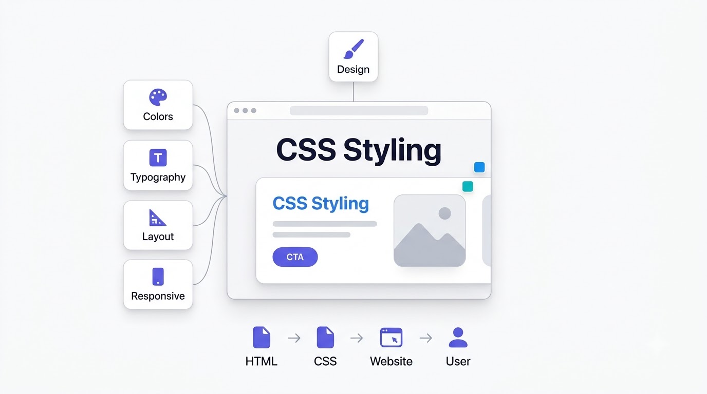
If HTML is the frame of the house, CSS is everything that makes it a place you’d actually want to live in. Colors, fonts, spacing, layout, how it looks on your phone versus your laptop, all of that is CSS’s job. Without it, every website on the internet would look like a plain Word document from 1998.
CSS stands for Cascading Style Sheets. “Cascading” refers to how style rules flow down and combine, where more specific rules can override more general ones, and rules from different sources stack on top of each other in a predictable order. “Style Sheets” are the actual files, or blocks of code, that hold all your styling instructions.
The purpose of CSS is simple to state even if the execution gets complex: it separates what a page says from how that page looks. HTML says “this is a heading.” CSS says “and that heading should be blue, bold, and 40 pixels tall.” That separation is one of the most useful ideas in web development, because it means you can completely redesign a site’s look without touching a single word of the actual content.
Why CSS Exists
Before CSS existed, in the earliest days of the web, styling had to be baked directly into HTML tags themselves. Want a red heading? You wrapped it in a <font color="red"> tag. Want a table for layout, because that’s genuinely how people used to build page layouts? You nested table inside table inside table, which was a nightmare to maintain and even worse to update.
Here’s the real problem that caused. If a site had a hundred pages and you wanted to change the brand color from blue to green, you had to manually edit that color on every single page, in every single spot it appeared. One redesign could take weeks of tedious, repetitive editing, and it was incredibly easy to miss a spot and end up with an inconsistent site.
CSS fixed that by centralizing style rules into one place. Change a color once in your stylesheet, and it updates everywhere that rule applies, across the entire site, instantly. That’s not a minor convenience. That single idea is why modern websites can be redesigned in days instead of months, and it’s why a WordPress theme update doesn’t require rewriting your content.
CSS Makes Websites Beautiful
This is the part of CSS most people actually notice, even if they’ve never thought about the word “CSS” itself. Colors come from CSS: your brand’s specific shade of blue on every button, every link, every accent. Fonts come from CSS too, the difference between a site that looks professional with clean typography and one that defaults to whatever the browser feels like showing.
Layout is CSS’s job as well, controlling where things sit on the page, how much space surrounds them, and how columns and sections align. Animations, the smooth hover effect on a button or the fade-in when a section scrolls into view, are CSS. Spacing, the breathing room between a heading and the paragraph below it, is CSS. And responsive design, the entire reason your site doesn’t look broken on a phone, is CSS doing the heavy lifting through something called media queries, which we’ll get into later in this guide.
House Analogy
Back to the house. HTML built the frame: walls, doors, windows, all structurally sound but bare. CSS is everything that comes after that frame goes up. It’s the paint color on the walls, the furniture arrangement in the living room, the curtains on the windows, the lighting fixtures that set the mood.
Two houses can share the exact same frame, same rooms, same layout, and look completely different once decorated differently. That’s precisely what happens with website templates. A WordPress theme can power thousands of different-looking sites because the HTML structure stays largely the same while the CSS, the “decoration,” changes completely from site to site.
HTML vs CSS: What’s the Difference?
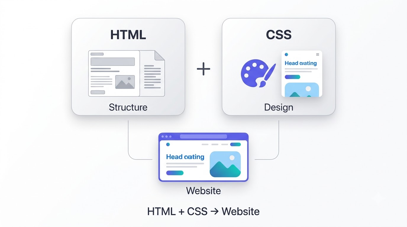
This is where a lot of the confusion actually clears up, because side by side, the differences are pretty stark. Here’s a direct comparison:
| Factor | HTML | CSS |
|---|---|---|
| Purpose | Structures and labels content | Styles and visually presents content |
| Syntax | Tags like <p>, <h1>, <div> |
Selectors and properties like h1 { color: blue; } |
| File extension | .html |
.css |
| Function | Defines what content is | Defines how content looks |
| Used for | Headings, paragraphs, links, images, forms | Colors, fonts, layout, spacing, animations |
| Example | <h1>Sale Ends Friday</h1> |
h1 { color: red; font-size: 32px; } |
| SEO impact | Direct, through headings, alt text, structure | Indirect, through page speed and mobile usability |
| Speed | Loads first, minimal impact on speed by itself | Can slow page load if bloated or render-blocking |
| Learning curve | Easier to start, tags are intuitive | Steeper once you get into layout systems like flexbox |
| Browser role | Browser parses it to build the DOM | Browser applies it to style the DOM |
| Can work alone? | Yes, but looks completely unstyled | No, CSS needs HTML elements to style |
| Relationship | Provides the content CSS styles | Depends entirely on HTML’s structure |
Notice the “can work alone” row, because that’s the part people get wrong most often. HTML can technically exist without any CSS at all and still function as a webpage, just an ugly one. CSS cannot exist without HTML. There’s nothing for it to style. A CSS file sitting by itself does absolutely nothing until it’s connected to HTML elements it can target.
That’s why you’ll never really find one without the other on a real website. They’re not two competing technologies you choose between, the way you might pick React over Vue. They’re two different jobs, structure and style, that always work as a pair. Every functioning website on the internet has both, whether or not the person who built it thought about it in those terms.
Why Marketers Should Learn HTML and CSS
Nobody’s asking you to build an app. But here’s what actually changes once you understand this stuff even at a basic level: you stop waiting on developers for things you could fix yourself in thirty seconds, and you start noticing problems on your own pages before Google or your users notice them for you.
Better SEO Optimization
SEO and HTML are basically inseparable, and this is the biggest reason “what is HTML and CSS” matters to anyone doing search work. Heading tags, <h1> through <h6>, tell Google your content’s hierarchy, what’s the main topic and what’s a supporting subtopic underneath it. Get that structure wrong, skip your H1 or stack three H1s on one page, and you’re actively making it harder for Google to understand your content.
Meta tags live in the HTML <head> and control things like your page title and meta description, the exact text that shows up in search results. Canonical tags, also HTML, tell Google which version of a page is the “real” one when duplicate or similar content exists. Schema markup, a specific type of structured HTML, is how you get those rich results in search, star ratings, FAQ dropdowns, recipe cards. And image optimization, proper alt text and compressed file sizes, is HTML plus a little technical know-how that directly affects both accessibility and image search rankings.
Landing Page Optimization
Every CTA button on your landing page is HTML and CSS working together, the <button> or <a> tag providing the structure and click functionality, CSS providing the color, size, and hover effect that makes someone actually want to click it. Layout improvements, moving your form above the fold or restructuring a hero section, are CSS changes at their core.
Hero sections, that big attention-grabbing block at the top of a landing page, live entirely in HTML and CSS. And form optimization, reducing friction by changing input field sizes, spacing, or button placement, is something you can often adjust yourself once you understand basic CSS, instead of filing a ticket and waiting three days for a developer to get to it.
Email Marketing
HTML email is its own strange beast, and understanding it will save you real headaches. Email clients like Outlook and Gmail render HTML wildly inconsistently, which is why email developers often have to use table-based layouts, a technique the rest of the web abandoned two decades ago, just to get consistent rendering across clients.
Inline CSS is the norm in email specifically because many email clients strip out external stylesheets entirely, so styles have to be written directly onto each HTML tag using the style attribute. Responsive newsletters, ones that look right on both desktop and mobile inboxes, rely on media queries that behave differently in email than they do on a normal website. If you’ve ever wondered why your email platform’s drag-and-drop builder produces such messy-looking code, this is why: it’s compensating for a rendering environment that’s stuck years behind the rest of the web.
WordPress Customization
WordPress runs a huge share of the web, and nearly every task inside it eventually touches HTML or CSS. Editing blocks in the Gutenberg editor is you working with HTML whether the interface shows you the code or not. The “Additional CSS” box under Appearance > Customize is a direct line to overriding your theme’s styling without touching a single theme file.
Theme adjustments, changing a button color, fixing spacing that looks off on mobile, adjusting a font size that’s too small to read, are almost always small CSS tweaks. Once you can read and write basic CSS, that “Additional CSS” box stops being intimidating and starts being one of the fastest tools in your entire marketing stack, because you can fix small visual issues in under a minute instead of opening a support ticket.
Better Communication With Developers
This is the underrated benefit nobody talks about enough. When you ask a developer to “make the button pop more,” that’s not a request they can act on precisely. When you ask them to “increase the button’s padding and add a box-shadow on hover,” that’s a request they can execute immediately, with zero back-and-forth.
Common marketing requests get resolved faster once you speak even a little of the language. “Can we make the headline bigger on mobile” becomes a media query conversation. “The form fields look cramped” becomes a padding and margin conversation. You don’t need to write the code yourself in most cases. You need to describe the problem using terms that map directly to what a developer can actually change.
Faster Troubleshooting
A broken link is usually an href pointing to the wrong URL, something you can check yourself in about ten seconds using your browser’s inspect tool. A missing image is usually a broken src path or a file that got deleted from the media library, not some mysterious server issue. Font issues are almost always a CSS font-family problem, either the wrong font is loading or it’s not loading at all.
Button alignment problems are CSS spacing or positioning issues nine times out of ten, not some deep structural bug. Once you understand this, you stop escalating every minor visual glitch to your dev team, and you start fixing half of them yourself before your first coffee is even finished.
How HTML and CSS Work Together
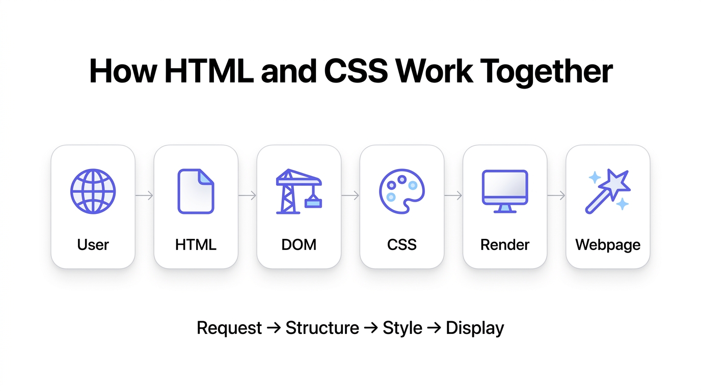
Here’s the actual sequence of events that happens every single time someone loads a webpage, and it’s worth understanding because it explains a lot about page speed and rendering behavior.
A user visits a webpage. Their browser sends a request and gets HTML back first. The browser starts reading that HTML top to bottom and builds the DOM, its internal structural map of the page. As it encounters CSS files, whether linked externally or embedded inline, it loads and applies those styles to the elements they target. Once both the structure and the styling are processed, the browser renders the final, fully styled webpage that the user actually sees.
User visits webpage → HTML loads → Browser builds the DOM → CSS loads → Browser styles the page → Final webpage appears
This sequence matters for a very practical reason: page speed. If your CSS file is huge, or if it’s render-blocking, meaning the browser has to fully download and process it before showing anything, your visitor stares at a blank white screen longer than they should. That’s a direct hit to your Core Web Vitals, and Core Web Vitals are a confirmed Google ranking factor. Every marketer running a site speed audit should understand this flow, because “our page is slow” almost always traces back to something happening, or blocking, at one of these exact steps.
Basic HTML Structure Explained
Every properly built HTML page shares the same skeleton. Once you recognize it, you’ll spot it in the source code of any website you visit, and you’ll immediately know something’s wrong if a piece is missing.
<!DOCTYPE html>
This line has to sit at the very top of every HTML file. It’s a declaration telling the browser “render this using modern HTML5 rules.” Skip it, and browsers can fall back into something called quirks mode, an older, inconsistent rendering behavior that can cause layout bugs that seem to make no sense until you realize the doctype was missing the whole time.
<html>
This tag wraps the entire document, everything else on the page lives inside it. It’s common, and genuinely helpful for SEO and accessibility, to add a lang attribute here, like <html lang="en">, which tells search engines and screen readers what language the page content is written in.
<head>
The head section holds information about the page that isn’t part of the visible content itself. This includes the page title, meta description, links to CSS files, and other metadata. Nothing inside the head shows up directly on the page the way body content does, but it has enormous influence over SEO and how the page functions.
<title>
This single tag controls two important things at once: the text shown in the browser tab, and, in most cases, the clickable blue headline that shows up in Google’s search results. It’s one of the highest-impact single tags on a page for SEO purposes, and it’s genuinely surprising how many sites either leave it blank or stuff it with keywords in a way that hurts more than it helps.
Meta Tags
Meta tags live inside the head and provide additional information about the page. The meta description is the most marketer-relevant one, it’s the summary text that often appears under your title in search results, and while it’s not a direct ranking factor, it heavily influences click-through rate, which absolutely does affect your traffic. Other meta tags handle things like character encoding and how the page displays on mobile devices through the viewport setting.
<body>
Everything visible on the page, every heading, paragraph, image, button, and form, lives inside the body tags. This is where the actual content marketers care about day to day gets written, and it’s the part of the HTML document that maps most directly to what a visitor sees on screen.
Closing Tags
Nearly every HTML tag needs a matching closing tag, written with a forward slash, like </p> closing a <p> tag. Forget a closing tag and you can break the layout of everything that follows it on the page, sometimes in ways that look completely unrelated to the actual mistake. This is one of the single most common beginner errors, and it’s exactly why website builders that hide the raw code exist in the first place.
Put it all together and a complete, properly structured page looks like this:
<!DOCTYPE html>
<html lang="en">
  <head>
    <meta charset="UTF-8">
    <title>Marketing Guide | Example Co</title>
    <meta name="description" content="A practical guide to HTML and CSS for marketers.">
  </head>
  <body>
    <h1>Welcome to Our Guide</h1>
    <p>This page explains HTML and CSS in plain English.</p>
  </body>
</html>
Most Important HTML Tags Every Marketer Should Know
You don’t need to memorize every HTML tag that exists. There are dozens, and most of them you’ll never touch. But there’s a core set that shows up constantly across CMS platforms, landing page builders, and email tools, and knowing them will make you dangerous in the best way.
Document Tags
<html> wraps the entire page. <head> holds non-visible metadata like the title and meta tags. <body> contains everything visible. These three form the outer shell of every single HTML document, and you’ll see them in the source code of literally every website you inspect.
Content Tags
<h1> through <h6> are your headings, with <h1> being the biggest and most important, typically used once per page, and <h6> being the smallest, rarely used. <p> wraps a paragraph of text. <span> is an inline container used to style or target a small piece of text without breaking the flow of a line. <div> is a block-level, general-purpose container, one of the most-used tags on the entire web because it’s flexible enough to hold almost anything.
Formatting Tags
<strong> makes text bold and semantically tells search engines and screen readers this text is important, which is a meaningful difference from just visually bolding text with CSS. <em> italicizes text and semantically signals emphasis. <br> inserts a line break within a block of text, useful for addresses or short lines that need to stack without starting a whole new paragraph.
Link Tags
<a> creates a hyperlink, and it’s arguably the single most important tag on the entire web, the “Hyper” in HyperText. The href attribute defines where it points, and attributes like target="_blank" control whether it opens in a new tab. Every internal link you build for SEO purposes and every CTA button that navigates somewhere runs through an <a> tag.
Image Tags
<img> embeds an image on the page. The src attribute points to the image file, and the alt attribute provides a text description, which matters for two big reasons: accessibility, since screen readers read that alt text aloud to visually impaired users, and SEO, since Google uses alt text to understand and rank images in image search.
Lists
<ul> creates an unordered, bulleted list. <ol> creates an ordered, numbered list. <li> defines each individual item inside either type of list. These show up constantly in blog content, and Google specifically likes well-structured lists because they’re prime candidates for featured snippets.
Table Tags
<table> creates a data table. <tr> defines a table row. <td> defines an individual cell of data within that row. Tables are the right tool for genuinely tabular data, like pricing comparisons or spec sheets, but they’re the wrong tool for page layout, a mistake that was common in the 1990s and early 2000s and caused massive headaches when CSS layout eventually replaced it.
Semantic Tags
<header>, <footer>, <article>, <section>, <nav>, <aside>, and <main> all describe the actual role a section of content plays on the page, rather than being a generic container like <div>. <nav> wraps navigation links. <article> wraps a self-contained piece of content like a blog post. <main> wraps the primary content of the page. These tags help both screen readers and search engines understand your page’s structure at a glance, which is a genuine SEO advantage over an entire page built from unlabeled <div> tags.
Multimedia
<video> embeds a video file directly, with built-in browser controls available. <audio> does the same for sound files. Both matter more than most marketers realize, especially as video content becomes a bigger part of on-page SEO strategy and page engagement metrics.
Form Tags
<form> wraps an entire form and defines where the submitted data goes. <input> creates a field, text box, checkbox, radio button, whatever type is specified in its type attribute. <textarea> creates a larger multi-line text box. <button> creates a clickable button. <select> creates a dropdown menu. Every lead gen form on every landing page you’ve ever built is some combination of these five tags.
Basic CSS Syntax Explained
CSS has a small, learnable grammar, and once it clicks, it clicks fast. There are really only a handful of concepts you need to hold in your head.
A selector targets the HTML element you want to style, like h1 or .button. A property is the specific style aspect you’re changing, like color or font-size. A value is what you’re setting that property to, like blue or 40px. A declaration is a property and value paired together with a colon and ending in a semicolon, like color: blue;. A ruleset is the full package: a selector followed by curly braces containing one or more declarations.
Comments in CSS are written as /* like this */ and are ignored by the browser, useful for leaving notes for yourself or a teammate. Whitespace, the spaces, tabs, and line breaks in your CSS file, doesn’t affect how the browser interprets the code at all, but it matters enormously for readability, especially when you or a developer come back to edit the file six months later.
Here’s a simple example broken all the way down:
h1 {
  color: blue;
  font-size: 40px;
}
h1 is the selector, it targets every <h1> element on the page. The curly braces { } contain the ruleset. color: blue; is a declaration setting the text color property to blue. font-size: 40px; is a second declaration, setting the size property to 40 pixels. Every <h1> tag anywhere on that page, unless overridden by a more specific rule somewhere else, will render blue and 40 pixels tall. That’s the entire mechanism. Everything more advanced in CSS is a variation and extension of exactly this pattern.
Types of CSS
CSS doesn’t just live in one place. It can be applied to a page three distinct ways, and knowing when to use which one matters more than it sounds like it should.
Inline CSS
Inline CSS is written directly on an individual HTML element using the style attribute, like <p style="color: red;">. The advantage is speed, it applies instantly to that one specific element with zero setup. The disadvantage is that it doesn’t scale at all, and it makes your HTML messy and hard to maintain if used broadly.
Inline CSS is most commonly used in HTML email, for the reasons already covered earlier, since many email clients strip out external and even internal stylesheets, leaving inline styles as the only reliable option. Outside of email, it’s generally considered a last resort, not a first choice.
Internal CSS
Internal CSS lives inside a <style> tag placed in the <head> of an HTML document, applying to that single page only. The advantage is that it’s more organized than inline CSS and keeps all your styles in one visible block. The disadvantage is that it still doesn’t share across multiple pages, so a five-page site using only internal CSS means five separate style blocks to maintain and keep consistent.
<head>
  <style>
    h1 {
      color: blue;
    }
  </style>
</head>
External CSS
External CSS lives in a completely separate .css file, linked into the HTML document using a <link> tag in the head. The advantage is enormous: one file can style an unlimited number of pages, and changing that one file updates every page linked to it, instantly. This is the standard, best-practice approach for essentially any real website beyond a single test page.
<head>
  <link rel="stylesheet" href="styles.css">
</head>| Type | Advantage | Disadvantage | Best Use Case |
|---|---|---|---|
| Inline CSS | Applies instantly, no setup | Doesn’t scale, clutters HTML | HTML email |
| Internal CSS | Organized in one place | Doesn’t share across pages | Single-page tests, prototypes |
| External CSS | Scales across an entire site | Requires an extra file request | Nearly all production websites |
Most Useful CSS Properties Beginners Should Learn
You don’t need to know all several hundred CSS properties that exist. A small, focused set covers the vast majority of what you’ll ever actually need to touch or discuss.
Typography
font-size controls how big text renders. font-family sets which typeface is used, and it’s worth knowing that if a specified font fails to load, the browser falls back to whatever comes next in that property’s list. font-weight controls boldness, from thin to extra bold. line-height controls the vertical space between lines of text, and it has a bigger impact on readability than most people give it credit for.
Colors
color sets the color of text itself. background-color sets the color behind an element. Both are usually written as hex codes, like #3366FF, or as RGB values, and both are typically defined by your brand guidelines rather than picked freely on a page-by-page basis.
Layout
width and height set an element’s dimensions. display controls how an element behaves in the overall layout, values like block, inline, or flex change its fundamental behavior. position controls how an element is positioned relative to the rest of the page or to a specific parent element, with values like static, relative, absolute, and fixed each behaving quite differently from one another.
Spacing
margin controls space outside an element’s border, pushing other elements away from it. padding controls space inside an element’s border, between the border and the actual content. Mixing these two up is one of the most common beginner mistakes in CSS, and it’s the source of a huge share of “why is this spaced weird” bugs on real websites.
Borders
border adds a visible line around an element, and you can control its width, style, and color. border-radius rounds the corners of that border, which is exactly how you get those soft, rounded buttons and image corners that dominate modern web design.
Effects
box-shadow adds a shadow behind an element, giving it a sense of depth or lift off the page. opacity controls transparency, from fully invisible at 0 to fully solid at 1. Both are subtle tools, but they do a lot of the visual heavy lifting in modern, polished web design.
Flexbox
Flexbox is a layout system built for arranging items in a single row or column, and it handles alignment, spacing, and sizing far more predictably than older layout methods ever did. Set display: flex; on a container, and its children automatically line up in a row by default, ready for further alignment and spacing control.
Grid
CSS Grid is a layout system built for two-dimensional layouts, rows and columns at the same time, which makes it ideal for anything resembling a magazine layout, a product grid, or a dashboard. Set display: grid; on a container and define columns and rows, and you get precise control over exactly where each item sits.
HTML and CSS Example: Building a Simple Webpage
Reading about tags in isolation only gets you so far. Seeing them work together on a real, if simple, page makes the whole thing click. Here’s a mini project with a heading, paragraph, image, button, navigation, and footer.
HTML:
<!DOCTYPE html>
<html lang="en">
<head>
<title>Simple Page Example</title>
<link rel="stylesheet" href="styles.css">
</head>
<body>
<nav>
<a href="#home">Home</a>
<a href="#about">About</a>
</nav>
<h1>Welcome to Our Store</h1>
<p>We sell hand-roasted coffee beans, shipped fresh weekly.</p>
<img src="coffee.jpg" alt="Bag of hand-roasted coffee beans">
<button>Shop Now</button>
<footer>
<p>© 2026 Example Coffee Co.</p>
</footer>
</body>
</html>CSS:
body {
  font-family: Arial, sans-serif;
  margin: 0;
  padding: 20px;
}

h1 {
  color: #3b2a1a;
  font-size: 36px;
}

button {
  background-color: #6f4e37;
  color: white;
  padding: 12px 24px;
  border: none;
  border-radius: 6px;
}

footer {
  margin-top: 40px;
  font-size: 12px;
  color: #888;
}
Without the CSS, this page shows default black text on a white background, an unstyled default button, and cramped spacing. With the CSS applied, you get a warm brown heading, a properly padded and rounded coffee-colored button, and a quiet, small-print footer that doesn’t compete for attention. Same HTML, same content, completely different presentation, purely from the CSS layer on top of it. That’s the entire relationship in one small, concrete example.
Responsive Design Explained
What is Responsive Design?
Responsive design means a website automatically adjusts its layout based on the size of the screen it’s being viewed on. A three-column layout on a desktop monitor might collapse into a single stacked column on a phone, and the navigation menu might turn into a hamburger icon instead of a full horizontal bar. It’s called “responsive” because the layout literally responds to the available space.
Why Google Prefers Responsive Websites
Google has used mobile-first indexing for years now, meaning it primarily crawls and ranks the mobile version of your site, not the desktop version. A site that isn’t responsive, that renders broken or unusable on a phone, gets penalized in rankings for exactly that reason. This isn’t a minor technical detail buried in an algorithm update. It’s a foundational part of how modern SEO actually works.
Mobile-first Design
Mobile-first design means building the mobile layout first, as the baseline, and then adding complexity and additional columns as screen size increases, rather than the reverse. This approach tends to produce cleaner, faster-loading sites, because you’re forced to prioritize what actually matters on a small screen instead of cramming a desktop layout down and hoping it still works.
CSS Media Queries
Media queries are the specific CSS mechanism that makes responsive design possible. They let you write conditional style rules that only apply within a certain screen width range.
@media (max-width: 768px) {
  h1 {
    font-size: 24px;
  }
}
This rule says: if the screen is 768 pixels wide or narrower, roughly tablet size and smaller, shrink the <h1> font size down to 24 pixels. Common breakpoints marketers will see referenced constantly are around 480px for phones, 768px for tablets, and 1024px for smaller laptops, though these vary somewhat depending on the specific design system a site is built on.
Responsive images resize automatically to fit their container instead of overflowing it, typically handled with a simple CSS rule like max-width: 100%;. Flexible layouts, usually built with flexbox or grid, reflow their content automatically as screen size changes, rather than relying on fixed pixel widths that break the moment the screen gets too narrow to fit them.
HTML, CSS, and SEO
Heading hierarchy matters because Google uses your H1 through H6 structure to understand your content’s organization, main topic first, supporting subtopics underneath. A page with a messy heading structure, or no headings at all, is genuinely harder for Google to interpret and rank correctly, even if the actual written content is strong.
Semantic HTML, using tags like <article>, <nav>, and <main> instead of generic <div> tags everywhere, gives search engines clearer signals about what each section of your page actually is. Image ALT tags describe images in text form, which helps both accessibility and image search rankings, and it’s one of the easiest, highest-leverage SEO fixes most sites still neglect.
Internal links, built with the <a> tag, help Google discover and understand the relationship between pages on your site, and they distribute ranking authority across your content in a way that directly affects overall site performance. Schema compatibility refers to how cleanly your HTML supports structured data markup, which enables rich results in search, star ratings, FAQ dropdowns, and more.
Core Web Vitals, Google’s specific page experience metrics, are directly affected by how efficiently your HTML and CSS load and render. A bloated CSS file that blocks rendering will tank your Largest Contentful Paint score. Responsive design, as covered above, is essential given mobile-first indexing. Accessibility overlaps heavily with SEO best practices, since both reward clear, well-labeled, logically structured content.
Page speed is influenced by how much CSS and HTML your browser has to download and process before it can show anything to a visitor. Clean code, meaning properly closed tags and organized, non-redundant CSS, tends to correlate with faster-loading, more crawlable, better-performing pages overall.
How Google reads HTML: its crawler parses your page’s HTML directly, essentially the same way a browser does, extracting text content, heading structure, links, and metadata to build an understanding of what the page is about and how it relates to other pages. What CSS affects indirectly: CSS itself isn’t read for keywords or content the way HTML is, but it heavily influences page speed, mobile usability, and Core Web Vitals, all of which are confirmed ranking factors in their own right.
Accessibility Best Practices
ARIA attributes, short for Accessible Rich Internet Applications, add extra context for assistive technology when standard HTML alone isn’t descriptive enough, particularly for custom interactive elements like dropdown menus or modal popups. Semantic HTML, again, plays a role here too, since screen readers rely heavily on tags like <nav>, <main>, and <button> to understand and correctly announce page structure to users.
Keyboard navigation matters because not every visitor uses a mouse, some navigate entirely by keyboard, tabbing through links, buttons, and form fields in sequence. A site built with proper HTML structure supports this naturally by default; a site built from generic, non-semantic <div> tags often breaks it entirely without extra, deliberate work.
Color contrast, a CSS concern, refers to how distinguishable your text color is against its background color, which matters enormously for users with visual impairments. Screen readers convert on-page text to speech, and they rely directly on your HTML structure and alt text to do that job accurately and usefully.
Focus states, controlled with CSS, visually indicate which element is currently selected when someone is tabbing through a page with a keyboard, and removing them entirely, a shockingly common design mistake, actively breaks accessibility for keyboard users. Accessible forms need properly associated <label> tags for every input field, so screen readers can announce exactly what each field is asking for. Image alt text, one final time because it genuinely matters this much, gives visually impaired users a text description of what an image shows.
Common HTML and CSS Mistakes Beginners Make
Missing closing tags are the classic beginner error, and they can break layout for everything that comes after the mistake on the page, in ways that look completely unrelated to the actual cause. Inline styling everywhere makes a site a nightmare to maintain and update consistently down the line, even though it feels fast and convenient in the moment.
Using too many divs, sometimes called “div soup” by developers, happens when someone reaches for a generic <div> for absolutely everything instead of using the correct semantic tag that already exists for that specific purpose. Skipping headings, or using them purely for visual size rather than actual content hierarchy, confuses both SEO and accessibility at the same time.
Poor CSS organization, with no consistent naming convention and duplicate, conflicting rules scattered everywhere, makes a stylesheet painful to maintain past a certain size. Overusing IDs for styling, when classes would work better and are reusable across multiple elements, creates specificity conflicts down the line that are genuinely frustrating to debug.
Ignoring responsive design is still shockingly common even now, and it directly and predictably hurts both user experience and SEO given mobile-first indexing. Broken image paths, usually from a src attribute pointing to the wrong file location, are one of the most frequent, easily fixable errors on real websites. Not validating code, meaning never checking your HTML against the W3C validator, lets small errors accumulate silently until they eventually cause a visible, hard-to-trace problem. Copy-pasting random snippets from forums or old Stack Overflow answers without understanding what they actually do is how a huge share of genuinely bizarre, hard-to-debug website bugs get introduced in the first place.
HTML and CSS Best Practices (2026)
Semantic HTML should be the default choice over generic divs wherever a more specific, meaningful tag already exists for the job. Clean indentation keeps code readable for both you and anyone else who has to open that file after you. Meaningful class names, like .hero-button instead of something vague like .btn2, make a stylesheet dramatically easier to maintain over time.
External stylesheets should be the standard approach for any real website, for every reason already covered earlier in this guide. Minification, compressing CSS and HTML files by stripping out unnecessary whitespace and comments before deployment, improves page load speed, especially at scale. Responsive-first approach means building for mobile constraints from the very start of a project, not bolting mobile support on as an afterthought once the desktop version is already finished.
Accessibility should be baked into a build from day one, since retrofitting it onto an already-finished site is consistently harder and more expensive than building it in from the start. Performance optimization, keeping file sizes lean and avoiding unnecessary render-blocking resources, directly affects both user experience and SEO. Reusable components, styled consistently through shared CSS classes, save enormous amounts of time on any site with more than a handful of pages.
Organized folder structure, keeping CSS, images, and scripts logically separated instead of dumped into one messy folder, makes a project genuinely easier to maintain as it grows. Comments where necessary help explain the “why” behind a tricky piece of code for whoever opens that file next, including a future version of yourself who’s forgotten the original reasoning. Version control basics, using a tool like Git even at a beginner level, let a team track every single change made to a site’s code over time, and reliably revert if something breaks.
Popular Tools for Writing HTML and CSS
Visual Studio Code is the most widely used code editor today, free, fast, and packed with extensions that make writing and previewing HTML and CSS considerably easier. Sublime Text is a lighter, faster alternative that some developers prefer specifically for its speed on very large files. Notepad++ is a simple, no-frills Windows-based text editor that’s still popular for quick edits that don’t need a full development environment set up.
Browser Developer Tools, built directly into Chrome, Firefox, and every other modern browser, let you inspect any live webpage’s HTML and CSS in real time, and even edit it temporarily to test changes before committing them permanently. This is genuinely the single most useful tool for a marketer to learn, because you can test a change instantly, on a live page, with zero risk, since nothing you do there is saved or affects the real site.
Live Server is a VS Code extension that auto-refreshes your browser every time you save a local file, useful for anyone actively building and testing pages. CodePen is a browser-based playground for quickly testing small snippets of HTML, CSS, and JavaScript without setting up any local files at all. JSFiddle serves a nearly identical purpose to CodePen and is popular for quickly sharing and troubleshooting small code examples with other people.
GitHub hosts code repositories and version history, and it’s become the standard place developers store and collaborate on website code together. Chrome DevTools specifically, since it’s the most widely used browser tool, deserves its own mention: it lets you right-click any element on any live page and select “Inspect” to instantly see the exact HTML and CSS behind it, which is quite possibly the fastest way to actually learn this material, by studying real, working sites you already visit daily.
How HTML and CSS Fit Into Modern Website Development
JavaScript adds interactivity and dynamic behavior on top of the structure HTML provides and the styling CSS provides, things like form validation, dropdown menus, and content that updates without a full page reload. WordPress, the CMS powering a huge share of the web, generates HTML behind the scenes from templates and plugins, while its theme system and Customizer both rely directly on CSS for visual styling.
React, a JavaScript library for building interactive interfaces, still ultimately outputs HTML to the browser, just generated dynamically through code rather than written by hand in static files. Bootstrap is a pre-built CSS framework offering ready-made components, buttons, grids, navigation bars, that speed up development considerably by handling a lot of common styling patterns out of the box. Tailwind CSS takes a different approach, offering small utility classes you combine directly in your HTML to build custom designs rapidly without writing much traditional custom CSS at all.
CMS platforms in general, not just WordPress, generate and manage HTML for you behind a visual interface, though the underlying HTML and CSS are still there doing the actual work regardless of how much the interface abstracts it away. Website builders like Wix or Squarespace hide the code almost entirely behind drag-and-drop tools, but understanding HTML and CSS still helps enormously when troubleshooting a rendering issue those tools can’t fix on their own. AI website generators, increasingly common now, still output actual HTML and CSS under the hood, meaning the fundamentals covered in this entire guide remain just as relevant even as the tools generating that code keep changing and getting more automated.
Even with every no-code tool available today, HTML and CSS remain essential because every single one of those tools ultimately has to produce standard HTML and CSS for a browser to render. Understanding the output, even a little, is what separates someone who can troubleshoot a broken page from someone who has to wait days for someone else to fix it.
Learning Roadmap for Beginners
If this guide sparked genuine curiosity to go further, here’s a realistic eight-week path.
Week 1: Learn HTML basics. Focus on tags, structure, and semantic elements. Daily goal: 30 minutes, building small static pages by hand.
Week 2: Learn CSS basics. Focus on selectors, the box model, and colors and typography. Daily goal: 30 minutes, restyling the pages you built in week one.
Week 3: Build simple pages. Combine HTML and CSS into small complete projects, a personal bio page, a simple product page. Milestone: one fully finished, styled page.
Week 4: Responsive design. Learn media queries and mobile-first principles. Milestone: make your week three project fully responsive across phone, tablet, and desktop.
Week 5: SEO-focused HTML. Practice writing proper heading hierarchy, meta tags, and alt text. Milestone: audit and fix the HTML structure on an existing page you have access to.
Week 6: Landing pages. Build a complete landing page with a hero section, a form, and a CTA button. Milestone: one finished, deployable landing page.
Week 7: Projects. Pick two to three larger, more ambitious pages to build from scratch, applying everything learned so far. Milestone: a small three-page mini site.
Week 8: Portfolio. Compile everything built so far into one place, whether a live site or a simple document, and write a short explanation of what each project demonstrates. Milestone: a shareable portfolio you can actually point people to.
Thirty minutes a day, consistently, for eight weeks gets a motivated marketer genuinely fluent in reading, understanding, and making small edits to HTML and CSS. That’s not the same as being job-ready as a front-end developer, and it doesn’t need to be. It’s more than enough to stop being intimidated by your own website’s code.
Conclusion
Here’s the actual takeaway from all of this: HTML builds structure, CSS builds style, and neither one does much of anything useful without the other sitting right beside it. That’s the whole concept underneath every single webpage you’ve ever visited, no matter how complicated it looks from the outside once a modern framework and a design system get layered on top.
For marketers specifically, this knowledge isn’t decoration, it’s leverage. It sharpens your SEO instincts because you understand exactly what Google is actually reading on your pages. It speeds up your landing page work because you can fix small issues yourself instead of waiting in a dev queue. It makes your email campaigns render correctly across a genuinely painful mix of inboxes. And it makes every conversation with your dev or design team faster, more precise, and a lot less frustrating for everyone involved.
Start small. Open your browser’s developer tools on your own site’s homepage today and just look around at what’s actually there. Try changing one CSS property temporarily and watch what happens in real time. From there, dig into semantic HTML for your next blog post, get genuinely comfortable with responsive design principles, and when you’re ready to go further, JavaScript basics and deeper technical SEO work are the natural next steps after everything covered here.
Frequently Asked Questions
What is HTML?
HTML, HyperText Markup Language, is the code that structures a webpage’s content, defining what each piece is: a heading, a paragraph, an image, a link. It’s the foundational layer every website is built on, and browsers read it to know what content to display and how it’s organized.
What is CSS?
CSS, Cascading Style Sheets, is the code that controls how a webpage’s HTML content looks visually: colors, fonts, spacing, and layout. It separates a page’s structure from its presentation, meaning you can completely change a site’s look without touching the underlying content or markup at all.
Can I learn HTML without CSS?
Yes, HTML functions on its own and produces a readable, if unstyled, webpage. But in practice almost nobody learns just one of the two, since real websites always combine them, and learning both together makes each one easier to understand in context.
Is CSS a programming language?
No, CSS is a style sheet language, not a programming language, because it lacks logic structures like loops and conditionals that true programming languages have. It’s sometimes debated online, but by the widely accepted technical definition, CSS is a declarative styling language rather than a general-purpose programming language.
How long does it take to learn HTML and CSS?
Basic fluency, enough to read code and make small edits confidently, typically takes four to eight weeks of consistent practice, around 30 minutes a day. Genuine comfort building complete projects from scratch usually takes a few months of regular, hands-on practice beyond that initial stage.
Is HTML still used in 2026?
Yes, HTML remains the foundational structure of every website on the internet, including sites built with modern frameworks like React or no-code tools like Webflow. Every one of those tools still ultimately outputs standard HTML for the browser to render, so it hasn’t been replaced, it’s simply generated differently now than it used to be.
Should marketers learn HTML?
Yes, at least at a basic level, since it directly improves SEO work, landing page troubleshooting, email campaign building, and communication with developers. You don’t need to become a developer, but even conversational fluency saves real time and reduces dependence on someone else for small, common fixes.
Does HTML help with SEO?
Yes, directly. Google reads a page’s HTML to understand heading hierarchy, meta tags, alt text, and overall content structure, and all of these carry real, measurable ranking influence. Clean, semantic HTML consistently outperforms messy, unstructured HTML in both crawlability and rankings.
Can I build a website using only HTML and CSS?
Yes, for a static site with no dynamic functionality like logins or a searchable database, HTML and CSS alone are enough. Anything requiring interactivity beyond basic hover effects and animations, like a shopping cart or a comment system, typically needs JavaScript added on top of that foundation.
What’s the difference between HTML, CSS, and JavaScript?
HTML structures content, CSS styles that content visually, and JavaScript adds interactive, dynamic behavior on top of both. Together they’re often described as the three core building blocks of the web, each handling a distinct, complementary job.
Do I need HTML and CSS if I use WordPress?
Basic knowledge still helps enormously, even though WordPress generates most of the HTML for you automatically behind the scenes. Understanding CSS specifically lets you make small custom styling tweaks through the Customizer’s Additional CSS box without needing to hire a developer for minor changes.
Is CSS difficult to learn?
The basics, colors, fonts, and simple spacing, are genuinely easy to pick up within days. Advanced layout systems like flexbox and grid take real, sustained practice to fully master, but a beginner can be reading and lightly editing CSS confidently within a couple of weeks.
Can AI replace learning HTML and CSS?
AI tools can generate HTML and CSS code quickly, but someone still needs to understand the output well enough to review it, troubleshoot problems when they inevitably show up, and communicate clear, specific instructions to the AI in the first place. Understanding the fundamentals actually makes you considerably better at using AI coding tools, not less relevant to bother learning them.
Which should I learn first?
HTML first, since it’s the structural foundation everything else, including CSS, gets applied to. Most beginner learning paths teach HTML basics for a week or two before introducing CSS, and that sequencing genuinely makes both easier to understand in context.
Are HTML and CSS enough to become a web developer?
No, not for most modern development roles, which also typically require JavaScript at minimum, and often a framework like React on top of that. HTML and CSS are the essential starting foundation, but a full front-end developer role today requires meaningfully more than just these two skills alone.
How do HTML and CSS affect page speed?
Bloated, unoptimized HTML and CSS files take longer to download and render, directly hurting Core Web Vitals scores and, as a result, search rankings. Clean, minified code with no unnecessary bulk consistently loads faster and performs better in both user experience metrics and SEO.
What are semantic HTML tags?
Semantic tags, like <article>, <nav>, and <header>, describe the actual meaning and role of a section of content, rather than being a generic, meaningless container like a plain <div>. They help both search engines and screen readers understand a page’s structure far more accurately than generic markup ever could.
Can CSS improve user experience?
Yes, significantly. CSS controls readability through typography choices, visual hierarchy through spacing and sizing, and responsiveness across every device someone might use to visit a site. Poor CSS, or a site missing it almost entirely, produces a genuinely frustrating experience even when the underlying content itself is strong.